The author says:
The attached file is my latest and final submission.
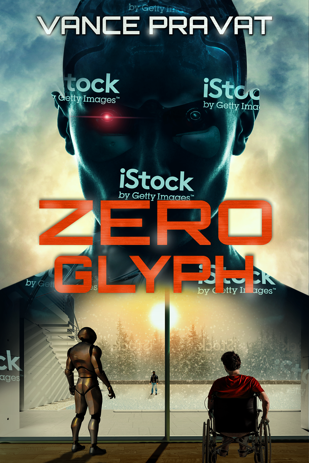
The book blurb for what it’s worth: Sometimes you have to break in in order to break out… Raphael, the world’s first superintelligent AI, has gone missing from its lab. If the security tapes are to be believed, it has simply vanished into thin air. A case of tech-theft or something far more sinister? Its creator, Andy, has complete faith in the security protocols he built into his AI, but others are not convinced. Confined to his home, he is now in a race against time to set things right, all the while staying one step ahead of the skulduggery and infighting within a company that seeks nothing less than control of the new economy. Dive into trolley problems and machine morality in this sci-fi howdunnit of Ex Machina meets Rear Window as you try to figure out whether Raphael is a guileless automaton or a monster that will do anything to get what it wants.
[original submission and comments here]
Nathan says:
Gosh, it does my heart good when someone submits a cover, gets constructive feedback, and follows through on that feedback. Well done.
My two comments:
- The way the title overlaps the sun’s glow is a little awkward; I would either tweak the layout to get rid of the overlap, or add a dark outline to the title to separate the red of the title from the orange of the sun.
- I would both enlarge and separate the robot and wheelchair figures, letting each take up more real estate closer to the edges. Especially with the robot, there’s nothing to be gained by leaving all that blank space behind it.
Other comments?
A big improvement! Congratulations!
A few things to think about, large and small and in no particular order.
1. The cast shadows are not in perspective. For instance, the shadow cast by the central post is from a light source to the right of the sun, not the sun itself.
2. I would really consider discarding the window frame and whatever that device is on the far left. They don’t really add anything but unnecessary complexity to the image. Just have a flat plane running from the foreground to the treeline.
3. You need some rimlight on the robot and seated figure: they are being backlit by that bright sun.
4. I agree with Nathan that the two foreground figures need to be enlarged.
5. I am not sure why “Zero” and “Glyph” are two different sizes. I
would make them the same.
Since this submission, I went ahead and purchased the top image, fiddled around with the color grading so that the final result is a lot more uniform and pleasing than the one above.
https://drive.google.com/open?id=1m6hxNARCCxcglYGYYdjNSISDOZFL6kf2
The difference between the font sizes is more pronounced in the latest one and I like to think that the effect leads the eye toward the center of the composition down below. I’ve seen this in other covers. And the top figure’s overlap with the sun’s glow is not as clumsy as before.
The shadows I’ll have to fix. And add some rimlight.
As for the window frame and the staircase outside, they are all part of one photo of a house. With my skill level, it is too much of a hassle to get rid of them, so I will let them be.
Last time someone suggested choosing a different man in wheelchair image, but unless I get art custom made I have to work with what I got and there’s not many stock images of wheelchair-seated men facing away. This was the best of the lot that wasn’t a complete silhoutte.
Nathan, Ron, Hitch, RK, and everyone else who gave me feedback last time and this time around: a big thank you to you all. You guys rock, and this site rocks!
Well, at least I was finally able to find out what that thing is on the left. It’s a staircase. I am even more convinced that you need to delete that along with all of the other extraneous details. I think it would be well worth the trouble. Why can’t these just be deleted? They are immensely distracting and work against the effectiveness of the cover.
Why not take your own photo of someone in a wheelchair? There are lots of ways to get hold of one for a few minutes: you might try a local hospital or clinic (which often have wheelchairs sitting around waiting rooms for general use), you could ask a doctor’s office, you could ask someone at a nursing home, you might ask a hospital/home medical supplier, etc. Then all you need is a volunteer for the five minutes this would take.
Here are examples of covers that I have done that all used photos that I took myself: http://black-cat-studios.com/photocovers/
It’s all really a matter of thinking outside the box…specifically, the box of being limited to found images.
The new head is great, and so is the typography. But I just think the entire scene in the bottom third adds nothing. The photoshopping isn’t great, it fits awkwardly into the composition, and it’s just not a very compelling scene–it’s just three small figures standing/sitting. If there’s no hope of replacing it with a more exciting scene, I’d lose it altogether.
I agree with Gwen. It might be possible to save the general idea by eliminating everything except the figures—making them much larger at the same time—and the plain they are standing on. The room itself not only doesn’t work, it works against the cover. Probably the worst part is the vertical bar that divides the lower part of the image in two.
Gwen, Ron – I will give it a try and see how it looks. Thanks
Maybe the face could just be over a city skyscape or something like that.
https://imgur.com/a/v42ldHK
a quick crappy remake. the elements still need positioning to balance them but you can get the idea from this. Make all the main elements bigger and make every part look purposefully placed. your room background is distracting. replacing it with the same texture as the top part will make it look cohesive.
placing some of that texture over the lower figures further embeds them in the scene as does weaving them into the text and making the text a solid graphic element.
Oooooh, Savoy! I like that. Not sure about the clouds, but I like the proximity of the robot and Wheels (sorry, it’s my shorthand for “the guy in the wheelchair” h/t to X-Men) to the head. It’s intimidating and creates a sense of foreboding and threat.
Good job! Wow!
The only thing I wish now is that the figure in the wheelchair be turned a little to the left, in part to mirror the angle of the robot and in part to make it perfectly clear that it is in fact someone in a wheelchair.
Just a rough cut. I got rid of the bottom scene altogether – house, robot, wheelchair man, everything… Then put in a new one, and changed the background and font to make it look more like a thriller.
https://imgur.com/a/q7rVdTj
I think this looks great!
I like this a lot! Excellent!
OH, YES!!!! I love this–well done, Vance!
I love the font and placement of name and title, the face of the android facing us with one glowy eye, and the colors. Especially the colors. But the part with the snowy woods with a character sort of in the snow, the glass wall, some kind of confusing architectural detail I cannot identify, a robot, a guy in a wheelchair, and some horizontal lines I cannot identify just confuse me.