The author says:
Jake Takeda is a high school student living a quiet life on Lhasa space colony. He has a genius level I.Q. but not much in the way of common sense. When he discovers an alien pod in his father’s salvage yard, he does what any sensible person would do. He opens it up and befriends the beautiful alien girl who emerges from it (Adeola). She just so happens to be an Arez, a warrior race with red skin that humans have warred with for centuries. It’s a desperate race for Jake and Adeola to stay ahead of Station Security. All the while, in the shadows, a team dispatched by the Arez conducts a violent search for the red girl.
Nathan says:
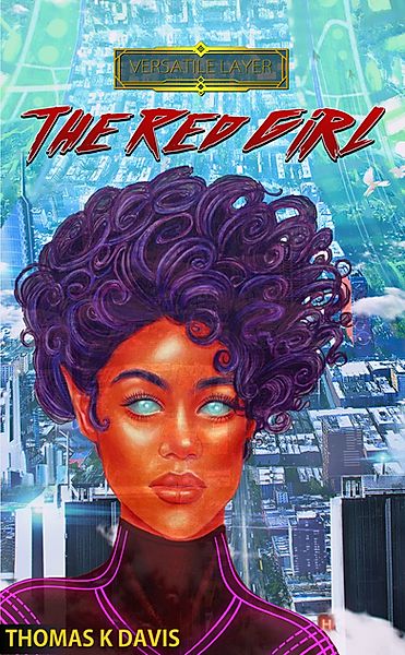
There’s a definite “Kelly Freas” vibe from the picture of the red girl, but I don’t think that’s nearly enough to get “sci-fi adventure” across to your potential readers. Here are the main problems:
- The title is almost unreadable even at full size, and it’s incomprehensible at thumbnail size.
- The illustration style for the girl clashes with the background. (And her transparency serves no purpose.)
- A portrait and a cityscape don’t say “sci-fi,” and they say “sci-fi adventure” even less. (I know that, on further examination, the cityscape appears to be on the inside of an orbital ring or Dyson sphere. But things that are only noticed on further examination don’t have the up-front impact your cover needs to attract the right eyeballs.)
I think you need to re-think the concept behind your cover. Instead of starting from “What kind of cover can I put together with what I have?”, think “What would attract the interest of the readers who would enjoy this story?” The main ideas your cover needs to get across (aside from being able to read the title) are:
- Science fiction.
- Adventure and intrigue.
I know that custom artwork may be beyond your budget. My advice is to search sites with already-finished artwork (DeviantArt, ArtStation, etc.) and find something with the right “feel” that doesn’t actively contradict the events or setting of your story (e.g., don’t choose artwork with dinosaurs if there are no dinosaurs in the story) and ask to license it.
Other comments?
Well, you are off to a fair start, but there is some work to do…
As Nathan rightly points out, there is no sense of adventure or action, although the description suggests this is an important part of the story.
There is no suggestion of a relationship between the characters though, again, this is apparently an important part of the story.
In fact, the cover is really uninformative beyond establishing the fact that the book is science fiction. Other than that, there is nothing that informs the potential reader about what sort of book this is, what it might be about or what its themes might be. It’s just a portrait of an alien-looking girl and not much else.
The first lines of your description suggest a potentially attractive cover: “When he discovers an alien pod in his father’s salvage yard, he does what any sensible person would do. He opens it up and befriends the beautiful alien girl who emerges from it.” The scene of the alien girl emerging from a pod in a futuristic salvage yard, to the amazement of the onlooking student, would be both interesting visually and evocative.
If the two characters are being hunted down by security guards that, too, would suggest an interesting cover. As Nathan says, it would establish the two basic themes of 1. science fiction and 2. adventure and action.
While the text and other graphics need attention, I think that the cover art needs to be resolved before tackling the typography.
Honestly, I don’t really agree with Nathan this time.
The artwork is great and the idea of representing one of the main characters works very well (I’ll show you one of my covers as an example, that practice has worked very very well for me).
The artwork works perfectly fine, but nothing else. You need to change the typeface to one that shows that this is a science fiction story, preferably a bold sans typeface. You also need to create a clear contrast between the character and the background, use complementary colors to achieve this.
Also, I think you need another title because it is only enough to see the cover to realize that there is a red girl in the story, you do not need to repeat it.
This Philip K. Dick book is one of the best examples I can give you to see what I want to tell you: complementary colors, a sans serif typeface, a good title and your artwork are enough to make an excellent cover.
Don’t forget to share the result because I really want to see it.
Thanks for the feedback. I noticed that some people were having difficulty reading the title. I’ll simplify the font. (Just because I love it doesn’t mean others will connect with it.) Also, thanks for sharing your cover. It’s a similar idea but implemented better.
The difference between the PK Dick cover and that for The Red Girl is that the character on Three Stigmata is doing something. That is, the character has, well, character. There is more than enough going on to suggest that there is a story behind the cover, and an interesting one at that. The red girl cover is just a portrait of a red girl who is apparently an alien…and that is about it. Unlike the Dick cover it is static and uninformative. Absolutely all a potential reader could obtain from it is the broad idea that the book is probably science fiction…and that’s about it.
I, too, have put my characters on some of my covers but I tried to do more than just portray them: I tried to put them in contexts that informed the reader more about the book than the mere fact that it contained a particular character. Here are a couple of examples:
http://www.black-cat-studios.com/black-cat-press/miller/imag006.jpg
http://www.black-cat-studios.com/black-cat-press/miller3/imag001.jpg
https://m.media-amazon.com/images/I/51TDK7JEsqL.jpg
I have often suggested a test that should be applied to any book cover: Imagine it with the title in a language you do not understand—or even with no title at all: would you be able, from the imagery alone, be able to tell what the book is about, its nature or themes? If all you can obtain is a broad suggestion of genre—that it might be a mystery or a fantasy—then the cover art might need to be rethought.
One of the most important reasons for making a cover suggestive (and you know what I mean—get your mind out of the gutter, Nathan) is that this helps set your book apart from the ten thousand others in the same genre. Sure, your book might clearly be a romance or thriller…but what makes it different from all of the other romances or thrillers on the same shelf? The Philip K Dick book is definitely science fiction…and just as definitely like nothing else in the genre.
It is not just a picture of a character, it is a picture of a character implying a story.
A cover needs to convey more than just “here’s a pretty girl” or “it’s science fiction” or “it’s a romance.” It needs to also suggest something of what the book is about. As I said about the cover for the Dick book, it needs to imply that there is a story. Simply plunking a character in front of a background isn’t enough—the character should be involved in the setting, be part of it. The character should be doing something. In this regard, compare Red Girl with Three Stigmata. This is one of the main places where Red Girl goes wrong: aside from being uninformative, the cover is completely static, which is surely inappropriate for a book that is described as having action, adventure and intrigue…let alone some romance.
Here are a few more examples of where I included a character as the main visual element on a cover…and tried to be careful to make sure that they were involved in the cover and that there was something that conveyed an idea about the character themselves…
http://www.baen.com/media/catalog/product/cache/1/image/9df78eab33525d08d6e5fb8d27136e95/9/7/9781625792570-lg.jpg
http://www.baen.com/media/catalog/product/cache/1/image/9df78eab33525d08d6e5fb8d27136e95/9/7/9781618249258-lg.jpg
http://www.baen.com/media/catalog/product/cache/1/image/9df78eab33525d08d6e5fb8d27136e95/9/7/9781625792921-lg.jpg
I know you’re right, Ron, but I don’t entirely agree with you.
In my experience, an attractive cover is more than enough to make any book stand out. It is not necessary that the cover gives you an idea of what it will be about (although it does have to be slightly related to the plot) because that is what the blurb is for.
I see this every day in the type of content I consume. This cover corresponds to a manga about a guy who gives life to a female artificial intelligence (something like Weird Science); this other corresponds to the story of a guy who becomes the manager of a ladies’ bedroom; This is about a young girl who discovers that she is the heiress of a space empire (curiously, it is an American manga). I know that manga and a fiction books can have very different audiences but, in the end, the idea of marketing is the same and works particularly well if we apply it to books.
Perhaps the main difference between the covers that I show and the one that we are reviewing is in the dynamism, but I think that it can be solved with the title and other elements on the cover.
And your statement is completely true, provided we agree on what “attractive” means. It isn’t just a synonym for “pleasant,” “nice,” “professional and becoming,” etc. It has to be something which actually catches the attention of the target audience — that says, “Hey, I know what you like, and I’ve got it!” What exactly works to attract a specific audience will differ from genre to genre; flowers attract bees and poop attracts flies. The point is, Do the signals I send let the target audience know that this is something they want?
You’re right, Nathan, I hadn’t considered that. It would have been easier if the OP had mentioned the book’s target audience. I think that all the suggestions can work well applying to the right scenarios and the relevant target audience.
Well, hell. I find myself disagreeing with Jose on this, but I’m not spectacularly surprised by that. If you view Jose’s profile and look at his mag covers, they’re not, conceptually, wildly different than what the OP has submitted and they are colorful and character-centric. In fact, I thought to myself that he would like this cover, if he dropped by. 🙂
But, here’s the thing. I don’t. And I really hate it when I dislike something or…to be more precise, find it a bit off-putting, but cannot explain WHY.
For one thing, to me, the face, the character, doesn’t appear to be alien, per se. I thought when I first saw it that she was simply a stylized Black chick. The red never spoke to me as “danger, danger Will Robinson!”
The background–I’m with Nathan. The background doesn’t tell me a damn thing. I literally don’t know what to make of it. It appears to be a city, any city. So..without the description, what’s the story?
I do, in fact, use the Miller Test–if I don’t read the description and assume I can’t read the title, what is this book about?–and I got nuthin’. Unlike the PKD story that is discussed, above, I don’t really get SF or Fantasy or…? from it. And in the PKD, you had an obviously fantastical creature/character, AND the word Eldritch in the title. The intent is patently clear. And of course, “Philip K. Dick,” which carries its own immediate identifier, but even had it all been in Hungarian or Russian or what-have-you, I’d have known from the character that it was fantastical–either sci-fi or fantasy.
Is “Versatile Layer” the name of the imprint, or…? I found that confusing at best. FWIW.
I’m sorry and I wish I had something clearcut to say to you, other than I might consider the chick’s head and a spaceship behind her, or some background that screams “Scifi!” As Nathan or someone else said, you can get wonderful backgrounds for that pretty affordably or freely, at Deviant Art (affordable, sometimes) or Pixabay (free!).
I hope that’s remotely helpful, but I fear not. (Oh, ditch that horrible font.)
Ah, you got me, I really like this cover’s concept. Also, I think you are right. She looks like an 80’s black girl. But she reminded me of Starfire, that’s why I related her directly to aliens.
I do agree with Jose that the title and artwork are redundant. All that the cover art does is illustrate the title.
Which is all well and good…but a red girl doing what? Involved in what? What is she saying about the story? The situation she may be in? Her relationship with other characters or the location she is in? That’s the sort of thing you need to be thinking about and I think the sort of things that Hitch is suggesting.
Thanks. This is feedback is very helpful.
Yes. For example: https://pixabay.com/illustrations/fantasy-architecture-surreal-mood-5023437/ something like that. Sure, maybe your world doesn’t have big floaty whatever, but everybody would instantly KNOW, Sci-Fi or Fantasy or Sci-Fantasy. This one: https://pixabay.com/illustrations/space-modern-science-fiction-886060/ or this: https://pixabay.com/photos/fantasy-science-fiction-futuristic-5025823/
It’s not like the old days in which you couldn’t find a suitable decent background unless you were yourself an illustrator or artist. They abound and can be adjusted to suit pretty much any situation. Between DA, Pixabay and Fiverr, it’s achievable. And if you have zero dough, Pixabay really is a brilliant resource. For little dough, Deposit Photos has a pretty good collection.
Hope that helps.
Since the story evidently takes place in a space colony (I am assuming this means an orbital one), NASA has a collection of high-resolution space colony images—especially some depicting the interiors—that are absolutely free to use https://settlement.arc.nasa.gov/70sArt/art.html
My previous design had the MCs falling through the sky together. But I drew them myself and they looked cartoonish. https://www.instagram.com/p/BrjHfHpggPD/?igshid=4giluocc5ynd
The face is from an even earlier design that was just her over a purple bg.
Even with the cartoonish style, this is much better than what was posted here for review! The image is both engaging and intriguing, suggesting character, situation and story. I think if the figures could be rendered a little more realistically, this might be a winner.
The cartoonishness would probably be mitigated a bit if the background were done in the same style. As it is, the contrast between the photorealistic background and the figures only emphasizes the difference.
Needless to say, the type has the same issues as ever, but I think that the cover art needs to be resolved before you worry too much over the typography and other graphics.
(By the way, it wasn’t until my second or third look that I realized that the city is on the inside of a sphere or cylinder. That might be made more immediately clear.)
From where I’m sitting, the problem seems to be mainly that while the titular girl certainly looks sufficiently alien to establish the genre, nothing is really happening in this image; she’s just standing there against a vaguely futuristic city (which you have to look closer than most casual browsers are going to in order to see the steady curve upwards indicating the city’s in a spinning torus-shaped space station). An (arguably) attractive girl does not automatically equal an attractive cover: pretty girls are a dime a dozen, especially on science fiction covers. What this cover mainly needs is more action and energy, which is probably one of the reasons Ron Miller likes that “outtake” cover of yours showing the two tumbling through the sky (which is a kind of action, at least) better than this one.
From your synopsis, I get the impression this is mainly a “guy and gal on the run” kind of story, so that’s probably what you should be showing: a guy and a gal on the run. As it happens, we had a cover with that very kind of imagery (albeit for a rather different kind of story) submitted here some five years ago; that wouldn’t be a bad place to start for getting some ideas what to show on yours. Simply put your human guy and alien gal in a similar pose (maybe holding hands as they run; whether there’s any “rescue romance” in this story or not, you should definitely tease the possibility on the cover) with a few peripheral shots of the station’s security forces in hot pursuit and maybe also of that Arez team that’s trying to “help” her (and doubtless making a huge mess of things in the process, as is typical in this kind of pursue-and-evade story).
Between the action of running (for best results, angle that image a bit to one side to add a little more energy to it) and the girl still being all red and extraterrestrial-looking, you’ll have a much more dynamic cover and one that shows prospective readers everything they really need to know about what’s inside at a glance. (Incidentally, from that discarded cover, I take it the protagonist is a black guy? That would certainly explain why an alien gal potentially attractive to him looks like Uhura from the original Star Trek television series with cherry-red skin and curly dark purple hair; granted, a lot of us white guys who watched that show thought she looked pretty good too…)
Thanks for your input. Some great ideas and suggestions.
Looking forward to seeing your next version!