The author says:
June, 1804 – France. Napoleon is declared Emperor. The port city of Boulogne has been transformed into an armed camp where 200,000 men drill daily for the invasion of Britain with a massive fleet in the harbor. The British Navy pokes and prods to keep them contained, but critical mass is approaching…
Just inside the camp, a small Roman bath is about to be highlighted by two eclipses – in 44 AD and 1914. A Roman Legionnaire, a French Lieutenant, and a WWI Scottish Highlander all settle in for a soak. Mysterious explosions cause all three to duck under the water. Coming up, Titus and George find themselves in the lap of Bayard – in 1804. Trying desperately to communicate, they discover a portrait of Bayard’s wife – Emerald. But… they’re all married to Emerald! Or are they? How to return home? How to escort a future Englishman and an ancient Roman through militarized France on a quest for Emerald without being caught by Napoleon’s Spymaster – already on their heels. How will George deal with his ancestor – an English Commodore ordered to kidnap the new Emperor?
In the summer of 1804, events from one of military history’s crucial focal points provide the backdrop for a race against time – without changing history.
Nathan says:
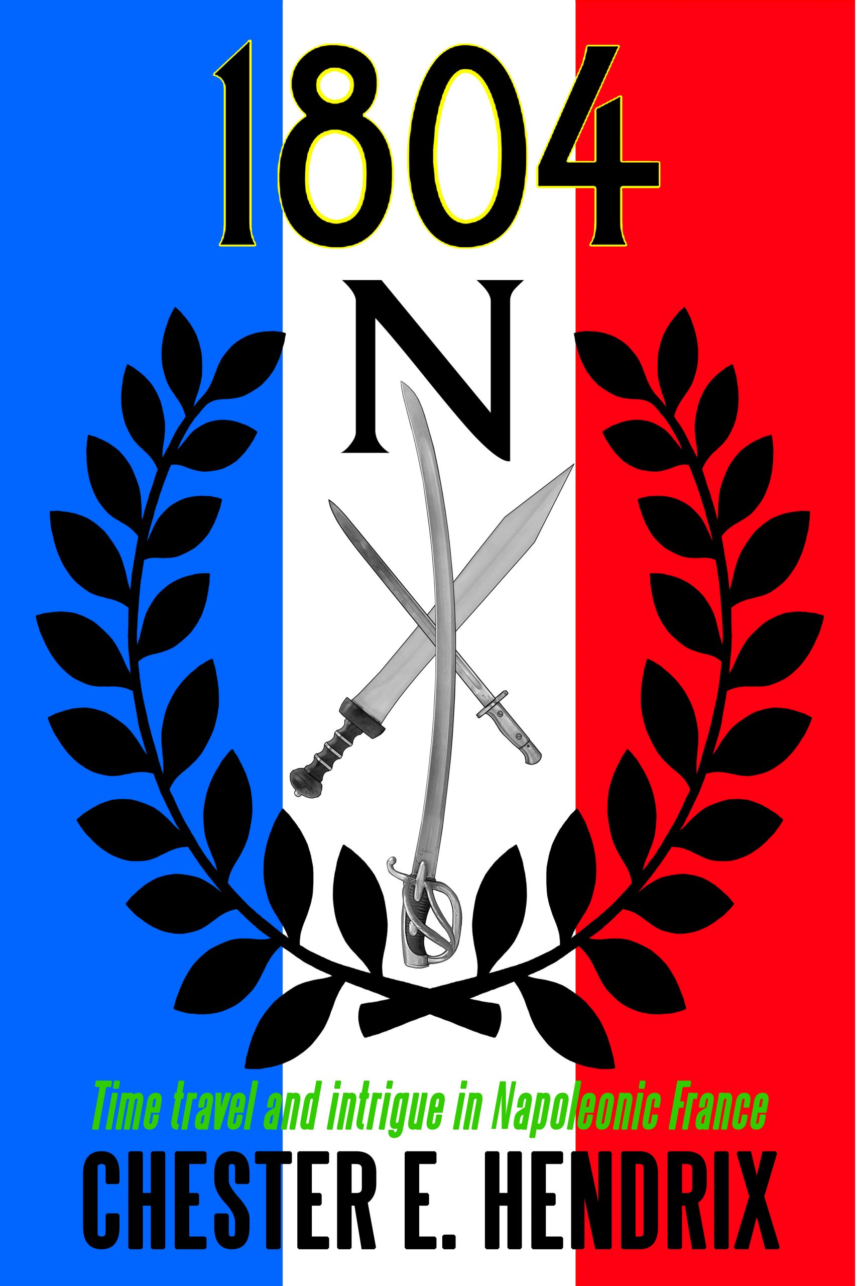
I understand that you’re trying to work with a budget here, but all the current cover conveys at first glance is “French.” The inclusion of arms from different centuries doesn’t convey anything about time travel, which is the big selling point.
I think you may need to go with custom artwork to do justice to the novel’s hook.
Other comments?
Please rethink the title. it’s too obscure for readers.
Brainstorm and write 25 different titles… then get feedback and narrow it down.
Read this article: How to Create Titles to Hook Your Readers by Judith Briles
https://www.thebookdesigner.com/2016/02/63714/
I agree with the others about the art and the title. Also, if you still want to do the cover on the cheap, you can buy something like an antique map image for $12 and overlay something modern over it to get across the time travel element
https://www.istockphoto.com/photos/old-map-of-france?phrase=old%20map%20of%20france&sort=mostpopular
Honestly, I thought it was perhaps an address, at one of those massive British housing projects that we Yanks see on the telly, with myriad buildings of densely-packed apartments. That’s truly what I thought it was, before I read the description.
I agree. This is one of those cases where you need to already have some special knowledge in order to appreciate the cover. Even if the weapons would be immediately recognizable to the non-expert, they are far too small.
A book cover should neither be comprehensible only to those with special knowledge nor be a visual puzzle that needs to be deciphered.
The cover needs to be rethought from scratch.
I’d take a page from Diane Gabaldon and go for a simple but elegant look. Rich colors and texture but a simple graphic, maybe a few wedding rings, or maybe a portrait of Emerald but have it broken or made up of different parts like one sleeve an old gown and the other something modern, maybe a portrait overlaid with a photo or vise versa but keeping it subtle not flashy.
Don’t worry about showing the characters or place at all, the reader can find all that out inside the book. Worry about getting the tone of the book across. So think intrigue, romance, and danger when picking your elements
Olive branches and the French flag are unnecessary, but I think that the book needs a better title. The book has an interesting plot line that is overshadowed by a boring title. I couldn’t say anything more about the cover if the title remains the same.
From the summary, it sounds like this is kind of a mash-up of the premise of Hot Tub Time Machine (2010) with a plot from a Harry Turtledove novel that throws in a bit of the running gag in Time Bandits (1981) about the limp-wristed married couple who keep somehow turning up in each of different eras the protagonist and his friends visit. Whether you’re approaching this with your tongue firmly in cheek (as with the movies) or more seriously (as a Harry Turtledove novel might), this is all highly potentially intriguing material. So, why isn’t your cover showing anything so intriguing?
In your case, I’d say you’re falling prey to a common mistake many authors make when they’re just getting started publishing, which is assuming that your prospective readers are all as learned experts in the various subjects you tackle in this story as you are. The French flag, the weapons from different eras, and the title’s reference to a very important year in Napoleon’s campaign all doubtless point to scholarly subjects you’ve researched quite thoroughly; but have your prospective readers? To be sure, my roommate in college who was quite the expert on the arms and equipment of various times and places (to the point that he sometimes drove the rest of us crazy pointing out all the anachronisms and other inaccuracies in any movie set in an earlier historical era the other students and I might happen to be watching) would immediately recognize those arms to be from different eras, but he was truly a one-of-a-kind personality in our entire college; I doubt you’ll have very many readers if you confine your target audience to him and his ilk.
So yes, the other critics are right: pretty much everything, including the title, is going to have to change in order to draw a larger audience. That said, you need not necessarily do anything too fancy to make that broader appeal. The cover designer for those Harry Turtledove novels has already perfectly demonstrated how to show something to be a time travel story set in an earlier era with the cover for The Guns of the South: hey, is that a Confederate general holding a ridiculously modern-looking assault rifle? Why yes, yes it is!
Notice that to appreciate what’s happening on that cover, you don’t have to know that Confederate guy is specifically General Robert E. Lee, or that the model of that anachronistic assault rifle he’s holding is an AK-47, let alone as much as my old weapons expert college roommate could probably tell you about where and when that specific rifle was manufactured. The point is making the prospective reader with even the most basic understanding of the Civil War think Dude, why’s that old Confederate guy holding a modern rifle? I guess I’d better take a closer look at this book to find out.
So too with your book: your readers don’t need to know all the details, but if you start with an instantly recognizable genuine painted portrait of Napoleon (which is doubtless considered public domain artwork these days) and discreetly use an image editor to slip a turn-of-the-century Scottish guy in World War I getup and a classic Roman trooper in his standard soldier’s gear into the background behind Napoleon somewhere just close enough to the foreground for the prospective reader (but not Napoleon himself) to notice them, you won’t need to explain anything. Your prospective reader will wonder what those two wildly anachronistic guys are doing in a portrait of Napoleon, and give it a closer look. Never mind, too, that painted portraits weren’t anything like photographs and a painter (of course) wouldn’t have painted those two guys who weren’t supposed to be there into the picture; pretending the painter was acting exactly like a camera and painting everything just as he saw is a bit of artistic license to which cover designers in general are entitled. Don’t worry, either, about cramming that bit of temporal weirdness about a gal named Emerald somehow being married to three completely different guys from three wildly different eras onto your cover; your readers can find out about that when they read a summary on the book’s sales page, or when they actually buy and read the book.
Once you have such a deliberately anachronistic cover image, then… well, yes, you’ll still need to change the title; I mean, you don’t see Harry Turtledove’s alternate history books named after years on the calendar, do you? Try to come up with something just a little more vague and intriguing that points indirectly to the gist of the story, like Beloved Emerald or The Roman Bath Not Taken. (What’s that title got to do with Napoleon having these other guys from the wrong historical eras hanging around with him? I guess I’d better have a closer look at this book on its sales page so I can find out.) Whether your story is intended to be quite serious or totally tongue-in-cheek, try to set it up on the cover the way you would set up a joke with a hilarious punchline: intriguing details and possible misdirection, but always holding back the payoff until your audience pays you to deliver it.
Case in point: here’s a painting of Napoleon that already has two troops behind him casting anxious glances at each other as if to say “Are we sure the boss hasn’t flipped his lid?” (This being before the Battle of Waterloo, such anxieties might be well-founded.) It also seems to have him looking back suspiciously as if he doubts his minions’ loyalty and resolve. Simply slip the anachronistic characters from your story in the background directly between Napoleon and his men there, and you’ve got an intriguing (and possibly a bit humorous) image to hook your prospective readers into taking a closer look.
RK is absolutely correct. Keep things simple and make the significance of the cover imagery perfectly clear to anyone, and not just those who are familiar with the subject. Here is an example that more or less does what RK suggests in their note about the painting of Napoleon–
https://www.charliehills.com/gallery/picture.php?/596/category/3
The anachronistic mix of eras should be pretty clear to anyone, whether they are experts or not. (And the difference might have been emphasized even further had I given the man a revolver.)