The author says:
This book is written for those who are uncertain of their eternal destiny. Many give little thought to what happens when they die. This books lays out the truth about heaven and what changes can be made to help one change the trajectory of their life if necessary to be sure they get to heaven.
Nathan says:
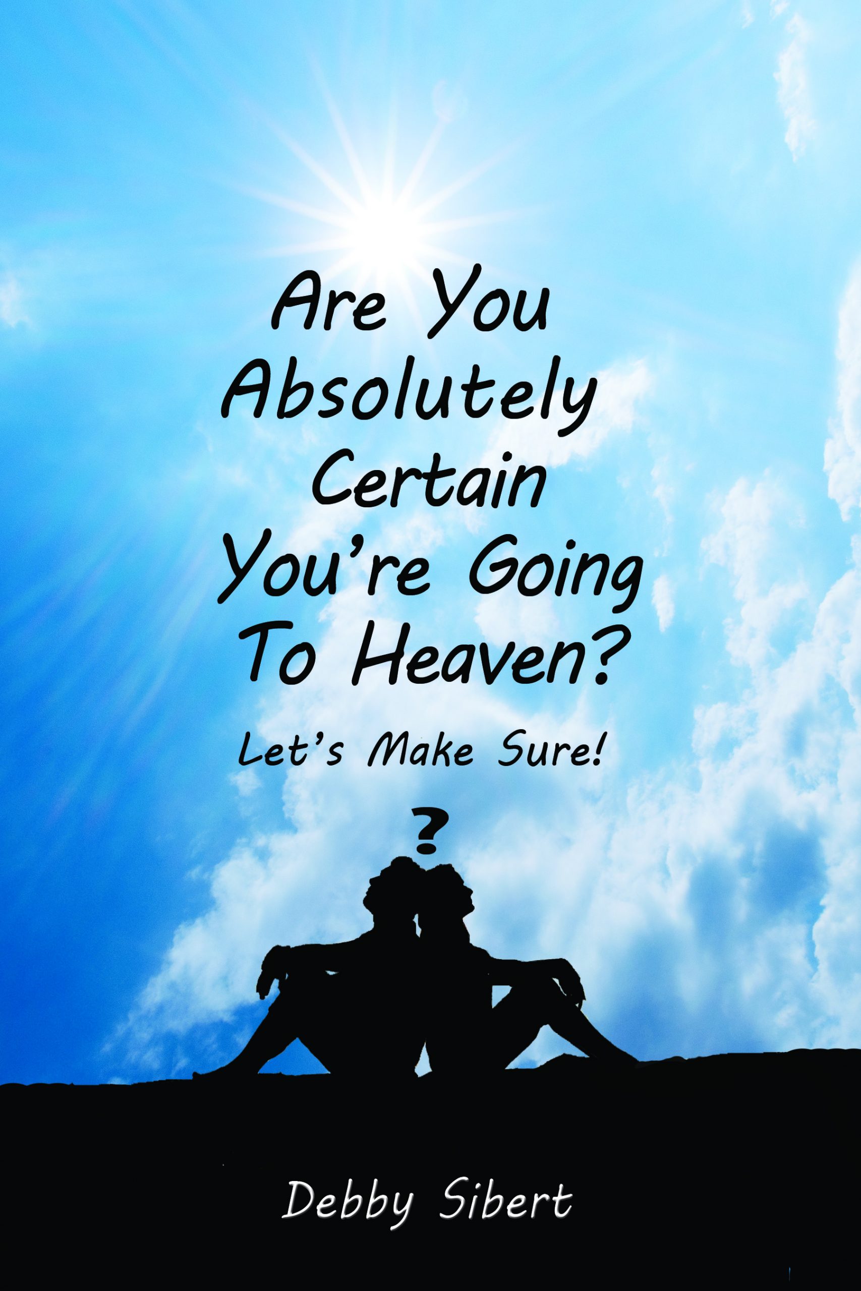
It just comes across as perfunctory and plain. While a handwriting font could certainly work in this context, this specific font seems far too casual to me, given the subject matter,
One of the frequent commenters here likes to use this test: If the text were in a foreign language, could a reader know generally what the book is about? I think this cover pretty clearly fails that test.
Obviously it’s neither easy nor desirable to try to convey any doctrinal specifics through the cover imagery, but I think the two concepts that the non-text elements of this cover could be expected to convey are “Christianity” and “hope.” If I were designing this cover from scratch, my first impulse would be to use an image of Jesus’ hand reaching out to the reader — that covers both of those concepts, and very clearly bullseyes the intended readership.
Other ideas?
I really cannot add much to what Nathan said other than to rethink the color scheme, which is essentially monochromatic. Blue and black scarcely conveys hope and enlightenment, let alone appear anything but dull and unattractive.
To apply, as Nathan mentioned, “The Miller Test,” (submitter, you can easily infer for whom it is named!), this book could just as easily be titled “How do you know that he’s right for you,” or a dating guide. That’s not how you want it to appear.
With a book that is patently faith-based, you want your Christian audience to IMMEDIATELY know “this book is for you.” This cover doesn’t say that, in my opinion.
Thanks for your feedback and comments. Much appreciated.
Thanks so much for your comments> I really appreciate it and will rethink.
I agree with the others. Here’s some images I found on Pixabay that I feel convey the idea of heaven better, and I would suggest matching your typography to the tone of the book and the age of the audience to whom it’s directed. Dark blue, maybe, rather than black. Sorry to not be more helpful!
https://pixabay.com/photos/cross-christ-religion-easter-4062996/
https://pixabay.com/photos/jesus-christ-god-holy-spirit-4336337/
https://pixabay.com/photos/jesus-god-holy-spirit-bible-gospel-3507364/
https://pixabay.com/photos/the-clouds-clouds-sky-heaven-white-1382021/
Your comments and images are very helpful. Thanks so much!
The trouble with making a cover for a book on such a weighty doctrinal matter as this is that Heaven being openly stated to be glorious beyond all imagination (“Eye has not seen, nor ear heard…” …you know the drill), all concrete artistic portrayals of it tend to be less than compelling to your prospective readers. Abstract portrayals like this one, however, also tend to be too generic and far from compelling. When I first saw the thumbnail for this cover, my first thought was of those wretched lines from John Lennon’s severely overrated atonal song “Imagine” in which he asks us to imagine there being no Heaven and “above us, only sky” as if such were a highly desirable situation rather than a truly nightmarish scenario. (He might as well have said “Imagine that when you die, there’s no afterlife and therefore no matter what you do, everything you were striving to achieve throughout your life will have been a complete and utter waste of time!”)
In any case, trust me on this: a picture of the sky is the absolute last thing you want to show on the cover of a book about Heaven. When it makes people think of anything Heavenly at all, it makes them think mostly of popular culture’s stereotypical theme-park version of Heaven with winged people wearing big floating golden rings (“halos”) on their heads perched on big fluffy clouds and strumming on golden harps. Just as those theme-park caricatures of devils as red-skinned trident-wielding bat-winged guys with pointy tails and goat hooves for feet and horns on their heads make people think of Satan and his demons as no more real than the bogies they imagined lurking under their beds and in their closets as children, showing the sky when speaking or writing about one’s eternal destination tends to make people think of Heaven as more of a pleasant abstract concept taken from a fable for children than a wholly real and concrete historical place to which mature adults with practical minds can honestly aspire to go once their lives in this temporal existence all reach the same inevitable conclusion.
As with any book, it’s always a good idea to check out what’s on the professional covers of other books in the same genre as yours. In this case, I’m thinking the original and newer covers for Christian apologist Josh McDowell’s book Don’t Check Your Brains at the Door could be rather instructive. Being written mainly for high school and college students, the original cover shows a rather cartoonish and literal illustration of the title’s hilarious premise. Having also been written with an eye toward the older teachers and professors who’d be working with these students from this book, however, the newer cover shows a somewhat more abstract mosaic of a human head done in a style something like that of a stained glass window in a church.
The premise of your book’s title and contents not being so inherently humorous, the cartoonish approach is almost certainly not the right one for your cover. However, a somewhat literal-minded illustration may still be possible: how about a portrayal of the broad road leading to Hell and the narrow road leading to Heaven as described in Matthew 7:13-14? One narrow and winding mountain road (if you’re paying attention, the Bible never speaks of a “straight and narrow” way, only of the “narrow” part) leads up to Heaven, and one huge broad flat straight valley highway (“…the gradual one—the gentle slope, soft underfoot, without sudden turnings, without milestones, without signposts…” —C.S. Lewis, The Screwtape Letters) leads down to Hell. You don’t even have to show the actual places, although you might want to show the gates with Heavenly sunlight streaming through the one and smoke and the sickly glow of Hell’s fire emerging from the other. (Fun fact: if you take Revelation’s passages about “brimstone” i.e. sulfur entirely literally, Hell’s fire should in fact be burning a dark blue color, as that’s the color of flame burning sulfur produces; which also possibly explains Hell being described as “outer darkness” in certain other Biblical passages, since those dark blue flames don’t produce much illumination.)
Alternatively, if you’re going for a somewhat more abstract approach, you might play upon an analogy: since a lot of people think of going to Heaven primarily as way of seeking refuge from going to Hell, you could show a fire insurance contract and a quill pen in somebody’s hand preparing to sign it. Throw in the tagline “Is your fire insurance truly paid up?” and you have a pretty effective lawyer’s visual portrayal of your book’s main premise. On the other hand, if you think that’s a bit too grim and gritty, you could make it a country club membership contract; as political satirist P.J. O’Rourke once said in a humorous article offering proofs that God is a Republican, “It is very hard to get into God’s heavenly country club.”
In any event, your cover needs to make a clean break from the popular (and erroneous) association in your prospective readers’ minds between eternal Heaven and the temporal “heavens” of our planet’s atmosphere. Think in more real and practical terms while designing your cover just as you want your readers to think of Heaven as a real and practical place.
Very thought provoking. Thanks so much RK for all the time you took to give me so much great feedback. I will definitely give this a lot more thought. I know that even if the content is amazing, if readers aren’t drawn to the the title or cover, they will never find the gems inside. Thaks again.
This cover is dull. I think the title is enough to attract your target readers without the use of a stock image. Maybe you just need a cover like this one.
Thanks so much Hose. I’ve gotten a lot of good advice here. I really appreciate your input. I’m really going to have to rethink this.
I don’t think there is anything wrong with the silhouette idea. I like that idea. I would read it if it didn’t show too much Christianity on it. I’m spiritual but not too religious. I think the sky could show more purples, blues and pinks. Maybe rays of sun through the clouds. I love the black silhouette idea. Maybe pick a better handwritten font or plain black san serif font with rounded o’s e’s and rounded bowls in the font. I like the silhouette and not to religious symbolism. It may draw in readers who aren’t sure of their religious beliefs about Jesus. Maybe make the silhouettes a bit bigger. Like the idea. Totally into silhouettes. Millenials love black.
Or a neat idea would be to show a hand with a white sleeve reaching down from the right corner to reach out to a hand tan or grey or white from the lower left corner. In the background could be a beautiful sky with blues, pinks, purples etc or peach. With the sun coming through the clouds. Pick a color font in black or pastels in the middle of the pic. You can also put your name on the top. And the title down the bottom. Very cool idea. It presents well to religious and non religious people. It could be Jesus or anyone lending a hand to someone to help them. Love this idea.
Hi Kristen,
Thanks so much for your feedback. That was very helppful.