
The author says:
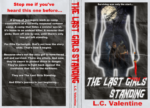
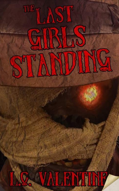
A group of teenagers work as camp counselors at a recently reopened summer camp. One that hides a sinister secret. An undead monster returns from the grave, picking them off one by one, until there’s only one girl left standing. For Ellie Cartwright, that’s not how the story ends. That’s how it begins. Because she’s not the only girl to have faced evil and survived. There are others. And now, they’ve sworn to protect those in danger. They’ve sworn to fight back against the creatures that lurk in the darkness. They are The Last Girls Standing. And Ellie’s journey is just beginning… (This cover is not final, hence I’m seeking feedback before I move on with it. Thank you for any help).
Nathan says:
I really think you’re missing a bet by not having the cover showcase Ellie and the rest of the Last Girls Standing. The “hook” to this story are the protagonists, not the monster, so having a bunch of blood-spattered teenage girls in a stance like the Bad Girls movie poster (what, that reference is too old? Fine, how about Birds of Prey?), with a shadowy monster looming them, would more clearly promise what the book’s main attraction is.
That kind of thing is budget-intensive, I understand; if you need to be more scaled-back, how about imagery which juxtaposes “teen girl” with “horror violence”? (The first thing that came to my mind is an iPhone in a pink, bejeweled case, leaning against a bloody Louisville Slugger wrapped in barb wire.) You could find someone to photoshop something like that together competently for a lot less than the custom artwork in my idea above.
Also: That font’s too self-consciously spooooky to be taken seriously. Only use it if you’re going for a solidly tongue-in-cheek, R.L. Stine-loving demographic. And even then, it really doesn’t work well on a slant.
Other comments?
