The author says:
It’s been 10 years since the unprovoked Arez attack on Lhasa Space Colony. The war between humanity and the Arez is in full swing with no end in sight. Countless heroes have been struck down by the alien hordes. The orbital cannon on the moon of Titan is the only thing keeping the Arez armada from penetrating further into Terran space. The courageous Captain Jake Takeda has been dispatched to Titan along with the rest of his elite Strike Team. Their mission is to defend the orbital cannon from the viscous Arez ground forces stationed on the exotic moon and to defeat their cruel leader. The dreaded general known only as The Crimson Death.
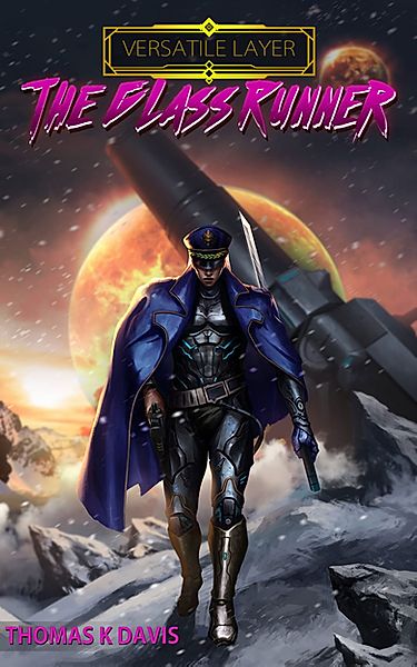
Nathan says:
I think this is much closer to the bullseye than the last cover you submitted. The genre of military sci-fi is very clearly communicated.
I’m still not crazy about that title font; it sacrifices readability, and doesn’t bring anything in return (it could as easily be on an ’80s-inspired slasher novel). And I don’t like how the byline is pretty much the only non-centered element.
If the cover art was rendered in separate pieces and composited, then I would suggest you move the cannon to the right so that the planet can silhouette the figure’s head as well. If not, then I would suggest extending that highlight we can see on the right shoulder up around the top of the head to separate and emphasize it.
Other comments?
I think this is an example of where someone is so much in love with the art (either because they did it themselves or they paid a lot of money for it) that they don’t want to cover up even a fraction of an inch of it.
The result is that the title and the author’s name get crammed into margins and corners. The readability of these is made even more difficult by choosing a decorative typeface for the title, giving it a color that does not provide enough contrast with the background and then adding shading and a drop shadow to it.
There is plenty of space in the top third of the illustration to allow for type placement. Take advantage of this.
The byline is not readable and absolutely impossible at thumbnail size.
I asked previously what “Versatile layer” even means. I’m sorry, but it looks out of place there. Particularly against that title font.
And speaking of–I’m with Nathan. That font isn’t helping this book any and it didn’t help the last cover, either. I’m sorry–you obviously love jagged fonts and you really want one, but the truth is, that cover is already very, very busy. The artwork is busy, that box of “Versatile Layer” is busy and the font is just…in my opinion, it’s overkill.
Is this a comic book? Is that what this is meant to cover? That font certain would convey that, if that’s the intent. Anyone here know?
Are you or your artist primarily a comics person? Because this looks like the cover of a graphic novel or an RPG sourcebook, not a military SF novel. I also agree with our host’s opinion of the font and font cover, which seriously dates this cover. I’m very reminded of the old Cyberpunk RPG sourcebooks with that font.
Take a look at the Amazon Top 100 in military science fiction for an idea of what modern military SF looks like. You’ll see bold sans serif fonts with minimal styles applied to them, and the text taking up a lot of the cover real estate. The ones where the text is crammed to the top and bottom? 99% of the time, those are self-published, and they almost always look off-balance and amateur. Trad publishers design the cover image around the title; self-pubbers design the title around the cover image.
If you compare this to the Amazon Top 100 Comics & Graphic Novels list you’ll see a striking difference in the cover styles. The comics *do* design the title around the cover, because *they are a visual medium* and the artwork is important, because it signifies what you’re getting inside: lots of art.
Here is why nailing your genre is so important: if your cover were to come up in Amazon search results, I’d assume it was a graphic novel.
(1) I’m looking for a graphic novel, great! I read your text in the book description! Oops, it’s a novel, I’ll go on to the next graphic novel. No sale.
(2) I’m not looking for a graphic novel. I move on to the next book in the search results, perhaps grumbling at authors who keyword-stuff and get their books put in the wrong category. No sale.
Yeah, some people don’t care if it’s a novel or a graphic novel, but they’ll read the description either way. You want to ALSO reach readers who DO care, because *you reach more people that way.*
So I looked up your author website and… yeah, you’re a comics guy. Nailed it. 🙂 I’m wondering if you’re trying to attract comics readers, or if you’re trying to fuse comics and prose together? Either way, in today’s world I think you’re just muddying the genres in your cover instead of appealing to both audiences. Just take it for granted that there’s a big overlap in comics and MilSF prose readers, because there is.
If you’re questioning the need to indicate that your book is prose, note that when MARVEL, of all publishers, puts comic-type covers on their novels, they put “Prose Novel” in the title to ensure that buyers aren’t disappointed.
For a more subtle difference than “Prose Novel,” check out these two Hellboy books:
(comics) Hellboy: The Complete Short Stories Volume 1
(prose) Hellboy: Odd Jobs
The graphic novel cover has the text in three stripes: a banner at the very top with the actual title of the collection, the Hellboy series name right below it, and then the author names waaaay at the bottom.
The prose collection sticks the series title near, but not right at, the top in the same place the comics puts it, because they want brand recognition. But the rest of the cover text–the title, editor, illustrator, and tagline–looks a little more like regular novels, being in a block and not in a line way at the bottom.
What is the difference between your cover and Hellboy: Odd Jobs? Hellboy is GIANT and not covered by text, with a small book title, because Hellboy is a well-known property that sells books. Dark Horse wants you to spot him from across the store.
Your characters are not that well-known yet. You should put a significantly higher weight on the book title, a lesser weight on the cover image, and the least weight on the series title. The series title is to let people now that there are other books in the series if they like this one.
And speaking of series titles…the decorative element you have surrounding “Versatile Layers” is Art Deco. There is no indication that you have a 1930s aesthetic in your cover image, nor in the book description. It sticks out like a sore thumb. You’ll also notice, if you went to the Amazon MilSF novels, that very few of the novels have a special graphic dedicated to the series title.
It screams COMIC or RPG SOURCEBOOK the way it is. (Honestly, my husband brought me tea while I was experimenting with your cover [see below], and guessed your genre as “Cyberpunk RPG comic…but weird, like military SF, but that doesn’t fit the Cyberpunk game…” when I showed him the current cover.)
So! Because I am procrastinating on other work, and I rarely get the chance to mess with MilSF, I did some experimentation.
See the results: https://i.imgur.com/TXkmnQO.jpg
I am not saying that these are all good; in fact I like only 2 of them. This is more to show you my train of thought and design process.
I believe you commissioned the illustration before you thought about the cover design, or while assuming you wanted the cover to look like a comic. Or the artist you hired isn’t as familiar with prose novel covers as they are comics and concept art (or they just followed your directive without pushing back). They did terrific work, but it’s not quite composed right for a prose cover.
Versions 1-4 are me trying to make the illustration work with a prose cover style without re-framing it. They are also me experimenting with layer styles on the text, only to decide that yes, as I knew already, too much fuss on the text still doesn’t work as a novel cover. They scream “Comic!”. (When they’re not screaming “HELP I AM TERRIBLE!” and “I AM UNREADABLE AT THUMBNAIL SIZE!” It goes to show that things that sound good in theory–hey let’s have the title effect reflect the “glass” in the title!–often turn out like crap on the page.)
Version 4 is when I hit the effects that I thought worked on the title, though not on the smaller text in your byline. And when I came to the conclusion that the illustration just wasn’t going to work as-is.
Versions 5-8 are after I bumped the picture up so the illustration took up the top 2/3 of the cover and the text took up the bottom third, adding a gradient that blended with the snowy rocks. That immediately put it into prose novel territory. And having either the series or the byline separate from the title, at the other end of the image, frames the image and balances the cover overall.
Many trad-pubbed covers put the text directly on top of the artwork, but in this case the character’s body language is key to getting the emotion of the cover across, much as it is in Gideon The Ninth, so I wanted to leave him mostly uncovered. (That cloak shape works really well, by the way adding interest and balancing the composition).
Versions 5 and 6 are experimenting with text placement, plus a lens flare behind the title on #6. Versions 7 and 8 are experimenting with different fonts.
#5-6 – We’re finally getting somewhere decent here. Looking at them, I’d try both your byline and the series title white, with the title in steel grey. I think the flare doesn’t work, but some sort of texture behind the title might be something to experiment with.
#7 A play on the word “runner,” extending it off the edges of the image to give it movement and motion. Normally you don’t want to put text this close to the edge because it crowds the text and doesn’t allow it breathing room, and if you went to print, the trimming of the cover is not exact and you might cut parts of the text off.l In this case, you WANT text cut off, though. Verdict: doesn’t work for this book. It would work for a contemporary action thriller, though, so I shall file that idea away in my head.
#8 I like this title font. It reads a bit more MilSF to me. The lens flare isn’t working here, either, so I’d stop trying to use it. But the series title in the same font as the title, but a different line weight, works nicely, and I think I like the horizontal separator as a nice design element. I might try the steel-grey metal effect again, but I’m thinking that plain white with a drop shadow is the way to go. There is nothing wrong with plain white with a subtle drop shadow.
Overall, #8 is my favorite so far, with 5/6 as second runner-up, but I wouldn’t be done yet. I’ve done 20-25 or more versions of a cover, just working out what fits and what doesn’t, and getting feedback from the author. Out of all of these, I’d actually have sent you 5, 6 and 8, and none of the others.
Wow.
I was coming at the design from a comics BG. I see the huge difference between comic and novel cover design now. Thanks for breaking that down for me. Also the examples you whipped up look incredible. A few weeks ago, I did a redesign of the text after the criticism of the previous cover but I was still off. It still looks like a comic book. The Glass Runner: Versatile Layer book 2 https://www.amazon.com/dp/B07M8L7F4W/ref=cm_sw_r_cp_api_i_lchSEbQYJ9C7N
This is what they’re talking about (if you, like me, find a visual aid helpful) https://imgur.com/a/8VV1Am4
Not sure what “versatile layer” is supposed to be. To me it looks like a template layer with the template name still in it “this is a versatile layer for you to use.” That’s something you may wish to address, perhaps in the blurb (“The first novel in the Versatile Layer universe” or whatever it actually means)
The art is glorious! Best of luck!
(that’s what I get for taking so long to type)
Ignore my post, Augusta Scarlet’s got you covered. (#8 is my fav, too, haha)
~Syd
In my opinion, everything below the knees is unnecessary; if you cut the artwork you could have more space for the title and your name. The typography does not work, at least not all in capital letters, but if you want to use it you need a lot of contrast (as seen here or here).
Otherwise, I completely agree with what Nathan and Hitch said.
So I take it this is a sequel to that Red Girl for which you submitted your previous cover? Yes, the artwork’s good, though I’d recommend taking a bit of the shine off the guy’s sword and armor if you’re going for a prose novel here (which I presume you are). You want the artwork to look painted like traditional science fiction artwork, not penciled and inked like comic books and graphic novels, even if that’s how it was actually crafted.
As to your fonts and title and byline placements, yeah, I’m with the others: you’re going for entirely the wrong effect here. Aside from the G in “Glass” looking like an F in the thumbnail (whatever kind of contraband “Flass” is supposed to be; science fiction has certainly used far weirder made-up words), that jagged font makes me think more of island resorts and nightclubbing than of anything even remotely connected to science fiction and the military. Considering that your protagonist there on the cover looks to be dressed something like Sergeant Tamora Calhoun and her Space Marines in Hero’s Duty from the Wreck-It Ralph movies, you should follow examples of the titling from such Space Marine-themed stories and games and use a similarly straight-edged clear-cut font featuring metallic texturing and/or military-style stenciling. You might even want to throw in some rivets on the letters or maybe some armor plating similar to what your protagonist is wearing to drive the point home.
As to the placement of the captioning, wherever you choose to locate the title and byline, don’t worry too much about covering up either your protagonist’s boots or that big cannon in the background. All that matters is people being able to see your appropriately active protagonist in the thumbnail; everybody already knows what boots and big guns look like, and they’re not providing any of the real action on this cover. So (among other things) don’t go shrinking your byline and cramming it off into a tiny little corner at the bottom like that: it makes you look ashamed to be attaching your name to this; show some pride, or at least some satisfaction with your achievement of having authored another book. Chances are that’s more than a lot of people around you have ever achieved!
Finally, a little note on your summary: do make sure to have an editor or at least a fresh pair of eyes look over your writing before publishing, since I notice you describe the antagonist aliens as “viscous Arez ground forces” in your summary. Since the last I saw of that titular Red Girl Arez female on the proposed covers of your previous novel, she didn’t look particularly colloidal or gelatinous, I think you meant to say “vicious Arez ground forces” there. That vicious/viscous word-swap is the very kind of auto-correct typo that slips right past those spell-checkers on word processors and web browsers, so you need a fastidious human who’s never read your novel before and therefore isn’t inured to such mistakes to catch them.
Thanks for catching that mistake.
Now that I understand how the text should be formatted on the cover, I’m seeing how I missed the mark on that. All of the other covers, I’m looking at on Amazon, have the large text that’s easily readable as a thumbnail. I didn’t get what I was doing wrong before.
it reminds me of a warhammer 40,000 tie-in novel
I know that I’ll get laughed at for this, but while I know what a war hammer is, and I assume that (because you said tie-in) that a “Warhammer” is a game of some type (?) what’s a Warhammer 40,000? If I may ask?
Warhammer was originally a D&D-inspired fantasy tabletop game with a very orc-heavy setting.
Warhammer 40,000 (often abbreviated to Warhammer 40K) is a spinoff that took the general premise into the future (i.e., 40,000 AD); the spinoff became more popular than the original iteration, because who wouldn’t love orc battles in space? It’s spawned novels, comics, etc.
Thanks for that. Yes, yes, it’s true, I have no cool. I’ve never played a role-playing game, or anything, game-wise, after Pong. (Honestly, never understood the appeal of the role-playing thing, but I’m sure it’s obvious once you’ve tried it.)