The author says:
Genre: psychological thriller Third in a series. Book one and two had been compared to V.C. Andrews and Book three is similar vibe.
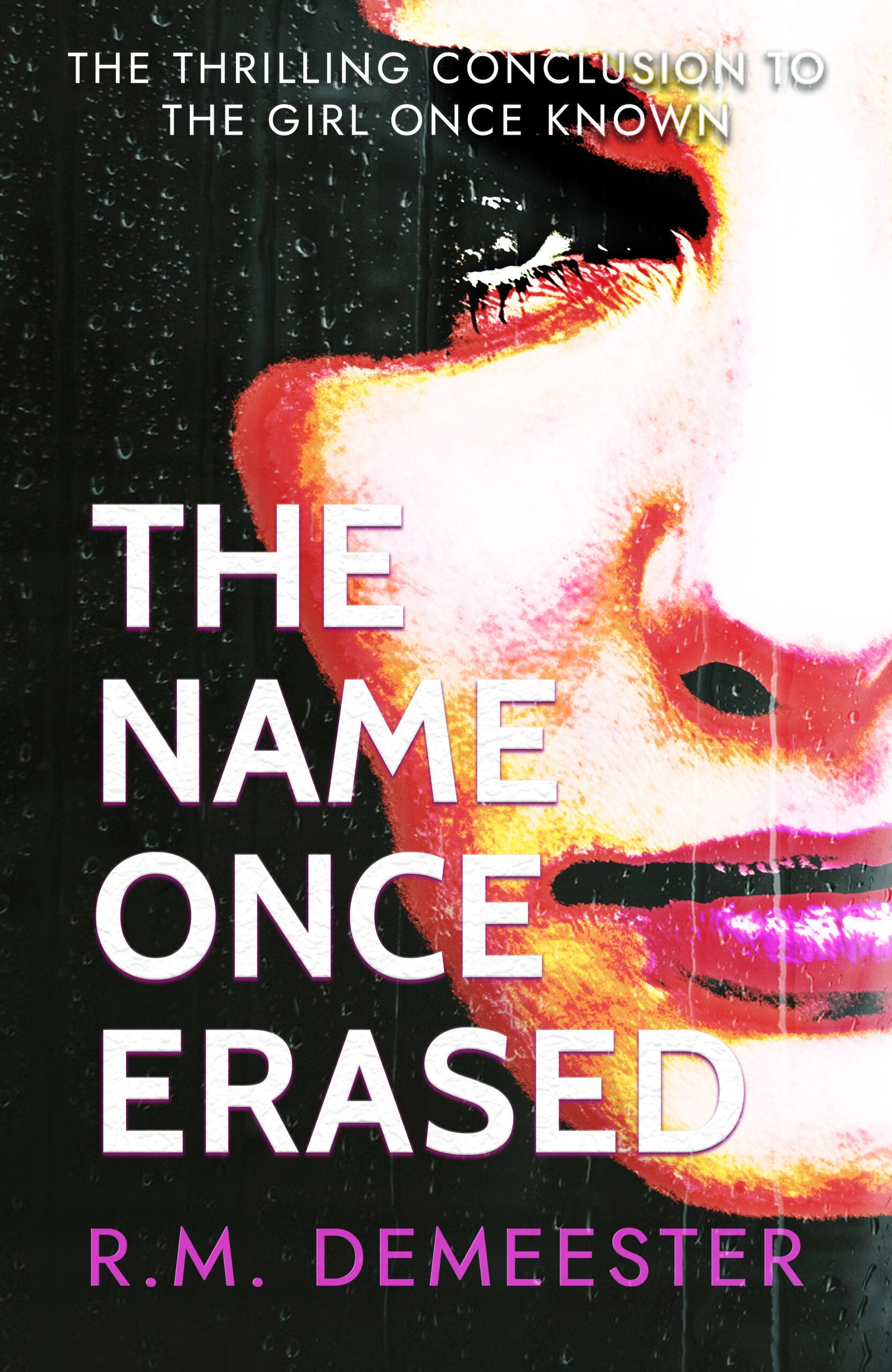
Working Blurb: After The Girl Once Known and The Bond Once Broken, this family story reaches its thrilling conclusion in The Name Once Erased. Mira is now married with children, and she believed she had her family’s dysfunction under control—until her grandmother’s funeral. She had always thought her father’s side of the family, despite his past indiscretions, was the more stable one, free from secrets. But an online ancestry test reveals a cousin her father insists he doesn’t know. Then her estranged paternal aunt and cousin resurface, and Mira pushes to find answers because if she knows one thing, it’s that secrets have a way of coming out. As Mira digs for the truth, someone seems willing to go to any length to bury the family name and its secrets for good. But Mira is determined that the lies, betrayals, and past hurts must end with her even if it puts everything she loves at risk.
Nathan says:
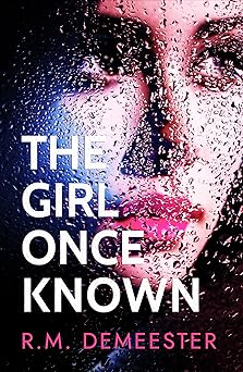
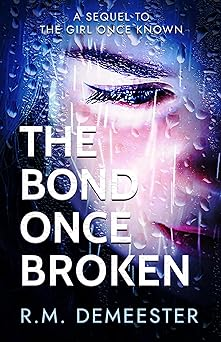
Let’s look at the previous two books to check the branding:
I can see where you’re trying to go — “similar but different” — but the photo for the third book is over-processed, and it’s distracting.
The raindrop motif is also much subtler, so much so that even in the full size, it only appears at the second glance. In keeping with the trend toward fewer raindrops on the previous two covers, I would confine the drops on the third one — maybe just to the lower half, or just to the margins — but make them large enough to be noticed.
Other comments?
I think it’s great as is!
The main issue is the part of the white type overlapping the image. There is not quite enough to set it apart. Perhaps try making the drop shadow just a little denser.
About all I’d recommend is conforming each of the three books to each other: the second book The Bond Once Broken is probably the best designed, as the high brightness and contrast and saturation are not too high and the drop shadow is just enough to make the text legible. For The Girl Once Known, I recommend adding a drop shadow to its text to make it that little bit extra more legible. For this The Name Once Erased cover, maybe ease back ever so slightly on the brightness, contrast, and saturation to make the gal’s face and the raindrops and text in front of it more discernible as they are on the other two covers.
I think the cover you designed is better than the original for sure. I was just wondering if changing the cool colour pallete from the original was just a personal choice or something you thought was more accurate to the book itself. The title is fine but the typography of the “the thrilling …” could be a bit more readable. The thin font and its colour merging in with the image behind doesn’t help and the text seemed a bit big to me. Apart from that it looks great and the colours are attention grabbing
I agree about the text on top. Maybe flush left and put on three lines in the black area and get off the white area completely? Also, the title of the previous book should be in italic.
I love the look of the first two books – but, for some reason, I don’t feel like this third one ‘matches’ them very well. I can’t figure out precisely what’s jarringly different; maybe it’s the less ‘photo-realistic’ aspect of the previous two that’s missing from this third one, maybe it’s the shift away from the blue-toned palette of the previous two to the more red-toned one of the third one, maybe it’s the lack of the raindrop detail… or maybe it’s the combo of all three. I mean, it’s still a good cover – but I don’t love it as much as the previous two.