Reconstructing Christmas

The author says:

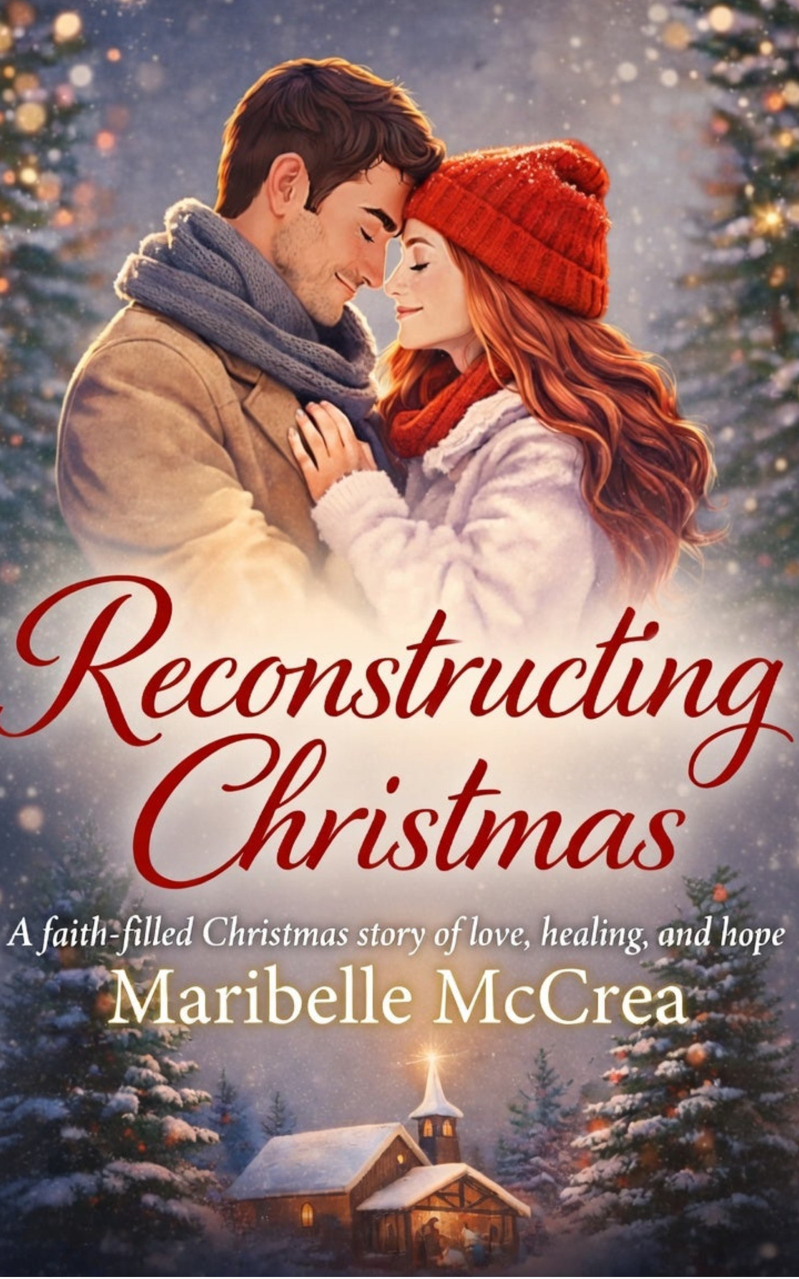
Reconstructing Christmas is a closed-door sweet romance novella with Christian themes, set in Atlanta during the Christmas season. Taking place one year after the events of For the Love of Rhett, the story centers on love, healing, and renewed hope against a festive Southern backdrop. The target audience is readers of sweet, faith-filled contemporary romance who enjoy emotionally rich holiday stories and gentle happily-ever-afters, particularly fans of authors such as Debbie Macomber, Becky Wade, and Denise Hunter.

Nathan says:

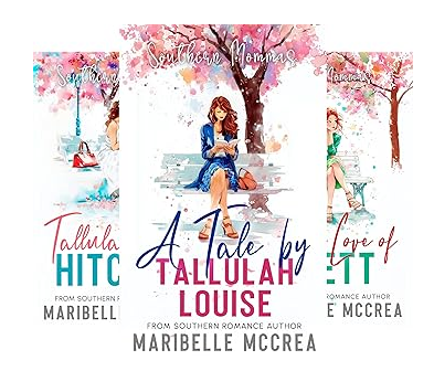
You mentioned that it’s a follow-up to The Love of Rhett, so I looked that up-, and found that it’s the third volume of a series:

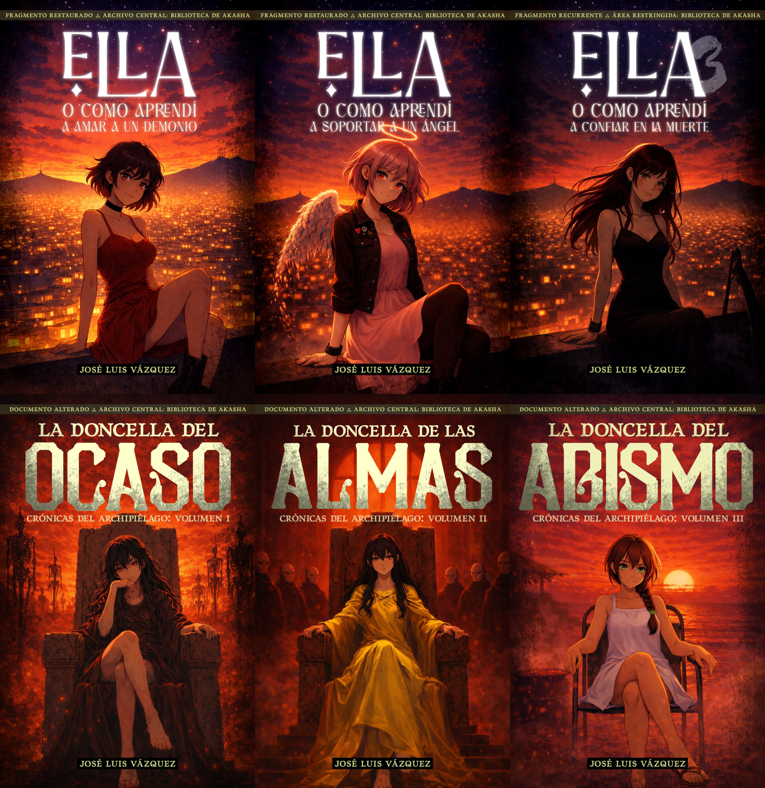
I think you’re missing a bet by not continuing the branding.  A reader of your previous books should have some indication that this is a Christmas story that involves the same characters and/or setting. You should be looking at creating a Christmas-themed continuation of the common elements of your previous covers: Same typefaces and locations, same general layout… even just putting a central figure in cold-weather clothing and hanging ornaments on the background tree might be enough.

Even if you want to indicate more of a break between the previous trilogy and this volume, you should look for ways to make it stand out, because as it is the cover of Reconstructing Christmas is far too generic. It looks like the result of asking a LLM for a Christmas romance cover. So even if you don’t want your readers to immediately connect this book with the previous ones, just things like carrying over the title and byline typeface and layout at least preserves an element that isn’t so bog-standard.

Other comments?

Busqueda

The author says:

The main character is a wolf who lived in captivity and was recently abandoned in the tundra, where he must learn to survive. Throughout the story, he meets various wild animals with whom he forms bonds. The plot has many moments of drama and introspection. The novel is in Spanish, but I would also like an opinion on the cover design.

Nathan says:

The biggest problem is that gray is a dull color. It doesn’t draw attention to the book. And because most potential readers will first encounter the book online with other reading options on either side, it will get passed over.  Adjust the contrast so that lights and darks stand out better.

The photograph has some distracting details to it, most especially the dark mark in the snow over to the left. I would remove all the details of the snow close to the edges of the cover, so that attention will be drawn to the footprints.

Finally, the typeface doesn’t add anything.  I would experiment specifically with some handwritten fonts, and see how they add character to the cover.

Other comments?

My Traveling Teacher [resubmit]

[original submission and comments here]

Nathan says:

From one extreme to the other! 🙂

I like where this is heading — it definitely doesn’t give off the AI vibe of your previous submission — but it brings its own set of problems:

  • Not much is visible (or graspable) from the thumbnail. I can’t make out any of the text, and of the rest, there may be a window, and either a path or a stream… If you change the typeface to something without as many thin elements, it will be more readable, and cropping the image a little closer will make the visual components of the image more prominent.
  • The lens flare looks really artificial compared to the rest of the image. Trimming it down to just the sun, without the halo, would let it be prominent but not overpowering.
  • That would also help the human figure, which is in danger of being lost next to the flare. A slight darkening of that figure’s silhouette would also bring more focus to it.
  • There’s no need to make the byline look like an afterthought. put it on there margin to margin. (And you don’t need “By.”)

Other comments?

Hollowed Ascension

The author says:

Eidola, a world recovering from a two hundred year war with the demonic forces of hel still finds itself in the shadow of the relics left behind, giving rise to a new profession. Chaos drifters, highly skilled adventurers and explorers whose purpose is to gather and neutralise these items. Brail a new drifter finds it difficult to maintain his financial situation and his crumbling party. That is until he meets the reclusive and mysterious Von, offering to take part in a job which could put their names with the best. But are Von’s intensions so pure? And what is his relationship with the vile and illusive humanoid species known as the “empties”.

Nathan says:

It’s a pretty good cover… but not for this book.  Your blurb speaks of action-adventure in the ruins of a (SF? fantasy?) world. Your cover would probably catch the eye of someone who wants a grittier version of Twilight. The people who would like your book aren’t going to click on the cover, and the people who click on the cover will read the blurb and realize the book isn’t for the.

Cat Scare

The author says:

Genre: meta-horror

Setting: from the 1980s to the near-present in a world not too different from our own except where otherwise noted (i.e. the black magic involved in the protagonist’s origins)

Target Audience: experienced horror fans who’d like a novel that does for them more or less what John Scalzi’s Redshirts did for Trekkies

Premise: What if (minor spoilers) the cat in the “cat scare” scenes in horror movies (and sometimes horror novels) actually *is* the monster, and this is his way of warning people nicely that they’re not welcome in his domain and really ought to be leaving if they don’t want to suffer some horrible fate? What if the reason he does this is that most ordinary people are actually a lot more reasonable and capable of taking the hint than the cliched characters in poorly written horror stories? What if we saw some of these horror stories from said monster’s point of view for a change? That’s what this story does: explains his origins, and how and why he does what he does.

Nathan says:

Aw, what a cutesy-wutesy kittie!

…Which shows the problem right there. Looking at this cover, between the kitten photo and the typeface, I might think that it’s some sort of cozy paranormal fantasy.

If you want this to appeal to horror fans, lean into it. Use typefaces familiar from horror movie posters. Use a full-grown cat — NOT a kitten — hissing or arching its back or doing something ominous. Don’t make the mistake of thinking the cover’s fine because you know the story and it fits; think, “Will this tell the target audience who knows nothing about the book that this book is for them?”

Other comments?