The author says:
The Rending Cauldron The Handmaid’s Tale meets Alien in this dark medieval fantasy where one species’ plan for survival lurks behind a blood-stained shroud of secrets.
In a prison hidden by ancient magic, Vestra hunts for a path to liberty from her captors, but the deadliest threat is one she can’t outrun. It’s growing inside her. Astérien, Vestra’s betrothed, hunts for her day and night, racked with guilt about Vestra’s capture. His efforts betray him, and he suffers inescapable captivity of his own. Worlds apart, the two young elves fight ingenious systems that would see them separated forever, and little does Astérien realize just how little time Vestra has left to break free. Only through the deeper understanding of both magic and mercy can the two of them hope to defeat their enemies and navigate the painful path back to one another.
The Rending Cauldron, due to its sensitive themes and some shocking imagery, is intended for adult readers. It should appeal to readers of Terry Brooks, Michael Moorcock, and (I hardly dare say it) Brandon Sanderson.
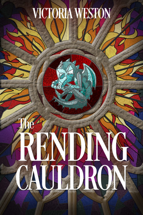
The cover art is a concept. Typography is not my strong suit and may end up outsourced, unless the whole design is trash. (I also have a second concept I’m toying with.)
Nathan says:
I don’t think the cover concept is bad at all. It definitely needs some refinement.
The stained-glass motif allows you to essentially use line art — very bold, simplified imagery that will stand out and be understandable in thumbnail (where the majority of your readers will first encounter your cover). So lose the stone-texture sun pattern that doesn’t mesh well with the stained glass anyway, reduce the distracting textures in the baby dragon and make it larger, and generally work on making it “pop” in thumbnail.
Other comments?


Not much I can add to Nathan’s comments. The stone might work, but there’s too much of a mismatch in style. Perhaps if it simply looked more like stone and less digitally generated… https://www.abelard.org/france/stone-tracery-in-cathedrals.php
It’s not a bad concept on the whole, but I do see two problems with it:
A) While you’ve got what looks to be a green dragon fetus properly centered to draw the viewer’s eye, it’s a bit too small for those seeing your cover in thumbnail (which is the way most people on the sales site will first spot it) to discern just what they’re supposed to be seeing in the few seconds of interest you’ll be granted to get their attention.
B) If you must have all that fancy stained glass window artwork around the central figure of the dragon (which could earn almost any cover a busybusybusy tag on Lousy Book Covers), you’ll need a much more eye-catching and robustly solid-looking typeset than the boring and reedy printed flat white one with serifs you’re using here in order for the title and byline even to be legible.
As I say, stained glass window artwork is not a bad concept at all, especially for a vaguely medieval story. The only problem with that kind of art is that its inherently ornate style makes it a little less immediately accessible to human vision than other kinds of artwork, meaning you’ll have to work a little harder to simplify it enough to make it something immediately comprehensible to your prospective reader. Complicating matters further, a fetal green dragon is probably not something your prospective readers see every day; and as such, they may need a little extra time to make sense of such an unusual sight that they aren’t likely to grant you.
If I’m understanding your pitch and the accompanying imagery on the cover rightly, this is a story set in an elven world in its version of the Medieval Era in which for some reason, one of the elves’ political factions needs captive women such as Vestra (the protagonist) to be its baby factories (the Handmaiden’s Tale element) for gestating green dragons (doubtless the Alien element, as it’s unlikely this kind of gestation ends well for the women when these dragon babies reach full term). When the protagonist gets captured and made a part of this nefarious project, her betrothed Astérien (the deuteragonist) seeks to rescue her from it, but ends up imprisoned himself due to some kind of political skullduggery going on in the background in the government(s) ruling their land(s). The conflict and tension driving the plot derives principally from the loving couple having to figure out how to get back together with their captors willing to stop at nothing to keep them apart, and then figuring out what to do about the dragon baby rapidly growing in Vestra’s belly before its imminent birth (which probably can’t be from her birth canal the way a baby of her own species would be) rips her open and thereby kills her; have I got this story summarized properly?
So yeah, I can easily imagine what’s so “sensitive” about the themes (like the works you cited as inspirations for your story in your pitch, one can see it has plenty of obvious analogies for medical rape, forced impregnation, and maternal endangerment, among other disturbing topics) and so “shocking” about the imagery (even if it’s only described rather than actually depicted—in fact, especially if the text leaves it to the reader’s imagination where it’s actually worse than any onscreen portrayal could ever be—a dragon baby being born by clawing or eating its way out of an elven lady’s belly would indeed be a gut-wrenching sight to behold). That said, the only hint your current cover image provides to any of these themes is an isolated-and-not-so-immediately-recognizable dragon fetus; none of the (presumably humanoid) elves, no hints of their social setting other than the broad association stained glass windows have with medieval religion in most people’s minds, and not even so much as a womb depicted enclosing that dragon fetus to provide any context to its significance in this story. This cover’s parts just don’t quite add up to a sufficient sum to draw and keep a prospective reader’s attention.
My recommendation: pregnancy all by itself is a bit mysterious to men and rather stressful to women, even when the men and women in question want to make babies. So… why not focus more on the protagonist Elf lady Vestra and her delicate situation? While illuminated medieval texts and frescoes weren’t too shy about depicting pregnancy (albeit in a rather cartoonish and unrealistic way since people didn’t really understand the finer points of how pregnancy worked back then), finding a stained glass window depicting a pregnant woman back then would be far more difficult; as such, a pregnant woman depicted in stained glass window art is both immediately recognizable (to your prospective readers with their short attention spans) and unusual enough to be intriguing (and thereby hold their interest).
The solution to the problems with this cover, therefore, is to depict Vestra pregnant with that dragon; bonus points if—like the aforementioned medieval drawings and paintings—you can come up with a way to make her belly transparent or give the viewer something like a cutaway medical diagram to show the dragon fetus gestating within her. While the DeepAI image generator I used to whip up my example of how such a cover image might look did in fact have a pre-programmed setting for portraying the requested image as stained glass window art, it came up short for portraying the gestating dragon within the elf lady in this manner; so if you and/or an artist working under your direction can pull that off, you’ll have an even better image for your cover. Nevertheless, depicting your pregnant protagonist should be your primary objective, see?
As to the typeset for the title and byline… either integrate the text into the artwork or don’t, but bear in mind the invention of the printing press was effectively the definitive end for the Medieval Era, as it rapidly gave rise to both the Reformation and the Renaissance. For your story set somewhere in its elven world’s timeline before printing presses were invented, it would be more appropriate for your text to be either some kind of calligraphy or fancy Olde English lettering of the kind one also finds on illuminated manuscripts from that era. Whatever you choose, make sure it A) contrasts enough with the colorful imagery behind it to be legible, B) doesn’t cover anything important on your image, and (above all) C) does not look like anything generated by any kind of machine, let alone a computer program.
In short: I agree with our esteemed host that the concept is a good and workable one, but I think you should shift your imagery’s focus to the pregnant protagonist Vestra (who’s a lot more attractive to the eye than a dragon fetus anyway). Then get yourself some decent medieval-style lettering for the title and byline to match the cover’s general medieval vibe. Once you get those two elements of your cover right, it’ll have prospective readers flocking to your book’s sales page for a closer look.
Rats! Looks like I failed to close my “a href” html tag properly. Sorry about that, esteemed host.
Super esteemed-host powers to the rescue!
FWIW, I had no problem with the typography (which is why I didn’t mention it). If a refined version of the cover graphic is carrying the weight, then the type’s main function is to be (a) readable and (b) not distracting.
Eh, well, font boredom covers don’t typically win Lousies over on your other site; that doesn’t mean a boring font isn’t still a flaw. I still say something in the Olde English category is best, though regardless of any other factors, the title and byline both need to be a fair bit larger to be legible. Here’s more or less what I would do with the cover (based on my AI-generated image, which I know it won’t be used, but still).
Fun fact about that example: it’s somehow actually more legible in a thumbnail than at full size; something about a multi-colored stained glass window seemingly doesn’t mesh well with any kind of text, fancy or plain.
My one typography comment is that by the time you throw in Olde English faces with all that stained glass and all those colors, man, it is really going to be busy-busy-busy and I’m not sure all that legible. I’d have to play with it a bit, but my immediate reaction is Spock’s Eyebrows.