The author says:
Historical fiction/Coming of age and adventure mainly based in late 1960s rural England with elements of magical realism. At its heart, a boy’s love for his dog. Should appeal to readers of books such as ‘A dog’s purpose’/’Old Yeller’/’The art of driving in the rain’
Nathan says:
This one’s got conceptual difficulties. I might have gotten “rural” and “dog” from the cover, but the ghostly eyes and the suspense-thriller tagline work against the description you give.
If the milieu/setting is an important draw for the book, then I need to get a hint of that on the cover. If the boy-and-his-dog element is as important as you say it is, then I need to get a hint of that on the cover. (Just a dog doesn’t cut it.)
I think you need to start by finding or creating (or having created for you) an image of a boy in dated clothes with his dog. Couple that with an era-specific typeface, and then start experimenting.
Other comments?
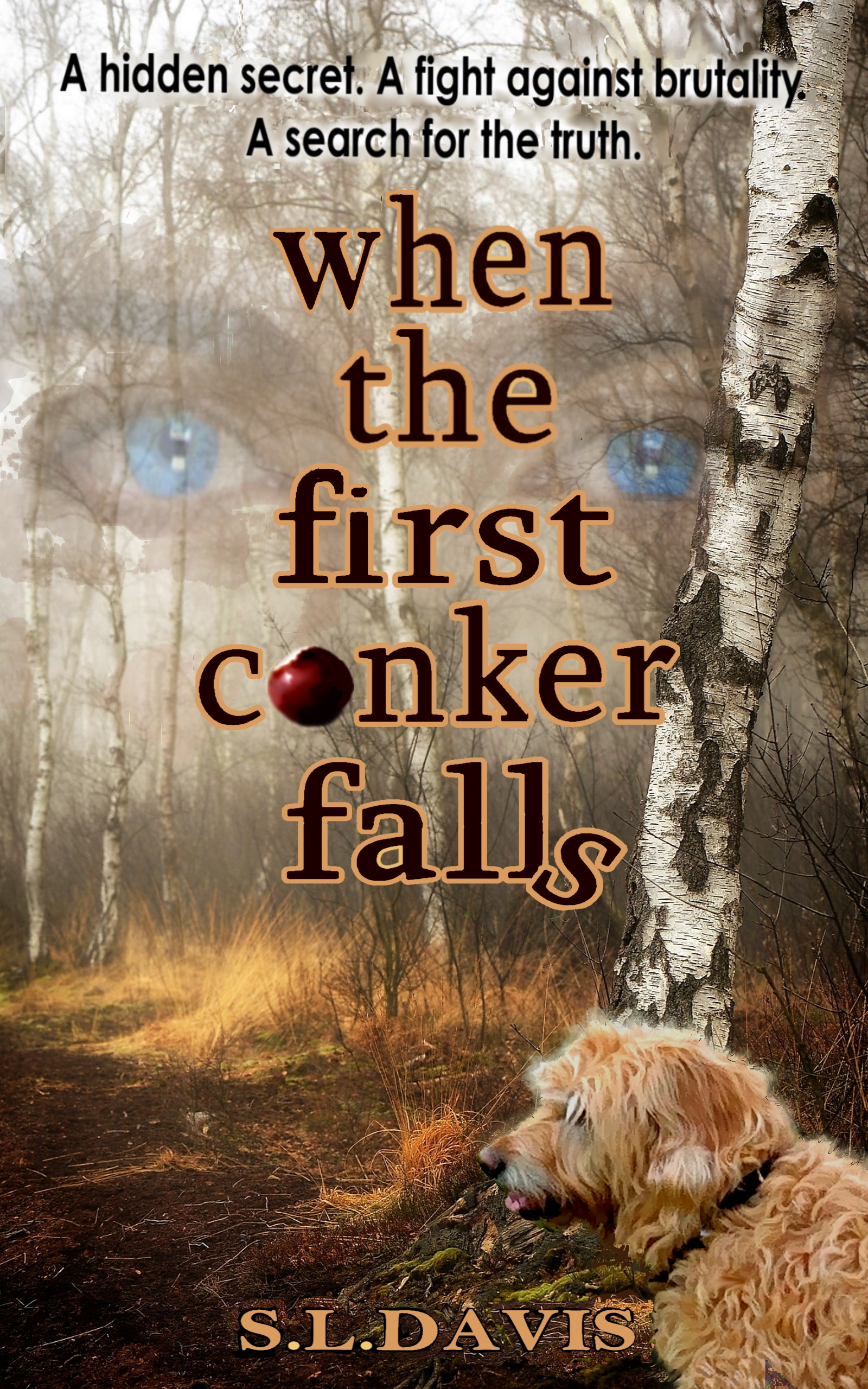
Too much.
I think you are trying to get too much of the story onto the cover. And you are including images that are probably more meaningful to you—because you are intimately familiar with the story—than they would be to the potential reader.
In short, the cover needs to be simplified.
Also, avoid illustrating words by making them look like what they say. Don’t use a chestnut for the O in “conkers” and don’t make the S falling in the word “Falls.”
Finally, you need to come up with an image that better conveys a sense of the book you are describing: ” At its heart, a boy’s love for his dog.”
A “hidden secret” is a tautology. You might want to rethink that line.
Okay, so:
Firstly, is that meant to be a chestnut or an apple? Ron’s takeaway was chestnut; mine was apple. My takeaway on that is, that sort of confusion isn’t good.
You have a nice, pretty color scheme, with those warm fall colors (not counting the floaty eyes), but while it’s good to have a cover that attracts people, but not one that initially draws the eyes, in a good way–but then leaves them hanging or confused, or disinclined to click. I think all three of those things apply to your cover. Without your description, I’m getting…in fact, I don’t get anything. I’m not getting “boy and his dog,” or “mystery” or…I guess “ghost story,” perhaps? Not Magical Realism (one of my least-favorite phrases in the publishing biz…)
I wish I had something specific and solid to say, to salvage this cover effort, but I really don’t. I think you need to detach yourself from specific elements of the story (aside from the dog, presumably) and reimagine the cover entirely. I know, nobody ever wants to hear that, but…I think this one needs a redo. I would also concur with Ron’s comment about playing with the text, vis: the chestnut/apple and the falling “s.” I think doing that conveys a completely different vibe than what you appear to be publishing, as per your description.
And as I said above, “hidden secret” is just, well…I mean, isn’t a secret, by definition, hidden?
Thank you for taking the time to critique my cover. Looks like it’s back to the drawing board!
I’m not sure what this book is about but the cover looks like a mystery rather than a boy and his dog story. I thought the Apple looked sort of Adam and Eve like.
Maybe do some pencil sketches of the boy and his dog. Work out a more warm and inviting tag line. If it’s about a boys love for his dog maybe holding or hugging the dog would be good.
So hard to hear that a cover may not be working out. There’s a list of good cover artists here on the site to use if you have a hard time.