The publisher says:
This book was first published in 1926 in the Harlem Renaissance. Short stories, fiction, about life in the Caribbean at that time. All the stories have a sinister ending: getting leprosy in Panama, a poor kid dying from eating too much dirt, a vampire bat, etc. For anyone interested in the Harlem Renaissance or colonialism: fans of Toomer, Hurston, latin-American writers, etc.
[original submission and comments here]
Nathan says:
My honest-to-Pete first reaction: “Where are the dinosaurs?”
I think you’re still flailing. If the significance of this book is its relationship to the Harlem Renaissance, show me something indicative of the Harlem Renaissance.
I’ll repeat my advice from the first submission:
I find that covers for new editions of “significant” literature from the past works best using one of two starting points:
-
- A photo of the author.
- An image sourced from the time period of first publication.
Other comments?
Hi:
No. I’m sorry, I usually try to be more useful, but just No.
My reaction wasn’t horribly different than Nathan’s–my first thought was that this was a poster for one of those early-1950’s horror films, like The Devil’s Bat (Lugosi) or the silent one from the 1920’s (The Bat), etc.
It’s just all wrong for this. The “Harlem Renaissance” theme here is screwing everything up. After all, that’s the category into which this book was shoehorned by then-critics; but it’s a story-based set of fiction, around men working on the Panama Canal, isn’t it?
What about some historic images from that? Or the quarries, etc.? Aren’t these stories about the folks that worked in those environs, about the Caribbean culture, and how they coped? Not gigantic bats in the jungle?
The bat makes it feel action/adventure-y, rather than like Literature. I think you need to rethink what you’re really selling here and that might move you toward a more appropriate cover.
It looks like a vampire novel.
I know that a vampire bat figures in one of the stories, but I think this image gives out all the wrong vibes.
The cut-out black silhouette is also at total variance with the background.
The background has neither saturation nor contrast.
As one possible source for images, try the Library of Congress image collection for period photos of the Caribbean https://www.loc.gov/pictures/search/?q=caribbean&fa=displayed%3Aanywhere&sp=1 Y
Maybe make that bat gold and add some art deco to it. I like the art but think you need a person on there, Harlem renaissance art tends to have simply drawn people, so it probably wouldn’t be hard to find/make one to fit. I’d definitely recommend punching up that color to take advantage of that aspect. think high contrast like in that period’s art.
https://imgur.com/a/t4nPr5e
(Both images are the same. the one with the orange border is just showing where the trim would be.) I put in the one without the border so that you could use it if you wanted.
that image requires attribution
https://commons.wikimedia.org/wiki/File:Study-for-Mural_Douglas.jpg
I added the palm tree to fill the space. Anything could be added just keep it the same color tones. The color could be changed with a color mask. These colors have a more modern vibe but the art style is retro, which I thought might work.
Oh, Shel, I really, really like that cover!!!
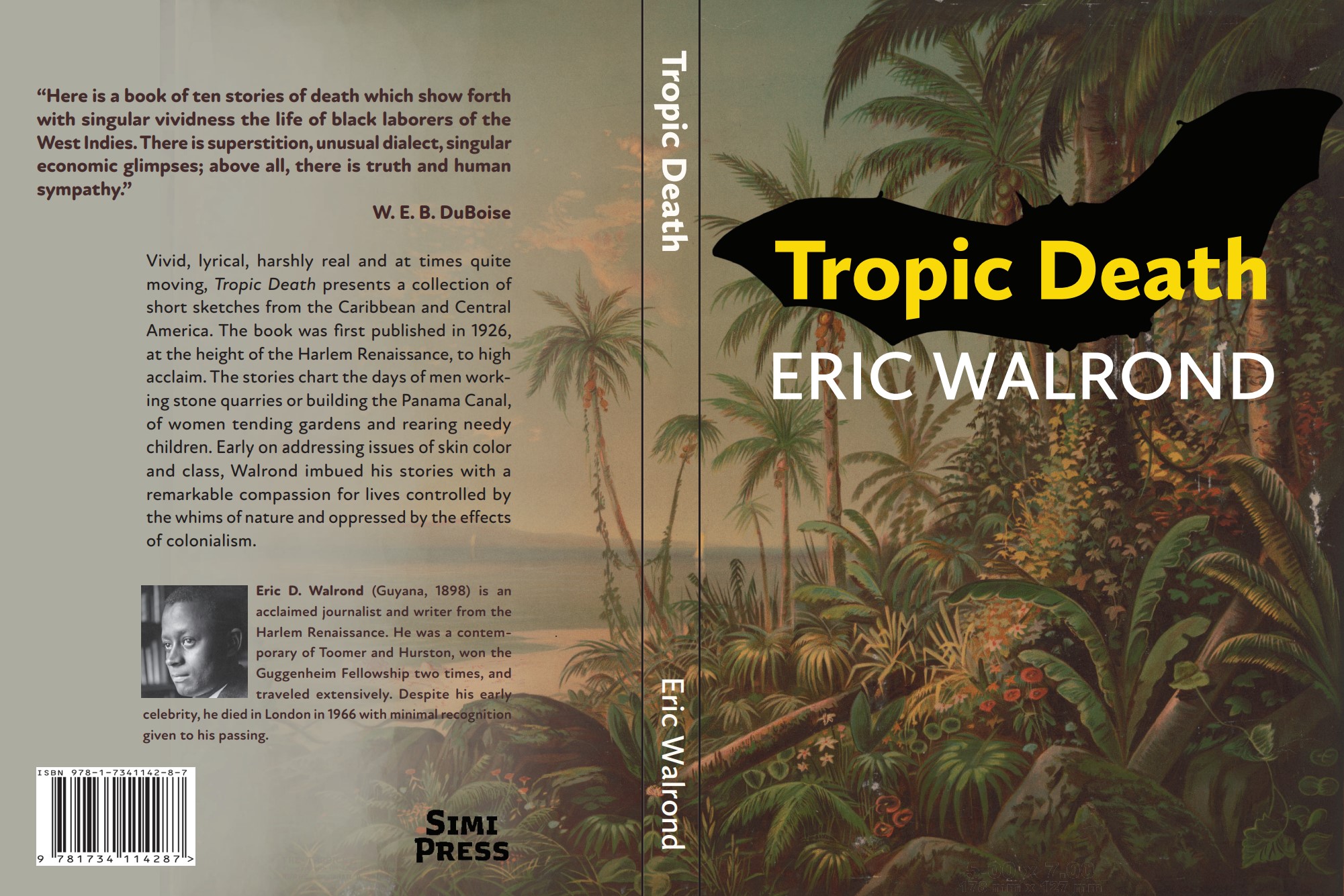
I’m the creator of the cover. I try not to comment on these threads when it’s my own cover, but I’d like to clarify a couple things.
1. There are only 2 photos of the author that I know of, and I’m having trouble securing the rights to either of them. (Yes, I know that one of those photos is on the back cover.) A full photo of the author was my original plan.
2. There are bloodsucking bats in one of these stories, and the background image was taken from the library of congress, a postcard from Barbados or Panama I think. Stories include kids who get eaten by sharks, a voodoo story, a man who gets leprosy, a snake who eats a woman’s child while they’re sleeping, etc. So I mean, there are elements of pulp fiction in these stories.
Shelley, thank you. I think your cover looks professional and fits the genre. But I would have to convince the Delaware Art Museum to give me the full resolution for a print edition, wouldn’t I?
Maybe something similar to this is the only thing that would work:
https://www.amazon.com/Heart-Darkness-Norton-Critical-Editions/dp/0393264866/
Thank you everyone for your honesty. I’ll shut up now.
Just to give an idea, this would be the book with the author’s photo. Maybe I should figure out rights and go with this?:
https://imgur.com/a/aF1NHOn
Or you could optimize the extant: https://www.dropbox.com/s/1wtbs21c4g3a3mz/hYTbOek_auto_x1.jpg?dl=0 when I zoom it, it’s pretty damn crisp. Optimized to 300dpi.
Offered FWIW.
I ran the image through an upscaling process so that it would be crisp. (it adds pixels) Granted it would never be as crisp as an image that was taken at 300 DPI but because the image is grainy by nature the result is eminently printable. That same process doesn’t work well on human faces but there are work arounds to that like adding lighting so that even though the image isn’t as clear as one might want the eye doesn’t really notice.
The problem with using the picture of the author on the front is that a potential reader would assume it a book about the author. It’s unlikely to garner new readers to the stories themselves.
I did like that background he used with the plants, it’s just that bat didn’t match it. I think it could work but it needs some punching up with some elements changed to more clearly identify the genre.
Hi: LOL, great minds think alike–so did I, when I dl’ed your version. It should be visible somewhere from Mars, now. 🙂
I thought I replied with this yesterday but didn’t see it show up so maybe I forgot to add enter.
Adding horror elements can be as simple as making text a bit off by changing up size/ width/ orientation of letters a bit like in
https://imgur.com/a/7rmk92B
red text, blood, all are horror cues and easy to add in.
or you could make a composite of art (This version has more of a mystery vibe achieved by having the effect of the bats leaving the book. It has hints of horror but because the text is orange, not red, it’s just hints.)
https://imgur.com/a/XF6gbyN
I liked your plant background a lot but since I didn’t have it, I made this one. By running all graphic elements through a filter to make the art style matches the cover will look more cohesive. High contrast in the colors will draw the eye so make sure you use high contrast.
Ooooh, I like that second one mucho. It’s very very vivid. LOVELY.
LOL, (“Thank you everyone for your honesty. I’ll shut up now.”) I really don’t think you need to, or should, shut up. After all, what the hell do we know? We only know what we see in front of us, rather than your intent. And truly, yes, that’s part of why we’re here–because buyers can only see what’s in front of them, too, right?
In rummaging around, the image that you’ve used does appear to be about it, in terms of stock images. Stoopid question–can you afford to have an illustrator simply sketch something up, perhaps from his extant mug shots? Not ideal, granted, but…it would solve the scarcity of image(s) issue.
I get that his book has pulpy elements. I do get it. I think the…the conflict here comes from the various points of view, around what the book represents. Is it Pulp Fiction? Is it, rather, LitFic, representing the Harlem Renaissance theme/time/era? Are we splitting the baby, unprofitably, trying to ride two chariot horses at the same time, one foot on each horse? (I’m taking meds. I apologize upfront for getting garrulously carried away…)
Maybe that’s what bugs me…I can’t quite get to either of those, from here. It’s neither. (If you must pulp, then let’s get you a better vampire bat, at least!)
Yes, you may be right around the rights/usage of the image that Shel used. I don’t see a full resolution version anywhere.
Sorry I don’t have something more.
To be fair, I did put “Shut up” in the instructions for submitting your cover for critique, i.e., don’t argue back or try to justify your cover. Joey’s response was eminently reasonable, and if all submitters behaved in the same way, the “Shut up” rule wouldn’t be there.
Ah, my bad. (So, what else is new?)
I do agree with your last sentence, absolutely.