The author says:
Set in New Orleans LA An alien hiding in New Orleans, now known to FBI who is investigating him. There is a series of murders, investigation by female detective, also complicated by a spiritual assailant/witch.
Nathan says:
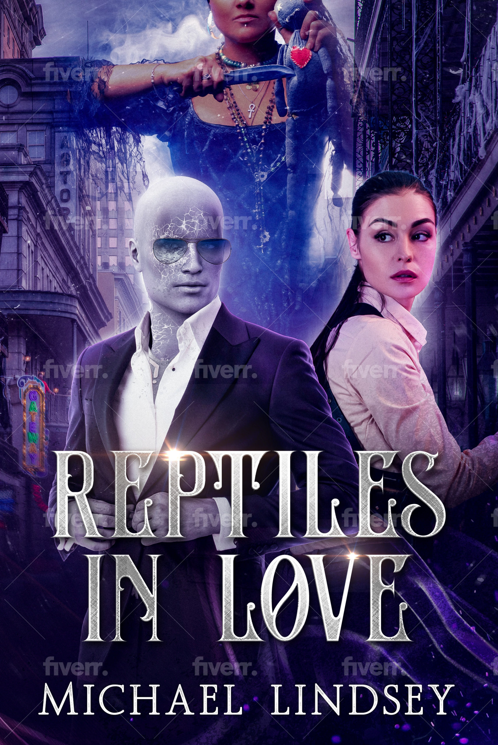
It looks like the disparate cover elements have been assembled without a plan. For instance: The male figure is too large to balance with the female figure beside him, but he’s not so large that he intentionally dominates the layout. And the woman up top, instead of adding anything to the first impression, just obscures the New Orleansiness of it all. (The Poser-made male also clashes with the photographic female.)
My advice: Scale down the number of elements so that in thumbnail it communicates clearly at first glance.
Other comments?
Too much.
I think you are trying to tell the entire story on the cover. It needs to be pared down to just one strong visual element. You could do this by eliminating the figure in the back. I don’t think it is at all necessary…and I suspect only has any significance if you have already read the book.
Keep the two main figures: the juxtaposition of the alien-looking man and the human woman is sufficient to convey a sense of what sort of book this is.
I agree with Nathan that any sense of the story being set in New Orleans is not coming through. Another advantage of losing the third figure would be allowing more of the city to be revealed.
I would make absolutely certain that the male figure is clearly alien and not simply a human lit by a monochromatic light. And speaking of light, make sure that the lighting on the figures is consistent: there is too much of a mismatched cut-and-paste quality right now.
The title typeface not only seems inappropriate it is becoming almost as much a cliche as Papyrus. As are the obligatory but superfluous sparkles.
I am really struggling with this cover. I can’t get any sense of it. I certainly do not get a Science Fiction vibe–and presumably, as there’s a space alien in it, that’s an element; I don’t really get a mysterious (or mystery) vibe, or a crime vibe. I mean, sure, if I look really close, I see the Hoodoo mama getting ready to stick a knife in a hoodoo doll, but…there’s no “here here,” as they say.
When distilled to its gist, what is the actual real story theme here? Is it a mystery, at its heart? A SciFi book? A romance? You’re going to say, “it’s a crossover” and that’s fine, but when push comes to shove, what is your storyline? Your one-sentence storyline? L
ike, for example, a storyline sentence for the first “Harry Potter” book: “An eleven-year-old wizard tries to stop an evil sorcerer from returning to life.” (courtesy Snowflake Pro’s lecture Notes from Randy Ingermanson.) If you can say something like “An alien hiding in plain sight in New Orleans tries to stop a murderer with supernatural powers,” or something like that, it will give your story some focus, which you could use with your cover designer.
I don’t feel this cover works at all. The font has got to go, period. It’s the wrong font for SciFi, for Mystery and even for Fantasy. it’s more Romance vibe, and it’s not helping this cover at all.
I’m sorry, but I don’t think that commenting on this cover is going to solve the issues. I think it needs a total redo, from the ground up. With more focus on the real essence of the story, a prospective buyer immediately knows that ‘this book is for me.’ Your Fiverr needs to re-imagine this. And I think that s/he needs your help to do that–right now you are kitchen-sinking it (throwing everything in).
Everything about this from your title to your font choice to the colour scheme and general layout screams “paranormal romance”
If you have written a paranormal romance, congrats–you’re in the right ballfield! You just need to edit the image because as the others have said, this is far too busy.
If you have NOT written a paranormal romance, you may want to scrap this cover design and start over with something more representative of your story.
(I know nothing in your description says “PNR” but it could be a test, “Does this look like PNR without me saying it’s PNR?” In which case, yes, yes it does.)
Let’s see… For starters, we’re talking about a space alien here, right? Not a Mexican border-jumper who also just happens to be a glabrous albino? (I suppose the reference to “Reptiles” in the title might be a clue to that, but there’s always the possibility that part of the title was meant ironically, as in “You people who complain about aliens illegally jumping the border are just paranoid! The next crazy thing you’ll be telling me is they’re all secretly lizardoids trying to take over the world!”)
Truth be told, your current draft of the cover looks like it’s trying to get itself on this site’s companion site LousyBookCovers.com: it’s already got all the features of the layers upon layers, busybusybusy, and random imagery tags. While the rather odd appearance of that glabrous albion guy does attract a bit of attention, this cover doesn’t really have a proper focal point. Also, as others have already noted, it’s just plain too cluttered; bearing in mind that unlike any book series based on a television show (e.g. Buffy The Vampire Slayer books) which might be expected to have several characters from that show prominently featured on the cover, your prospective readers have never been previously introduced to your characters and have no idea who they’re supposed to be.
While a story with a space alien and a beautiful lady detective (potential love interest?) and a witch who (your summary seems to be implying) is capable of some actual sorcery does sound like it would be an interesting mish-mash of genres, neither we nor any of your prospective readers really need to see all these elements on the cover at once. You’d do far better to stick to showing just the protagonist there in the middle of New Orleans, as his distinctive appearance and the rather exotic location are quite appealing to the eye all by themselves. Also, unless it’s some kind of plot point that your protagonist actually has a translucent body (with matching translucent clothes), don’t go layering him into the scene; try to make him look solid and opaque so he’ll actually seem to be standing there on the streets of New Orleans, even if you have to use the old “cover the blue-screen lines by having the character exude a magical/unearthly glow” trick movie makers in the 1980s used back before their studios’ special effects departments developed any truly convincing computer graphics technology.
Basically, for this kind of cover, less is more: showing that a rather unearthly-looking guy has somehow ended up in the exotic locale of New Orleans should be enough to get your prospective readers’ attention. Once you’ve got that, you can tell them about the rest on your book’s back cover and/or in a summary you provide on the sales page. Let them find out about all that other bizarre stuff (e.g. forensic science and witchcraft and space aliens all exist together in the same universe?) once they actually buy your book and start reading it.