The author says:
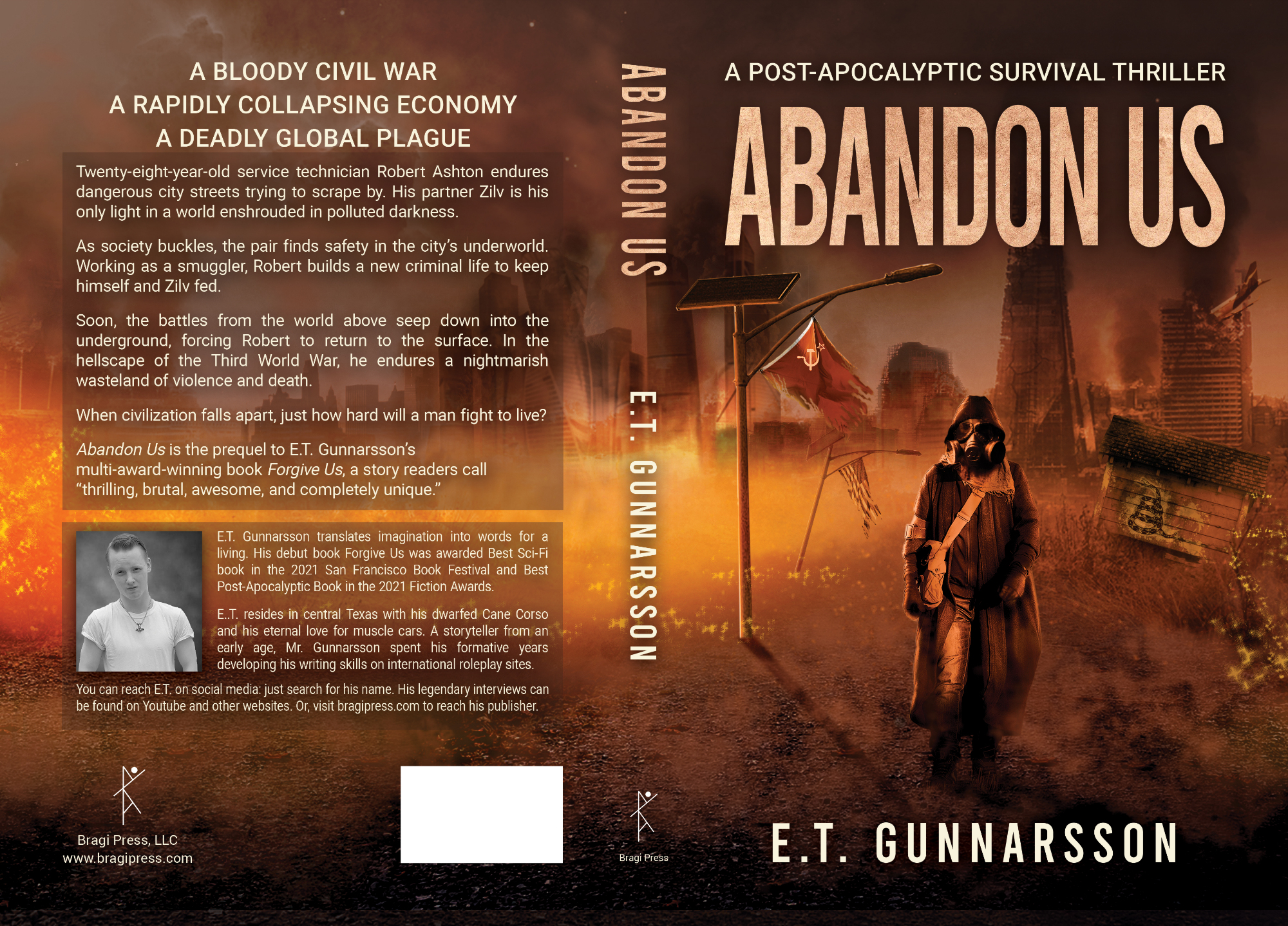
A BLOODY CIVIL WAR A RAPIDLY COLLAPSING ECONOMY A DEADLY GLOBAL PLAGUE
Twenty-eight-year-old service technician Robert Ashton endures dangerous city streets trying to scrape by. His partner Zilv is his only light in a world enshrouded in polluted darkness. As society buckles, the pair finds safety in the city’s underworld. Working as a smuggler, Robert builds a new criminal life to keep himself and Zilv fed. Soon, the battles from the world above seep down into the underground, forcing Robert to return to the surface. In the hellscape of the Third World War, he endures a nightmarish wasteland of violence and death. When civilization falls apart, just how hard will a man fight to live?
Abandon Us is the prequel to E.T. Gunnarsson’s multi-award-winning book Forgive Us, a story readers call “thrilling, brutal, awesome, and completely unique.”
Nathan says:
Because this is a prequel, it’s important to see what branding has already been established, so here’s the cover for the previous book, Forgive Us: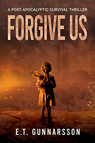
Definitely on-brand, then.
I’m going to make one suggestion for the front of the Abandon Us cover: Make the human figure larger. (One of my rules of thumb: “Nobody feels bad about not seeing feet.”)
And for the back, I’m going to suggest that a serif font works increases the readability of big blocks of text.
Other comments?
I can’t add much more to what Nathan said. Very nice-looking cover.
I really dislike being a “me too” kind of person, but yes, what Nathan said and I strongly second the serif for the rear cover.
(Important n.b.: What on earth is a DWARF Cane Corso? I have familiarity with the breed and I’ve never heard of them. CC’s have gotten a very bad rap and unfair treatment.)
Freyja is simply a dwarfed. 50 lbs at 4 years old.
I like the “Forgive Us” cover better, maybe because it’s less busy in the background and the person stands out more. There is more contrast with the light, and it leaves more to the imagination. Since “Abandon Us” is a prequel, it works for me. But when I look at in the thumbnail, the person almost fades into the background. Whereas with the “Forgive Us” cover, it still looks like a person.
Just my two cents. Overall it looks professional to me.
I also think that the spacing between the two words (“Forgive Us” versus “Abandon Us”) is better on the first cover. I realize it’s minuscule, but the two words run together a skoosh more on the second cover. I keep reading it as ABANDONUS, or ABANDONS or something like that. It’s been bugging me since the cover came up, and I didn’t want to kvetch if it’s only me, but…I just keep getting the title read wrong.
Any additional use of the compressed face or some kerning to get a teeny bit of added space between the two words would, I think, be worth doing.
Like Nathan and the others have said, this cover is solid in all its basic decisions, but there are just a few points that need adjustment to bring it up to a professional standard that will get browsers clicking.
I’ve run through the issues letting the cover down and explained how I’d address them here! https://www.kathrynrosamiller.com/post/cover-advice-abandon-us
As usual, I really like the work you did on that in your blog post, Kata. Very very helpful. (Although, I still think the kerning on the title for this one needs help.)
Oh wow, I totally missed this! I’m so sorry!
I truly appreciate the feedback now when I see it.