The author says:
In 2005 Dan Perry quit his job as a software engineer and went backpacking in South America. His trip lasted two and a half years; he went 1000 days between jobs (hence the title). The first two chapters focus on his corporate life and his decision to leave. The rest of the book is about his trip, with a focus on the people he met and his inner growth. This will be a two-book series. The main target audience is young adults who are interested in international travel. The book is also geared toward armchair travelers of all ages.
Nathan says:
I need to preface my remarks by saying that I’m only one man. One terribly intelligent and insightful man (not to mention sexy), but one man nonetheless. So this cover might hit that sweet spot for someone else. But for me…
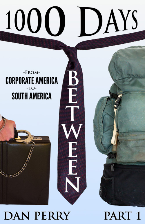
You’ve noticed how I try to work with the original design concept for almost all of these submissions, but I just really don’t like this one, right down to the core. Vertical type only rarely works, and this is not one of those rare times. The distorted type above it just makes it worse. And Trajan, the font used here? It’s an overused but still serviceable workhorse, but only because it conveys “epic” well; this is just not the right place for it.
And having the necktie (symbol of corporate employment) divide the briefcase (another symbol of corporate employment) from the backpack (a symbol of travel and freedom) doesn’t work.
I hope someone else has something more positive to say, because the only advice I have is to start over with another concept entirely.
People


I love Trajan. It’s one of my favourite fonts, as you said, because it’s such a workhorse. But I agree, it’s not really working here. Seems like a San serif font is more suited to non-fiction. I’m not so bothered by the concept, or even the vertical type (although I doubt I would have done it), but to me, I didn’t get the right hand image was a backpack. I had a hard time figuring out what it was.
Oh, and finally, “part 1” shouldn’t be as important (same size as) the author name.
The big killer for me was that I really couldn’t figure out what in the world was on the right side of the tie… until I read the title, but if I had been shopping for books, I would never have made it past the picture.
The division is clear. Perhaps that concept could work. But it needs to be easier to tell what’s on either side. Plus, the object dividing the scene has to be neutral; the tie belongs in the briefcase camp. Clever try, but the symbolism doesn’t work.
Even though the word “between” does fit visually as being between the two sides, it’s too hard to read. Browsing through dozens of books, the hard-to-read titles get passed over.
Look at the movie pic for Jungle 2 Jungle. You don’t want to copy that idea, as it clearly looks comedic. But when I look at that, the business and jungle concepts are immediately clear. However you lay out your cover, you want both Americas to be crystal clear. You also want the text to be instantly read.
What are the most important words from your title? Judging by the cover, I’d say that BETWEEN must be, with 1000 Days a runner up. But those are the least important. The only part of the title that tells me what to expect is Corporate America to South America. In fact, this phrase interests me more than any other part of the cover. Make this stand out well, and suppress the unimportant stuff.
I agree with what’s been said here – start from scratch. The title should be more basic i.e. non-distorted, non-vertical, and “part 1” should be below the title not next to the author’s name. What you’ve got looks like your saying: “This is part one in the Dan Perry saga”.
The images don’t work for me either. I have a couple of suggestions: a simple one – use a fancy image of a map of the Americas as your background and have the title and tagline the more dominant part of the cover. Or if you want to show a division of the two places I would do this horizontally rather than vertically – The metropolis of New York (or wherever) and the top and South America at the bottom.
Personally, I would go with the map idea – I like simplicity! :p
Thanks, everyone, for your comments. I shall take your advice and start over.
I hope you’ll post the re-vamp so we can see the improvement.
Yes, please post your next design. I’d love to see it.
I have to pretty much agree with everyone else. This is a case of too many design choices, most of which have no apparent rationale. Try to keep things clean, simple and direct. I look forward to seeing your next effort!