The author says:
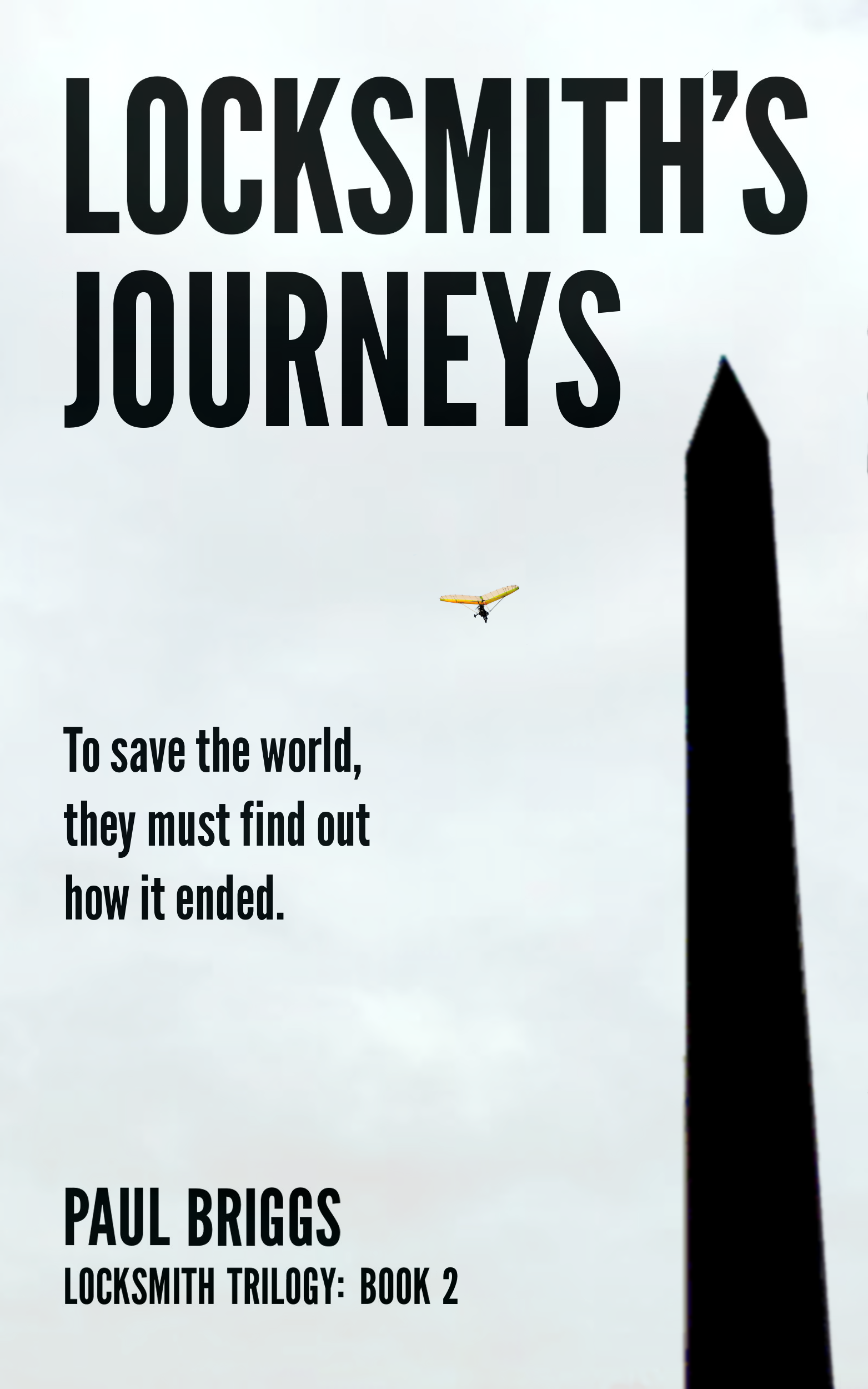
“Locksmith’s Journeys” is the sequel to the YA science fiction novel “Locksmith’s Closet.” Lachlan Smith and his immediate circle of family and friends continue their search of the future through the time portal to learn the secret of what happened to the human race. Back in the present, they learn who made the portal and why. (This isn’t quite the final design. I plan to add some flocks of birds silhouetted against the sky. But that will be a lot of work, so before I do it I want to know if it’s worth improving.)
[For those who don’t recall, Locksmith’s Closet already received the CoverCritics treatment; final version is here.]
Nathan says:
You’ve hit a good balance between maintaining a series look or “brand” and making this cover original and different. (I hate when the differences between series volumes are so subtle that I can’t tell them apart.)
My problem with this cover is that it’s so… plain. The silhouette of the Washington Monument (I sure hope that’s supposed to be the Washington Monument, because that’s what 100% of people will immediately think) could be from one of a billion tourist snapshots, and the paragliding figure is similarly just there. Even just a different color to the sky could make a big difference — I took the cover you sent, slapped on a cloudy sunset from Google Image Search, and got this:
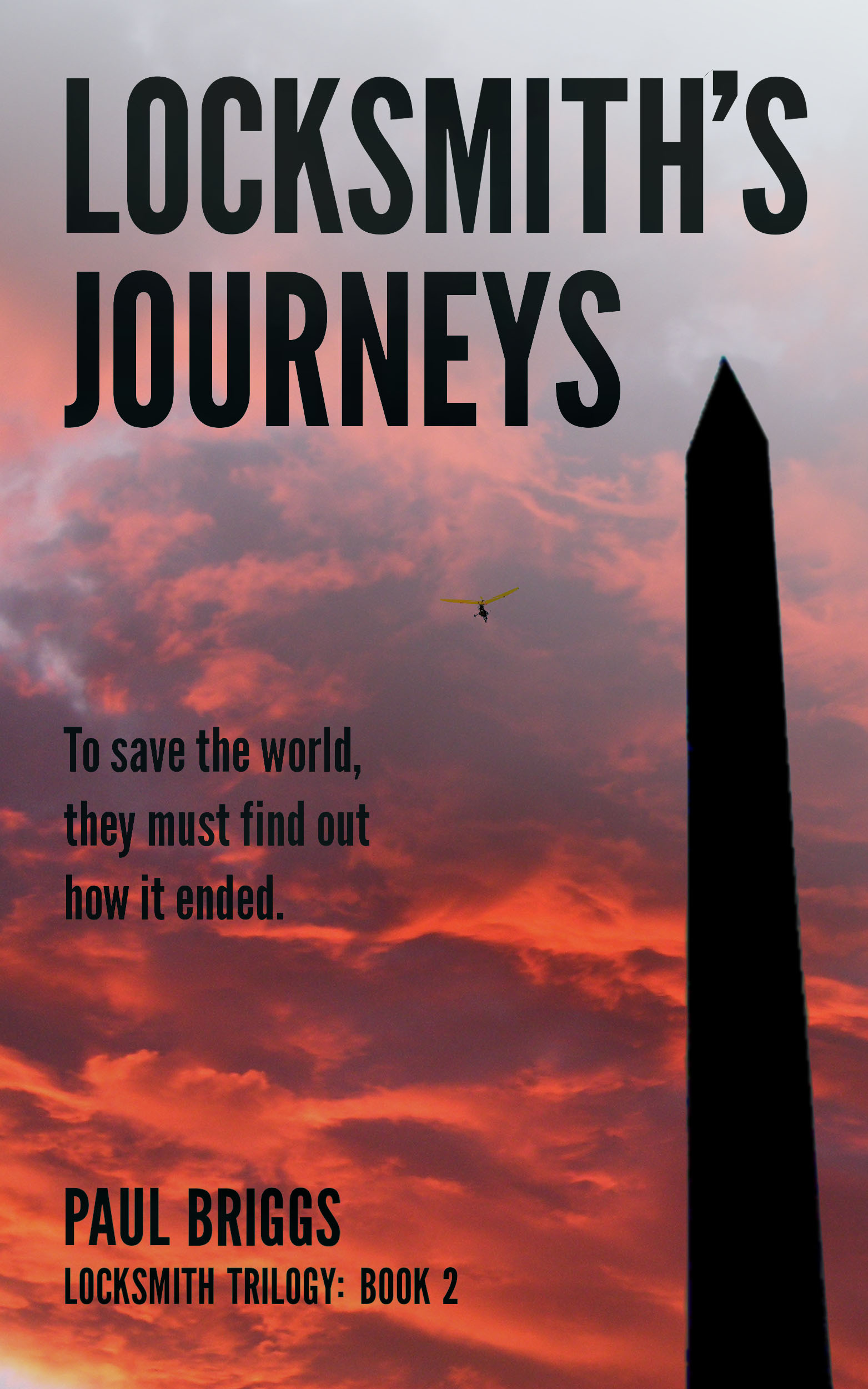
That was thirty seconds of work; image how much better it could be if you fine-tuned the light/dark dynamics from one corner to another, etc.
Two other comments:
-If I divine correctly, your intent was to make the blur on the Washington Monument look like the camera was focusing past it toward the paraglider. Unfortunately, looks less like it’s out of focus and more like it’s a poor resolution image.
-The paraglider itself is so small as to be ignorable, and in the thumbnail it might as well not be there. I’m not saying that every image element needs to be clearly discernible from the thumbnail, but since your image really only has two parts — the monument and the paraglider — they really ought to be easily seen. It’s only going to get worse once you add the flock of birds, and even worse if you go with a more dynamic sky like I suggested.
Other thoughts?