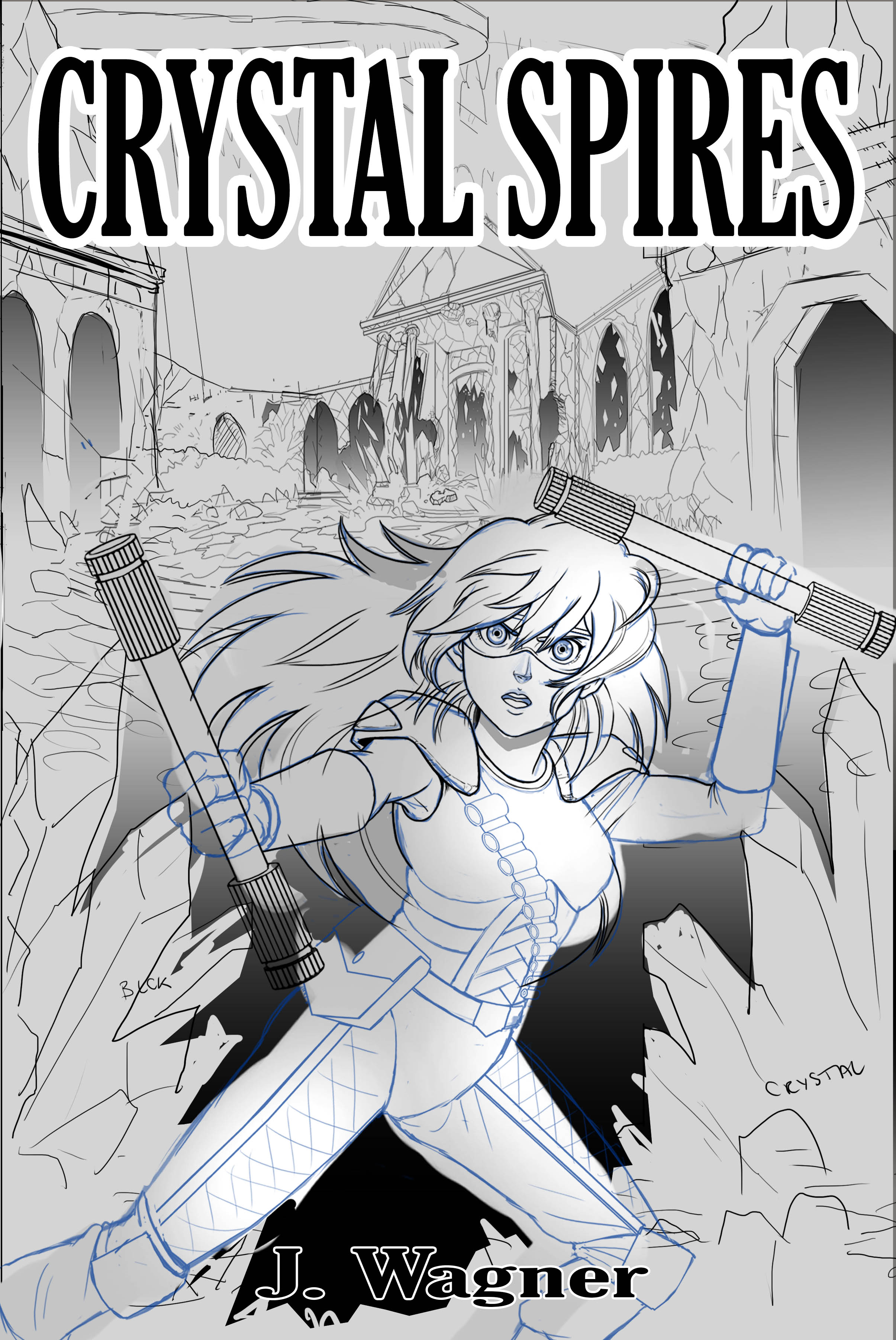
The author says:
In a possible world, much like our world, the North American peninsula has fallen subject to a buy-out, which has seen the continent rebranded as the United States of Enterprise (USE). At the West Coast of the United States an enormous rock formation has manifested spanning nearly the entire coast. There, in a mountain range call the Gorgon Mountains, those rejected from the highly advanced USE society have made a home.
Nathan says:
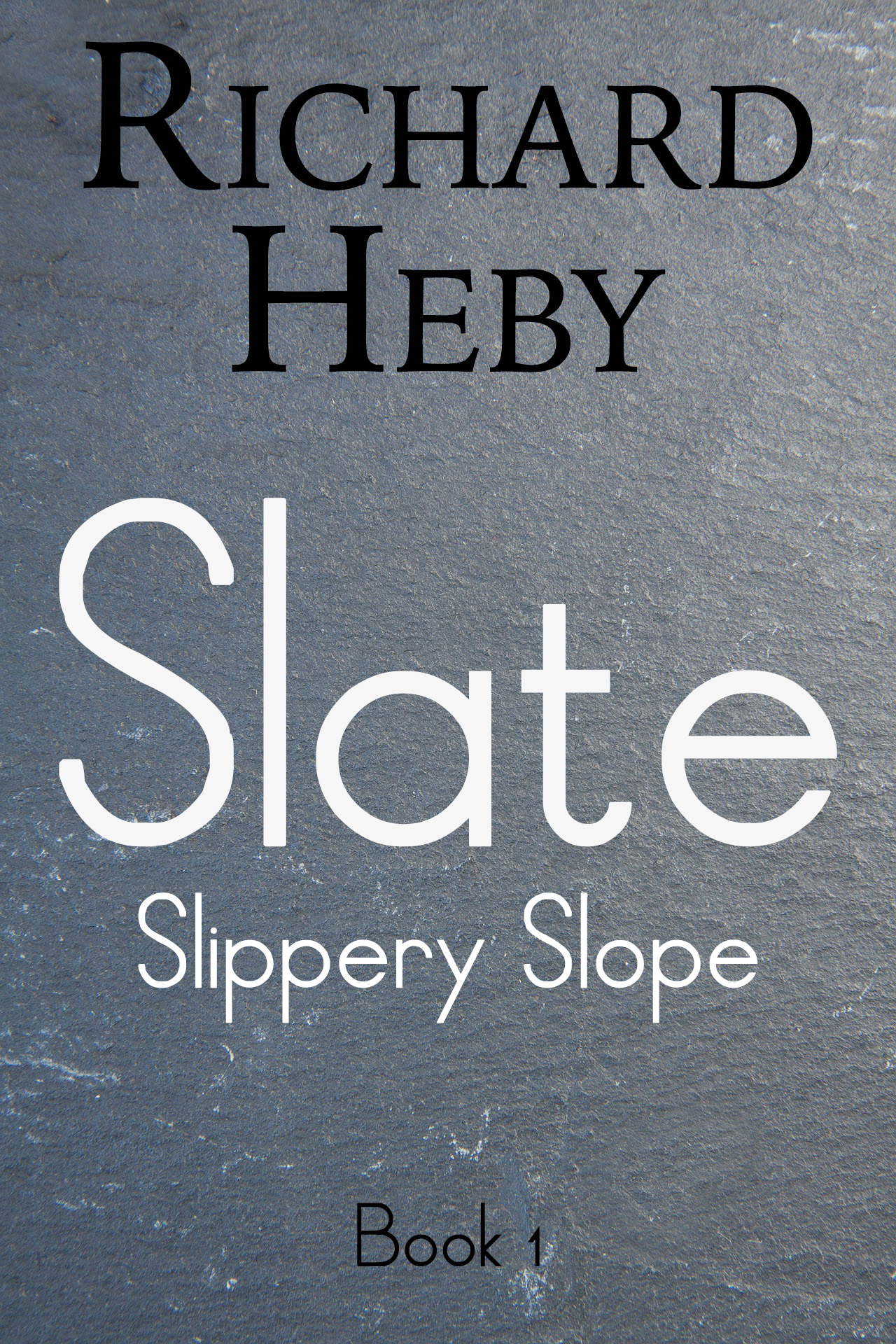
So… where’s the cover?
Okay, that’s snarkier than it needs to be, but seriously. There’s nothing here. I can’t tell genre, mood, anything from what you’ve got. I don’t think the fonts work well together (I don’t think that the title font works well for anything period), and I can’t even tell which is the book title and which is the series title.
I know that the success of books like Hugh Howey’s Wool series have been at the forefront of a resurgence in understated covers, with nothing but minimal text and background textures, and if used right those covers can be surprisingly effective. But let’s be honest: the original cover to the first edition of Wool was pretty unimpressive. Later ones are better, in that type and background still use dynamic color and texture to create a visual draw and convey a mood. Howey burst on the scene in the early days of indie ebook publishing, where there wasn’t as much competition; I’d go out on a limb and say that if he were starting out today, using his original covers, he’d be almost completely ignored.
If you want to stick with minimalism — and like I said, that can certainly work — couldn’t you add just a little bit of visual interest? For instance, a crack through the slate would not only make it more interesting, it would reinforce the theme of a divided society. Stronger, slightly distressed type would not only make the words easier to read (“Slipper Slope” and “Book 1” are thin enough to vanish in the thumbnail), but could also add to the idea of a hardscrabble life on the fringes.
Other ideas?