The author says:
This is a concept/composition cover for a title I probably will self-publish. You know, after the publishing houses reject it. Title: Jackman Genre: Space opera, science fiction and fantasy mash-up Target Audience: SFF readers Short synopsis: As Arekan traveled the stars as a crewman aboard merchant vessels, he used many names. It was safer that way. The young man had his own secrets to keep. But Sinlon Mor’a’stan, a member of the outlawed family that once ruled the Kyn Empire, did not know these secrets. When he taps Arekan as his son Santir’s guide and protector, he unchains a force that would change not only Santir and Arekan’s lives, but the Empire of Kyn forever. But before the two young men get to Santir’s home world they face many dangers, including Santir’s failed spacewalk, pirates, and their intense dislike of each other. Thanks for taking a look at this!
Nathan says:
I like the fact that the image you sent me is labeled “concept art.” This is a starting place, and a good one.
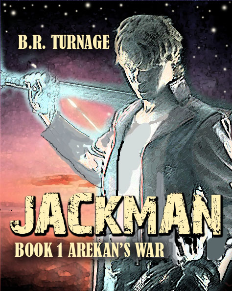
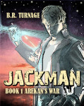
First, when I look at the thumbnail, it seems oddly bleached — and by “oddly” I mean that the lack of contrast doesn’t seem to be for any reason in particular. I can see that you were going for a glow/aura/nimbus look, but I still think you can work some contrasts into the figure. Especially with a light title across the figure, it just looks washed out.
Also from the thumbnail, I can see that the proportion is a little wider than standard. Obviously with an ebook cover you can technically make it at any proportions you want, but there’s still reader expectation to deal with. Readers of genre fiction unconsciously expect their book covers to approximate the standard dimensions of a mass-market paperback — two-to-three, or 6″ x 9″ if you’re printing at Createspace. The good news is that I think that trimming the right side of the image would actually make for a better layout of the figure. I mean, it’s not like you need to see his left shoulder…
Moving from the thumbnail to the full image, here’s my first impression:
BUSYBUSYBUSYBUSYBUSY
The combination of filters adding “fake detail” to the photo plus the textured font for the title adds up to “too dang much.” What’s worse, it looks like you’re trying to compensate for a blurry or too-small photograph by gussying it up. There are ways to do that that work better than this.
And finally, your synopsis puts this book firmly in “space opera/science-fantasy” territory, but the cover doesn’t hit that bull’s eye nearly so well. From the cover, I’d guess maybe SF, or maybe urban fantasy, or possibly a light-hearted post-apoc adventure… What can you do to up the “sciffyness” of it? More futuristic fonts? The silhouette of a Kelly Freas-like spired city on the horizon? A multi-colored planet peeking in from the upper left? Whatever you choose, give more definite clues to your potential reader.
Other thoughts?


As a sci-fi reader, I look for sharper images of people and better contrast before getting past the cover.
Nathan already covered much of what I would have said, and better than I would have, but I’d like to emphasize that the lack of strong contrast is really hurting this, IMHO; what he’s said about the aspect ratio (2:3) is definitely true, and I am really not getting “space-opera” from this. I’m getting Male erotica/romance? Is that the intended target audience? I’m assuming that from that “their intense dislike of each other” line, (which is a prerequisite for romance stories, pretty much), and something else that I can’t define. I think that another element, besides a sword, is required, to send the “space opera” feeling–spaceship, space-station, (the usual–people are surprisingly comfortable without the routine), something. I mean, really, you can’t appropriate a lightsaber, but is there something else you could do? Even the dreaded “ray gun” on the hip, maybe? (The guys here will think of something; they usually do.)
There’s a lot of good about this cover, though; I like that you didn’t go bonkers with fonts (hooray, you!); I’m not nuts about the byline font, but that’s easy to fix. I like the general sense of good taste, but be warned: taste doesn’t necessarily lead to SALES. (Yeah, it makes me nuts, too). Mo’ better color is your friend. 🙂
The layout is nice, but the piles of filters kill it. I know this is a draft, but you need to get images that are high-quality enough to stand on their own with no filters, because as is it looks like the pictures were maybe not that good and you filtered them to death to cover them up.
I’m also not going for the byline font and I agree that the addition of a boldly sci-fi element, like a spaceship, would make the genre a lot clearer. It looks like
But to be perfectly honest, my first reaction to this cover is to see “Jackman” and think “Hugh” and then be a bit irrationally disappointed when it wasn’t.
Oh, geeze, I thought it was only me. That was the first thing I thought of, too–“where’s Hugh?”
😉
It looks like I lost half a sentence, is what it looks like.
I meant to say “It looks like urban fantasy.”
You’ve run across the same boundary a young Orson Scott Card discovered decades ago when he submitted what he thought to be one of his science fiction stories to one of Ben Bova’s science fiction magazines and got back a rejection letter saying Ben Bova loved his story, but the magazine did science fiction and not fantasy. Fantasy and science fiction share a niche; each of them deals with characters doing things that are impossible in the real world by using some kind of applied phlebotinum. What separates them is that in fantasy, the impossible thing is done using magic or miracles; in science fiction, the same impossible thing is done using technology and/or some kind of previously undiscovered scientific principle.
The others here have already discussed the technical problems with the contrast, clutter, and filtering, but I’ll focus on the theme. On your cover, you’ve got a fellow dressed in what might be a futuristic outfit. Fine; if that’s your main character or somebody else important, that’s a fairly nice establishing shot. I’m not entirely certain whether that’s a sword or a baseball bat in his hand or something else entirely, but played right, a mysterious object in the character’s hand might intrigue a potential reader enough to make him buy your book, so that’s fine.
However, what are we to make of the background? It’s mostly a starry sky and a sunset and an extremely blurry something-or-other that might be a landscape. Your sky and landscape might make a decent background for a fantasy novel, but not for science fiction. As Orson Scott Card explained when discussing that story of his that got rejected for being in the wrong genre so long ago, science fiction needs monitors and machines and metal and rivets.
We need to be seeing some technology here; judging by your description, a space ship or a domed city on an asteroid or something along those lines is what you specifically need in your background. Show us more than just planets and moons in outer space; some fantasy covers use planets and moons in outer space for their backgrounds too. Show us a little of what kind of hi-tech civilization we can expect to see in Santir and Arekan’s world, whether it’s in our future, or some alternate universe, or a long time ago in a galaxy far, far away.
Thank you all very much for you comments. All useful information going forward to designing the final cover.
“But to be perfectly honest, my first reaction to this cover is to see “Jackman” and think “Hugh” and then be a bit irrationally disappointed when it wasn’t.”
Hugh who? (lol)
Yeah, in our information glutted age its hard not to butt against words that people haven’t connected in their minds with something else.
Again, thanks! You’re the best!
Beth