The author says:
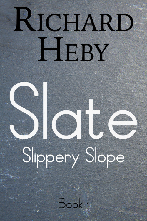
In a possible world, much like our world, the North American peninsula has fallen subject to a buy-out, which has seen the continent rebranded as the United States of Enterprise (USE). At the West Coast of the United States an enormous rock formation has manifested spanning nearly the entire coast. There, in a mountain range call the Gorgon Mountains, those rejected from the highly advanced USE society have made a home.
Nathan says:
So… where’s the cover?
Okay, that’s snarkier than it needs to be, but seriously. There’s nothing here. I can’t tell genre, mood, anything from what you’ve got. I don’t think the fonts work well together (I don’t think that the title font works well for anything period), and I can’t even tell which is the book title and which is the series title.
I know that the success of books like Hugh Howey’s Wool series have been at the forefront of a resurgence in understated covers, with nothing but minimal text and background textures, and if used right those covers can be surprisingly effective. But let’s be honest: the original cover to the first edition of Wool was pretty unimpressive. Later ones are better, in that type and background still use dynamic color and texture to create a visual draw and convey a mood. Howey burst on the scene in the early days of indie ebook publishing, where there wasn’t as much competition; I’d go out on a limb and say that if he were starting out today, using his original covers, he’d be almost completely ignored.
If you want to stick with minimalism — and like I said, that can certainly work — couldn’t you add just a little bit of visual interest? For instance, a crack through the slate would not only make it more interesting, it would reinforce the theme of a divided society. Stronger, slightly distressed type would not only make the words easier to read (“Slipper Slope” and “Book 1” are thin enough to vanish in the thumbnail), but could also add to the idea of a hardscrabble life on the fringes.
Other ideas?


When I first saw the thumbnail, I figured this book was going to have something to do with… you know, slate. I figured maybe this was a technical manual about quarrying the stuff or something. I’ve never even heard of Wool and its sequels, so your shout-out to that series is effectively lost on me, as it also most likely is on a great many other potential readers.
Minimalism may work, yes, but probably not for a story like yours. Wool‘s gimmick was only a novelty, and novelties invariably bring diminishing returns every time after the first that someone tries to cash in on them. Coming up with potential sequels and knock-offs for such successful novelties (Wool 2: Electric Boogaloo) is an entertaining party game, but not very useful for selling books.
Incidentally, looking at this cover from closer up, I actually thought for a moment I was looking at an ocean surface on a cloudy day from a distance. Honestly, look at it for a moment and see if you can’t detect the same optical illusion of little waves, some capped with foam, and some looking polluted with oil slicks. Do you see it?
As to how to fix this… I presume slate does somehow figure into your story; a reference to the mountains where this exiled group lives, perhaps? Slate rock itself is not a bad medium for a starting template, but have you considered having something engraved on that template? Gravestones, dedication plaques, and other carvings are typically put on slate. How about showing a simple engraving of the North American continent with lines showing the USE’s borders, and then having a crack in the engraving running through the west coast, hinting at where this division between insiders and outsiders lies? If these Gorgon Mountains formed as the result of a massive earthquake or something, you’ll score even more points with your readers by hinting at that as well.
For the font… well, look up whatever font people are using on plaques and other slate engravings, and use that. I doubt any of them are using anything so thin and spidery as whatever you’re using here. Put your titles and byline on the aforementioned broken engraving of an alternate-universe North American map in some kind of placard font, and you should be good to go.
Thank you very much for these suggestions RK! I have since changed the cover, after hiring a pro to get it right.
I also thought it was a zoomed-out view of the ocean.
Well I do like the ocean 🙂
Third for the ocean here. What does that title font look like in all caps? It might work better then.
Hey Matt, all caps wouldn’t have fixed the problem 🙂 I needed a pro.
4th vote that thought it was the ocean, and wait for it: I have slate floors in our summer place, mind you.
This cover’s big issue, right away, is the shrieking lack of contrast. Sure, black, white,etc., but you have NO color. With very few notable exceptions, no color = no sales. People are like ravens…attracted to bright, shiny, pretty things. At the very least, do something powerful with the font color. Perhaps something maroon-ish? Blue? Just anything, to make it stand out?
I also think that both fonts are not helping you. The byline font is not working for me, nor the title font. Is this dystopian? What about Masterplan for the title, maybe? Or Boycott? (What do you guys think?) Y’know, Brand-New burn might be groovy, for this. Again, though…COLOR.
On the bylines..hmph. Can’t make any recs yet. Need to see this with some revamping. I like the cracked-slate idea, and it will hopefully avoid the problem with the water-illusion. If someone like me–who LIVES on slate floors–thought it was water, well….
Thank you Hitch! I realize now that the idea of blank slate doesn’t do much. I think the new cover is much better at illustrating the genre of this story, i.e. YA, dystopian, short read.
Nothing wrong with using a slab of slate to illustrate the cover of a book called “Slate,” but it needs a little more, as Nathan says, in order to suggest something of what the book is about. Having the slate appear to be cut into the rough shape of the US, with bits and flakes laying around it, and perhaps even cracked would be better. Whatever it takes.
Hi Ron, you are so right! Thank you!
Hi there, Richard Heby here, author of this book and designer of this cover. Thank you all for the comments and suggestions! I soon realized that after designing this cover it really didn’t make sense, and it didn’t fit the book at all. So I hired a pro and adjusted the cover to the one you see here: http://www.amazon.com/gp/product/B01560PFWQ
Richard:
I think that is far more evocative. I admit, I wish he’d gone a bit further with the font for the byline, but yes: that’s much, much better. Well done, you! (p.s.: like the clever marketing ploy with the #30minuteread, too.)
Thank you for the comments, Hitch! The font was one area on which the designer and I were going back and forth. I hope my covers will only improve as the series goes on. 🙂
Richard: You’re on the right track already, so…I would expect that they shall. Good luck!