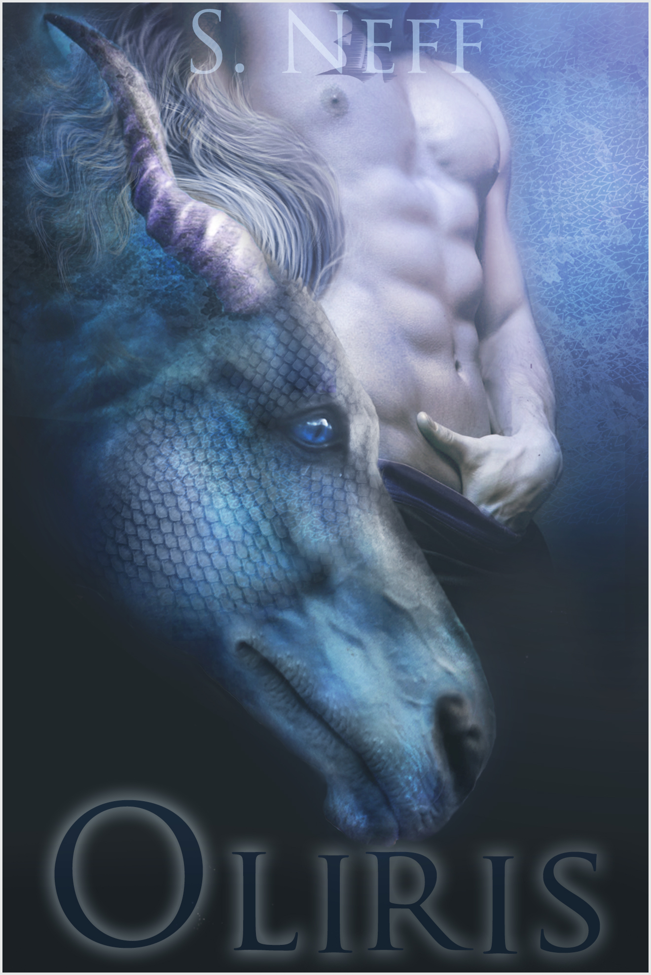
The Stray 1: To Plan

The author says:

Set in a fictional world inside a computer simulation, the book follows a high school freshman who seems to attract trouble wherever he goes. There are weapons in the book which are disguised as walkmans, so those are important. The events take place in 2002 (in the simulation) even though the simulation is running several centuries in the future. The book is a fusion of new adult, fantasy, science fiction and thriller. The target audience is minimally late teens (18 and 19), even though the main character is 14.
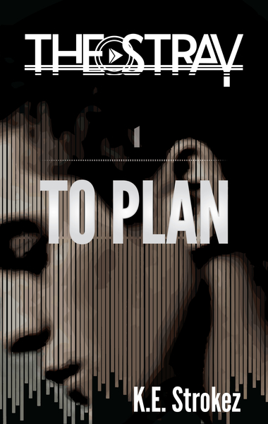
rsz_cover_2_kindle-01

rsz_cover_2_kindle-01

Nathan says:

There are a lot of good ideas here.  I’m not so sure that they work well together.

First: Which do you want to be more prominent, the series title or the book title? Given that the heavy branding is apparent in the series title, I’d go with that, and make the book title subordinate to that, both in size and in position (by which I mean, I’d place the book title more directly beneath the series title so that one can clearly dominate the other).

I’m also not sold on the title/byline font.  It obviously isn’t the same one as in the series title, but it’s also a sans-serif font (and the title is also in all caps), which means it doesn’t contrast cleanly either. I’d play around with some slabbish serif fonts to see what works better.  And the placement of the byline is counter-intuitive; yes, I understand you didn’t just want to center-justify everything, but the off-center placement of the byline just looks like you moved it to the side because, well, you didn’t want to center-justify everything.

My biggest complaint, though, is that there isn’t enough “zing.”  The muted color scale, the abbreviated dynamic range… nothing grabs me.  Could there be more contrast in the model’s face?  A deeper-hued tint tying it altogether?

I’ll let the others come up with further suggestions.

Watched

The author says:

A romantic suspense set in modern-day Portland, in which a stalker attacks the FMC and kidnaps her. Assault with a truck-shaped weapon is involved, thus the traffic. Author lookalikes would be a mix of J.D. Robb and Janet Evanovich in a perfect world.

Watched (6)

Watched (6)

Nathan says:

Leaving aside the question of whether J.D. Robb would even exist in a perfect world… (I jest, I jest.)

I like all the elements here. Simple, iconic, germane for the genre.  So everything I have to say falls under “tweaks.”

  1. The silhouettes are a little too black to be recognizable at thumbnail size; even at full size, it takes my brain an extra 3/4 of a second to identify what I’m seeing. Can you try adjusting the levels on the couple so that there’s a liiiittle more non-black to their shapes?
  2. I think there’s a bit of a clash between the monochrome top half and the full color/red-heavy bottom half. Maybe adding a subtle blue tint to the top would work.
  3. Sitting right over the two brightest areas of the couple image, the “W” and “D” of the title are hard to read in the thumbnail. It’s possible that adding the blue tint would solve this, but in case it doesn’t, consider adding a diffuse drop shadow (it doesn’t have to be nearly as strong as the one on the byline).
  4. There’s gotta be some other font you can use for “A Novel.”
  5. Watch your kerning.  The “A” on your main font seems especially problematic — note the extra space to both sides of it in “Watched,” and the gap between the A and T in “Batto.”

Good work! Other ideas?

Chasing Redemption

The author says:

Genre: Science fiction/Military thriller. Blurb: Captain Ben Wildes, the pioneer of Saturn and a highly decorated officer, is falsely implicated in a tragic accident that claims twelve lives. Once a rising star in the ESD (Earth Space Defense), he’s found negligent in a deeply politicized trial. A year later, Ben receives a surprising opportunity to redeem his career. He’s provisionally reinstated and tasked to investigate the fate of a missing commercial space mining vessel last reported an area that’s perilously close to a sensitive territorial line. The incident requires a delicate investigation, and Ben’s the only captain with the unique experience to handle the assignment. Evidence of attack is certain to breach long-standing treaties between two superpowers, which will lead to war. As the mission unfolds, Ben uncovers shocking secrets with alarming ramifications, and quickly learns that chasing redemption is far more perilous an undertaking than he ever anticipated.

Cover notes: This is a proposed cover upgrade to the current cover (http://www.amazon.com/dp/B006ZMRCTO). I’m also utilizing a Shuttershock sample image (didn’t want to purchase until I’m sure it’ll be used), so please try to overlook the watermark and lower photo resolution.

ChasingRedemption2015Upgrade

ChasingRedemption2015Upgrade

Nathan says:

I’m not sure that this qualifies as an “upgrade” to your current cover.  Both are executed with skill and precision, and both have exactly the same problem: They’re the wrong covers for a military sci-fi novel.

Remember, your book cover has one purpose beyond all others: to attract the attention of the readers who would want to read the book.  So if I’m the kind of reader who would want to read a novel about a disgraced former officer now on an interstellar mining vessel who ricks being at the center of a war in space, am I going to stop and pick up the book (or read the blurb on Amazon) when I see an almost monochromatic picture of a uniform cuff?  (And that’s if I can identify it; at thumbnail size, my first impression is of an abstract design.)

You’re already a Shutterstock user, so search “spaceship” on there and see the incredible art available.  Or do the same thing on DeviantArt; the artwork there is not as likely to be overused, and most DeviantArt artists are happy if you offer them twenty or thirty dollars for the right to use a piece of art that they already made for free.  And when you search, remember your main criterion: “Is this an image that would capture the attention of someone who would like this novel?”

Good luck.

Leave Them in the Dust!

The author says:

This is a non fiction book for marketing managers and managing directors of business schools, universities and training organisations who sell leadership, management and technical professional courses to organisations. The book’s focus is helping organisations grow their business through sales and marketing so they sell more places and beating their competitors in the process. I’d grateful for your thoughts and feedback, as i find the proposed book cover design is bland

marketingexecbookcover

marketingexecbookcover

Nathan says:

I concur with your “bland” judgment.  I’m seeing two major problems with this cover:

  1. Professional silhouettes? Been done. So, so done. Overdone. Uberdone. Done beyond all previous conceptions of doneness.  Silhouettes like these are the zombies of the nonfiction cover universe. And yet your designer was so proud of the “clever” visual that he included it twice, sticking it in the title for added “impact”!  It also doesn’t help that their intercontinental connectedness makes this look like a book on business globalization, which doesn’t seem to feature in the book’s description at all.
  2. Even if — even if — globalized silhouettes weren’t an overdone visual motif, it’s a difficult-to-read cover.  Light-colored type against a white background, with only a subtle drop-shadow completely overpowered by the silhouettes within the type…  Plus, Impact font is as much the zombie of nonfiction cover fonts as silhouettes are the zombie of business book graphics. Plus plus, the subtitle is an awful lot of words (and inconsistently capitalized words, to boot) saying absolutely nothing.

Altogether, this cover is so generic and cliched as a marketing how-to book, it’s almost a parody, and not a very good one.  Sorry if that sounds awful blunt, but if there’s one thing that a marketing book cover needs to demonstrate from the first millisecond, it’s skill at marketing.

Anyone think differently?

Oliris

The author says:

Senana Sa’z Rays has always been angry. Since the day he hit puberty an unholy rage festers in him threatening to destroy everything he loves. It ultimately gets him imprisoned on planet Indiku for a sentence of five years to harvest in the Leeri flower fields. Sena didn’t expect to be taken by a blue dragon, or what they would end up meaning to each other. There is a race against time for the two, and they’ll have to find a way to survive when everyone is trying to kill them.

Oliriscover546

Oliriscover546

Nathan says:

I should preface all of my comments by saying that I am definitely not the target audience for this book.

That said, I like the cover in thumbnail.  The restrained and focused color palette brings together what could otherwise be two unrelated images.  I think the type is a little too restrained, and could benefit from higher contrast.

When seen at a larger size, however, the cover presents a lot of problems.  First is that the dragon pretty clearly has a horse’s nose.  In fact, it was only when I looked at the description again that I realized I was supposed to be seeing a dragon, not a mer-horse or something.

And the guy’s hand down his pants… combine that image with the horse, and there are clear implications of bestiality that are hard to ignore.  Unless your male protagonist is actually a model-turned-pornstar, get his fingers out of his britches.

There are other areas that need improvement — the single nipple that looks like an eye, the tattoo that intrudes on the byline, the odd glow that defines the edge of the horse/dragon’s nose — but those are the two largest ones I see.

Other comments?