The author says:
Senana Sa’z Rays has always been angry. Since the day he hit puberty an unholy rage festers in him threatening to destroy everything he loves. It ultimately gets him imprisoned on planet Indiku for a sentence of five years to harvest in the Leeri flower fields. Sena didn’t expect to be taken by a blue dragon, or what they would end up meaning to each other. There is a race against time for the two, and they’ll have to find a way to survive when everyone is trying to kill them.
Nathan says:
I should preface all of my comments by saying that I am definitely not the target audience for this book.
That said, I like the cover in thumbnail. The restrained and focused color palette brings together what could otherwise be two unrelated images. I think the type is a little too restrained, and could benefit from higher contrast.
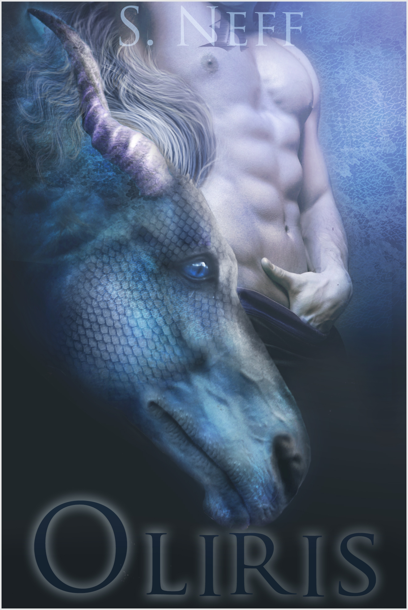
When seen at a larger size, however, the cover presents a lot of problems. First is that the dragon pretty clearly has a horse’s nose. In fact, it was only when I looked at the description again that I realized I was supposed to be seeing a dragon, not a mer-horse or something.
And the guy’s hand down his pants… combine that image with the horse, and there are clear implications of bestiality that are hard to ignore. Unless your male protagonist is actually a model-turned-pornstar, get his fingers out of his britches.
There are other areas that need improvement — the single nipple that looks like an eye, the tattoo that intrudes on the byline, the odd glow that defines the edge of the horse/dragon’s nose — but those are the two largest ones I see.
Other comments?
Daaaaaaaaaaaaaaaaaaaaaaaaaamn.
Now that that’s out of my system, I also liked this cover at thumbnail but think it needs tweaking at full size.
Is this a romance, or some romance-adjacent genre? Because the shirtless dude with the hand down his pants, sexy as he is, really feels out of place on a high fantasy cover. And yeah, I got a bestiality vibe from it too. Also, I can’t tell if the letter on his neck is supposed to be a tattoo or something or part of the typography.
As for the dragon, that’s far from the worst Photoshopping I’ve seen, but I don’t think it’s quite ready for prime time. The palette and shades do a great job of tying the whole image together holistically, but the longer I look at it, the more it looks like a lot of layers stacked on top of each other with a lot of soft blending. The lighting should be more consistent, the mane needs to all be flowing in the same direction, and (the big one that caught my eye) you need to use a displacement map to make the textures wrap around the face.
Yes it’s M/M romance and trust me you’re getting the right vibe…
The title definitely needs more contrast in thumbnail, when glancing at it quickly I initially didn’t even realize there WAS a title in the thumbnail version! I don’t think a serious amount of change needs to be done, though, just play around with the glow until it pops a little more.
The male model’s neck is too long. Maybe give a hint of a chin/jawline.
uh, dudes, specifically Nathan and katz: that’s not accidental bestiality, methinks. The line says:
That’s pretty clear. The dragon “takes” him in the physical sense, and now they’re in wuv. This is Dragon-cest, so to speak.
The horse’s head is simply too horsey. I’m an old (in all senses of the word) horse person, and all I see is a horse’s head, with odd ram’s horns (nobody mentioned those? Really?), a permed mane, and what apperas to be the soft muzzle of a horse, combined with the scales (from the jowl back), that are intended to convey lizard-like tone, for the dragon. I think that with some tweaking, this could work, but it needs to be less obviously a horse. Change the line of the head; change the scaling (remember: scales get smaller as they approach the nostrils/muzzle) and make the mouth less “extended horse mouth,” and more dragon. Maybe an open mouth, and some teeth?
I like the color-tone, overall. I don’t like the fonts, or the lack of strength/contrast in the colors (or lack of any therefor) of the fonts. The byline disappears entirely into the cover image, and the title is almost unseeable in thumbnail. While I don’t hold with the idea that the text all has to be readable at thumbnail size, I do think that the contrast would greatly help this cover be SEEN in a thumbnail parade, on a genre or general search page, on Amazon, B&N, etc.
I also think, in terms of font selection, you’re missing a wonderful opportunity to use a fantasy-type font. You’re doing the cover and yourself a disservice, by not taking advantage of the positively gorgeous fantasy fonts out there. What about something like …I dunno, Ayosmonika? or if you’re leaning more to the romance-y side of this, I always like Foglighten. Granted, I use it more for chapter heads in that type of book, but…(and I’ve been liking Demon lately, too. Really depends on which way you’re going.)
Hope that helps. Nathan, if as usual, I manage to screw up the quote, would you so kindly fix it? Thx.
Yes, I’m definitely seeing the bestiality overtones in the artwork; also in the synopsis. If this isn’t an erotica novel with a fantasy setting, the author definitely needs to get that beefcake model’s fingers out of his pants and come up with a somewhat less suggestive way to say the dragon rescued the guy from that penal colony or broke him out of prison or whatever.
If it is an erotica novel with a fantasy setting… well, aside from my finding the subject matter morally revolting and definitely being completely outside the target audience, I should probably state right up front that the author’s aiming even lower than the lowest common denominator. Bestiality in a fantasy setting appeals to a very, very, very specific niche market which might not have much room for another author. This is what TV Tropes calls an Audience-Alienating Premise: a story concept that, no matter how professionally you write and market it, is unlikely to find many buyers. To put it another way, the number of people who bought Taken by the T-Rex because they actually wanted to enjoy it rather than make fun of it and/or ship it off to someone as a gag gift was prohibitively low; and those who bought it for those other reasons are extremely unlikely to be repeat customers who’ll buy your book.
Either way, the dragon on this cover definitely looks more like a horse than anything else. Unless that’s supposed to be a plot point (e.g. a dragon in this world is basically an amphibious pegasus with ram’s horns, so of course it looks like a horse), this element definitely needs to be redrawn. Also, while there are no bubbles or anything obvious like that, the heavy emphasis on blue coupled with the dragon’s oddly floating hair suggests this is a picture taken underwater. Unless the dragon in question is a water dragon, and a fair amount of this novel does take place underwater, I’d recommend a different setting and color scheme.
Finally, the fonts: in addition to the complaints and recommendations of other critics here, having dark and translucent fonts on this kind of cover does not work. The byline font is too spidery already without the transparency effect making it even more difficult to see, and the coronal glow around the dark title font only barely makes it readable in the thumbnail. Some scaly green fantasy font would be far better for being both a lot more visible and a lot more appropriate to the story’s premise.
And if it is actual bestiality erotica, honestly, lose all subtlety and make it unquestionably clear.
Ok. Yes and no to the bestiality part. The dragon (La’el) turns into a human under strange circumstances. This is a m/m or gay romance novel and the target audience is indeed specific. Regardless of he whole plot of the book, it is actually a science fiction novel, with he dragon actually being from another planet thus making him an alien. I agree that he looks to much like a horse and have been trying to figure out how to tweak the image to make it more effective. In the end I’ll have to start over because I don’t think I can make this one work out any better since I used a low resolution photo. Thank you for all the comments and suggestions even with this being out of everyones comfort zone 🙂
If the Dragon is sentient in the first place, then it isn’t bestiality – even before it transforms into a person.
It is mythical and has intelligence (I hope). It can make its own decisions- make the choice to bang a dude, it if so choose to, and give consent to be banged if that instead floats its dragonboat.
It is no more bestiality than a werewolf taking someone in hybrid form, or a centaur getting down and dirty, or even Brian from Family Guy. They are not mindless creatures, so the term bestiality doesn’t apply. It is sex with bestial creatures, but not bestiality. A fine line maybe, but an important one.
Sex with animals is wrong. Why? Well, because it is, but also because they can’t reason like we can. Make a choice. Dragons are not mindless. So it isn’t bestiality.
Trust me on this, I write about dragons banging dudes all the time. Amazingly we write for the same audience. Well, probably anyways. My book, Breakers of the Code, is in the archives here. Don’t worry, I already broke this place’s comfort zone wide open! 😉
Look me up on Goodreads or Facebook or something S. Neff. It would be cool to compare notes.
– CB Archer
(Oh and I think the text needs to be brighter on your book cover as well)
Waffs: so–seriously–the key to bestiality is sentience? If the critter has the ability to consent, or not, it’s not bestiality, is that correct? (I’m genuinely asking. This isn’t really my genre–I was reading what I thought was a paranormal mystery-type series, in which, lo, dragons had human form and the female protag became involved with one, and it still kinda icks me out, but, hey….whatever spreads your wings.)
Does the transformation play into whether or not it’s bestiality? If the dragon did NOT transform, sentient or not, would it still be bestial? ???
I… don’t rightly know actually. Perhaps I was just talking big in an attempt to allow myself to sleep at night.
Regardless, That is how I consider it to be at least.
Bestiality is sex with animals. Animals cannot really reason. Animals cannot really decide. Dragons can. Werewolves can. Centaurs can. Clarence the magical sparkle horse can.
Spock isn’t a human, or Legolas. They are non human and mythical. How different is Spock from a centaur?
It is no longer sex with a mindless animal, which is what bestiality really is.
Big distinction – Places that did not allow bestiality in their novel submissions did allow magical creature sex.
^-^
Yeah, I think the audience for dragon-banging is way bigger than anyone not in that audience suspects.
Except for the fact that I can’t read the title and that nipple stares at me like a cyclops, it’s not bad.
I would lose the tattoo on the guy’s neck, it looks distractingly modern and real-world for a fantasy/sci-fi setting.
The dragon-horse concept doesn’t bother me, since dragon/aliens aren’t real they can look like anything we want, and if I was smooching one I’d rather it have a nice soft horse mouth than the standard snaggletoothed one! The problem, as I think you mentioned, is that you seem to have started with a low-rez image and it really shows, especially around the tip of the muzzle. Instead of using a flat scale texture try using source photos of actual lizards or even models of dinosaurs, from a place on the source’s body that would have a gently curved plane similar to the horse’s cheek (such as the side of the torso).
I also don’t like the flat gray gradient under the title. Brighten up that title aura and put some of those lovely subtle blue-purples from the overall image under it.
On first glimpse it looks OK, with few tweaks like making the title stand out, but after few seconds the horse cosplaying a dragon is problematic. It is clearly a horse tweaked to look like a dragon: even if the dragons in your universe look like horses, this is not the way. Dragon and horse simply do not mesh here. Also there is ghost hair, transparently floating in air, not rooted in anything.
The dragon and the man seem also a bit crowded together, maybe because there is no shadow behind dragon/horse, so it is hard to see if there is any distance – and also flattens the dragon.
Sexy man looks like a sexy man, and the background is fine. If ‘steamy’ is an adjective that fits the book, the model is apt – though a bit overused. Look at samples in Amazon, or indeed in Lousy Book Covers, and the sadly headless hunk leaning back, photographed slightly sideways, seems to a busy man indeed. This is not necessarily a problem as such, if the point is to offer something familiar to the potential reader, and if the rest is well done.
You were going for “Kirin” weren’t you? Assuming you are dead set on PhotoShopping this yourself (instead of commissioning something from DeviantArt with this as a sample) then look up deer heads as well. And maybe start with the photo of an Arabian breed in 3/4 perspective as well. (They have more delicate lines to work with) Morph the horse head into slightly more of a deer shape and wrap/scale the dragon scales appropriately. That will give you something that screams “dragon” and is also extremely unique.
Your layout is really good but Photoshop skills fall a bit short. Commissioning some art will be WELL worth the money. Or… spend the hours doing it right. (Photorealisic morphs requires pixel level painting to get right)