See Through You

The author says:

See Through You is a book for people on a spiritual path, searching for who they truly are. It’s a book that provides a practical guide to spiritual awakening, or in other words, discovering who you truly are.

Book 1 cover.indd

Book 1 cover.indd

Nathan says:

This is another cover where I’m not really the target audience, so all I can say is that something clashes for me between the two typefaces used; perhaps a cursive or italic font for the subtitle would work better.

Anyone else got anything?


The Thirteenth Hour

The author says:

Let me first start of by thanking all of you for this site. Wish I’d stumbled on it earlier! I’m in the process of updating a cover to a book that is already out and would welcome any feedback.

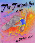
“The Thirteenth Hour” is a fairy tale about a young man who, through no fault of his own, ends up involved in a quest around the known world to find the secret of eternal life for a narcissistic ruler. Thought it’s not something he’s thrilled about, he continues on the quest alone and without provisions after his team perishes and their ship sinks early in the mission. Along the way, he comes to better understand something about adventure, but more about becoming an adult and his own person.

Creating a suitable cover has been challenging since it’s been a difficult book for me to classify. It has fantasy and sci-fi elements, but hardcore fans of those genres would probably find it lighter. It’s not really young adult (in the publishing sense), since the characters are a little older (late teens-early twenties), but the “new adult” genre seems mostly dominated by romance novels at the moment. So, I have described it as a fairy tale for adults. I was aiming in this cover to have warm colors and a sense of dynamic motion to fit the central image of the main character speeding over the cloudscape while doing a backflip on his hoverboard. But, I let you be the judge of whether that was successful or not.

logan flip clouds_cover small draft2

logan flip clouds_cover small draft2

Nathan says:

Thanks for the kind words — and now you’re probably going to hate me because I’m about to crap all over your cover.

Because it’s just not professional quality. It’s not.  Yes, you have artistic talent, but your work doesn’t show the results of years of learning professional technique.  It looks like the kind of thing that could be pinned up inside a locker, but not something that could compete against other books on Amazon.  The line quality is primitive; the anatomy and perspective is off; the colored pencil work is colorful, yes, but it lacks a dynamic light/dark contrast — if seen in grayscale, it would all be a midrange murk.

On top of that, the choices you made for type are plain wrong.  The typeface is borderline unreadable, and while I understand that you bent the text to run parallel to the hoverboard, but the unfortunate effect is that “The” becomes the most emphasized word in the title.

Name five book titles that you would expect to have a common readership with yours.  Now go to Amazon and look at their covers. That is how your readership expects books to be presented to them — that’s how they expect their books to look.

I really don’t see a way to salvage this.  At best, you could take your version of the cover to a freelance illustrator and say, “Here’s what I was thinking,” and see how that freelancer could adapt your ideas to a professional design.

Other comments? Am I wrong?


Dragon Warrior & The Princess

The author says:

He’s a volatile, genetically-engineered slave, longing for peace. She’s a spoiled princess who wants to reclaim the throne and save the world. He must help her. Princess Aurelia is left for dead on the frozen planet of Quisquiliae. There she meets a dragon warrior…the last of his kind. The Dragon Warrior, who had also been left for dead, thought war and servitude were behind him. But his short-lived peace is shattered when the fiery young woman revives and starts telling him what to do. He submits himself to her, as is his duty as a slave to the royal family but, deep down, he blames her for everything he is and all he has been forced to commit. After the Dragon Warrior saves Aurelia’s life, the princess is duty-bound to return the favor. Her course of action shocks the Dragon Warrior as he tries to come to terms with his true nature and identity. The Dragon Warrior and the princess walk the path of honor together but it will take a confrontation with space pirates, a supply run for weapons, a star ship battle, a ground skirmish, a rescue mission and, ultimately, an encounter with evil itself before they find out where this journey will end. An edge-of-your-seat science fiction adventure filled with innocent, romantic longing, The Dragon Warrior and the Princess breaks from the typical military space opera mold. Shaped by the theme of mercy verses justice, where shades of grey polarize and resolve into right and wrong, The Dragon Warrior and the Princess displays the power of good working through its heroes to give the world hope and a future.

NewDragonWarriorAndPrincessCover

NewDragonWarriorAndPrincessCover

Nathan says:

I know I’m not the target audience for this, which is okay: It means I can look at it strictly from a design standpoint.

The first thing I notice is that, in the thumbnail, “The Princess” is almost invisible, and even in the larger version those words tend to disappear into the similarly colored background.  I think you’ve established the color scheme well enough in the main image that you can use contrast to make the text stand out — maybe a deep cherry red, that starts strong at the bottom of the title and fades toward the top.

I also think you’ve got too many fonts, exacerbated by the unsuitability of the typewriter font for the byline. (You should ditch the font that “The Princess” is rendered in; for one thing, the kerning problems between the uppercase and lowercase letters seem almost too great to correct.)

One other thing, regarding the layout of the image itself: The nearest part of the space-station-thingie, which is the natural focal point of the structure, is obscured both by the title and the fade into the portraits. Also, it’s angle can cause confusion among viewers who maybe think initially that they’re looking at some sort of castle from a high angle.  If you vertically flipped the space station, the nearest part would be more easily seen near the byline, and the castle confusion would be lessened.

Other ideas?

Lavendiron

The author says:

This is a coming-of-age slice-of-life romantic black comedy set in the year 1969 of an alternate timeline. This story follows the strange love life of fourteen-year-old Heinrich Kennedy, product of the Greensboro Lebensborn Institute, as he gradually comes to terms with being attracted to both a boy and a girl from another Lebensborn Institute that he met while attending the Stonewall Rally in New York. The institute authorities don’t mind his interest in Rolf Heisenberg, but their records indicate that Emma Monroe is biologically his half-sister. To make matters worse, their attempts to steer him away from Emma and toward the recently-turned-eighteen Rolf are thwarted when Rolf is suddenly drafted into Germania’s brutal Pacific War with Premiere Lysenko’s Soviet Bloc forces in Japan. In chapters punctuated with various pop cultural references (such as the lyrics to the first verse of “In The SA Now” by Aryan Dorfbevölkerung), we get a personal perspective of life in a world in which Nazi Germany won World War II due to Ernst Röhm’s rise to power as its Führer after Sturmabteilungnacht. This story is aimed at readers of Harry Turtledove alt-history novels who might appreciate something a little lighter and softer in the same genre.

Lavendiron

Lavendiron

Nathan says:

A black comedy alternate-history Nazi love triangle? I can totally get behind that.

The problem with your cover is that it’s too subtle.  Readers will pick up on the swastika over the White House, sure (well, maybe not in the thumbnail) and the Germanic script, but it’ll be at least a few seconds before the pink tones and “Lavendiron” can come together in their minds… and they still won’t get it.

I mean, this is Springtime For Hitler with teen angst melodrama!  Go big or go home! And I think on this one, because this doesn’t match any conventional genre, you can’t just pull together a cover with imagery familiar and appealing to that genre’s readers.  I think you’re gonna have to spring for a custom cover on this one.

In fact, I know just the guy.  Let me see if he’s interested, and then I’ll give you his contact info.

The Assassin’s Brink

The author says:

The first in a series of stories featuring covert operative Alexandra “Alex” Granger and her off and on lover/partner Marcus Kane. In THE ASSASSIN’S BRINK, former Delta Force operator Alex Granger is recruited by the Central Intelligence Agency for an off-books mission in Iraq to assassinate ISIS commander Abdul bin al Kamal–formerly known as Lt. Cdr. Kenneth Monroe, a Naval Intelligence officer. But nothing is what it seems when Alex finds herself ambushed and nearly killed by a CIA strike team. Wounded and on the run from her own country, Alex calls upon the one person she can actually trust: Marine sniper Gunnery Sergeant Marcus Kane. Now the duo face off against a shadowy cabal working within the CIA who want nothing more than to end their lives and keep their existence a secret.

The-Assassin's-Brink

The-Assassin's-Brink

Nathan says:

Very professionally done.  My main complaint is that it’s aggressively generic: Flag, assassin, even the fonts chosen, all look calculated to be an indistinguishable thriller.

If Iraq is a major setting in the book, I’d try tinting the image with a sandy color/texture, both to indicate more of the story contents and to give the illustration some distinguishing factor.

Also, if the assassin photo extends down further, I’d try bumping her up on the cover to give more room for making the title larger without obscuring her hands.  And, as I said, finding variations of the fonts that aren’t as generic.

(One other point: “America” is singular, so “America’s Best Operative Has Become Their Worst Enemy” doesn’t make sense unless “Their” refers to something else entirely, which is confusing.)

Other ideas?