The author says:
How can I keep praying when nothing seems to be working? I get tired of praying without results! Is it possible to pray effectively? The Author’s tale of her journey so far in the warrior clan of God’s kingdom addresses the above struggles Christians face. If you desire more in your prayer life, this Book is an ideal Book for You! Reading this Book will challenge every reader to strengthen their prayer life and keep praying!
Nathan says:
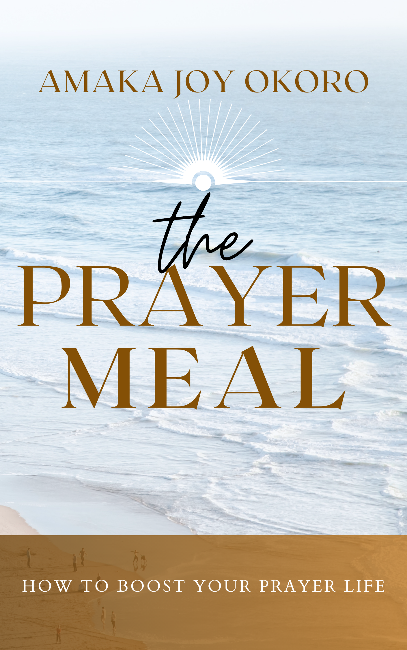
I noticed that the file name of the image is “PUBCODE MEDIA PREMADE COVERS (9).png,” so you may not have a lot of control over changes. That said, I still think you can make better use of the space with a few tweaks:
- Move your byline to the shaded area at the bottom, where the bigger letters will be more readable than the current subtitle.
- Push the title (and the sunburst motif above it) right to the top.
- Use the open space left below the title to display your subtitle at a bigger, more readable size.
Other comments?
The brown panel really doesn’t seem to serve any real purpose other than to frame the tagline. I would eliminate it and move the tagline up beneath the title.
Also, please ask the cover creator to kern the lettering of the title a bit better. It’s clunky. (Granted, most people probably won’t consciously notice this, but the subconscious plays into buying decisions more than the normal person knows.)
The gap between the e and the a in “MEAL” is noticeable. The A-Y-E kerning, in PRAYER, is done poorly and should be kerned so that they are…I don’t know how else to put this, but…singing in harmony, not each off on their own note and key.
I understand that the designer was trying to use an expanded version of the font in all-caps, for impact, but that needs more hand-kerning and eyeballing, IMHO.
I’m with Ron on the banner, although, Ron, it does seem to provide some color balance to the cover. See what I mean? If you remove that banner, the entire cover kind of washes out. What do you think s/he could have done instead?
I like the color banner. I think Nathan’s idea to put author name there is spot on.
I’m wondering if the addition of sunlight/sunrise across the snow would add the hint of hope that this cover is lacking.