The author says:
In summer 2006, twenty-year-old Gerald Yeung and his childhood friends from Hong Kong travel to South America and Africa on their parents’ dime. Confronted by challenges foreign to their privileged upbringing, the “Wannabe Backpackers” persevere in their Christian Dior clothes. They make plans to do it again when they turn thirty. The decade that follows doesn’t go exactly to plan. Gerald chases the American Dream in a town of twenty thousand and subzero winters. Others pursue a fast-and-furious life in Hong Kong. They all experience failed relationships, career setbacks, and a decreasing ability to impress girls at clubs. The summer of their thirtieth birthdays, they hit the road again to fulfill a lifelong dream — the 2016 UEFA European Championship. Set during European soccer’s most anticipated event, Kong Boys traces a friendship that transcends distance, culture, and time, dovetailing the different trajectories of seven boys in a decade of changes in Hong Kong. Kong Boys is a celebration of youth, brotherhood, and a sport of incomparable beauty.
Nathan says:
You know what? I’m gonna give the commenters first stab at this. Have at it, guys.
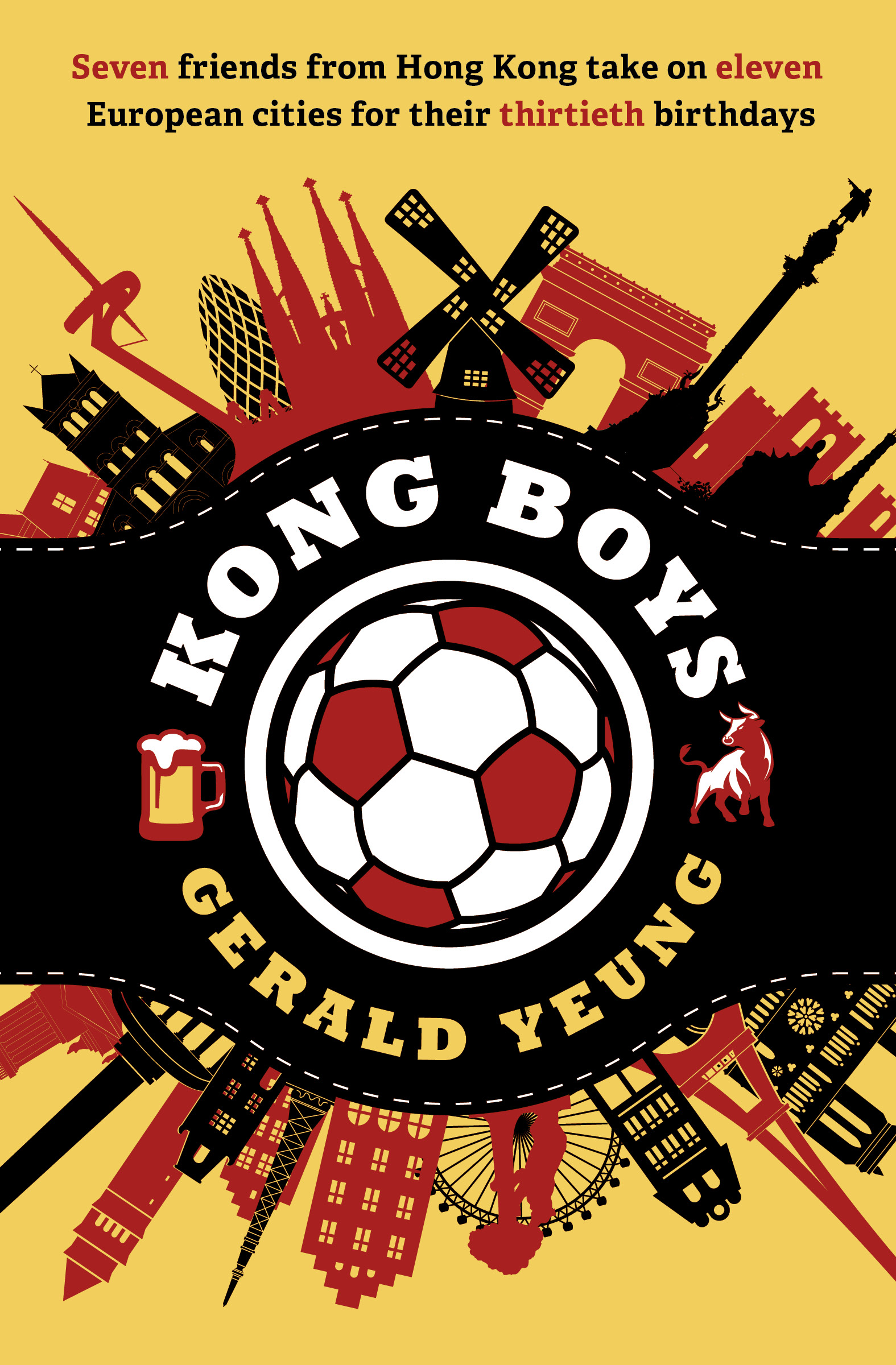
I have no idea why but the tagline read to me like this was a book about thirteen year old kids and I was like huh- how do kids do that? so I re read it. I think it was maybe the ball in the center preconditioning me to see thirteen and not thirty. Seven friends- Maybe try- Seven buddies to age that line a bit?
But the real problem is, I think the cover is missing the humor mark. It’s showing the cities, which isn’t the real focal point of the story. A more humorous image would likely sell the story better.
I think it’s a spectacular design…I only wish it was a little more suggestive of the actual nature or theme of the book, as Shelley suggests. The emphasis placed on the soccer ball is especially misleading. Even though a championship meet might be a centerpiece of the novel it is not what the book is about.
Sorry, but I don’t agree with Ron or Shelley. For me, this cover is great and I think the book, with this cover, will be a success.
Wow. Well,that’s some spectacular artwork and I’m with Ron. I agree it’s ever-so-slightly misleading, but I also agree with José–it’s a great cover and I suspect that any oversights will be, well, overlooked.
I do agree with Shel–buddies, rather than friends. It does then signify adults, or at least, late teens/YA, rather than “kids.” With the soccer ball front and center, I think making the age of the protagonists clear is important.
ONE last teeeny-weeeeny comment. If they aren’t going to NYC, you oughtn’t use the Wall Street Bull; it’s pretty well known and might imply “NY.” But…perhaps nobody else will even notice it.
Meh, I think it’s great. I don’t see why “friends” would be inherently more childlike than “buddies”. No adult I know male or female, refers to their friends as “buddies”
Also, Hitch? The only famous bull I assoc. w/Wall Street is the charging bull sculpture and that clipart ain’t it. But I’m Canadian so just because I don’t make the association doesn’t mean it’s not famously assoc. w/Wall Street
Mmm…it could be because I trade options, but that was my immediate thought. Beer on the left (Germany!), NYC on the right. We’ll likely never know what the cover designer and the author meant there. 🙂
I still think that yes, there’s a big difference between friends and buddies, but, hey…{shrug}. Everybody brings their own frame of reference to it, amirite?
You are absolutely right!
Me, I didn’t see the beer and bull as destinations so much as generic pub signs, so there’s that!