The author says:
The world is falling apart due to climate catastrophe, violent insurrections, and government corruption. Suburban father Howard Hall decides to take matters into his own hands against one of the men he views as responsible for the societal decay; the candy mogul Li Wen. After modifying his RV into a vehicle of war, he leads his family on a siege of the Wen Estate. However, the battle proves to be more complicated than expected when a group of teenage punks show up to terrorize both the Hall family and Wen’s personal army.
This short novel is a satirical action thriller set in the very near future of the United States. The target audience is adult fans of humorous speculative fiction and would likely appeal to fans of authors like Thomas Pynchon, Norman Spinrad, William S. Burroughs, Nick Mamatas, and Carlton Mellick III.
Nathan says:
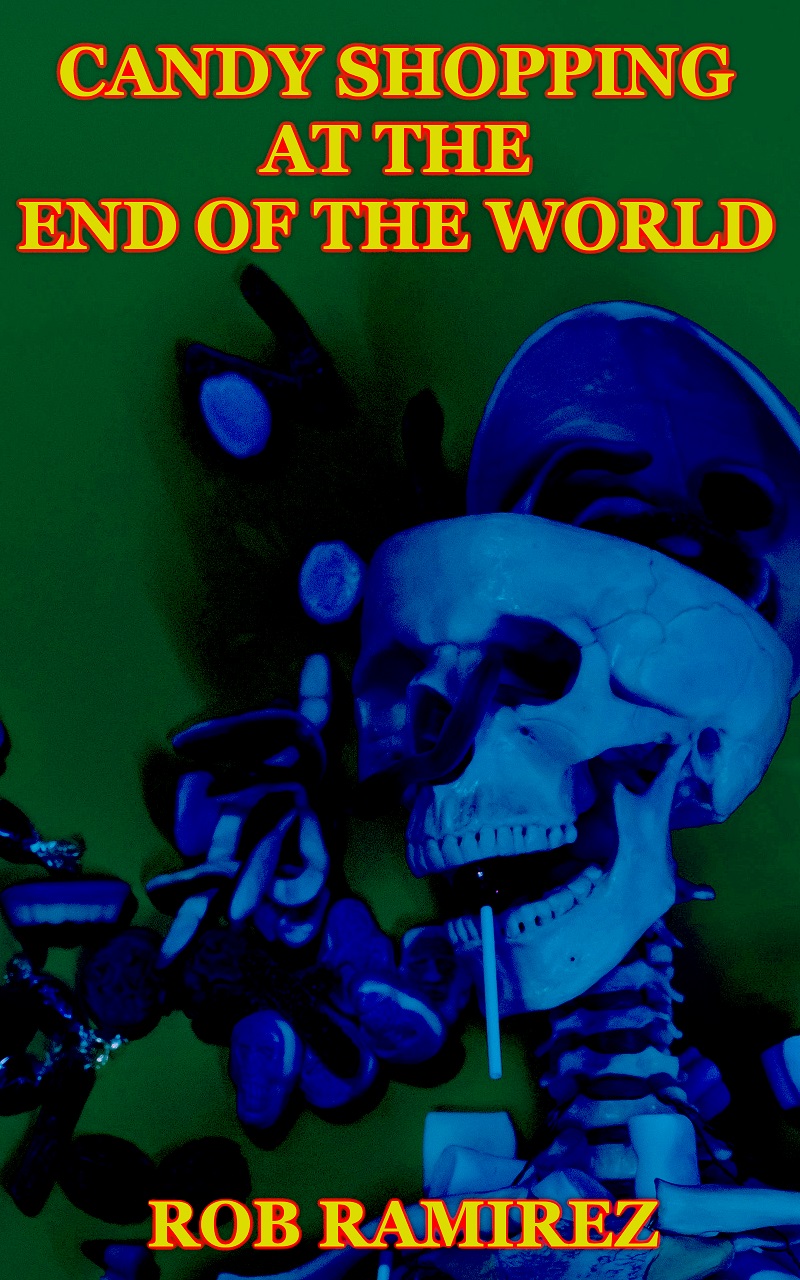
I think the main problems with this cover become apparent in thumbnail: Nothing stands out. Even at full size, the objects to the left of the skeleton are unidentifiable. (From the description, I might guess that they’re candy, but…) And the title and byline look like they’re trying to be as unobtrusive as possible.
This is a cover which might benefit from a ground-up re-think. After all, you’ve got a nifty juxtaposition of post-apoc and candy; it should be easy to create an eye-catching cover from those elements.
Nevertheless, here’s a five-minute redo to show how even the existing elements could be improved:
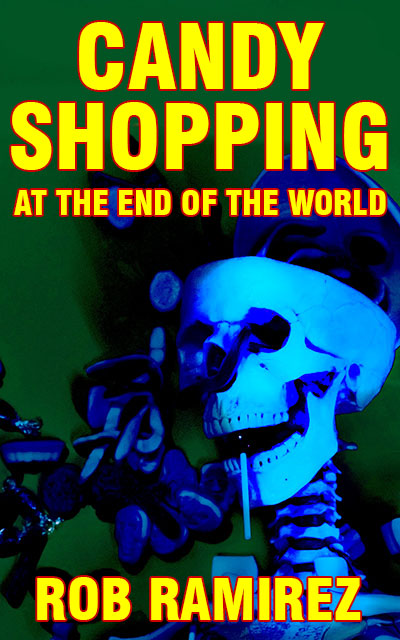 No, I do NOT recommend the typeface I used. Five minutes, you know. (And even here, I’m wishing for some clear candy elements.)
Other comments?
I think it needs a complete overhaul- sorry- but it’s murky and not understandable as to the elements.
I think I’d go for a more recognizable satirical image. One that takes no time to parse the meaning of. Your skeleton appears to be smoking, what if instead you remove the cigerette and make the top of the skull a candy dish?
Then change the title placement and font to fit that new image. I’d probably use grunge elements for it.
I agree with Shelley: this needs to be rethought from scratch.
Aside from the contrast issues, it really doesn’t readily convey any sense of what the book is about. I suppose that is supposed to be candy floating around the skull…but I only deduced that after reading the description—which is putting the cart before the horse.
You need to come up with an image that much more clearly suggests the nature, theme and idea of your book.
After staring at it for a while, I thought maybe those were those old-fashioned chocolate candy coins? The ones that came wrapped in gold foil-ish stuff? But seriously, I had to look at it for ….5 minutes? No buyer is going to do that. And I only thought of those because the title has candy in it.
I like Shelley’s idea. The candy-dish skull. With something apocalyptic or grunge near it and or fonts? Something. (A nuclear fallout cloud in the background? Or…? Only you know what Dystopian elements you’ve used, we don’t.)
This cover simply doesn’t work for me at all and not even Nathan’s 5-min redo is not viable.It looks like a poor-quality sci-fi/dystopian cover, maybe, not humor.
Sorry, I wish I had something positive to say. I do like the plot outline–but this cover would never get me to that plot description to read, sadly.
I’m with Shelley and Ron I’m afraid – this isn’t the cover that best serves your book and you’d do best to take another look. I think you’ve shown you have a good basic eye for composition, you just need a steer on how to select imagery, fonts etc.
Humour is one of the tough ones with book covers. Covers have to work in quite broad and bold ideas, so the subtleties that create humour easily get lost or milled into something a bit basic. Even some of the superstar humorists have, for my money, often been badly served by their covers.
I tend to think one of the more successful approaches in this area is to worry less about representing content too literally, and instead pick an image that seems to speak to the tone. The authors you mention often feature surrealist imagery on their covers which has a ludicrous edge without looking light-hearted.
I think you already understand that from the image you’ve used. The crucial thing is that is all needs to be waaaaay clearer.
You have to remember a cover is there to grab people’s attention. It needs to communicate itself within the 10-second window it has as someone glances over the image – at thumbnail size!
Your imagery is along the right lines in subject matter, I would say – a half-abstracted allusion to the book’s content which communicates a funny/off-beat/edgy vibe. But it’s where near clear enough what’s going on, and what the elects even are, even barring the colour treatment.
But yeah, also the palette and darkness are the bigger problems. The cover’s a featureless blob at thumbnail, and simply quite ugly to look at, at any size. The collection of colours you have chosen are not great together, in large part because they are all so dark and saturated. You need some variety of tones. Not everyone has a good implicit instinct for colour – but you can use colour-wheels and online palette-generators to suggest what colours to combine effectively.
It’s not wrong to use bright.contrasting shades at all – the covers of books by authors like Pynchon and other popular satirical/off-beat authors like Carl Hiasson definitely create a trope of using bright contrasting colour to speak to hard-edged humour. But they only push that so far!
A final note on title treatment. You have obviously created your title carefully and I think it’s a good one that represents what you describe of your books well. It does so much work in getting across the vibe of the book – and then it’s kind of sidelined on the cover!
Instead think about letting it dominate.
Modern book covers tend to be really typography-led, with title-treatments taking up 90% of the cover space. That’s for a practical reason – it makes the title readable at thumbnail – but it also creates beautiful covers. When you have the particular challenge of communicating a specific humorous tone and your title is an effective tool there, all the more reason to blow it up big!
See for instance these Christopher Brookmyre covers
https://lh3.googleusercontent.com/proxy/-8_PhzqluIOk7Mlz9E4PoyMbGc2Q2ssCaGIkWImNQXYQ_1Yde2OejvMyN70RsKfi8PlHT0S_5SdXMVieYmCTxs2ET8fWaIElJFsogN6FAgncTyQ4yTkmNuA7Dqc
https://images-na.ssl-images-amazon.com/images/I/61L5rZpY9AL.jpg
They’re designed to centre clever titles that tell you a lot about the books.
Kata: Your “Googleusercontent.com” link returns a 403 Forbidden Content error, FYI. Any chance you have another link?
it worked for me when I clicked it the first time (but not now) so I know it linked to this cover:
https://images-eu.ssl-images-amazon.com/images/I/71MmzvnW41L._AC_UL600_SR600,600_.jpg
Thanks, Syd and Kata.
Ah sorry! Thanks for that Syd!
Actually, showing a skeleton and some candy works just fine for a satirically apocalyptic story involving a candy mogul in my opinion. Even young children tend to see skeletons as being rather cute and funny in a darkly comical way (which is why the makers of various poisons stopped printing the skull and crossbones on their products and started putting “Mr. Yuck” stickers on them instead to warn the kids away), and adults have recognized skeletons as symbols of civilization-wrecking apocalyptic events pretty much ever since the advent of the danse macabre in medieval times. The problem I’m seeing here is what I’m not seeing: due in large part to a lack of focus and the “cool” blue-and-green color scheme not providing much contrast, the candy tumbling into the frame behind the skeleton consists of a bunch of blurry blue blobs exceedingly difficult to notice on the full-sized cover even when you’re looking for it (which casual browsers on a sales site won’t be) and nigh-impossible when viewing the thumbnail—which is the very first glimpse anyone browsing a sales site is likely to get of this book’s cover.
As just about anyone who’s ever been in a candy store as a kid can tell you, selling candy doesn’t usually take much advertising, since the bright food coloring candy manufacturers use in nearly all of their products draws children’s eyes to candy as readily as the glint of tinfoil draws birds’ eyes to it. As such, having all the candy on this cover colored dark blue and out of focus against a dull green background is a nigh-criminal misuse of otherwise good and effective imagery. Really, if you want a good juxtaposition of candy with death to illustrate this story’s main themes, you ought to use a brightly violent “hot” red-and-yellow color scheme on that skeleton in front and a veritable rainbow of color on all that candy tumbling into the frame behind it just like what one would see in a typical candy store’s display.
In fact, while the skeleton you’ve got does a decent job of conveying the apocalyptic theme, it seems to me it would do even better if you had it centered on the cover and directly facing the viewer with a well-lit candy store display behind it. While it makes a certain twisted kind of sense for this symbol of death to be smoking (although after looking more closely, I notice that’s actually a lollipop in its mouth), the juxtaposition of death with sweets means it would make even more sense for it actually to have a candy (or gum) cigarette in its mouth instead; to this end, I’d recommend having one of those sweets in the background be a pack of King brand cigarettes (which are sold to this day in just about any candy store that doesn’t bow to the whims of political correctness) just like the ones on Van Halen’s infamous 1984 album cover showing a cherub with a cigarette in hand (that’s right, the little tyke used as its model—who was three years old at the time—was only holding a candy cigarette; the cover wasn’t being as transgressive as it pretended). To drive home the apocalyptic nature of the symbolism, I’m thinking this danse macabre symbol could also do with a contemporary update to this Grim Reaper stand-in’s weaponry: maybe have the skeleton dual-wielding a pair of semi-automatic rifles Terminator style, which—in addition to bringing to mind that rather apocalyptic movie series—will tend to remind people of apocalyptic movies in general, since nearly all such movies show their characters keeping and bearing a fair number of firearms.
In short, you’ve got the right kind of imagery present, but you need to make everything bolder, brighter, clearer, and louder. Even if most of this story takes place at night (as is probable for this genre of story), that’s no reason for your cover to be so dark and poorly lit. The bizarre juxtaposition of a heavily armed skeleton in the foreground with a brightly lit and cheerfully colored background would simply serve to make it so much more comedic even while simultaneously driving home how emotionally dark and violent the story is.