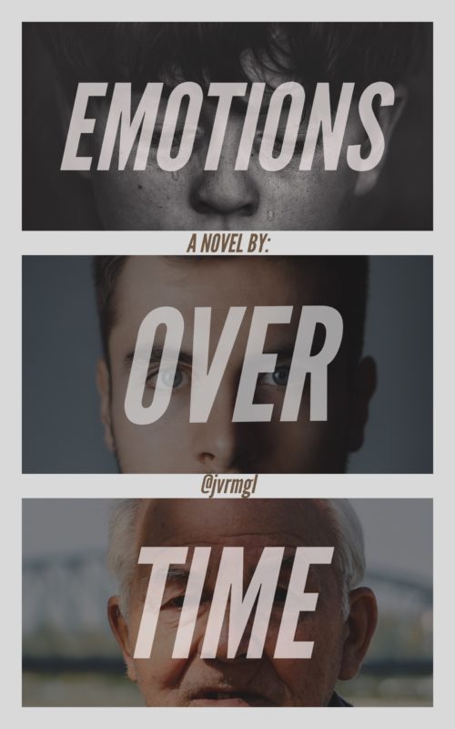
The author says:
Not too sure yet but it’s something like a coming-of-age adult drama thriller thingy, mostly the first part of what I said. I thought the people in the picture represents someone growing older in just a short while. Idk, thoughts?
Nathan says:
It sounds like it’s still a novel in process, and you’re not too sure what it’ll end up being. Aside from any problems that may present in novel-writing itself, it makes it almost impossible to put on your marketer-hat and figure out the audience you’re trying to attract — you don’t know what your product is yet.
As far as the cover image simply as a concept, I like it, although I would recommend a number of changes (change the top photo to something in color, make the three words in the title all the same size, move the interstitial byline to a single line at the bottom, and give the author a REAL name), but it’s hard to focus on the number one purpose of a cover — attracting the attention of the readers who would like the novel — before we know who those readers are, and we can only know that once we know what the novel is.


The aging face idea is fine, but I’d crop them all similarly.
Also, double check the ratio you’ll need for the finished cover. This mock up you have looks too narrow.
When you say someone growing older in a short while did you mean that literally? Right now I’m getting the impression that the story follows him throughout his life as he ages naturally, so if that’s what you’re going for great. If it’s some sort of rapid aging story then maybe the background could be a continuous photo?(And if it already is then it’s hard to tell, since the top two are entirely sky and the colors change so much.) Not sure if it would get the effect you need, but maybe. Or maybe it’s just me.
I could swear that we’ve either seen this cover before, specifically, or one very, very similar. @Nathan–do you remember the cover I’m talking about? The young-to-old face, on the cover? Maybe I’m simply losing it, but I could swear we’d seen it either here or over at LBC. Anyone else? Very, very similar to this. Anyone?
I’ve seen a fair amount of movie posters that are very similar; is it one of those, maybe?
I don’t know. It’s really bugging me.
The poster for the TV adaptation of Any Human Heart does this left to right. It’s what I thought of immediately when I saw this cover.
I don’t remember the one you’re talking about, but after posting three or four of these a day for fivish years, I gotta admit, my brain has a callus on it.
The first impression I had was one of overall greyness.
The fundamental idea is good—that of having a progression of faces of different ages—but you obliterate it by covering almost the entirety of each face with type. Combined with the fact that the images are so murky to start with, you completely lose the effect you are after.
Covers have to get their message across in a single glance. You cannot count on a potential reader spending time puzzling out what is there.
You have the core of a workable idea—it just needs to be executed more effectively.
I would also certainly find a better solution for your name. The suggestion that Nathan makes is a good one.
If your story is still in the developmental stage, it would be good to try experimenting with different designs. Your current design of pictures vertically divided with horizontal strips might be able to pull off suggesting the progression of the character’s age, but have you considered trying the opposite approach? A few weeks ago, our host pretty much suggested something like this for another book: have your picture be one picture composed of mashed-together vertical stripes instead to indicate the passage of time (or, as in this case, the progression of the character’s age).
If you were to take a vertical strip from each of the three pictures of your protagonist’s face from which this cover is composed, mash them together into one picture, and then place your composite protagonist against some continuous background, this would give prospective readers (whoever they might be) the kind of impression you’re probably trying to achieve. You would also have more room to put your title and byline somewhere they aren’t obscuring the protagonist’s face(s). If you can fade each strip into the other, you also have the benefit of your cover looking a bit like one of the “wipes” movie editors sometimes do to indicate the passage of time along with a scene change.