The author says:
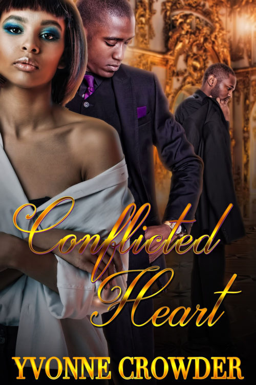
The story is a Urban Romance Fiction which targets Females 25-35. The story is about a female and her longtime boyfriend. Secrets are revealed that rips their relationship apart. As a possible knee jerk reaction she winds up falling in love with a new man. She has to try and resolve her conflicted feelings and decide who she is love with and wants to be with.
Nathan says:
From my perusal of the genre online (since I’m doubly not the target audience), I’ve seen that the covers of urban or African-American romance are generally more color-crowded than for Caucasian audiences. That’s fine, but even within that framework, I think there are things that you could do to make the image “pop” more.
- The figures don’t have enough contrast with the background — the poor fellow on the right gets lost in the wallpaper. Dimming the background, even just immediately behind the heads, would help the people stand out.
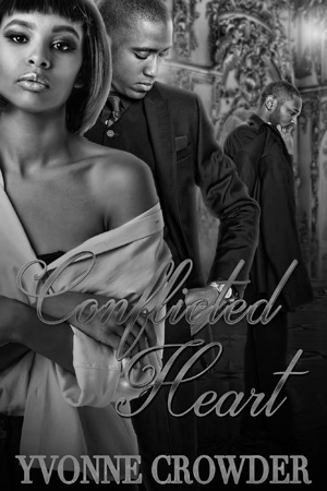
- In the same vein, the title lacks contrast from the background, especially the word “Conflicted.” Yes, they are different colors, but the values (light and dark) aren’t contrasting enough; in fact, the variations in color tend to camouflage the word instead of helping it stand out. You can see that more clearly if you see it in monochrome:
I would lose the gradients in the title, and darken the image ever-so-slightly from the woman’s shoulder on down to let the title stand out.
- The other problem you can see in the title, especially in the word “Conflicted,” is that the letters aren’t quite linked. This is a cursive font; the tails of each letter should run into the next letter completely, instead of having those itty-bitty breaks.
Other comments?


Another thing that bothers me about the guy in back is how weird his hand is. I had to zoom in to see … oh, he’s holding his jacket over his shoulder.
I also agree with losing the gradient on the font – shiny isn’t always better – and yes, do fix the disconnected script in “Conflicted”.
Though I’m not seeing any single major problem here, the many reasons to nitpick I’m seeing might add up to one major gripe for your readers. For openers, while I can appreciate some ethnic authenticity, only the characters themselves should use improper grammar when engaged in dialogue or narrating the story. For authors telling the story in the third person, verbs has to agree with their subjects and prepositions are not for ending sentences with; also, try and use “try to” where informal speakers use “try and” in their sentences.
Though you’ve done a better job than most with your cutting and pasting than a lot of artists we’ve seen on here, the bizarre joint angles and out-of-place lighting on the man’s arm betray your efforts. As others have already noted, the lack of contrast between the title and background makes it somewhat difficult to read in thumbnail, and even trickier in gray scale; and bear in mind on that last point that a fair number of the prospective readers for the electronic version will be using older devices, so they will be seeing this cover in gray scale. While I don’t recommend scrapping the gradient altogether, I do recommend brightening it a lot more and darkening the background behind it a little further to enhance legibility; also fancy-handwriting fonts are notoriously difficult to read even at the best of times, so try experimenting with some other simpler-though-still-elegant fonts.
Finally, bearing in mind that the printing of covers on physical copies of your book might sheer off as much as an eighth to a quarter of an inch from the edges, I’d recommend edging the characters downward and a little to the right to help center their faces vertically and horizontally. They’re the focus of this story, right? So… focus this cover on them as well; and specifically on their heads and shoulders, where people typically focus when dealing with other people roughly the same age and size in real life.
Pretty much ditto everything already said.
The cover is simply too much of a much, with the result that you really don’t take away anything from it. This is especially true in thumbnail size where everything more or less blends together into an overall texture.
I am sure that everything you have included is important within the story, but I suspect that the significance of your cover is pretty much lost to anyone who hasn’t already read the book. Which is putting the cart before the horse.
It is not at all clear to the uninitiated what the relationship of those three people are or what the setting is.
You need to zero in on just what is really important: what gets the theme and nature of your book across in a single glance? A book cover is not meant to tell the story, it is meant to attract and intrigue.
In other words, simplify.
Probably the most serious problem is the choice of typeface for the title. Script can be difficult to read easily in the best of circumstances. Adding shading and shadows only exacerbates this problem.
Again, keep it simple!
Oddly, the thumbnail looks awful; effect that is dispelled when seeing the full size, which is a lot, lot better – but still needing some work.
Thumbnail size suffers especially of the flaws already mentioned, the title is unreadable and the overall gold-colour scheme is a mess. The background I think should be changed altogether, it is just too busy, and the colour is too close to the faces of the people in the cover – if anything, it adds a phantom purplish tint, from the contrast with the strong orange-gold background. As Nathan said, the light-level or value is too similar, which is the main problem – I would still consider greenish or blueish background. It would add depth too, as per colour perspective rules – cold colours look further away than warm ones. Or use a neutral grey, to match the dress, at a different value, either lighter or darker; most likely darker looks better. Title has too many effects all at once, by the way, having a single colour and shadow should be plenty, or a subtle shine, but should be overall a lot brighter to be readable.
What also seems more noticeable in thumbnail is how the couple – the woman, mainly – has their heads stuck in the very corner of the image. There should be enough space to bring them down and a little bit to the right, for a more conventional composition (different is not necessarily better) and still leave space for the third-wheel man, and the title. The title could be a lot higher, without obscuring the detail you want or looking like it is crowding the people.
I think the purple tint on the text is too match the tie and I don’t hate it. Just lightening the shadow on it might be enough. I like the placement and the people too. My concern is for print they are likely to be cropped oddly but ebook it’s fine.