The author says:
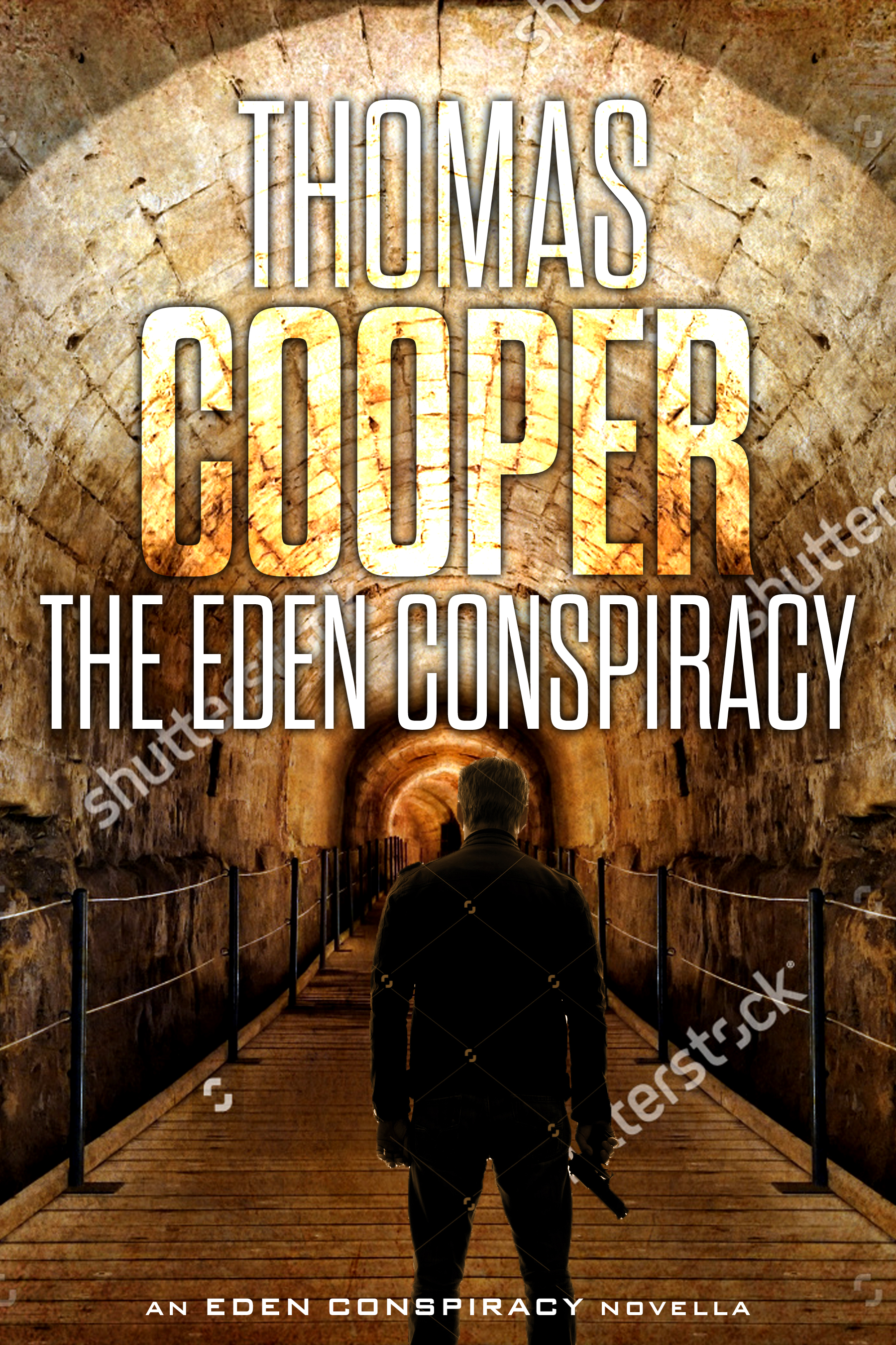
Professional killer Jack Reagan is hired by a mysterious group to kill virologist Daniela Grosskopf and steal a vial of a deadly virus known as the Omega Strain. But when Jack has second thoughts and decides to instead protect Daniela and the virus, he must face off against modern-day Knights Templar seeking to recreate the Garden of Eden. A reworked cover previously shown here (https://covercritics.com/?p=1686). It is a quick mockup using free sample images.
[original submission and comments here]
Nathan says:
Definitely bullseyeing the “international thriller with archaeological overtones” subgenre.
My three comments:
- Make sure there’s enough contrast between the text and the background for it to be readable; as you can see in the thumbnail, even the largest words on the cover tend to blur into the background. At the very least, add an outline, drop shadow, or dark outer glow.
- I’d suggest more space between byline and title. Having them so close together may lead people to believe that “The Eden Conspiracy” is a volume in the”Thomas Cooper” series.
- You’ll want to play some more with the size relationship of the gunman to the background — some people might realize, given the relative size of the man to the handrails, that we’re dealing with an armed hobbit here.
Other than that, well done.
More comments?