The author says:
It’s a technothriller, but its primary target audience is probably women and girls.
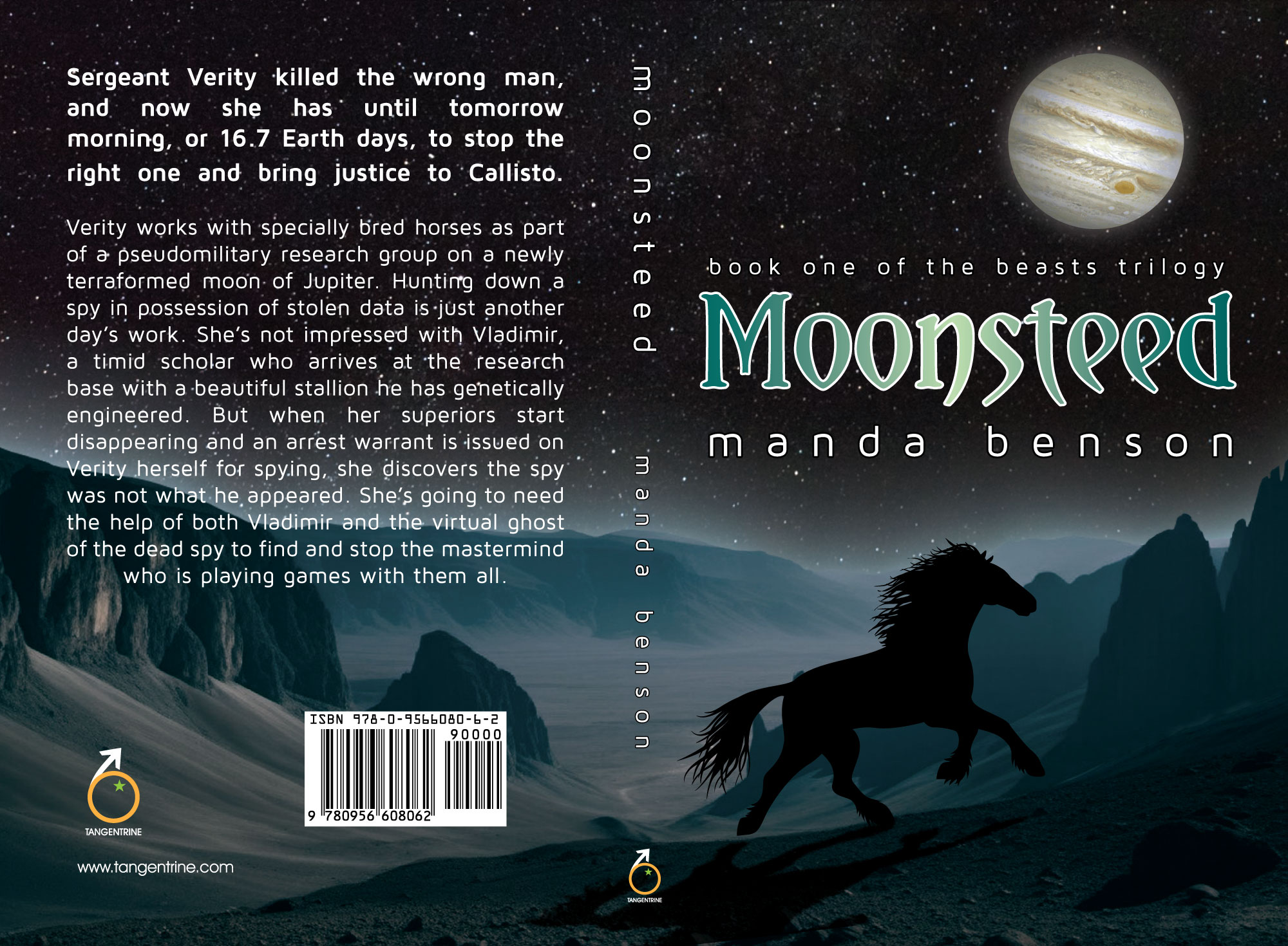
Nathan says:
I’m very confused. You say it’s a technothriller, but your front cover is entirely any like any technothriller ever… and your back cover description, while involving espionage, is very clearly SF.
There’s at least a little SF in your front cover imagery, but only if the potential reader lingers long enough to see that that’s Jupiter in the sky, not just the moon.
There’s nothing wrong with the techniques by which the cover is rendered, but it doesn’t succeed in giving anyone in its target audience a signal that this is a book they’d want to read.
It really needs to scrapped back to the concept stage.
The design is pretty nice. There are just a couple of issues. One is an overall murkiness: the cover art needs a little more contrast. Another is a problem endemic to silhouettes: they tend to be black holes in the middle of a cover. Having your horse as a silhouette adds nothing significant to the cover while at the same time you lose a chance to convey a sense of its personality and character. You might want to also suggest the alien setting a little more explicitly so that it comes across immediately at a glance: you don’t want to depend on everyone recognizing Jupiter for what it is. (By the way, speaking as an illustrator who specializes in astronomy you might want to take a look at your Jupiter. Seen from Callisto it would be more than 8 times larger than a full moon here on earth.)
I’d recommend adding some rings to the moon, (they can be very subtle you just want to know at a glance that isn’t supposed to be the moon) some glow to the sky and ground and some light to brighten up the horse. Not the entire horse but you want to highlight it. A moonbeam would work to connect the 2 separate images. I’d also recommend changing that font for a more thriller and or sciency type font like the one used on author name.
It’s a competently assembled cover, but as mentioned it doesn’t convey the setting or nature of the story.
The technical inaccuracies aren’t helping.
Jupiter would appear much larger in the sky and I believe the spot would appear more along the middle as Callisto orbits.
Also, even if we could terraform Callisto the surface would not resemble parts of Earth or Mars. It’s completely riddled with impact craters and has little or no geological activity.
Callisto isn’t being bombarded by Jupiter’s radiation like the closer moons, but the lack of orbital resonance also means no tidal heating, and the Sun is too far away to rely on the greenhouse effect. That means well insulated habitats producing their own heat are required (Underground?).
I’ll concede that this is excellent artwork for the cover of a fantasy novel, but a techno-thriller? If not for Jupiter being up in the sky (something that’s not immediately noticeable to any casual browser looking through thumbnails on a sales site), I would never have guessed this was anything else but a fantasy. Even seeing that detail now doesn’t really give me any reason to think otherwise.
While the technical inaccuracies “ccparticipant” notices aren’t really detracting from the cover (outside a few hyper-competent astronomers in academia and maybe NASA who are absolutely enthusiastic about their chosen occupation, how many in the great masses of casual readers of techno-thrillers and other sub-genres of science fiction would even know about those obscure astronomical details?) that much, it remains that a horse on a wind-swept rocky and sandy landscape even when the celestial body in the sky happens to be Jupiter still speaks more of fantasy than anything the least bit “techno” about the book’s potential contents. You’re running into the same problem that dogged Orson Scott Card when—as a young adult just getting started on his professional writing career—he submitted the manuscript to a story he’d written about a guy on a distant planet with telepathic powers to one of Ben Bova’s monthly magazines, only to have it returned to him with a friendly rejection letter saying the staff appreciated the good writing and hoped he’d submit them something else sometime, but they published only science fiction, not fantasy. After he got over a mild fit of rage at them for rejecting his story (which was too science fiction!) and took a humbler and more sobering second look at it, he came to realize that for all the setting (colony in another solar system) might be typical to science fiction short story, absolutely nothing else was: all the colonists in his story were living at little more than a medieval level of technology, mostly in houses of wood and clay; and in that context, the protagonist’s telepathic powers were more like magic to them (and to the readers) than any kind of technology.
In other words, it was—in fact—a fantasy, and he probably should have submitted it to some monthly fantasy publication (if there was any such) instead. Now, from your summary on the back cover, I can see that your story is in fact science fiction (under the categorical umbrella of which—yes—a techno-thriller certainly is a fairly popular and well-known sub-genre). The question here is whether your cover’s artwork makes this immediately obvious to the prospective reader casually browsing a sales site for something fresh to read, and the answer—alas—is: no, it doesn’t.
While it’s true that the common stereotypical thinking among readers and writers of fiction in general is that men prefer science fiction while women prefer fantasy, and moreover that these stereotypes are not entirely unfounded (men do tend to be the majority of the target audience for all things science fiction while women likewise are typically more into all things fantasy), the authors and target audiences for both genres have always rather freely cross-pollinated with each other thanks—in good part—to the powerful fantasy writings of men like J.R.R. Tolkien and C.S. Lewis and the brilliant science fiction writings of the likes of Mary Shelley and Alice Mary Norton. To this day, many brilliant authors of both sexes—including the aforementioned Orson Scott Card and his colleague Octavia Butler—write plenty of stories for both genres, and have many fans who will gladly try something from the genre that—supposedly—belongs to the other sex if one of their favorite authors wrote it. If it turns out male readers find your writing—which you say is deliberately directed toward girls and women—too “girly” for their tastes as you may expect, or—conversely—if more boys and men than girls and women come to like your story and be fans of your books nonetheless, you and your readers will just have to learn to live with that outcome; a fat paycheck from your book sales and fans from one or the other or both sexes finding your story so gripping that they can’t put the book down until they reach the end should greatly mitigate any of your and their consternation over whatever results from its publication.
As to the cover, well, I hate being the bearer of bad news: it is indeed a well-made cover with good artwork, but it’s not the right one for your book. You’ll have to start over with an image that specifically says “techno” and not just “set on another planet,” since—as Orson Scott Card learned the hard way—that plot point by itself doesn’t automatically make it science fiction. As he explains in his book How To Write Science Fiction & Fantasy, the fundamental difference between the genres is only this: if (in-universe) you can do some impossible thing by chanting a spell or rubbing a talisman or praying to a tree, that’s fantasy; if you can do the exact same impossible thing by pushing a button or throwing a switch or crawling into a machine, that’s science fiction.
What this specifically means for your cover is that, while it should definitely have a horse on it and nothing necessarily forbids it from having that wind-swept dusty and rocky landscape lurking somewhere in the background, what this cover really needs is some equipment from the genetic lab where the protagonist Verity’s colleague Vladimir engineered that beautiful stallion and/or the military moon base where she and her pseudo-military research group are (if I’m reading your summary right) researching genetically enhanced equine animal husbandry. Show us futuristic-looking computers and machinery and metal walls with rivets, even if most of the research in the actual story takes place in stables that look very much like the ones we already have here and now on Earth. In fact, even if your story specifically indicates the military base and research lab on Callisto is no different in appearance from anything we’ve got here and now on Earth (though I can’t imagine why you would write it that way), don’t be afraid to engage in total artistic license (which is a fine-sounding euphemism publishers typically use to mean their cover art is brazenly lying to the target audience); movie posters for science fiction films since The Forbidden Planet (and probably even earlier, for that matter) have gotten away with showing stuff that never actually occurred—even in deleted scenes—in the movies they advertised absurdly often, and so can your cover.
Bottom line: if you want to sell a techno-thriller set in the future, show your prospective readers futuristic technology. Whether it’s stables with tech-strewn riveted metallic walls that look like something from the Death Star or a horse in metallic restraints hooked up to futuristic machines monitoring its vital signs standing on a platform in the middle of a high-tech science lab, or just horses bedecked with a circuit-laced saddles, stirrups, and bridles/halters, show the readers tech. Give them something to indicate that whatever currently impossible feats your protagonist and her colleagues can achieve in their time (e.g. that “virtual ghost” you mentioned in your summary), they do it through tech; that’s what makes this a techno-thriller.
Jeez, RK — I can’t wait for Chapter 2!
Heh. Pardon my verbosity on these subjects that inspire such enthusiasm in me. You should see the kind of “short” stories I write when inspired in this manner.
Yeah, nope. This is completly not working for me. The only remote hint that this is sci-fi is the font and even then, as that font’s been overused a bit, it’s not a strong tell.
The horse’s silhouette (as a horse person, FWIW) is not doing anything for me. Kinda looks like a half-Friesen Feral. And the back is flat, to be picky. If you’re going to talk “Beautiful stallion,” then perhaps using a headshot, or…? might get that across better. (Is there a specific breed involved here?)
I agree with the others about the landscape. I feel like I stopped my car in Utah during a night drive. Nothing there says Jupiter or anything else non-Terran.
I like RK’s idea about bedecking the wondrous stallion with future tech. That could be awesome. And it would clearly establish the genre and the like.
And please, spend some more time investigating fonts. There are some lovely sci-fi fonts out there now. Blackpast, Grid Regular (Might be just right for the premise here and a bedecked-with-tech horse…)…many. Take your time. You’d be shocked at just how crucial the font conveying the genre (or at least, not closing with the message from the cover art), really is.
Sorry, hope this helps.
I believe you have a good start. You have the elements you want in there that tie to the story, which is good, but they could be used more effectively.
I do agree that the overall cover is too dark and that Jupiter is too small. At first glance, it simply looks like the moon. There’s not really anything about the landscape that suggests it’s a terraformed alien moon. There needs to be a bit more contrast to make things stand out (ie, light vs dark). You don’t necessarily want 100% light against 100% dark, there do need to be midtones. You have some midtones in the distance of the moon, but not enough. Things tend to print darker than they look on the screen, and the screen preview is already really dark. Also, I would play into color a bit more. Jupiter looks a little dull and the way it’s pasted kinda looks like an old science textbook cover. I would also consider actually painting it in, rather than using a photo. That’s part of what’s throwing the look off. You have a tiny planet photo, a digitally painted landscape, and a crisp black silhouette. I would experiment with either going all crisp outlines for everything, or all digital painting for everything. The horse could use some rim lighting and/or reflective light to suggest 3D form, rather than a cutout stuck on top of the landscape (if you go with something that isn’t just crisp cutouts). You might toy around with making Jupiter so large you don’t see much (or any) outer space behind it, and place the horse silhouette in front of that. You could include some of the landscape, plus maybe add some sort of building/ship/whatever structures you have on the moon to show that humans have built there. This does just look like a desert valley with a horse. Is there something about the horse you could use to show it is not a normal Earth horse? Do they have glowing eyes, or any other un-natural elements that show they have been modified? This does seem a little more fantasy than sci-fi, especially given the synopsis on the back. I like your sci-fi fonts and the green color, but they are the only thing that look particularly science-y. You might consider leaning more into the computer side of the story. Maybe the horse could have lighted outlines, like something from Tron? A cybersteed. Even if they aren’t cyberkinetic in the novel, it would convey the sci-fi aspect much better. Overall the cover will appeal to horse girls, but not to sci-fi readers looking for sci-fi. It looks more just like a horse western until you start looking closely. A book cover should reveal the genre and overall tone/theme of the book without looking closely. You should be able to see it from the next aisle over in the bookstore and go “Oh! Space horse novel!” or “Oh! Sci-fi thriller! With horses!” I recommend looking at other sci-fi and thriller covers to see what all elements you could incorporate.
Overall, you have a good start! This is definitely something you can build off of, and you can still make a great cover without even fundamentally changing what you have, just improving on what’s already there! The style feels very nostalgic for me, it looks like something I would have picked up in jr high or high school.