The author says:
An epic fantasy set in the medieval world of Fareldin. The story follows a man content to die, who begins to find new meaning as he helps a kidnapped teen girl return to her fiefdom. But protecting her may prove fatal as dark plots threat All because he can’t say no to his wolf. This book would appeal to adult readers of Tolkien, John Flanagan, and Micheal J. Sullivan.
Nathan says:
While there’s nothing specifically wrong here, it’s very murky, and strikes me more as a gritty medieval historical novel (or, at most, grimdark fantasy) rather than epic fantasy. And at thumbnail size, it all fades into a gray that can be easily overlooked in favor of the book covers that will appear to its left and right on Amazon.
My advice: Up the contrast, crop it so there’s less gray space, and keep looking at fonts until you find one that gives a more epic feel.
Other comments?
The basic idea is very nice…but the murkiness and lack of contrast are working against the cover. I think you can keep the mood while still bringing out the characters more.
I agree with the contrast comments. Also, the typeface is not working for me (not to mention the kerning). Should the top say “Book 1 of the…”
Oh, good catch! I completely spaced putting book 1! I’m not attached to the type face. I’ll go back to the drawing board and pick some different ones to try. Is there one that comes to mind for you?
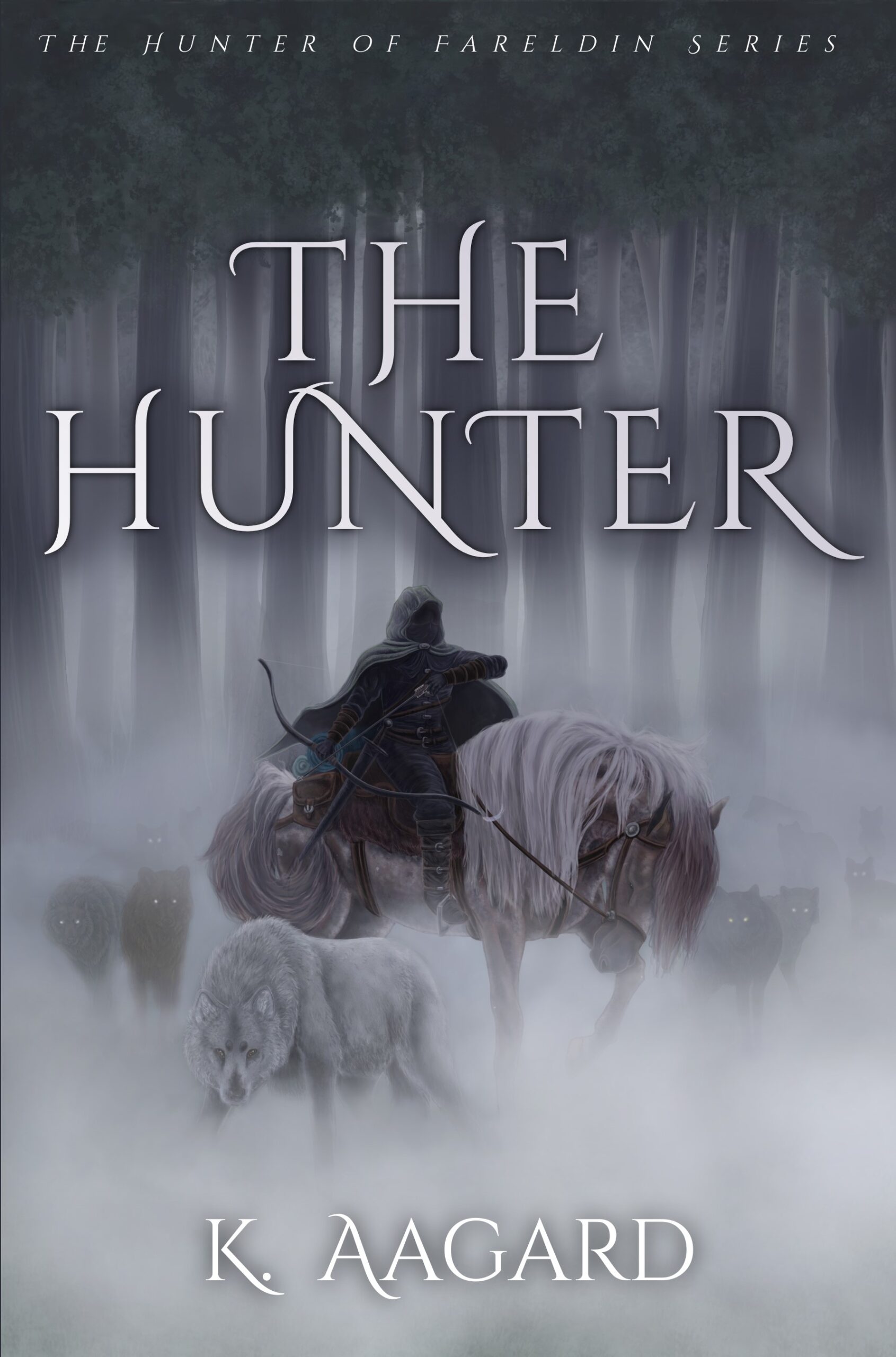
Good things —appropriate overall impression and fits the genre. The lack of contrast isn’t that critical because the type is readable and gives the feel it’s set in a frozen wasteland. The font is ok —also used in the fantasy genre.
Needs work —the rendering of the art itself appears like poorly executed AI. Sloppy hands and feet, body shape, arm position that at first looks like a stump. Same with the horse’s hindquarters that looks swirly, maybe suppose to be a tail? Also, is it me or do you see a dog’s face under the horse’s mane?
Not AI, I have all 500 layers to prove that. I’m just terrible at drawing hands.😂 For the life of me I can’t find the appearence of a wolf face in the fog aside from the ones I drew and highlighted with eye shine. But I plan to lessen the around the face and legs more. Once your brain sees a face it will never unsee it, I dont want a phantom wolf just chilling waiting to throw the image off for someone.
I will also fix the swishing tail since it causing confusion.
Sorry for the AI assumption. I’ve seen a lot of AI renderings really screw up the hands and feet, just like many artists. I can’t imagine 500 layers (or was that simply hyperbole?
Overall, I think you’re close to it presenting well, just needs some work.
Last I checked it was 500 or so. I’m terrible at layer management. No offense taken, AI is rampant these days. I appreciate the feeback!
FWIW, Joann:
I, too see the…face (?) or something in the mane. I don’t think anybody else would–you have to really be looking but yes, there’s an arrangement of mane hair there that just…forms a face or head shape or something. 🙂 Just thought you’d like to know, nope, you’re not crazy.
The swirling/swishing tail also creates an optical illusion, but I haven’t quite sorted out what that is.
I checked out the covers of your comp authors (not Tolkien, his covers are a Special Case) and they definitely have more contrasty, eye-catching covers for the most part (and even the less contrasty ones have distinct shapes). So maybe either go for sharp shapes or more contrast.
As for the text, I see you’re using Cinzel Decorative. If you know how to fix the kerning, I’d suggest doing that for the H and E in lowercase and just use caps for the T in The, H and R as the caps R has that nice swashy bit. The rest of the caps are too swashy, imo. Look at your comp authors’ covers–they go easy on the swash.
My reply didn’t go through. 😕 Thank you for the feedback. I’ll be upping the contrast and sharpness of the image. I’m not attached to the font and will test others. Do you have a possible font I should try?
Cinzel is a fantasy standard for a reason (and not just because it’s free, haha), so it could definitely work for you. I’m linking to an image that shows your title in different fonts, you’ll have to search the internet to double check if they’re free for commercial use (I buy way more fonts than I should(!) and can’t always keep track.)
1. Cinzel Decorative
2. Brilon
3. Herina
4. Lucy Rose
Herina might give too much of a YA or Fantasy Romance vibe, but it’s a lovely swashy font
Lucy Rose has quite a few stylistic alternates so you can play around with those.
https://imgur.com/a/ggw7BsS
Here’s my feedback. Hope it helps.
1) The illustration isn’t perfect, but can work for a book cover IMHO.
* If tweaked, it could communicate genre and tone. In fact, unlike the first commentator, as I looked at it I was thinking “epic fantasy.” But more like Farseer than LOTR.
* Sure, the hands and feet may be too “blocky” for fine art, but do readers REALLY pay attention to those details when scrolling through Amazon? Designers, yes, but not most readers.
We’re creating book covers to market our works, not stand-alone museum pieces!
2) Typograghy needs work.
* I’d switch to an easier-to-use typeface in a dark hue for the fine print.
*The title font is interesting, but needs kerned. Or changed.
* If you keep the font, use the upper and lower case, as you did for your name and subtitle. You will still need to kern (even the “The” on the subtitle makes my eyes bleed!). However, all-caps would require creating ligatures, especially between the U & N. Sharp, elegant ligatures take a lot of work!
3) I’d prefer some color contrast.
*The image has a blue-silver cast… at least on my knock-around laptop in Starbuck’s lighting. Me, I’d tint the image more blue (color overlay) and then play with some glints of a contrasting orange or the red/yelow triad to make elements pop.
*I use color.adobe.com, which analyzes images and provides suggestions for complementary and triadic color combinations. It’s not perfect, but usually steers me right.
5) Tonal Contrast.
* Everything seems a little high-key and bright to me, which makes details hard to make out. Some deep shadows and darker mids will make the brights pop.
Good luck! You have a decent start here, better than most authors making their own book covers. Itjust needs tweaking.