The author says:
“APOLLO DREAMS: The Space Case Chronicles, Volume 1” is a coming-of-age novel set in 1970, juxtaposing the real-life challenges of a young boy named Billy McBride with his vivid space adventures as Captain Apollo. Set against the backdrop of the Apollo 13 launch, the narrative seamlessly blends historical events with a rich imaginative world. This dual narrative offers a unique exploration of family dynamics, bullying, and the power of imagination. Targeted towards middle-grade to young adult readers, the story would resonate with fans of authors like Madeleine L’Engle, Roald Dahl, and E.L. Konigsburg, who weave reality with elements of fantasy and adventure.
Nathan says:
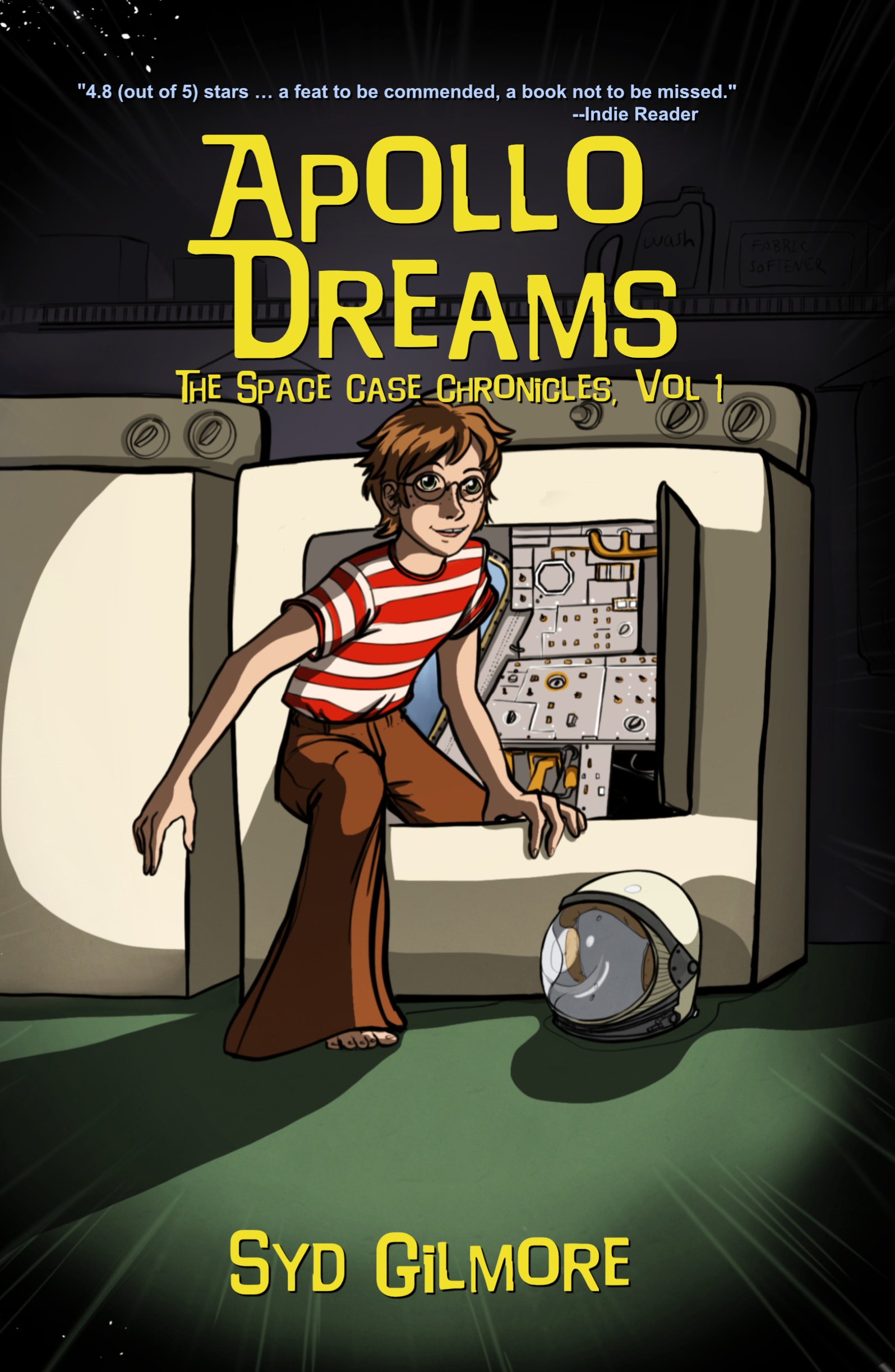
No pun intended, but there’s an awful lot of empty space here. Given that most of your potential readers will first encounter your book as a thumbnail on Amazon or some other ecommerce store, you would be well served by maximizing what they can see in that tiny real estate.
If you crop it like this, you lose no detail at all, and instead maximize what readers see:
My second suggestion would be to double the spaciness. Until you zoom in, you don’t really notice the instrument panel in the washing machine (there’s a sentence I never thought I’d write). So bling it up! Add glowing Christmas lights to the panel, put a Saturn-like ring around the title, anything so that the science fictional nature of the story is instantly apparent.
My third suggestion: Between the striped shirt and the glasses, your protagonist looks like the lovechild of Waldo and Harry Potter. That may be intentional, but if not, at least change the color of the red stripes. (And the shadows on his face are a little distracting.)
Other comments?
I will have further comments later, but his left hand–hands don’t really work that way. His left arm would be turned rather awkwardly, IMHO, to achieve that position and there’s no real explanation as to why it’s that way. Caught my eye immediately.
His left hand is also huge
I agree with Nathan about the cropping. That being said, I didn’t realize that was a washing machine until I saw it pointed out. With the front of the machine spotlighted and the rest in shadow, my focus was on the door and what lay behind it.
I would delete the quote. A blurb from an anonymous reader doesn’t impress me much.
Psst, Ron, I suspect that he means the “Indie Reader” website. https://indiereader.com/
Could be wrong, but…your reaction indicates that if he does mean that, he needs to make it more obvious that it’s IndieReader.com and not “an” Indie reader.
I definitely agree with Nathan about the cropping. The typeface is fun, but I think it’s all a little too bunched together.
I like the layout of the boy coming out of the washing machine, but if I’m being honest, I don’t like the artwork all that much. Can you get a different illustrator to redraw this same design?
Mainly, I’m seeing a lot of “dead space” on the bottom and not quite as much on the top. Cropping it as our esteemed host suggests might work, or you could swap the title and byline so each fits its area better. A third alternative would be to tilt the “camera” up (i.e. draw a little more stuff at the top of the cover and slice off the bottom) so the “dead space” in each area is more proportional to the title and byline filling it.
Also, yes, my colleagues are right about the character’s left hand: it’s disproportionate to the rest of his anatomy (i.e. it’s too large) and he really ought to be gripping that edge the other way, which is to say with his thumb in front and the other fingers behind the edge. Moreover, while kids really were wearing tacky clothes like that in the 1970s (I’ve seen the pictures; I know this for a fact), it would indeed be a good idea to change at least the color of those stripes so they don’t remind people so much of Waldo. Maybe turn them brown, or—depending on how much of a fashion victim your character is intended to be—maybe make them multi-colored stripes like something you’d see on a Life Savers’ candy roll.
i think everything that needed to be said about layout and cropping has already been said. as far as illustration goes, it isn’t clear where your light source is and that makes it distracting. if you’re going to do ambient light, that’s fine, just tone down the intensity of the shadows. if you want to do directional lighting, i’d suggest deciding on a single light source, then decide the front and back of each of your objects, and do your shading from there. your character’s face definitely gets too muddied with the shadows like that because there’s way too much detail packed into one area.
Also: Despite several people now saying it, that thing STILL does not look like a washing machine to me. Can’t see it. FWIW.
Really? It’s the dials on the back that really cement it.
Maybe there should be a sock hanging out 🙂
I also didn’t see the washing machine until it was pointed out. That said, I’m not certain it is supposed to be a washing machine, or if it is, why it has weird hardware inside where the drum should be. My assumption was that the kid had stowed away on a fictional Apollo mission and had hidden behind an access panel.
I agree with others about the Waldo similarities. I also don’t like the brown bellbottoms. I lived through that era and although I am sure brown (probably corduroy) bellbottoms were available, I only had denim ones, so it looks odd to me. But that’s just a nit pick.
Light sources definitely need to be addressed. The kid and the washing machine look like they’re being lit from two different directions and I find it a bit distracting. If the kid is being lit from the right, and we can see the right side of the washer, we should see some more light on that side of the washer.
With the description including “juxtaposing the real-life challenges of a young boy named Billy McBride with his vivid space adventures as Captain Apollo,” I assumed that the washing machine becomes Billy’s imaginary space capsule. I think it’s a good image, if the washingmachineness of it is made clearer.
I like the concept of the boy climbing out of he washing machine, but it needs a LOT more work. Needs to be instantly identifiable and all that. But I do like the idea, if it can be adequately executed.
Umhum…all it needs is the blue police-box light at the top…..
Where’s Harry?