The author says:
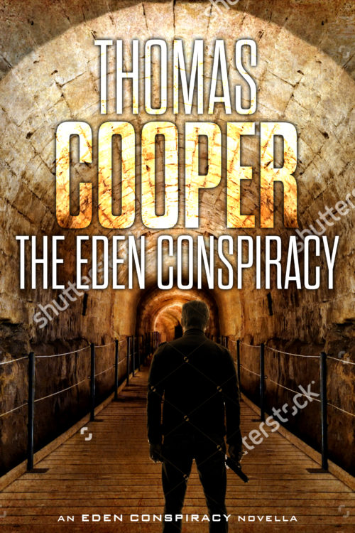
Professional killer Jack Reagan is hired by a mysterious group to kill virologist Daniela Grosskopf and steal a vial of a deadly virus known as the Omega Strain. But when Jack has second thoughts and decides to instead protect Daniela and the virus, he must face off against modern-day Knights Templar seeking to recreate the Garden of Eden. A reworked cover previously shown here (https://covercritics.com/?p=1686). It is a quick mockup using free sample images.
[original submission and comments here]
Nathan says:
Definitely bullseyeing the “international thriller with archaeological overtones” subgenre.
My three comments:
- Make sure there’s enough contrast between the text and the background for it to be readable; as you can see in the thumbnail, even the largest words on the cover tend to blur into the background. At the very least, add an outline, drop shadow, or dark outer glow.
- I’d suggest more space between byline and title. Having them so close together may lead people to believe that “The Eden Conspiracy” is a volume in the”Thomas Cooper” series.
- You’ll want to play some more with the size relationship of the gunman to the background — some people might realize, given the relative size of the man to the handrails, that we’re dealing with an armed hobbit here.
Other than that, well done.
More comments?


Looks good! Looking at the thumbnail jpg, I suggest that you add more contrast between the author’s name and title and the background image so there’s more clarity at the small size.
Put the author name on the bottom of the cover and the the title on the top. Unless you are already an international bestseller like Steven King or James Paterson or someone well known being done a major publisher knowing full well that the author name will sell the book on the name alone. That is why they do that. If this is your first book from an unknown author put the title up top and your name at the bottom of the cover
It’s a very nice idea, but could benefit from a little enhancement.
In both the full-size image and even more so in the thumbnail, the figure tends to blend in with the background. In the thumbnail especially it all becomes just a dark blot. You need to separate the two better. One possible way of doing this would be to brighten the area immediately behind the figure—for instance, as if there were a glowing light source in the distance.
The type works well enough at full size, but in the thumbnail the only legible word is “Cooper.” I would certainly consider some of the advice given by the others regarding ways in which you might make the text more readable.
The man and background (from which I presume the watermarks will be removed once you’ve settled on these as your figures) do have that Indiana Jones vibe to them, which should help with sales. As others have noted, however, your fonts are tricky to read in thumbnail and the size and placement of your title and byline really need to be swapped. Yeah, I get that you’re proud of your name, and you have every right to be, but the rule when you’re just starting out is that the title comes first.
I would note, concerning the size of the man as compared to the tunnel around him that either he’s a very small man or that’s a huge tunnel. That you want to keep him visible, I can understand, but that we’re only seeing him from the back anyway means nobody’s going to be too concerned if we lose a bit of his head and shoulders in the title and byline. In fact, about the only part of him from the back that’s truly interesting is that he’s apparently carrying a sub-machine gun; as long as your prospective readers can see that, they shouldn’t have any trouble figuring out that this is a somewhat grimmer n’ grittier kind of story than Indiana Jones’ swashbuckling adventures (for all that his movies did have a fair amount of disturbing imagery in them).
By the way, is this book going to be part of a series? You didn’t mention anything like that in your last submission, but that’s what the “Eden Conspiracy Novella” line at the bottom implies. It would be good to let us know when you go making new plans like that; serialization can require more modifications to the design, you know.
I’d either a)flip the title and byline and sizes, or I’d b) put the title up where the VERY BIG byline is now, and move the byline to the foot of the cover. I don’t know who you are, and unless “COOPER” by itself will snag significant numbers of readers (and if it does, good for you, I mean it), you’re sacrificing the title. I truly thought that the name of the book was Thomas Cooper: The Eden Conspiracy, until I looked at it.
And yes, you need to limn the letters or backlight them, in order to get them to standout on the cover, particularly at thumbnail, which is crucial.
Other than that, and the other comments from other posters here about the size of the male silhouette, it’s good.
Generic is in large part a good thing, it just means ‘of its genre’ and you’ve done a good job at signalling what kind of book this is.
But I think it’s a little TOO generic. You need to also have something about a cover that says why readers might want to pick up this book in particular and not the next book down the list with a silhouetted man on the cover (big name authors get away with incredibly repetitive and generic covers because the thing on the front that makes people want to pick it up are the words ‘Lee Child’).
There’s nothing really wrong with any of the elements here but none of them are working very hard. I think you could get a better tunnel photo, one that hints more at a particular setting (put in ‘knights templar’ on Shutterstock and amongst the results are some lovely passageways from relevant churches which immediately have an eclesiatical, atmospheric vibe that sells the theme better).
I also think the handrails in this photo make it inappropriate for a thriller cover. It rather undermines the tension and danger you hope to conveyneat handrails either side (also, on a side-note they throw off the scaling and make our man look like he’s rather wee).
Lots of thrillers use moody shots of their setting place to establish specific genre: e.g a nighttime Vatican skyline implies a Dan-Brown-esque conspiracy thriller. Where is this book set and could you use an image of it instead of the tunnel to lend this book more specificty?
I think you could do with bringing in some graphic element that enforces the exact theme. At the moment, this is definitely a thiller but gives no hints as to whether it’s Bourne or Brown or Nazi Germany. Why not bring in the Knights Templar cross idea you used before as a bit of graphic overlay?
Like this, as a super quick and dirty pass: https://www.kathrynrosamiller.com/single-post/2017/06/07/The-Eden-Conspiracy
Though the whole is far from perfect, I’ve done a couple of other things there that make the cover a bit more striking:
Your large text (the byline at the moment, though I agree with the others that this is the size and place better suited to your title) currently has two problems: it is too similar in colour to its background and it is too similar in lightness. This area of the background photo is already light, and you have put only slightly lighter text over it. It doesn’t really pop. I would up the contrast both by making the text lighter and the background much darker.
There’s no point in this part of the image being light: there’s nothing in it and it saps the atmosphere anyway if the whole tunnel looks brightly lit.
My version may be too dark throughout the illustration now, but your mileage may vary. There’s nothing we really need to leap out at us from the illustration at thumbnail, as long as its generally suggestive of ‘dark, atmospheric action’.
The other thing that changes with what I’ve done is pulling away from your single-colour – almost sepia – look and introducing some sharp colour contrast. Everything being brown/orange makes the book look muddy and dull at thumbnail.
(I’m not sure about the blue town I’ve used for the big text actually, it goes a bit Tom Clancy. As long as you’ve darkened down the background enough you can probably keep the big text in yellow-white.)
This particular treatment of the Templar cross loses some recognisability by cropping it so it might not be the exact use of it to go with. But I do like the way the horizontal bar provides a strap for text (here the title but properly the byline) and I like how the vertical bar sits over the illustration. It lifts a pretty dull image into greater intensity by giving it the James Bond blood-filter-on-camera look.