The author says:
Tag-Line: “Together but alone, Frank and Greta struggle to protect those they hold dear from both real-world mobsters and the unearthly monsters haunting the Rustbelt.”
Blurb: The Sultan, a drug kingpin with otherworldly mojo, is on the hunt, collecting debts. Which sends punk rocker Greta scrambling to save her hapless boyfriend. But all’s not lost. She’s got a wicked pair of Doc Martin’s: superb footwear for butt-kicking. And best of all, she’s got Frank, father of her junior high choir director, an ironworker whom the Sultan mistakes for a dimwitted pushover. He’s not. Because Frank has a burning desire to see his little princess’s youth orchestra concert, and he’ll smash through bedrock to get there… even though he hates that highfalutin Mozart crap. Problem is, Greta and Frank are stuck between a brewing modern-day wildcat strike and a 1966 racial uprising, placing years, firebombers, disgruntled hardhats, beleaguered shop owners, and the Sultan’s horde—dragons, demon bikers, Nazi stormtroopers, and whatnot—between Frank and his seat in the concert hall. Lacking superpowers but full of grit, determination, and moxie, they’ll claw their way back, or die trying.
Frank Meets Greta And The Voodoo Curse is book one of the Shantytown Voodoo books, a trio of stand-alone a character-driven magical realist novels. This novel addresses racism and the hard-scrabble life of America’s working-class using (and abusing) tropes from urban fantasy, horror, and crime fiction.
Nathan says:
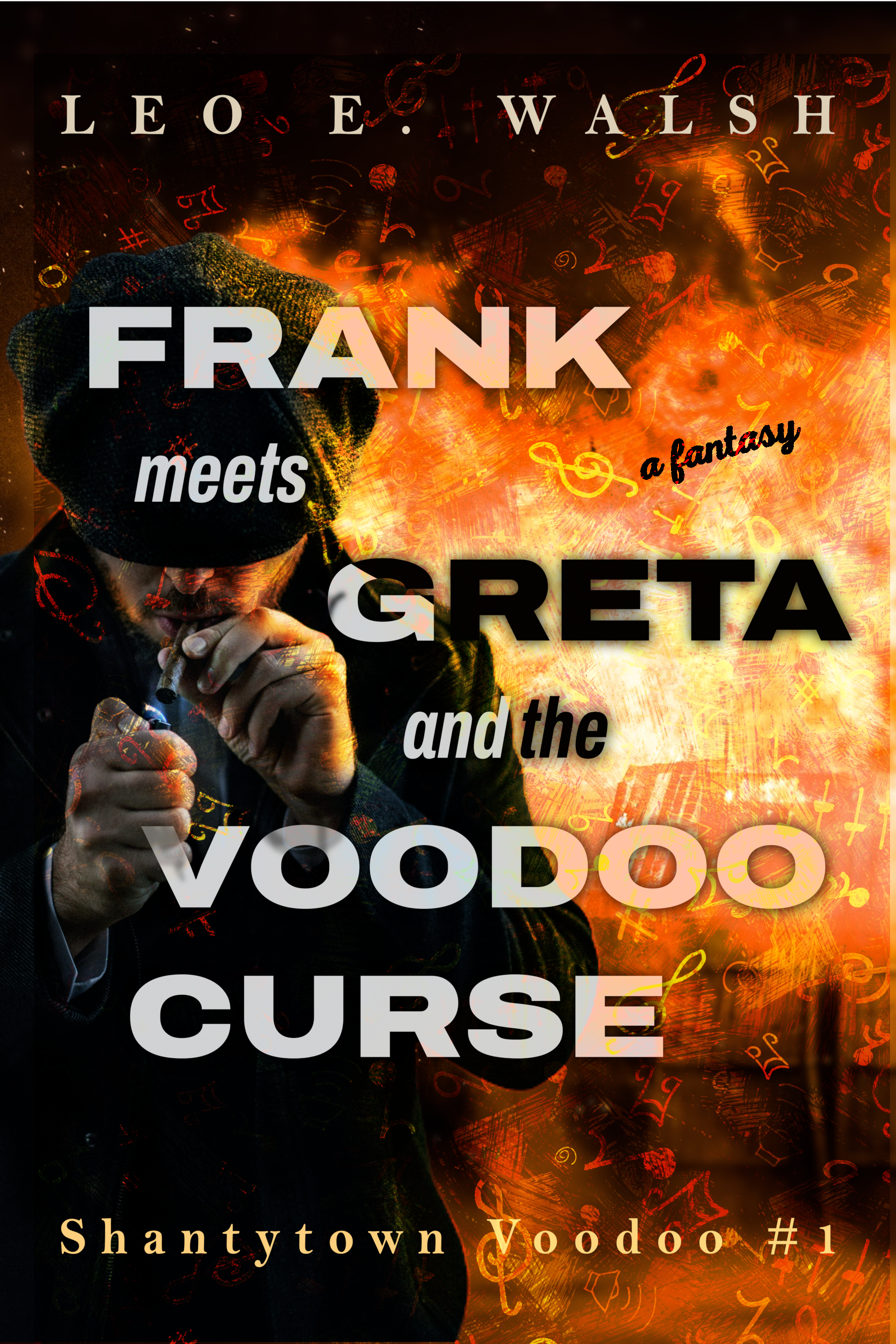
I like the image, but the type treatment (a) is a complete impediment to reading comprehension, and (b) messes with the image beneath it.
Two-toned type is always tempting, but I don’t see one use in a hundred that isn’t a problem.
My suggestion: Right-justify the title and leave it all in light tones. That alone will do wonders for the cover.
Other suggestions?
The art is great and the type almost works. I don’t mind the two-tone too much and I kind of like how it wraps around the figure’s head and hands…but the placement still seems haphazard.I would move “meets” to the right and not have “Voodoo” overlap the hand. “a fantasy” could be handled much better.
this needs something more like this
https://imgur.com/a/59AyB4S
don’t be afraid to mess with the font sizes and fix the spacing(kerning) by hand if needed.
(I’d probably lengthen a few of the stokes on Frank and Greta too and maybe even stagger them more)
I’d recommend a serif font for the ‘tarot’ vibe. (I used cobblestone and Chiller)
I loved the music notes so would add them back after making sure your text was readable
I agree with the others: the underlying image is just right for this kind of novel, but the titles and byline are cluttering the cover and making it look far busier than it needs to be. Considering that most of the “dead space” in the picture is to the right, that’s pretty much where all the book title’s text should be going too. The text in general doesn’t need to fill the cover, just be large enough to be legible and compatible with the cover’s overall style.
Also, since the cover image is more than sufficient by itself to make the genre and tone of your work known, the words “a fantasy” are redundant and should be cut altogether. Even if the somewhat over-saturated orange wash combined with the “gritty” image of a working class guy lighting his cancer stick didn’t give away which particular genres were being mashed up here, the part about a “Voodoo Curse” in the title would certainly point to the story’s lowly setting (maybe a slight surprise that it’s in the Rust Belt rather than—say—the slums of New Orleans down in Louisiana, but urban fantasies have always been about transplanting tropes about magic into places where you wouldn’t normally expect to find them) and potential racial tensions (Voodoo being known to be decidedly African in its origins, and most of the Rust Belt’s population being decidedly… not very African). You don’t need genre labels or a tagline at all when the image and title are already doing most of the legwork for you; try not to look like you’re trying too hard, know what I’m saying?