The author says:
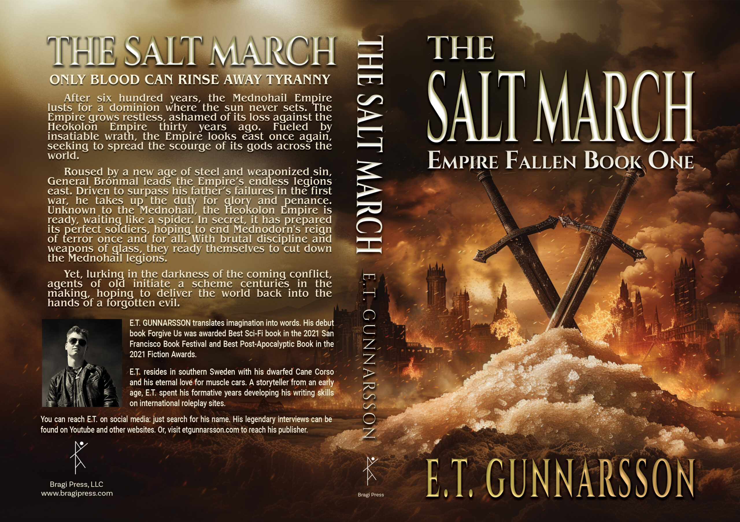
ONLY BLOOD CAN RINSE AWAY TYRANNY
After six hundred years, the Mednohail Empire lusts for a dominion where the sun never sets. The Empire grows restless, ashamed of its loss against the Heokolon Empire thirty years ago. Fueled by insatiable wrath, the Empire looks east once again, seeking to spread the scourge of its gods across the world. Roused by a new age of steel and weaponized sin, General Brónmal leads the Empire’s endless legions east. Driven to surpass his father’s failures in the first war, he takes up the duty for glory and penance.
Unknown to the Mednohail, the Heokolon Empire is ready, waiting like a spider. In secret, it has prepared its perfect soldiers, hoping to end Mednodorn’s reign of terror once and for all. With brutal discipline and weapons of glass, they ready themselves to cut down the Mednohail legions. Yet, lurking in the darkness of the coming conflict, agents of old initiate a scheme centuries in the making, hoping to deliver the world back into the hands of a forgotten evil.
Nathan says:
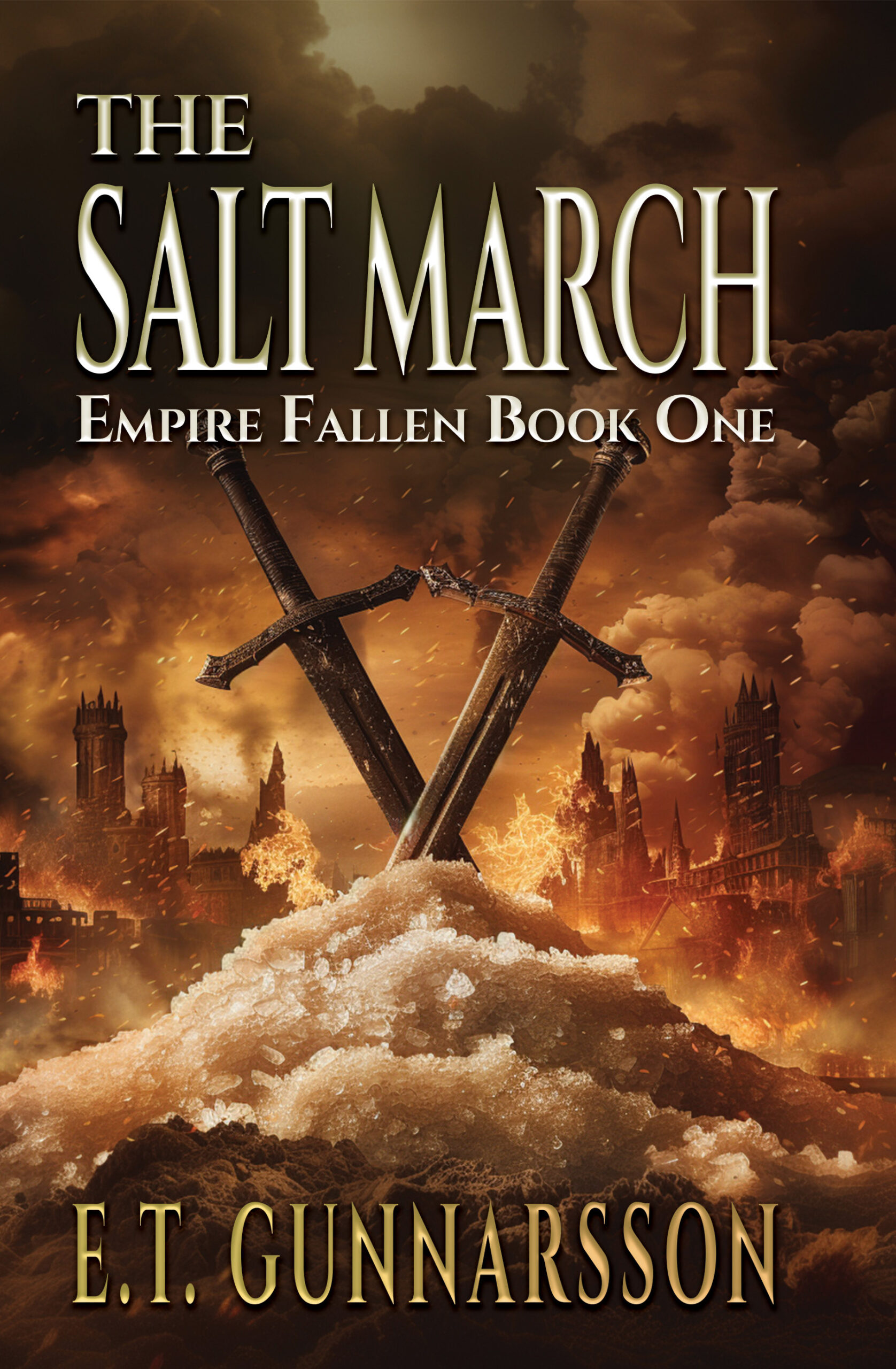
The first thought I had was, “Lower the swords!” Pull them down so that the text doesn’t overlap the pommels. All we’d lose is the bottom edge of the pile of salt, which isn’t essential visual information.
Anyone else?