After consulting with his readers, the author has determined that this is indeed YA.
[original submission and comments here, under an earlier title]
Nathan says:
It’s a very professional cover. I think the only things missing are signposts that indicate at least one of the eras in which it takes place (1942/1959). My first ideas are a letter on his jacket, or banners on the wall, or a 45 RPM record player on the side table. I think you could play with using a military-style stencil font for the subtitle.
Other comments?
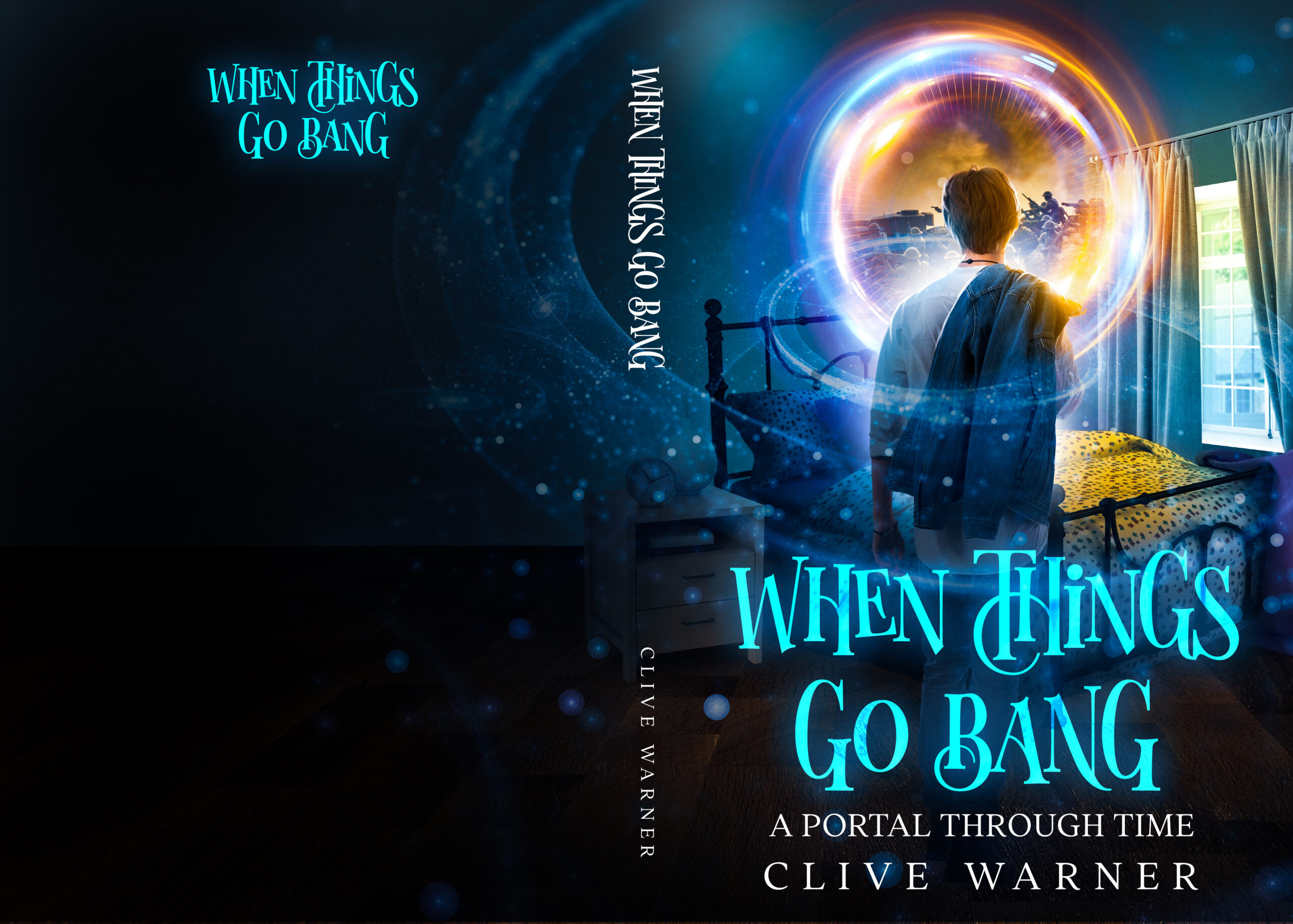
It’s looking pretty nice. There are only a few things you might want to take care of. In no particular order:
The typography is a little over-elaborate. I would at least eliminate the swash in the H in “Things.”
The mix and match perspective makes the art look a little wonky…and cut-and-paste. The bed and window don’t look like parts of the same room.
The bed looks a little odd with one half brightly lit and one half not.
The battle inside the portal takes a very close look to make out. This is something a casual browser is not going to take the time to do…and it is not going to work at all at thumbnail size. You might want to try to find an image that works more immediately.
Good points esp about the bed and window… I will try eliminating the window I think. It looks a bit extraneous.
As I recall, Alamein’s Avenger is both an earlier and later title, as When Things Go Bang was the title originally submitted here four-and-a-half years ago. Again, either title is fine in my opinion. As for the rest of the cover, well… as we say of a lot of covers on the “New Covers For Old” posts over on Lousy Book Covers, “Baby steps, baby steps…”
Your protagonist at the very least looks to be more actively stepping toward the portal into the past than simply reading about that past as on the last cover. My critiques of the portal and color wash remain the same, however: they look more like something from any of a hundred movie posters for contemporary films than anything from the middle of the 20th century. Granted, you can probably get away with using 21st century aesthetics—your younger readers probably won’t scream bloody murder when they find out the story is about a youth from the 1950s as long as they find him to be a sympathetic character—but that’s still a bit of a cheat.
As to the size and visibility of this portal to the past, a comparison I did of this cover with your previous submission shows the portals to be almost exactly the same size. In all likelihood, the reasons Ron Miller isn’t seeing it as clearly in the thumbnail are that A) your protagonist’s head is obscuring a bit more of it than on your previous cover and B) the thumbnail is of the entire cover back-to-front, whereas your previous submission showed only the front cover. While we don’t mind seeing the entire panorama of the cover here, do bear in mind that most of your prospective readers will only be seeing the front cover when initially browsing the sales site, so that front cover needs to be sufficient as a standalone; that said, I believe it mostly is.
What your cover mainly needs is just a little more clarity: something in its aesthetics linking it to the 1950s to broaden the appeal to older readers as well (although—especially if your story has a denouement giving us a glimpse into the protagonist’s living to a ripe old age—the contemporary aesthetics may also be a good way of attracting contemporary youths). You probably should reduce the swirly stuff in the foreground and make it a bit more transparent to ensure you don’t obscure the stuff behind it, and maybe lower your protagonist’s head just enough so we can see what’s going on in the portal behind it better. If you’re going to be selling physical editions as well as electronic ones, some kind of summary and/or promotional splash on the back cover would also be a good idea.
Bottom line: you’re almost there, but you’ve still got a bit of a way to go before you reach your final draft.
Ah yes I still have to complete the back cover, since I’m rewriting the blurb, etc. (thanks to the very useful comments I received). Apparently I’m still not quite right with the genre — it’s a crossover novel, EG Harry Potter. Thank you for your analysis.
This is a huge improvement. Just a couple suggestions:
I agree the H in THINGS needs to be toned day. It makes it hard to read. The subhead needs to stand out more. I suggest making it sans serif and enlarging it slightly. Moving the author name to the top of the cover may also help.
For me, the scene in the bubble needs to be much larger, so we can see what is happening. If you can’t separate the bubble, then enlarge the whole piece of art.
https://ibb.co/GFMkQp4
I have the PSD file and my daughter is Photoshop-fluent so I will ask her. Thank you!