The author says:
1942/1959 historical time portal adventure.
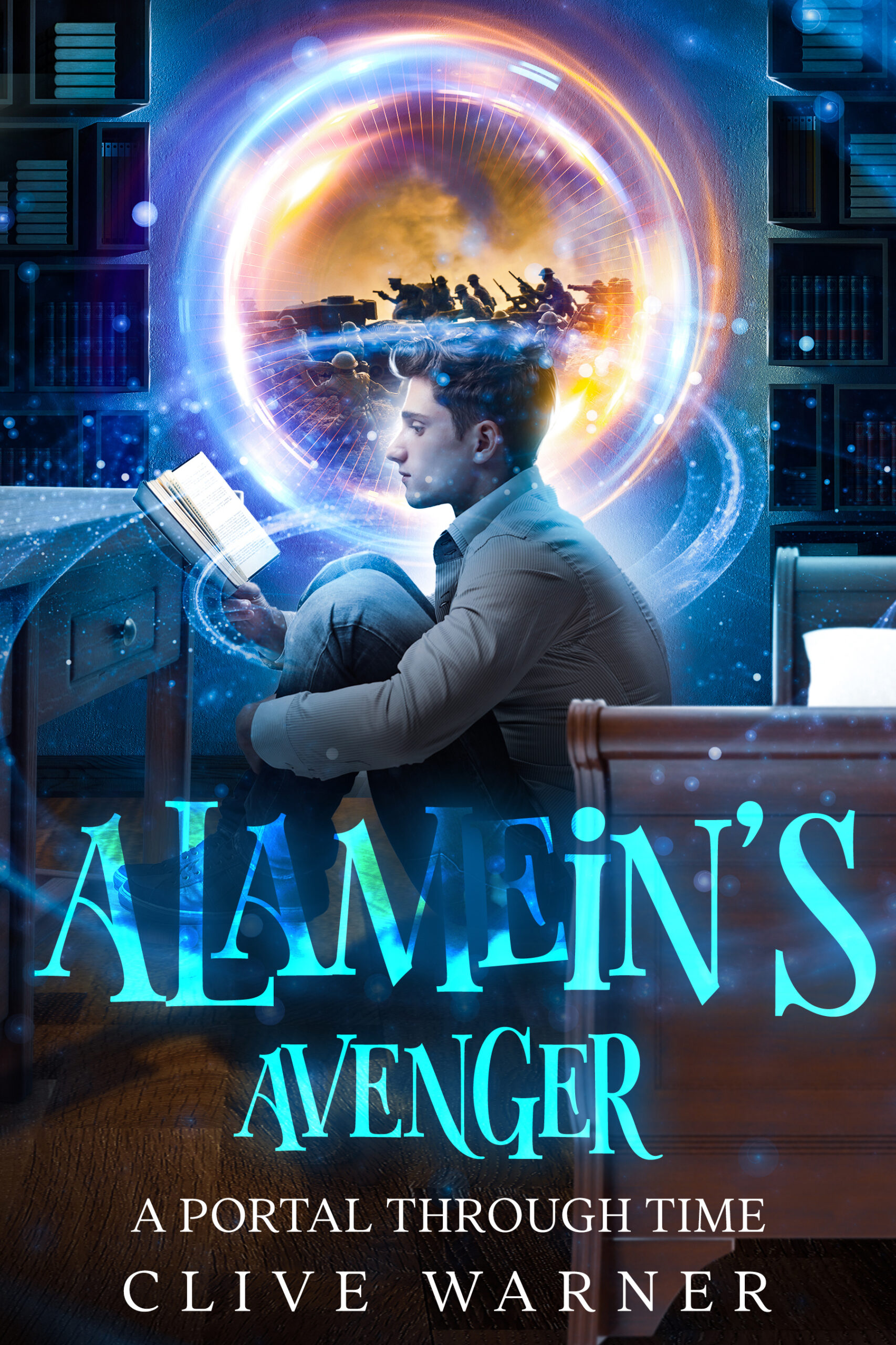
Jim’s parents are on the verge of splitting up, and he’s obsessed with finding a girlfriend. Then dead Uncle Buddy emerges from a stain in the wallpaper and takes Jim back to the Battle of Alamein, to fight in WW2. Buddy helps Jim deal with life’s problems. Back in 1959, Jim runs away and is saved from drowning by Old Beardy, the beach hermit, who acts as Jim’s second mentor to get him on the right track.
Intended audience: baby boomers.
Nathan says:
That last sentence of your description stopped me cold, because this is definitely NOT the cover for a book aimed at baby boomers. It’s got all the visual markers of a YA novel.
I was going to comment on things like the needlessly hard-to-read title or the muted colors of the head in front of the bright portal, but I think that would be rearranging deck chairs on the Titanic. If boomers are your target audience, you need to make this book look like the kind of book that boomers look at and say, “Oh, that’s for me!”
Try some more market research and start again.
Hi:
Yeah, NOPE. I’m a boomer. (67, served during the Viet Nam War, etc.)
The first thing I thought when I saw that cover was either a) MG Reader (Middle-Grade Reader, targeted at 8-12 and up, 2025K words) or b) Young Adult, 12+, 35-45K words, targeted at 12+. I see nothing, nothing at all, for Boomers there. I wouldn’t have glanced at it, other than in a mildly curious professional capacity–like @Nathan, about the fonts.
The model is clearly attempting to convey or channel that new kid that’s playing Spiderman–the one so annoying that I’ve now turned off not one, not two, but three (3!) Marvel-cum-Avenger flicks in a row. I think that most Boomers might find him just as annoying, but that’s who I saw immediately upon looking at this cover. (That one movie with him and Happy the chauffeur/whatever? OMG, I didn’t make it seven minutes.)
Anyway, to me, I’m sorry, I can see that someone was paid to make this and technically, in most ways, other than the godawful font deployment, they have some skill, but to me, this is a trash-it-and-do-over. I just…I just do not see any Boomer or frankly, anyone over about 18 picking this up. Sorry, truly. It’s just completely wrongly targeted, in my humble opinion.
The idea is nice enough…but there’s an awful lot going on—let alone some iffy rendering (that hand holding the book, for instance). And it’s probably needless to point out that the title is unreadable. Aside from the layers upon layers of busyness, there’s actually not much that conveys any sense of the story you describe. I think this cover needs to go back to square one.
I thought that plot sounded a bit familiar: you’ve apparently renamed the book for which you submitted a cover draft some four-and-a-half years ago and gotten some new cover art for it, but this is definitely a re-submit of When Things Go Bang. Well, either title should do fine for it in my opinion. As for your new cover draft as a whole… it’s a marked improvement over that previous submission, but it’s still not quite up to snuff.
I do share some of my colleagues’ opinion that if your target audience is the Baby Boomer generation, your covers aren’t very accurately reflecting your intent: if anything, before I read your summary, I might have mistaken this for a literacy-promoting fantasy novel in the style of The Pagemaster or The Neverending Story written for a slightly older audience (i.e. young adult to new adult). I mean, just look at the imagery: a stuffy looking youngster (though not too young; he looks about ready for college) in a dull gray-and-brown setting sitting and reading a book while a more violent and vividly colored orange-and-teal war scenario takes place in what might be “bubble” or “spyglass view” centered on his head… To me, that fairly screams “Reading about the glories and horrors of the past’s worldwide war(s) has him off in a world of his own!”
Now while the actual plot you gave us in your description is no less gripping than the one I imagined from my first impressions of the cover, it remains that these first impressions are rather inaccurate. Rather than The Pagemaster or The Neverending Story, your story sounds more like the basic “protagonist improves everyone’s life including his own by visiting the past” plot of the Back To The Future movies and Richard Peck’s YA novel Voices After Midnight, with your story specifically setting the protagonist’s present in 1959 and the past he visits in 1942. Also, while the protagonist’s clothing and hairstyle (reminiscent of the Everly Brothers’ look back when they were just beginning to earn their fame and fortune) do broadly hint at his being from the 1950s or 1960s, literally everything else on the cover suggests this book is targeted at today’s youngsters, not Baby Boomers from his time.
That said, to your informing us that your target audience is those Baby Boomers and not today’s youngsters after all, about all I can say is “Why not!?” One very big problem I can see with that strategy is that your intended target audience is very rapidly dwindling: my late mother (born two days before our nation nuked Hiroshima), for one, was in the last weeks of her life when your first submission was posted here; since then, I have seen a significant number of her peers follow her off this mortal coil. On a more positive note, I should point out that those Back To The Future movies, made back before the rise of the internet, appealed (and continue to appeal) to a rather broad target audience: my Baby Boomer parents’ generation appreciated the nostalgia, my generation loved the protagonists’ adventuring, and following generations have amused themselves both with our generations’ nostalgia for those movies and with picking apart those movies’ predictions of the future (and how they mostly didn’t come true); so why not your adventuresome and nostalgic time travel story as well?
If you think your book is a bit too long for today’s rather easily distracted youngsters, just bear in mind that the Baby Boomers thought a lot of my generation’s youngsters were too easily distracted by the shiny new technologies of our time (i.e. color television and VCRs) too. Yet ours was the generation that—in good part—went on to make the ever-heftier tomes of the Harry Potter franchise popular reading and J.K. Rowling an authorial superstar. If you think your story’s subject matter a little too dark or mature for today’s youngsters, bear in mind that I regularly hear complaints these days from the remaining Baby Boomers and from my own generation about how dark these times are and how cynical and jaded the children are already getting to be at such painfully young ages.
In short, I don’t see why you aren’t targeting pretty much everyone over the age of sixteen (or so) with this coming-of-age-while-on-a-time-traveling-adventure story of yours. If it’s all grim ‘n’ gritty stuff, you can probably attract a fair percentage of George R.R. Martin’s fandom (which includes some youngsters who really should not be reading his Song of Ice & Fire novels or watching their Game of Thrones adaptations at such tender ages), and if it’s a lighter and softer nostalgic retrospective through rose-tinted spectacles at two eras that arguably were both pretty dark times for British culture, you can likely attract an even broader audience of all ages who’d appreciate a break from the enforced bleakness and moralizing oh-what-is-the-world-coming-to cant of our time.
In any event, you’ll need to clarify the imagery on your cover a bit more; even if you go for a broader audience as I propose, the aesthetics of this draft are too contemporary (i.e. the CGI swirls around that portal and the orange-and-teal color wash make it look like an advertisement for an exclusively-on-our-streaming-service movie) and too cluttered in general. If you want your book to be retrospective, your cover artwork also needs to look retro.
Make the retro aspects of your cover as winking and ironic as Caging Skies or dramatic and dead serious as The Tin drum as you like, but make them clear and obvious. Don’t make the fantasy and/or science fiction stuff on it look like something out of a Marvel Cinematic Universe movie. Use 1950s aesthetics like those of The Forbidden Planet or the Fallout video game franchise or the like.
I REALLY appreciate your taking all the trouble to write that critique. Very informative. Thank you very much, I will try again.