Category: Covers

The Psychic and the Priest

The author says:

Hidden truths and new found strength have brought this unlikely pair together, and together Annie and Asha are a powerful duo. But will their magic be enough to take on an evil seeking vengeance, willing to do anything to get what they want, even if it means making a deal with the devil himself. Even with new revelations unfolding and new alliances being formed, going up against the powerful demon, Damarcus won’t be easy. Sacrifices will need to be made, lines will be crossed and loved ones will meet their demise as they take on evil in hopes of saving their kind and each other. Will they win or will they meet their demise?

Nathan says:

You’ve got the basics down, but the execution has some problems.

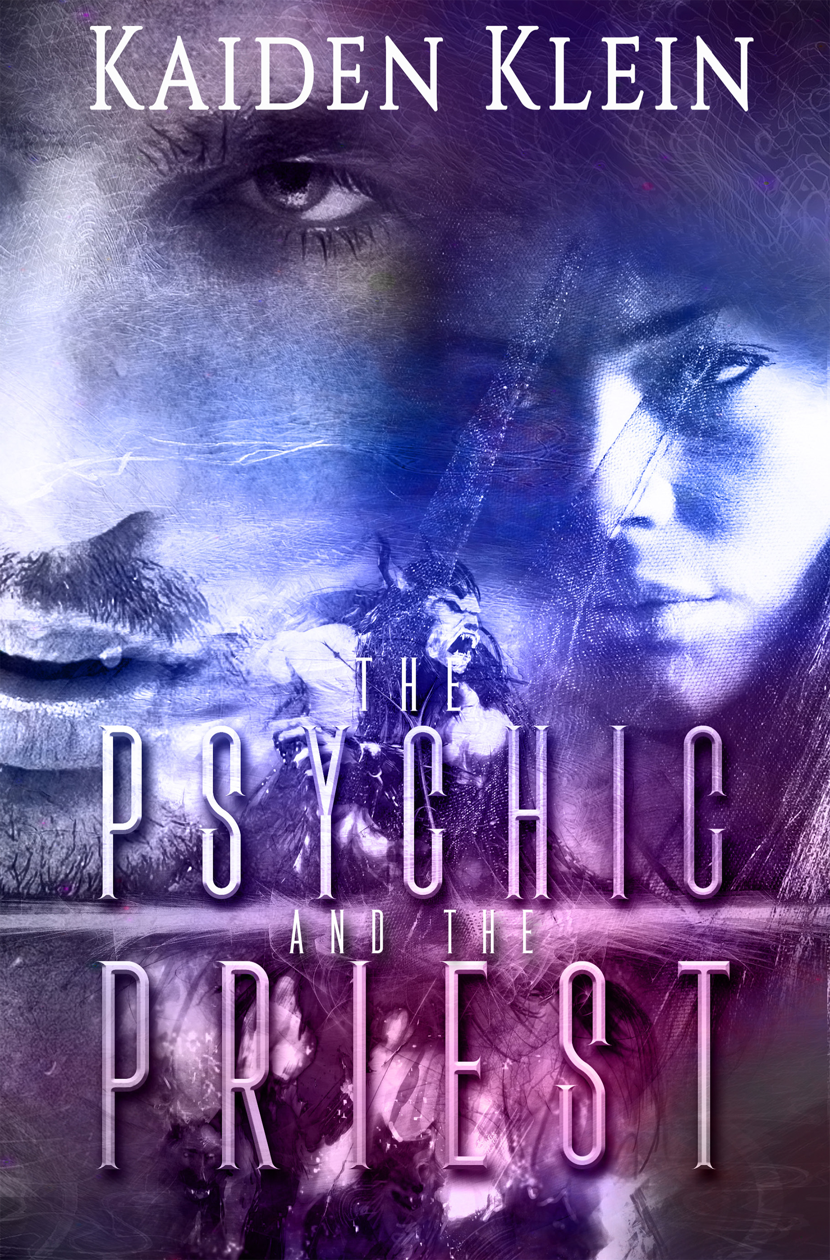
  1. While the byline is clearly readable in thumbnail, only the main words of the title are; I think just about anybody who saw the thumbnail first would conclude the title is “Psychic Priest.”
  2. The overlapping faces are confusing; the male face is cut off at his left cheek, as if the female face were in in the foreground — but the male face is so much bigger, the brain says, “Wait a sec, that can’t be right…”  The demon merely becomes “image noise” at thumbnail, and the other unidentifiable lays just make it murkier.
  3. Neither your cover nor your description give me any idea of setting.  Is this contemporary urban fantasy?  Second-world fantasy?  Historical fantasy?  Is this a pastoral or an urban setting?  A large part of the appeal of fantasy is the milieu against which the magical events take place — somewhere, you gotta give that to the potential reader.  (And there’s a lot of other text in your description which basically means, “Stuff happens, but I’m not gonna tell you about it here” — you could excise that to make room for some concrete details.)

Other comments?

The White Raven

The author says:

The White Raven is contemporary fantasy/magical realism with just a splash of romance about a cursed witch, set in modern times, who is shadowed by a white raven. The main plot deals with the mysterious connection between the heroine and the white raven, and whether it’s the cause of her curse or the instrument of her release. It’s an adult novel targeted to women mostly. **This cover is a draft to replace my existing cover that I already know is not working.**

Nathan says:

I love it.

Seriously.

The only things I would be tempted to do are (1) find a way to make the byline clearer in thumbnail, either by increasing the contrast or enlarging it a little bit, and (2) making the white raven emerging from the back of her head (now there’s a phrase I never expected to have occasion to write) just a little bigger, so that it “reads” as a bird easier in thumbnail.

But I love it.

Other comments?

The Eden Conspiracy [resubmit]

The author says:

Professional killer Jack Reagan is hired by a mysterious group to kill virologist Daniela Grosskopf and steal a vial of a deadly virus known as the Omega Strain. But when Jack has second thoughts and decides to instead protect Daniela and the virus, he must face off against modern-day Knights Templar seeking to recreate the Garden of Eden. A reworked cover previously shown here (https://covercritics.com/?p=1686). It is a quick mockup using free sample images.

[original submission and comments here]

Nathan says:

Definitely bullseyeing the “international thriller with archaeological overtones” subgenre.

My three comments:

  1. Make sure there’s enough contrast between the text and the background for it to be readable; as you can see in the thumbnail, even the largest words on the cover tend to blur into the background.  At the very least, add an outline, drop shadow, or dark outer glow.
  2. I’d suggest more space between byline and title.  Having them so close together may lead people to believe that “The Eden Conspiracy” is a volume in the”Thomas Cooper” series.
  3. You’ll want to play some more with the size relationship of the gunman to the background — some people might realize, given the relative size of the man to the handrails, that we’re dealing with an armed hobbit here.

Other than that, well done.

More comments?

Gladness Goes to the City [resubmit]

The author says:

Reprinting, with my comment and explanation, of a series of fanciful drawings and narratives by a leading newspaper artist of the 1910s.

[original submission and comments here]

Nathan says:

It looks like you made good use of the comments from last time around.  Good job!

I don’t think the typeface for “A Marguerite Martyn Book” works; everything else on the cover, while pediod-specific, is fresh and clean as if it just rolled off a sparkly printing press.  Adding a distressed font to that mix is jarring. (I’m also of two minds about the maroon-tone font color. At the very least, add an outline or drop shadow to separate it slightly from the aquamarine background.

I think you could also stand to enlarge your byline — not enough that it seems crowded, but enough so that it doesn’t seem to be the most unimportant part of the cover.

Other comments?

Programming Fundamentals in JavaScript

The author says:

A textbook for a college freshman level computer programming course. The goal of the book is to teach programming fundamentals, and it uses JavaScript to do that. This is different from some textbooks which are written to to teach JavaScript.  I am interested in the feedback from others about the comic on the back, which I freely admit is “art for a refrigerator”. However, I wonder if it is appropriate for the audience of the book.

Nathan says:

This is… dull.

Not that a programming primer is supposed to be whiz-bang exciting, but “clean and straightforward” doesn’t mean that it needs to be dull.  Take a look at the other programmings books on Amazon, and take note of the common factors:

  • clear, solid type
  • a simple but pleasant color scheme
  • explanatory subtitles
  • a simple central image

Your cover definitely has clear type, but it falls down on the rest.  And given the description you give above, I think even the title works against you — it still looks like a text on the basics of programming JavaScript itself, and the minimal description on the back does nothing to clarify that.  Something that separate the concepts better — “Using JavaScript to Learn Programming Fundamentals,” “The Fundamentals of Programming: Using Javascript Examples,” etc. — would help.  Then use a subtitle of the length of your back-cover description to explain more fully: “Understand the core concepts of all computer programming, using JavaScript as an example.”  And then put something substantive on the back cover: How this book approaches the subject differently than others, what exactly is covered, and why you’re qualified to explain this.

I think the idea of the cartoon is fine (the art, as you note, isn’t professional-grade), provided that there are some lighthearted moments of wit in the book — if it’s entirely dry-as-toast, then including the cartoon on the cover is false advertising.

Other comments?