Category: Covers

RE:Play [resubmit]

The author says:

Colden Frost, nineteen years old gaming genius has always day dreams of ‘better’ worlds, like the ones in his games he plays – and wins. When he finds himself transported to a different world in a different persona, he is elated. But is it the world he has always dreampt of or a dark reflection of his own world encased in ice. A reflection that holds something much darker, much deeper? Will Colden be able to clear this game? Or will he be consumed by his own personal Ragnarok?

[original submission and comments here]

Nathan says:

I like it — it builds on the strengths of the original cover. The only thing I would recommend is to brighten the “up” side of the wolf so that it shows up better in thumbnail.

Other comments?

Angel of Death

The author says:

Genre: Urban fantasy

Short blurb: Aria Cooper… High School student, Angel, Reaper, and apparently, a magnet for supernatural creatures. Ones that want to eat her. Aria is one month from her eighteenth birthday, on which she will finally become a Reaper. Her life has always been about one thing; death. As a Reaper, she will lead souls to their resting place. But someone seems determined to stop that from happening…

Target readers would be a mix between those that like the Mortal Instruments by Cassandra Clare and Deadly Beauties by C.M. Owens.

Nathan says:

Really, this hits the bullseye for the target market.

I would play up the wisps of smoke so they’re more visible in the thumbnail; they’re the clearest marker of magic/spirit/otherworldliness here.

Other than that, I’d just play with tweaks like the upper edge of her hair (which seems to clash strangely with the background) or the straight quote in the one-liner.

Good job! Other comments?

No Quarter

The designer says:

This is the cover I designed for my husband’s first book. No Quarter is a chase thriller set in LA in present time. People who like the Reacher novels or Bourne Identity might like No Quarter.

Nathan says:

Is this the final or a mockup?  I’ll assume the latter, so I won’t dwell on things like odd resolution and inconsistent edges.

Obviously, the problem with designing a cover meant to appeal to fans of blockbuster authors like Lee Child and Robert Ludlum is that the most important cover elements for either of them are the names “Lee Child” and “Robert Ludlum.” However, their current covers are also firmly in the current tradition of covers for thriller novels: Bold type that fills the cover, with anything else as a secondary feature.

Here’s my five-minute redo, which also changes the proportion a bit (since Ludlum’s and Child’s books always seem to come as tall paperbacks). I also added the “Series Character” placeholder — since both of those authors are famous for their series characters, that’s probably the same thing you want to promote.


Now, this still has plenty of problems — I think the original gray-dominant color scheme probably causes more problems than it solves — but I think this gives you a good starting point.

(Also: Lose the map texture.  It doesn’t really add anything, and it actually adds confusion.)

Other comments?

Man & Horse: The Long Ride Across America

The author says:

In 1974 a disenfranchised young man from a broken home set out to do the impossible. John Egenes saddled his young horse Gizmo and started down the trail on a seven month journey that took them across 11 states, from ocean to ocean. It is a tale that’s as big as the America they crossed, an America that no longer exists. It was a journey that could only have been experienced step by step, mile by mile, and viewed between a horse’s ears.

Nathan says:

The faux sepia tone, and the lack of anything visual which immediately places this in the 1970s, leads to the instant error that it’s a tale of a much, much older time.  (Yes, a few seconds’ examination of the rider’s garb shows that it’s very likely a photo from the ’60s or ’70s, but you will have lost the attention of those potential readers turned away by the initial impression.)

In addition, both title and byline get lost — the title because of size and color, and the byline because of size, color and the busy background behind it.  There would be no downside to putting the title across the horse and lower — ain’t nobody going to complain about the horse’s face being obscured.

My advice would be to take the sepia filter off the photo, and then add an element or two to show that the photograph itself is a document of the journey: a white border with black mounting corners, perhaps, or a couple of fold lines across the print.  Then seek out a period-specific (or at least appropriate) typeface — not something as gaudy as the “Mary Tyler Moore” font, but still something with a connection to the time period — and make sure that it’s readable, or at least visible, at thumbnail size.

Other comments?

My First Ten Days in Heaven [resubmit x2]

The author says:

I’m comfortable exposing yet another effort because the tone of this site is educational, not one where finding fault is the turn on. Much appreciated by all of us writers without funds and with minimal design sense. You make the world of writing a better place. Thanks.

[original submission and comments here and here]

Nathan says:

Aw, shucks. Thanks. We’re all happy to offer pre-publication advice and support — we save our snark for after a cover has been published to the world.

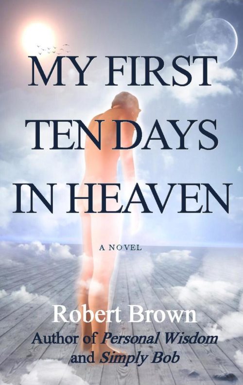
My first reaction — before any of the technical design stuff — is that, in looking at the three prospective covers, I really don’t know what to expect in your novel. I don’t know the tone, the mood.  I know that it’s “literary,” whatever that means… but is it lighthearted? Leaden with awareness of the futility of existence?  Postmortal existentialism?  The three covers we’ve seen so far could each apply to one of those three, which would each appeal to different readers.

I’ve got several specific pointers about this cover (kerning, position of “A Novel,” etc.), but I feel like it would be rearranging deck chairs on… not the Titanic, but a boat that’s not going where you want it to go.

At this point, my advice would be to get a second pair of eyes.  Find a reader with at least a cursory awareness of book marketing, have them read the book, and then ask, “What kind of cover would you expect to see on this?”  If you want, show them each of the three covers you’ve shown us so far and find out which one best matches the mood or feel of the book.  Then you’ll be able to dive into how best to design that cover to appeal to your prospective readers.

Best of luck.