Category: Covers

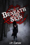
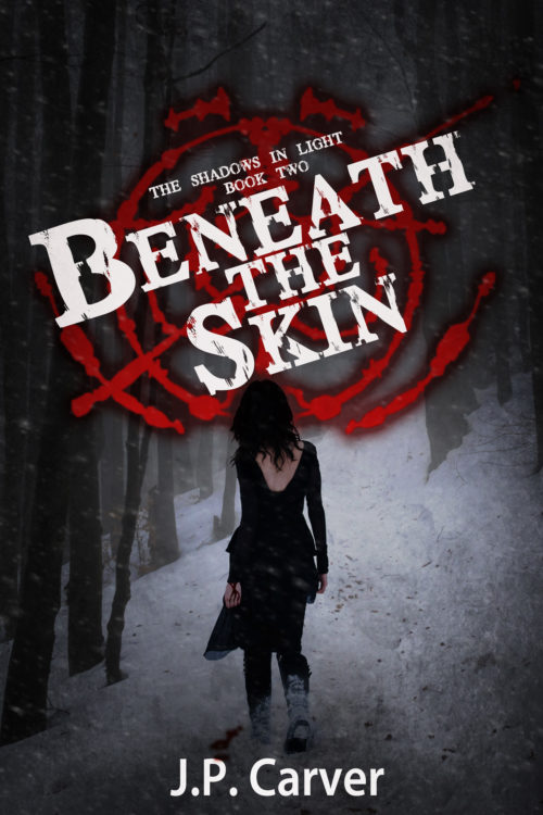
Beneath the Skin

The author says:

Genre: Horror/Urban Fantasy – Silent Hill meets Supernatural. Comparable book: Dresden Files

Publishable, but feel like something is off or missing in the design. May use too much white.

Elevator pitch: In the second book, Iris and Ben find themselves in a small mining town in the middle of a snow storm. An old friend called them there due to strange murders that could be related to a shape-shifter they are hunting.

Nathan says:

Now, because this is the second in a series, I didn’t want to give any advice which would run counter to branding, so I looked up the first book in the series:
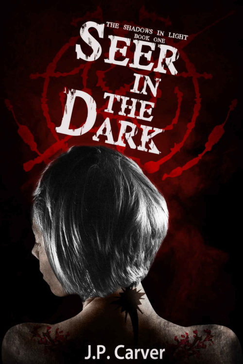
So far, so good.  I like that you both kept the title font and sigil behind it, while varying other details like the angle of the title and the size of the figure.

In fact, my biggest suggestion is both simple and, frankly, one that you will slap yourself over:

Move the title up.

Not only will that help match the layout with the first book, but it will isolate the woman’s head from the title and sigil.  The figure will seem more stark and purposeful if her head is more clearly separated from both title and background.

Looks good! Any other suggestions?
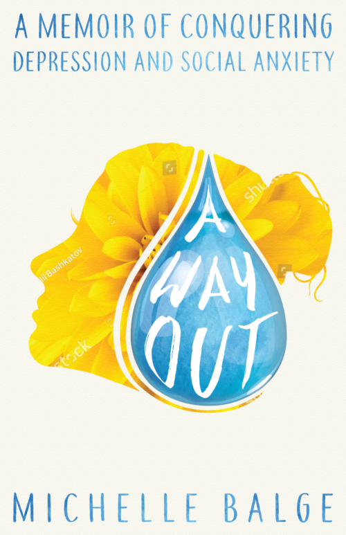
A Way Out [resubmit]

The author says:

This is a resubmission for A Way Out. I’ve taken some feedback and came up with this as a possible final product. I’d just need to purchase the flower image so please ignore the watermarks. This memoir is about overcoming depression and anxiety, and finding happiness on the other side. The cover is meant to show hope, that beyond the tears and storms in my mind, it’s possible for recovery and your life can turn into something beautiful.

[original submission and comments here]

Nathan says:

You’ve done a great job of integrating the comments given with the original submission.

The biggest thing that sticks out to me is that the waterdrop is now off-center, but not so much off-center that it appears intentional.  I would bring the drop back to the center; there’s still enough of the face showing on its left to make the flower silhouette recognizable.  In fact, I’d make the drop bigger — with the title enclosed in the drop, the whole title has gotten a little smaller and harder to read since the last version; I’d make the drop large enough to stretch from top to bottom across that empty space, then play with exactly where the head silhouette should be behind it.

The other thing that strikes me is that having “A MEMOIR OF CONQUERING” in larger type to fill the line makes it seem louder or more important than the next line, which it isn’t.  I’d make the type in the first line the same size as the second line, and not worry about it extending side to side.

Good work!

Any other comments?

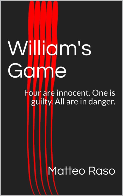
William’s Game

The author says:

After the death of businessman William Schulz, five people receive a letter saying that they are receiving a portion of William’s fortunes in the inheritance. When the five people meet at the mansion, they soon find themselves in a sadistic game of William’s imagination. Locked inside, they have to find the murderer and kill them before they’re killed.

Nathan says:

You may be doing something clever here with the five red stripes, but that’s negated by the fact that you’re also using a variation of the most generic and most boring ebook cover template.  At least you didn’t choose the even-more-generic variation:

Really, the only advice here is to start over and treat your cover as something that deserves thought and effort, rather than something you don’t care about.

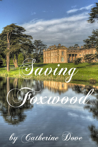
Saving Foxwood

The author says:

“Saving Foxwood” is a Regency romance, so the target audience is primarily women, especially those who like Georgette Heyer. It’s about a woman who marries beneath herself to save her home.

Nathan says:

I’m definitely not the target audience, but my perusal of the genre strongly suggests that most successful covers feature definite romantic imagery — the couple in question, or at very least one of the two romantic participants.  If your novel is actually a Regency romance (as opposed to, say, a historical novel which contains a romance), you probably want to use your cover image to brand yourself as being solidly in the genre.

There are definitely other problems here — the lack of contrast between “Foxwood” and the background, the blank space at the top that gives it an unbalanced feel, the unnecessary “by” in the byline — but I think you need to step back and revise the initial concept first.

Other thoughts?

Riven Calyx [resubmit]

The author says:

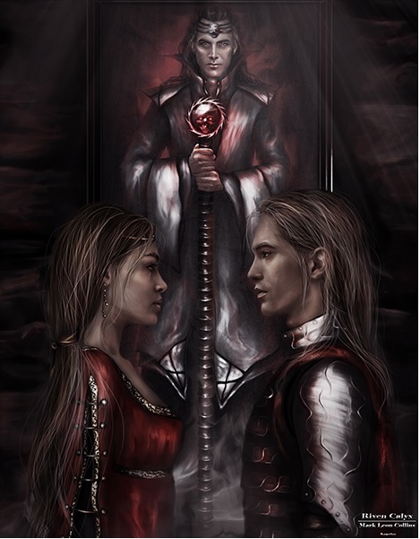
Riven Calyx is about a young ambitious knight who has been commissioned by the king to find a wizard. The knight doesn’t get all that he expects and soon find that he and the wizard have different agendas.

[original submission and comments here]

Nathan says:

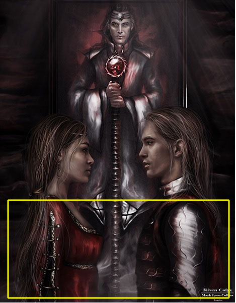
The artwork is like night and day. Now you just need to figure out what to do with the type.  Given the proportions of the artwork (unless the artist cropped out some background that you could use), you have roughly this much space for the title and byline:

(If you have a series tagline or subtitle, you could use those open areas to the left and right of the wizard’s head.)

Good luck!