The author says:
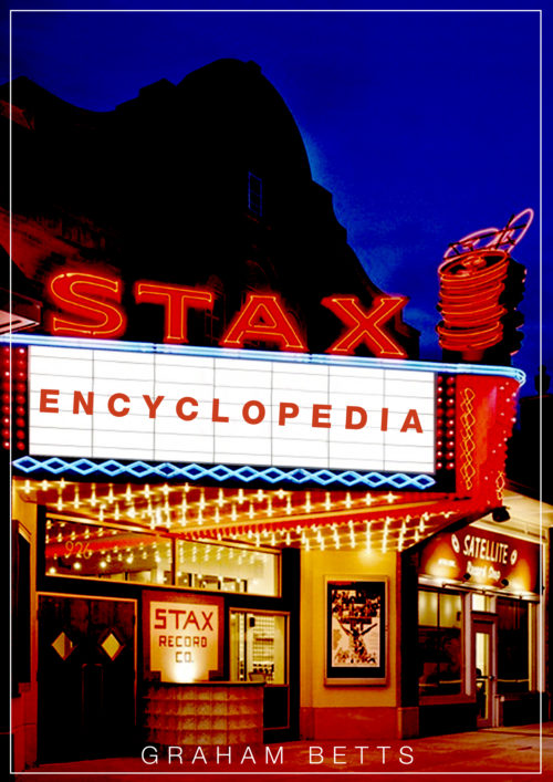
A non faction book that is something of a companion volume to The Motown Encyclopedia, this book contains 650 entries connected to Stax Records. These range from the label imprints (Stax, Volt, Enterprise, Hip etc), the artists (Isaac Hayes, Otis Redding, Staple Singers, William Bell etc), key musicians (Steve Cropper, Booker T Jones, Wayne Jackson), executives (Al Bell, Jim Stewart) and background stories to every record to have reached at least the Top 20 of the R&B chart. The cover attached is pretty much the finished thing.
Nathan says:
I have a technical comment, and a genre-specific comment:
Technical: The letters of “Encyclopedia” need to lean slightly to the left so that the upright strokes are parallel to the vertical gridlines on the marquee.
Genre-specific: Readers expect a non-fiction book to have more explanation on the cover, telling them exactly what the book is about. You have that wonderful open space above the marquee that’s just begging for something like “The Definitive 40-Year Story of the Legendary Label That Brought Us Isaac Hayes, Otis Redding, and the Staple Singers.”
Other comments?


I’d like to see a little more room at the bottom for the author’s byline. It’s too crowded. Great cover photo. You probably don’t need the white rule.
Yes, I’d definitely consider a tagline; when seeing this in thumbnail, my initial thought was that it might be about movies, considering how much the storefront in the picture looks like a movie theater. Blame it on the titular record company for making its concert hall look that way, I guess, but you definitely want to set the record straight about that. Also, reminding prospective readers of a few of the more famous names this label;s executives helped discover would definitely be a big draw, as the more casual music fans might not be aware of this company’s importance.
(Isaac Hayes? The guy who brought us Chef’s “Chocolate Salty Balls” song from South Park? I never realized these are the guys who discovered him until just now.)
There is one potentially serious aspect where incorporating the title with the marquee sign backfires, it meshes well enough that without the tagline and white border this stops being a book cover and starts being just an image of a theater. Without the book’s description, which a viewer will not see until after they click on the thumbnail, it is a craps-shoot whether they realize that a title is even present.
It gets worse: In the thumbnail both the byline and the border shrink to invisibility, and it looks like you just posted a photo instead of bothering to make a cover. This could easily send a poor message on sites like Amazon, where the thumbnail is the initial point of contact, because it telegraphs shoddy work inside the book.
There may be other fixes, but I think the simplest one is making the tagline and border thicker, at least thick enough that you can tell they exist in the thumbnail (even if you can’t read them at that size). This will make it clear that the viewer is looking at something that was composed, and help them realize that the title on the marquee is in fact the title of the book.
I’m not generally a fan of text blurbs, but in this case I would also recommend some descriptive text in the blue section of sky in the upper right (possibly a place to list some of the artists discussed within). A text blurb will very clearly indicate that the viewer is viewing a book, without needing to know that in advance.
Byline. Every place where I said tagline, i meant byline. Sorry.
I agree with Kris’ post. Before I saw that he’d posted it, the comment about not being clearly able to see that the title is deliberate, and not part of the image, is what I’d intended to say.
The front of the building does look exactly like a theater, and the text as the marquee. Unless you change the font completely–so that it doesn’t blend in–I don’t see how you can use this, as-is.
If you do plan to use the faux light-letters, then, yes, you need to match the slant/perspective of the lines. If you are not…perhaps something like DTNoted?
It’s unfortunate. It’s not a bad idea, but the features/structure of the building is working against you. If you leave it as-is, or only slightly changed, it looks like an image, not a cover. If you change it, you need to really boost the lettering/titling recognition.
And lastly–to echo what everyone else says–the byline needs to be MUCH bigger and heavier. Right now, it’s not worth anything. Nobody can read it in thumbnail, and it’s barely readable or rather noticeable at full-size. Getting a solid sans-serif byline (maybe something very stark, like Impact?) will help enormously to alleviate that “image” problem that you’re struggling with.
I know that this isn’t a huge help. I wish I could give you some better suggestions. I’d also play with the color of the title lettering, to see if you can find a fill color that will stand out enough to scream “NOT PART OF THE PICTURE!”
HTH a bit.
I don’t know if it is that confusing – to me the thumbnail clearly says that this is a book called “Stax Encyclopedia”. It still tells me nothing – my first unconsidered guess was some sort of experimental fiction book, with an unusual name. Next I thought ‘Why is the picture not higher?’ but I do presume the bottom of the original photo ends where the bottom of the cover ends.
Even with the suggested tagline above the marquee, that definitely would clear things for the prospective buyer, there is a lot of unused space so perhaps still inch the picture up a bit and leave a band of space for the byline?
As the line ‘Encyclopedia’ is definitely a bit mismatched with the background, and also sits a bit forlorn in the middle, another option would be to change the title to ‘Encylopedia of Stax’, leaving the marquee for byline, or for the tagline – though then it would perhaps have to be split, as really I would like to see at least mentions of few of the most famous recording artists, the fact that this is a record label (most potential buyers would know, but then again, I recognized few of those names but have never heard of Stax – you might always snare an Otis Redding fan, or someone looking for a gift for a record collector friend, besides the ones who already know the label) and some descriptive words, even if just ‘legendary’ or ‘groundbreaking’ or ‘soul’, and perhaps where it was based.
This is a very elegant solution. Making the byline ‘By Grahm Betts’ also helps clear up possibly misinterpreting the marquee as just a part of the image, as that is not the sort of phrase one would typically expect to see on a marquee. Matching angle is still needed, but it also makes matching font with the title a good deal less important. The trick would be making ‘Encyclopedia of’ either match or mesh well with the neon ‘Stax’ in the photo.
I agree with Nathan; I think if you put a nice tagline in that open space it will work well as-is.
The cover is really very well done and very attractive. I think it needs only a slight adjustment or two.
I agree with the others that a tagline or subtitle is necessary.
On a more technical level, I would like to see “Stax” and “encyclopedia” made to relate to one another a little better. There seems to be a little too much of a disconnect between the two words. Even if there is a tagline that would be the second thing a potential reader would see. I think that “Stax Encyclopedia” needs to read together as a single statement at first glance by anyone.
This could be helped a little by making “encyclopedia” larger. The large amount of space between the letters could be eliminated this way. I know that there was an effort made to make the letters fit onto the marquee realistically, but I think that could be sacrificed with no harm done. This would help eliminate some of the size difference between the two words, eliminate some of the space that visually separates “Stax” and “encyclopedia” and keep the letters in the word “encyclopedia” from floating in so much empty white space.
This could work, though if the letters in ‘encyclopedia’ are enlarged it becomes even more critical that they match the angle of the marquee precisely.