The author says:
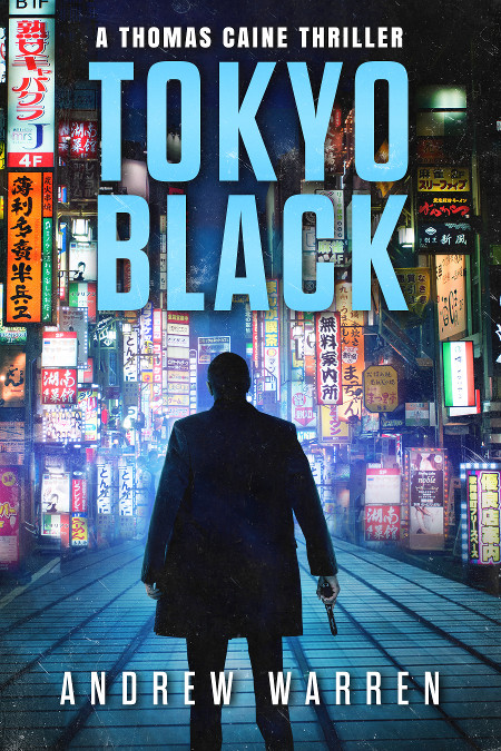
I am the author of this book. It was published in 2016, but I am considering a cover redesign for the series.
Tokyo Black introduces readers to Thomas Caine, a former CIA assassin. Betrayed and left for dead, he has put his past behind him. Now he lives off the grid, in the seedy underworld of Pattaya, Thailand. But when local gangsters set him up for a crime he didn’t commit, his old CIA masters make him an offer he can’t refuse: rot in a hellish Thai prison, or accept a dangerous mission in Tokyo, Japan.
The book is a spy action thriller. There are three other books in the series, which all follow a similar design treatment. Readers compare the style of the books to Vince Flynn, Ian Fleming, Barry Eisler, etc. It has a cinematic, high action feel, with a mysterious streak, and a heavy emphasis on Tokyo and the Yakuza.
Nathan says:
It’s very well put together, but I can also understand the impulse to redesign, especially if it’s been a few years and your sales are leveling off — it’s time to attract some new eyeballs!
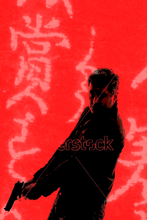
I don’t think this cover is too busy (the elements of the background blend into a good backdrop for the main character silhouette), but when doing a periodic redesign, I always think, “What can I flip to catch the attention of those it didn’t hook the first time around?” So instead of blue, I’m thinking red. Instead of a full background, I’m thinking a few strings of half-toned brush-written kanji, at an angle to the edges of the cover. Instead of a silhouette from the back, I’m thinking a posterized view of a man with a gun from the front. Sort of like this:
Note: Do NOT use that stock model photo. It was on the first page of search results of “man with a gun” on Shutterstock, which means that it’ll be overused and overexposed. But this at least illustrates my idea.
Other comments?


I love the blue. My only nit pick and it is super small is the two light spots on the guys head from the texture overlay make me want to think he’s facing me not the street which gives him a weird bulky appearance until I realized it wasn’t meant for eyes. I’m probably the only one who will ever notice or be bugged by it…lol
I might be tempted to put a hint of smoke by the gun(just a whiff as if it had just been fired) but I love special effects and tend to go overboard. because this is the cover already on Amazon I cant say if it’s enough of a change to grab new interest but it did catch my eye in a good way!
I think the cover works very well.
I would clean up some of the artifacts (which include the specks Nathan speaks of), but that’s about it.
On a side note, I normally have an aversion to silhouettes, but this one works. Probably because there is some detail within it that prevents it from looking like a flat cut-out.
I kinda love this cover. My only question is: is it me, or are the letters in the title ever-so-slightly juggled around? Not quite level? Does anyone else see this, or is it an optical illusion? They seem to be slightly canted?
And I love the fonts, too. Sorry, Nathan, but this one just really works for me. (Eisler fan here.)
Looking back at the cover, I see what you mean! It’s apparently an optical illusion.
But while taking that second look, I noticed something that bothered me a little. And that is the two signs at the upper left. They are so distinct from the others in the background and aligned with the edge of the book that I had at first taken them for some sort of publisher’s logo rather than part of the setting.
they look straight to me
Oh, I entirely agree. I took the request to mean that, after a few years of publication, he was toying with redoing the covers just to keep them “fresh,” not that there was anything wrong with them. I think he’s set himself a high bar.
I think the byline is ruler-level. I can’t tell with the title, but I think it is an illusion caused by the light texturing on the letters.
Looking over your series, I’ve noticed the cover you’ve submitted is evidently the one you wish to replace for your series. To make a mild understatement, you’ve got your work cut out for you: I’d think it nearly impossible to do any better than the covers you’ve already got for each book in that series. Anyway, I see no reason to recommend any changes to this one.
My only question: since this is the original cover you’re looking to replace, may we see your proposed replacement?
I’m loving this cover. The only thing that looks a smidgy off to me are the two signs in the upper left corner. They look a bit too bright, too square, not quite part of the scene. But changing that isn’t going to “freshen up” this cover. It’s really good to start with.
Like everybody else, I like the current one.
Only thing “wrong” about it is that the “T” of Tokyo doesn’t line up vertically with the “B” of black. It’s just a little bit off.
Short of complete redesign, you could do a bit of tweaking on your existing cover.
For instance, the light blue letters are calm and reassuring, like a blue sky of hope. It feels dangerous, but there’s hope and your character looks like the hunter, not the prey.
Making the title red & black and adding scope crosshair on the silhouette should up the stakes some
(Never mind the shaggy edges, I just used the select tool to change the color and it’s not perfectly straight)