Category: Covers

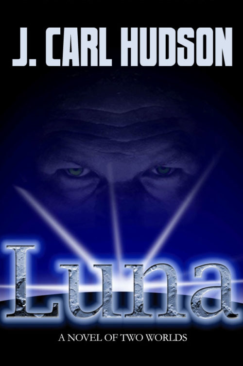
Luna

The author says:

Present day with available science appealing to all sci-fi readers with romantic interest.

Rebelling against government directed aggression and bond by a pack of nonviolence, Jake Starnes and his Luna Council build paradise where none thought to look. Ruthless eyes turn toward the heavens forcing Luna into conflict. How do you dictate the terms of war without harming those who seek to harm you? LUNA demonstrates that mankind can rise above its base tendencies and act as an example to accomplishment by intellect rather than brute force. The leadership of Luna embraces a brilliantly creative philosophy of nonviolence in bringing Earth’s military to a halt; waging the most humane offensive action ever seen in the history of mankind in a quest towards peaceful sovereignty. Savant intelligence copes with drama on an epic scale with a twist of romance, intimacy and love. featuring a new look at sci-fi adventure and conflict on Earth’s cratered and lava-scorched moon. The lure of fabulous mineral wealth combines with secrets of longevity strong enough to lure those in power toward a brutal and merciless conclusion.

Nathan says:

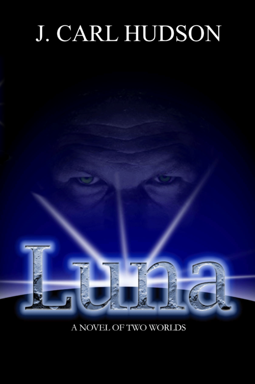
I think the elements are mostly fine (although the byline font too boring for words), but you’ve got an awful lot of margin around everything that serves no purpose. You’d be better off letting what’s there fill the space:

(That’s not the best font for the byline — I just grabbed the first one I found that was sans serif and tall.)

And while we don’t often focus on the back cover… dang, that’s a lot of words.

Other comments?
Afterlives

The author says:

Private detective and military veteran, Martin Coswell never never expected any special treatment from anyone. But when he awoke at Medicore Nanotech five years after dying of brain cancer, he got a second life to live. A life soon to be turned completely upside down by an AI gone rogue, and a daughter with a missing father.

Nathan says:

A good combination of “thriller” and “sci-fi” imagery.  However, the human silhouette gets lost because he’s against the darker part of the background.  I would exchange the DNA and rainy street images so that there’s something bright behind the silhouette’s head.

Any other comments?

The Fruit of Passion

The author says:

I designed this cover for my mythic fantasy novel. It’s not ready to be published. I’m just playing around with various concepts. The book draws heavily on ancient Celtic tradition and the story unfolds in a fictional island somewhere in the North.

Here’s the blurb: Since the death of her mother, Queen Blodwen of the island of Rumia, Morella has trouble adjusting to the changes in her life and cannot accept her loss. Having to deal partly with her own suffering because of that, partly with the challenges her people have set for her in order to be crowned queen, partly with a consuming love affair with Rhys, the king of the fae, and partly with driving away the military forces of the empire in the South that has set eyes on the islands of the North, Morella embarks on a quest of knowledge and maturity that will take by storm the realms of the Otherworld, offer her strong alliances with their leaders, test loyalties and friendships and, above all, prove the strength and endurance of the human spirit.

Nathan says:

The first thing you notice in thumbnail is that there’s a whole lot of unused real estate.  Negative space can be a major design element, but it takes a lot of skill to make it work.  There’s no reason that the cup of petals shouldn’t go edge to edge, that the title can’t fill two lines (please, some other font than Algerian), and that the knotwork can’t be behind them.

Also, that’s a big block of text for a front cover. Save that for the back cover (or the top of the Amazon blurb).

Other comments?

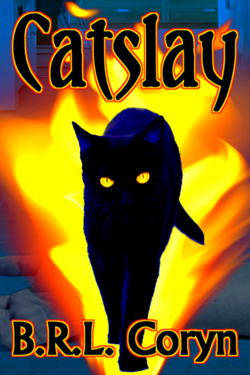
Catslay [resubmit #2]

The author says:

In 1985, a witch turns little six-year-old Dana into a cat. Ten years later, he escapes the witch and takes up with a little six-year-old girl whose legal guardians are sexually abusing her. The witch’s curse gave Dana no special powers or abilities whatsoever apart from being a cat with a human mind, but this is more than enough for his purposes; for when horrendous and often fatal “accidents” begin befalling various unsympathetic people and institutions around him and his new owner (starting with her rapacious guardians) who’s ever going to suspect her cat of being the culprit?

As mentioned on previous submissions, the genre is Suburban Horror-Fantasy, but I should probably also add that Horror is its primary genre, the Fantasy premise being of only secondary importance to the story.


[previous submissions and comments here and here]

Nathan says:

You say now that it’s primarily horror, but is that really the case?  Horror stories are usually about the people that things happen to, rather than the people doing things.  If this were truly a horror novel, I’d say to go back to the first cover you submitted as “Catslash” and work from that concept.  However, since it still seems more “urban fantasy thriller” than actual horror…

(BTW, if Dana is turned into a cat, not a kitten, and then the events of the story take place a decade later and he has “no special powers or abilities whatsoever apart from being a cat with a human mind,” we’re talking a pretty old cat here.)

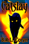
I think you’re missing the boat by having your cover be NOTHING BUT CAT. The story is how this cat protects the little girl, right?  Then have a sad-eyed little girl holding a cat with red eyes.  Put them against a black or murky background, use a title font reminiscent of the horror or revenge-thriller paperbacks of the ’80’s, and you’re good.

Other comments?