The author says:
Set in the current time, this horror novel follows a serial killer as he stalks his victims. Unfortunately for him, his sixth victim is far from the normal woman he is used to taking. Now at her mercy, he discovers the horrible connection between his latest catch and his departed mother.
Nathan says:
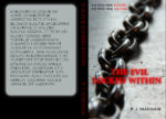
The chain is a fair image for this genre, but everything else lets it down:
- The color scheme is cool and reserved. It needs to be dirty and dangerous.
- The type is professional and generic. It, too, needs to be dangerous — their bold and brutal, or wild and untamed (or both).
- Red type is always problematic, as there are always contrast issues; as you can see here, readability as the red crosses both dark and light backgrounds is reduced almost to nil.
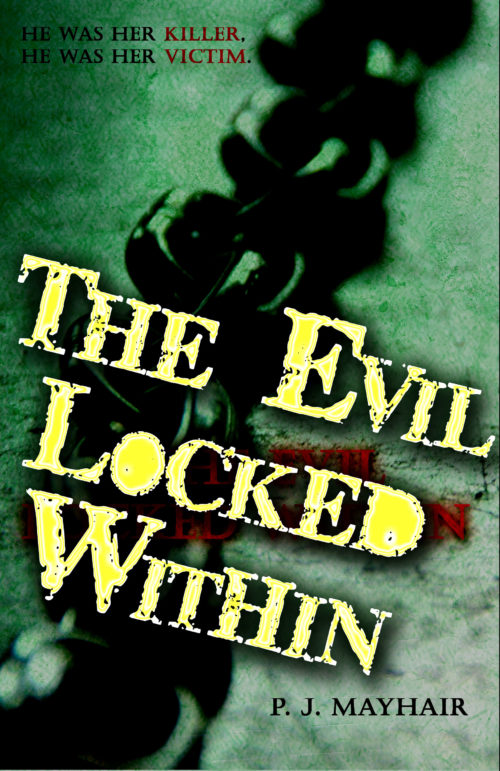
Here’s my five-minute redo:
I’m not completely happy with the font I picked, and I think that the texture I added to the photo ends up being too monochromatic, but hey — five minutes.
And finally: I know that the text on the back cover is a placeholder, but please make sure it’s readable, using upper and lowercase.
Other comments?


I like Nathan’s version much better albeit with a different font. The concept is good, the author’s version is too sterile for me for the subject matter. I need to feel the horror on the cover and it just doesn’t do it. What about some blood on the chain? Just a thought.
You’ve got the right general idea here, but the current cover is barely adequate at best. The chain and stark gray-scaled floor are a good start on the “torture porn” kind of aesthetic you want, but what red we’re seeing just isn’t splashy enough. In addition to red lettering’s usual troubles with visibility in the thumbnail, your title and sub-titles and byline are all simply too tidy to fit in with the rest of the cover’s aesthetic.
My recommendation? Get some decayed-and-messy-looking font like Broken Detroit to use for all titles and bylines, and make all lettering nice and big; it’s not as if people won’t be able to see the chain on the gritty concrete floor even if you fill the entire cover with the titles and byline. Before you letter your cover, however, give it some random blood splats as well; and be sure to apply those to both the front and the back for consistency’s sake. (Having blood splats on the back should help you get into the proper mood while thinking of something dramatic to write.) Oh, and lose the neatly-rounded-and-bordered windowing on the back: if possible, I’d recommend wrapping the grim-n’-gritty picture on the front cover all the way around, but even if that’s not possible, you want to maintain a consistently messy aesthetic across the whole cover.
Bottom line: you’ve got a good start on a cover, but now you need to continue crafting it until it’s complete.
I think the image is the first problem–it’s almost, but not quite, strong enough to carry the cover. Sure, it’s a little bit foreboding, but you could pick something a lot grittier. Look at the Saw covers: Some kind of gross body part would be good. (I’d also like an image that tells me whether this is gross-out horror or more psychological horror.)
So while your cover is like 70% of the way there, I’d go back to the start to make a cover that’s really strong.
Nathan’s suggested revision is a good one, but be absolutely certain that it is clear what the photo is of.