The author says:
A long buried secret. A persistent archeologist. And a dangerous covert organization…
Smithsonian archaeologist, Roslin Williams gets an amazing opportunity to excavate the site where the White House once stood hundreds of years ago. When the excavation begins, Roslin stumbles upon a shocking find—the Air Force One plane containing human remains and a mysterious briefcase, which only leads to more questions than answers… The televised dig immediately attracts the attention of a powerful shadow organization intent on ensuring the secrets contained within Air Force One remain buried, and a hitman is dispatched to eliminate Roslin. After she is attacked, Mark Appleton, a former Secret Service Agent, is hired to watch over her, but Appleton realizes with Roslin’s life in danger, there’s no one they can trust.
As the layers of betrayal and deception are slowly peeled away, a scandalous cover-up is revealed that will have worldwide repercussions. Together, Appleton and Roslin embark on a perilous journey to outrun the evil forces allied against them in order to unravel this ancient conspiracy. And unless they can avoid the sinister adversary who shadows their every move—this volatile, ancient truth will remain hidden forever.
Nathan says:
The biggest issue I see is one of mis-branding.
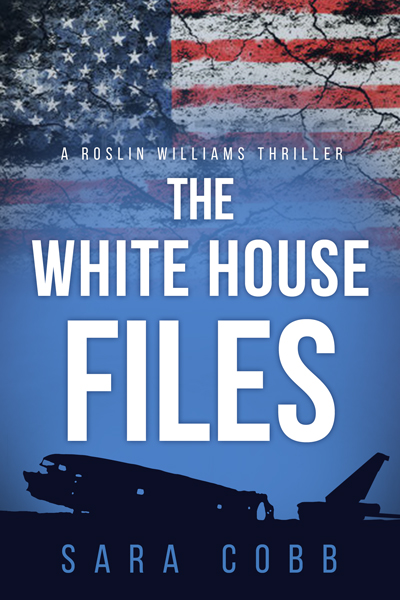
Your description says that this is hundreds of years after the White House and Air Force One are destroyed. By definition, then, you’ve got a science fiction novel. But your cover sells it as a straight (contemporary) political thriller. That means that the people who pick it up/click on it looking for a political thriller are going to be turned off by it actually being science fiction, and the political science fiction readers who would enjoy the novel won’t pick it up, thinking it’s a contemporary thriller.


All that being said, out the gate it’s a pretty good political thriller cover. Big clear lettering, distressed American flag, even the airplane carcass is recognizable as such in the thumbnail. It is clearly a hybrid book, so this isn’t necessarily bad on its own.
Could this be fixed by the simple addition of a date? Append the year to the title to yield “The White House Files: 2217” and confusion for the political thriller audience should be removed. The question remains if the date will be enough to draw in science fiction fans. Toward that end I’d suggest reducing “Files” to the same font size as “The White House” and have the year dominate the cover at a larger font size. Could that adequately contextualize the visuals for a science fiction audience?
Other than the misbranding Nathan mentions l think this is a pretty well-done cover. It might only need the addition of an extra visual element to get across the idea that the story is set in the future. Kristopher’s suggestion of adding a year to the title is an excellent…and very simple…solution.
From my assessment before reading the description, this is a more-or-less decent cover for a political novel in general, though it seemed a little bland and unfocused. Maybe that’s just because I don’t feel much of anything one way or the other about political thrillers in general, but part of it is simply that nothing on the cover really stands out at me; the remains of Air Force One aren’t identifiable as such without reading the description, and the derelict pavement with the Stars and Stripes on it serves only to identify (half) the genre, and nothing else. In short, you’ve got a start on a cover here, but it’s only a start from my perspective.
Being more of a science fiction fan, I find your description of the story a lot more compelling than your first-draft cover. The plot sounds like a bit of Logan’s Run crossed with a bit of Planet of the Apes, with archaeologists from a future civilization digging up secrets from our time that some people in their time would prefer to keep buried. That sounds like a story that would put me in your target audience.
In view of these comparisons, think of what the most compelling imagery from the movies for Logan’s Run and Planet of the Apes was. For the former, what I found most memorable was seeing the still-somewhat-intact famous buildings and monuments of Washington D.C. overgrown with vines and inhabited only by stray cats and a crazy old guy from parts unknown. For the latter, the most memorable part is the big revealing shot at the end of the protagonist discovering the upper half of the Statue of Liberty standing on the seashore, and then breaking down cursing and ranting at humanity for having destroyed itself.
This kind of memorable imagery is what your book’s cover needs as well: something that makes your readers say “Whoa! There’s something you don’t see every day!” For best results, I recommend mixing something unusual and unique from your story’s futuristic setting with something from our time immediately recognizable to us. For instance, you could show the protagonist wearing very futuristic clothes standing in the middle of Air Force One’s remains (possibly in front of a decayed-yet-recognizable Presidential seal) and staring at the fossilized skeletal remains of the President and some of his (her?) staff; that’s not too big of a spoiler, is it? Yet it would immediately get your target audience’s attention and give us a running start on understanding what’s in the story even before we read the description.
Of course, that’s just an example; maybe the clothes in your story’s future civilization don’t look all that exotic or different from anything people wear now, or no human remains survived the burial of Air Force One. The point is, give us something in the visuals on your cover to link this story to the far-flung future, and something else to link it to our present or near-present. The vaguely political symbols linked solely to the present on this first draft aren’t going to be enough.
Dude! Spoilers!
I agree with Nathan on the branding thing, but such “subtitles”, if that’s even the right term form such embellishments, are a pet peeves of mine. It’s like when the cover includes “A Novel” or “A Novel by…” Is the potential reader going to be confused without the writer explaining the obvious. I think this sort of gimmick comes across as just that, and is an insult to the intelligence of the reader.
I am all for K.I.S.S. approach to text on the cover of a book. Keep it simple, stupid. I think it’s a pretty good cover other than that.
I don’t think it’s all that misbranded because the description sounds exactly like a political thriller and the fact that it’s set in the future is totally incidental (it’s a future that still has the Secret Service, the Smithsonian, television, and so on, and that doesn’t mention any futuristic technology). And it really is a nice cover for a thriller: The colors and fonts are just right.