The author says:
Set in remote mountains of Nevada and travels around the US and abroad in current time.
Book 3 Die-Hard Patriots, a Political thriller Series.
Audience: Conservative men with interest in politics and preppers. Vince Flynn, Brad Thor.
Fearing his life is in danger, Cal Stockton seeks refuge in the remote mountains of Nevada. His future looks bleak until he inherits a sizable sum of money, followed by a visit from the former Secretary of State, Claire Haskett. She’s preparing to make a presidential bid for the White House. Fearing the United States is on the verge of bankruptcy and the dollar is in danger of losing its status as the world’s reserve currency, she wants to abolish the Federal Reserve and issue a new interest-free United States Note—a note backed by gold, yet owned by the People. All she needs are a few noble patriots willing to acquire that gold. Patriots willing to break a few laws and a leader willing to die for the cause.
Nathan says:
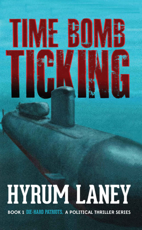
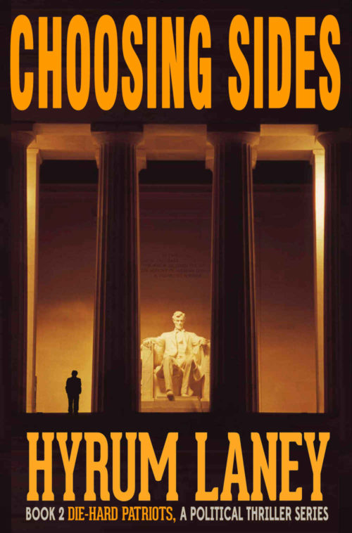
Series novels present their own problems; you want to maintain consistent branding across installments. For reference, here are the covers of the first two novels:
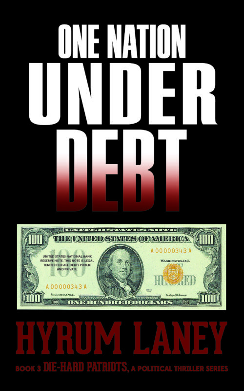
Good covers, if slightly inconsistent. Of the three, the third volume is the weakest, for a number of reasons:
- The title taking up roughly half of the cover makes it look like a nonfiction book.
- Couple that with a plain picture of currency, and it looks like a personal finance book, or a polemic against the Federal Reserve.
- In contrast to the first two volumes, in which the illustration extends out under the type, the third volume has the type completely separate from the single image element.
- Also in contrast to the first two volumes, the deep red of the byline blends into the background in thumbnail size.
Here’s what I’d do:
- Place the title on two lines, not three:
ONE NATION
UNDER DEBT
- Fill the cover with the image of the hundred-dollar bill, at an angle and with some texture. Darken it under the text, and see how that looks.
Other suggestions?


It’s not a design critique, but another matter important to consider is that there are specific laws that differ from copyright laws concerning how one is allowed to use pictures of money in marketing materials, which a book cover very much is. Under a simple, non-expert reading (I am not a lawyer) it is illegal under section 475 of the US criminal code as stated on this page https://www.moneyfactory.gov/resources/lawsandregulations.html
While I am sure there are ways in which it is permissible, since I have seen it done frequently, without expert advice on the matter it may be wise to not do it. Bars of gold with a US treasury imprint or similar could work just as well without the legal risks.
Thank you for the feedback and the link. I’m going to redesign the cover.
While I’m not so certain about KG’s interpretation of the laws concerning pictures of money in marketing materials, Nathan’s second point is particularly telling. I too initially thought from looking at the thumbnail that this was going to be some kind of political polemic about our country’s $20 Trillion national debt and what we ought to be doing to the various people and institutions responsible for running it up so high. You know: one of those “Wake up, sheeple!” books you might see advertised on a prepper site. (Incidentally, those “Wake up, sheeple!” books are a difficult sell because they’re preaching to the choir: everyone who agrees has already read free articles on the subject and doesn’t need another sermon, while everyone who disagrees won’t even bother with reading those free articles on the subject, let alone buy a whole book about it.)
In addition to recommending you get a full-cover picture for this book just like you did for the last two and drawing up the title and byline with the same fonts as well, how about using a different title? One Nation Under Debt sounds exactly like the title for a political polemic article you could find indexed on prepperwebsite.com or any of a thousand other sites just like it. While I get that a lot of your target audience is probably on those sites (preppers like political thrillers as much as anyone), you definitely need to clarify to your prospective readers that this book is a story, not a polemic. (Also, did I mention that title’s already taken… by polemics?)
A few of my suggestions for a new title:
Without Reserve
Kicking Can-Kicking
Dollar-Fall
Golden Sunrise
Paper Anchor, Away!
Preserve Currency
Precious Patriots
Thank you for the title suggestions!
Definitely retitling and redesigning cover.
Thank you for the great feedback and suggestions!
Sadly, about as bland a cover as could be imagined. Worse, it in no way suggests that it is a political thriller…unless one is already familiar with the author’s previous books, which should not be necessarily counted on. What the book looks like at first glance—especially given the title—is a non-fiction work about economics.
I realize that you have a tag line under your name that should make it clear that the book is fiction and a thriller…but dark red on black is pretty much a guaranteed camouflage. It’s difficult to read at full size and all but impossible as a thumbnail.
I agree with Kristopher about the potential problem of using an image of currency the way you have. But even if that is not a problem, there is the issue of “so what?” What does the image of the bill really convey about the book? Pretty much nothing. You should consider manipulating it in some way to get across the nature and subject of the book.
You might want to consider applying a test I have suggested many times in the past: Imagine the title of your book in a foreign language. Would you still have any idea what kind of book it is, or what it might be about?
I like your foreign language suggestion. Thank you for the suggestions and feedback
Yes, I agree. This is not your best cover, by far, and even though I like political thrillers, I’d walk right past this, assuming that indeed–it’s a non-fiction book, not a thriller.
Further–and I never suggest this–you probably do need to consider changing the title, for the reasons already supplied. In this day and age, nobody can escape having a title that someone else has used, or damn near (the “Girl on a Train” story….), but deliberately using one that’s practically a staple for non-fic on Prepper sites and for Prepper books–that’s asking for it. (You could always play on Stephen King–The Debt Zone?)
The dark red on black is bad, no matter what else you do. If nothing else, limn it with white, or something. Nobody wants to sit there and squint at a byline. I agree that a pile of gold bars would intrique the audience a hell of a lot more than a Benjamin.
Hope that this helps.
Thank you for the feedback and suggestions!
While the first 2 covers are pretty strong, with a good atmosphere and interesting elements, I wonder why this one is so different and.. underwhelming. The money bill contrasts way too much from the title and black background, like it was just pasted there.
Rather than a full-black background, deciding on a main color could be a way to start. Looking at the 1st and 2nd covers, they’re very blue and orange respectively. Going with the money theme, green could be acceptable but it would have to be an unsettling green with good contrast to show it’s a thriller, and instead of just the one bill, the cover image should, well, cover the whole thing. Many more bills, bills burning, or something to represent stock markets are a few ideas that come to mind.
Thank you for the feedback and suggestions! I very much appreciate the candid feedback of everyone. Back to the drawing board…