The author says:
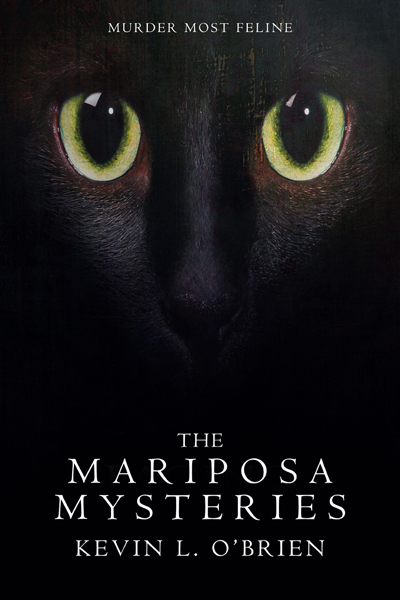
A collection of stories set in Victorian England that combine Sherlock Holmes style mysteries with the Cthulhu Mythos. January Ian “Jaim” Mariposa is a paranormal investigator whose partner/companion is a small black cat named Bubastis. That’s Bubastis on the cover. Target audience is cat lovers, mystery lovers, Lovecraft fans.
Nathan says:
The snark in me say that the cover is only missing two things:
- Holmes-style mysteries.
- The Cthulhu mythos.
It should be easy to find (or commission for a reasonable fee) something monstrous and Victorian; DeviantArt is awash in images like that.
Lovecraft fans in particular are always on the lookout for a good read, but you’ve got to include something on the cover to let them know that this book is for them — and if it isn’t in the title, it’s gotta be in the image.
Other comments?
Maybe it’s the cat lover in me, but other than the overly svelte font I like this cover. As long as the cat is common to all the stories I don’t mind it. Covers for collections are tricky, so I appreciate the simplicity here. Make the text (particularly the tag) more readable and it’s a winner.
This reminds me of the Catslash cover from a while ago, to the extent that I originally thought it was a resubmit. For that cover, where the cat nominally is the supernatural murderer, I thought this showed some inspired improvements.
For a Cthulhu/Victorian angle I do think Nathan is right that some weird fiction element would help, and I don’t think this concept will allow for that because the cat’s face needs a lot of space on the cover for this concept to be effective. One might try some tentacle-like ornamentation around the bottom edge, below the text, to evoke a ‘nightmares rising from the darkness’ kind of thing. Beyond that the only suggestion I have is to increase the heft of the letters in the title just a little. They look good, but are thin enough to be just too hard to read easily at thumbnail size.
Pretty good! But…
There is absolutely nothing whatsoever that suggests either Holmes or Lovecraft. Especially when your tagline is “Murder most feline.”
As nicely done as the cover is, I think you need to go back to square one and rethink the art entirely from scratch.
At the very least hint at the structure of the collection, but it’s a cool cover. It’s funny, when a cover is abstract the critics say “reference the book”, yet when the cover references the book they say “don;t be too literal”.
The point is, “Use imagery to attract the readers who would like the book.” It could be as simple as “If military history readers like books with green covers, use a green cover for your military history book.” The point is never to tell the whole story on the cover, or even to present a scene from the story literally — the point is to grab the right eyeballs with the visual cues that your audience reacts to.
That’s why I believe this cover only needs a more descriptive tag rather than a redo. You can’t represent all the stories in the collection, so instead he represented the common element in a visually striking manner. “Murder most feline” is the weak point.
Every story in the book may be different, but they are all evidently connected by being a combination of “Sherlock Holmes style mysteries with the Cthulhu Mythos.” It is this connection that needs to be conveyed by the cover…which it does not do.
For instance, Holmes in hand to hand combat with an Old One would get across the idea behind the collection better than a generic black cat.
No, B.L. There’s nothing wrong with the cover if it’s for another “cat solves mysteries” series, or one with heavy cat “influence” or theme, like “The Cat Who…” mysteries like those by Lillian Braun, or the Katwalk mysteries, etc. It’s really not a great cover for a Lovecraftian, Holmesian, Cthulhu-ic book–mystery or otherwise.
It’s a cool cover–but, as we find ourselves saying, often, here, about cool covers,–it’s a cool cover for an entirely different book. It’s great–but not for this book. I would never–never–even glance at this for the genre/area in which it’s being targeted. I’d think it’s either a) black magic-affected genre, e.g., witchcraft and all that cruft, or b) the aforementioned cat-themed mysteries. And honestly, who the hell connects cats and Holmes or Holmesian? Not I. Not pretty much anybody (although, I’m QUITE sure that RK will see this post and “treat” me to various and sundry cat-Holmes stuff on the Zon or Smashcurds.)
That’s what we’re saying. Cool, yes (although…not wild about the fonts, my own self). For this book? Nope.
As Nathan said, DeviantArt is awash with great artists for precisely THIS book. And not horribly expensively, either. Heck, you could probably even find something free on Pixabay that would work. (Did I say, to whomever, I adore the idea of Holmes wrestling Cthulhu???)
That’s my $0.02.
“At the very least hint at the structure of the collection, but it’s a cool cover. It’s funny, when a cover is abstract the critics say “reference the book”, yet when the cover references the book they say “don;t be too literal”.”
Can’t say I ever said that myself! A cover absolutely should reference the book.
So your target audience is readers who love cats, Sherlocke Holmes mysteries, and the Cthulhu Mythos? Well, I guess one out of three isn’t a total failure, but your cover’s definitely not ready for prime time. Not only are the cat’s eyes all I could see in the thumbnail, but they’re wide open in an innocent-looking “puppy-dog” kind of way; if Bubastis (an homage to Ozymandias’ cat in the Watchmen graphic novel?) is not secretly a vessel for some powerful eldritch abomination like the space alien from The Thing initially shown posing as a dog, I suppose that innocent look might be appropriate to his character, but all this cover had me thinking when I first saw it was “Some author is probably looking to sell a coffee table book as a way of trying to cash in on the internet’s LOLCats phenomenon.”
Basically, if all you’ve got on your cover is a cute and innocent-looking cat, a lot of other casual browsers are going to think the same thing. The vast majority of clicks will be from the kind of easily amused people who are into cute animal pictures like that, and when they discover that’s not really what your book is about at all, most of them will likely move on without buying it. Meanwhile, people who might actually appreciate a Holmes-and-Cthulhu mash-up with a feline companion animal thrown in for good measure will mostly pass it by without clicking on it based on the same assumption (i.e. the “mystery” indicated in the title is just an excuse plot to justify showing people a lot of pictures of cute things the author’s cat did).
Having a cute wide-eyed companion animal on the cover is fine, but your primary focus should be on the detective mystery and supernatural horror combination. A better image to capture your target audience’s attention would be a shot of some Holmes-like detective (the hooked pipe, fedora, and trench coat are optional) and his cat shown strolling through some stereotypically noirish horror setting (spooky old mansion, mean ghetto streets, abandoned insane asylum, etc.) with some tentacles snaking out from some dark corner to menace said cat and detective. This works even better if you can get a shot of the cat recoiling in terror with his mouth wide open, indicating he was the first to notice the threat. (“Um, boss? I don’t like the look of this pl— Aughgetitawayfromme!”)
Of course, with supernatural horrors like the Cthulhu Mythos in which the horror is not necessarily very clearly defined, making the setting sufficiently creepy is what makes all the difference. Take one of my favorite YA horror novel covers Terror in the Tomb of Death, which was for a book that wasn’t actually even meant to be all that scary: having poisonous-looking snakes slithering among the mummified corpses certainly helps enhance how creepy the Egyptian tomb looks, but there’s something unsettling about all of it even without them. As for the protagonist standing there holding the flashlight in the background, you could substitute just about anyone or anything for him into the frame and the image would still have the same effect.
So feel free to insert into the frame whatever kind of cat and detective you want your prospective readers to see, but when you’re picking out the setting, go for broke looking for the creepiest imagery you can find. Considering you’re working specifically from the Cthulhu Mythos here, I’d recommend looking at the heathen temple from the movie Dagon (loosely based on Lovecraft’s The Shadow Over Innsmouth) for pointers. This being a collection of stories, and the Victorian era having its share of potentially creepy locations (the miserable slums and hazardous slaughterhouses and bleak drafty old orphanages of Oliver Twist come to mind), you should have more than enough varieties of images of dark and vaguely disquieting locations available at a reasonable price to use for the setting on your cover.
When I first looked at the cover image, and those big eyes, I saw an alien. I guess that’s the science fiction writer in me. I quickly realized that it was a cat, but the face looked distorted, almost elongated. That look really pulled at my curiosity. I wanted to know more about what the book was about. So, for me, the cover worked very well to draw me in. However, I’m not that much into period pieces, and am not your main target audience. I think the others are right that you need incorporate elements of the period and/or the mythology. Love the tag line, Murder Most Feline. I hope you come up with a cover where you can keep that.
Yes, I know: shut up. But I must apologize; I should have made clear that my paranormal investigator is partnered with a small black cat who helps him solve the mysteries, so both the investigator and the cat will prominently appear in all the stories. I should also have made clear that the Holmesian aspect of the stories is the presence of a consulting detective with other Holmesian characters, and that the Mythos elements are subtle rather blatant; ie, no tentacled eldritch horrors.
I also should have explained that I am using Bubastis as a branding tactic. Every book cover in the series will feature a black cat on the cover, just as in the stories Jaim uses Bubastis as a mnemonic device so people remember the consulting detective with the uncanny little black cat. In fact, I expect readers to remember the cat more than the man.
For these and other omissions I apologize.
For RK: I didn’t even know about Ozymandias’s cat in the Watchmen graphic novel until I saw the movie. “Bubastis” is another name for the Egyptian cat goddess Bast, and the name of the ancient city in which Bast was worshiped.
Otherwise, I thank you all for your comments. They are much appreciated.
You could add some other element to the cover in the form of a reflection in the cat’s eyes – this would keep the main idea of the cover while narrowing the focus.
It’s a nice composition but it’s not right for this books. I’ve written up here
https://www.kathrynrosamiller.com/single-post/2018/04/17/The-Mariposa-Mysteries
ad mocked up some examples of how I think you need to think about redeveloping your cover to get something that’s going to communicate to browsers and get the right people to check this book out.
Like RK says your primary focus should be on the detective mystery and supernatural horror combination and you need imagery that shouts that!
Greetings Kata:
I could not leave a reply on your blog, so let me make a few comments here.
I honestly believe it would have been courteous to ask permission before featuring me in you blog. The fact that I posted to a public forum does not in and of itself grant blanket permission for anyone to publicly critique my cover outside of the venue I posted it to. And I would say the same thing even if you praised my cover.
My stories are not “Holmes/Cthulu … mashup”; that is, they are not about Sherlock Holmes vs. the Cthulhu Mythos. That’s partially my fault, since I did not explain that better in my description of the book, and apparently my later clarification was also not clear, so let me try to rectify that: the stories are about Jaim Mariposa and his partner Bastet using Holmesian flavor and tropes and setting, and the more subtle aspects of the Mythos, to tell unique stories that hint at cosmic (not supernatural) horror but don’t present it as the main point.
“…creepy tentacles are a big thing for Lovecraft covers…”
I wanted to avoid such an obvious cliche.
I am personally turned off by the style of the cover designs you suggest; I would not give any book with those covers a second glance. The designs also do not convey what the book is really about, though again that’s probably my fault for not describing it better. I did not mean to imply that horror was the point of the stories; they’re mysteries in which the perpetrators/weapons are connected with the Mythos, but they are not Mythos stories except in a peripheral sense.
Kevin, I’m siding with Kata here. This is the internet. People discuss things on various sites. Trying to limit the venues in which something you posted publicly is discussed is wrong-headed. (Just imagine if someone were to comment on the actual CONTENT of your book in non-approved venues! Horrors!)
If your stories are not a Holmes/Cthulhu mashup, then the first line of your description shouldn’t be “A collection of stories set in Victorian England that combine Sherlock Holmes style mysteries with the Cthulhu Mythos.” This isn’t “partly” your fault or “probably” your fault; this is WHOLLY your fault. All we have had to go on is your description of your book; you had better be more careful in your use of words (you know, those things that writers use) if you don’t want people to assume that what you say is what you mean.
I did not try to limit the venues in which something I posted is discussed, I only stated it would be courteous to ask first. Being the Internet does not abrogate courtesy, and believing it does is what’s wrong-headed. Had she asked I most likely would have said yes; it’s simply proper to ask first than assume.
As for your second paragraph, I acknowledged — at least twice — that it was my fault, so there was no reason to snarkily beat me over the head with it as if I hadn’t. This is the first time I submitted to your critique site, so my presentation was likely to be clumsy. Being as an “elevator” description is not a book, there is no opportunity to go back and reedit. However, I do assume that people are intelligent and can reason whether assumptions made in haste are correct. The fact that the cover did not show cliched Lovecraftian horror elements could have been deliberate rather than a mistake, to show that the horror aspects were not the major point of the stories, in which case a reasoned evaluation would have been that critiquing the lack of such elements was wrong-headed. At least, it would have been reasonable to consider that possibility.
Again: Welcome to the internet. Enjoy your stay.
So when we’re judging the cover by the description, we should also be judging the description by the cover? If you insist on putting the cart before the horse, you’re not going to go very fast. And saying “It may have partly possibly been my fault BUT [full paragraph on how it’s not my fault” is not exactly a good-faith way of owning up to mistakes.
And since the “shut up” dictum to submitters was both referenced and then summarily ignored for several more comments, I’m going to (a) close down the thread, and (b) skip the other three covers that this author submitted in a bunch. This is a site for constructive critique and commentary, not authorial defense.