The author says:
She thought he was neurotic. He thought she was psychotic.
The Navy thought they were the perfect pair. Shelby Ryder is a loose cannon. A Kansas farm girl, she became a Navy SEAL to avenge her parents, who were killed on vacation when a Russian sub torpedoed their catamaran. Earl Bernstein, from Chicago, became a SEAL to get away from his over-protective parents. Earl’s the sensitive type. He writes poetry and worries about his teeth enamel eroding. The Navy thought by pairing them together they would balance each other out. They were wrong. After brushes with the law and staying just this side of sanity, Shelby and Earl are on the verge of being de-SEALed. Now they’ve been given one last chance to redeem themselves. It’s a simple enough mission: they’re tasked with finding a United States senator who disappeared in Cuba while playing golf. But then one day the president tweets that the Russians are responsible, and things get hairy in a hurry. Soon it becomes clear—if Shelby and Earl don’t get the senator back, the situation will escalate into a nuclear war. So into the steamy Cuban jungles filled with snakes, spies and a German tuba band, the pair ventures, breaking every rule of civilized behavior known to man as they desperately try to find the senator before the missiles fly or Earl runs out of anti-cavity rinse.
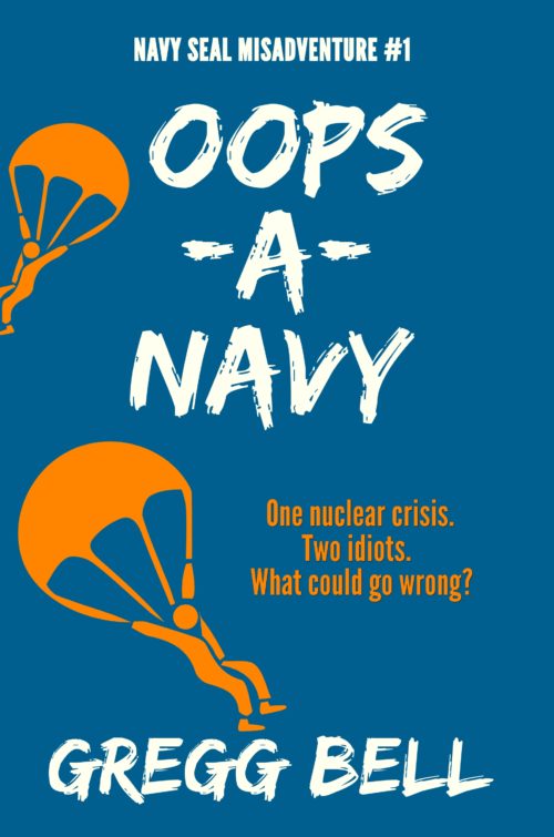
This is what I would like to think is a final image. It’s not a quick concept demo. Set in Cuba now.
genre: humorous thriller
target audience: people who like over-the-top humor
similar authors: Carl Hiaasen, Tim Dorsey
Nathan says:
Hmm. Something about it says “memoir” or something similar to me. The title and tagline point to comedy, but the graphic elements don’t convey humor (which is tough to do).
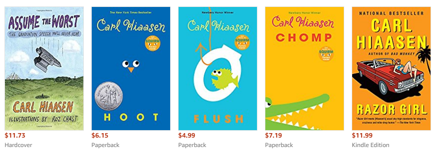
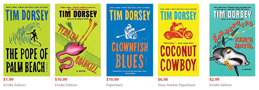
I took a look at covers by the authors you mention, Carl Hiassen and Tim Dorsey:
I can see where you drew on them for inspiration, but I think you missed the part that conveys humor. The images on the majority of covers from both authors are more than a little cartoony, and the majority of the fonts are either more chaotic than yours (which could be solved by shifting the letter positions, etc.) or more whimsical.
I think you’re on the right track. You just need to bring the funny.
Other comments?


Really, really close!
I would, as Nathan suggests, take the art just a wee bit further into caricature. Also be a little more aware of composition while you are at it. (You might, for starters, consider making at least one of the parachutists much larger.)
Thanks very much, Ron and Nathan. One thought I had regarding what Nathan said about those covers he posted was that “Hoot,” “Chomp,” and “Flush” are all childrens books. And “Assume the Worst” is a book for school graduates. The images for the adult humorous thriller covers are not that humorous. “Coconut Cowboy” is just a guy on a motorcycle. “Razor Girl” is just a girl on a car. I was told that when it comes to humorous thriller covers, it was ‘one or the other,’ if you will. Meaning either have a humorous title or a humorous image. Of course it can’t hurt to have both, but I thought “Oops-A-Navy” was a pretty whimsical title. And with the parachuters going in different directions and being icons, I thought that was pretty whimsical as well, and certainly as humorous, if not more so, than the covers for “Coconut Cowboy,” “Clownfish Blues” and “Razor Girl.” I guess if the ‘either or’ model is correct, I chose the title to the let the reader know that the book was going to be humorous.
And thanks Ron regarding the suggestion to make at least one of the parachuters much larger, but considering the tight fit on the bottom parachuter, and the top parachuter needing to be smaller for perspective’s sake, I didn’t see a lot of wiggle room for making either one any larger.
Eh, my first guess from the thumbnail would have been “Funny stories from this author’s time served in the Navy.” Your description makes it sound like it’s supposed to be more like Doctor Strangelove; the posters for which, incidentally, would make a good case study in the kind of imagery you should have on your cover. Cartoonish art is good, but what you’ve got right now looks a bit more like stencil artwork than the vector graphics or line-drawing caricatures on those similar authors’ covers.
Sight gags are especially difficult when the joke is something you’d only understand after reading the book or watching the movie in question (though that one shot of the guy in the cowboy hat riding the bomb on one of those Doctor Strangelove posters is sort of funny even if you haven’t seen the movie, I suppose). As such, the usual solution is to show prospective readers imagery that doesn’t exactly tell a joke itself, but does let them know there will be jokes in this story. Considering that some of the humor is apparently based on the protagonists being odd-couple protagonists, I’d recommend caricatures depicting the gal armed to the teeth and all done up in bandoliers and weighted down with military equipment like some kind of female Rambo, and depicting the guy as a wuss wearing an ill-fitting military uniform clearly intended for someone more muscular and basically looking like the affirmative-action hire your description suggests him to be (i.e. the guy who was a 90-pound weakling until he lost some weight, and would never have been recruited in the first place if the parasitic “diversity experts” in the Pentagon hadn’t given the recruiters “diversity” quotas to fill).
Basically, they don’t actually have to be doing anything obviously funny on the cover (though if you can throw some slapstick in there, your prospective readers will doubtless appreciate the effort), but they do at least need to look funny. People swinging from parachutes = not funny. Mismatched female Rambo wannabe & wimpy male draft-board reject = funny.
Thanks RK. I see the Doctor Strangelove connection. In fact, I did a cover with a missile taking off and aimed at two parachuters, but it was too cartoonish, and I thought ultimately it looked like a kid’s book. Seems getting an adult humorous cover right is a delicate balance. Appreciate the feedback.
Sadly, the author seems to think his book cover is pretty much untouchable as it is, which makes me wonder why he bothered to post it for comment.
And, yes, the large parachutist could easily be much larger…if the rest of the cover were to be redesigned to accommodate. (The entire design needs to be made less left-handed lopsided in any case.)
Thanks Ron. Untouchable? Hardly. If I was that confident, I wouldn’t have posted here. I’ll take another look at your suggestion of making the large parachuter bigger and see if I can make that work. And I can see what you’re saying about the left-handed lopsidedness. Appreciate your feedback.
Saw this for some weeks while I was lurking over at the KBoards. Seeing it over here, I thought I’d donate a super quick/messy edit that may help others trying to emulate similar genre covers:
http://de.tinypic.com/view.php?pic=xgjna&s=9
Based on the Tim Dorsey examples, I saw two places to add comedic energy: the title text and the visual storytelling (add a gag!).
Text: Horizontal lines (whether explicit or implied) imply a peaceful mood in visual art. The current title text is perfectly horizontal and staid, like a soldier at attention.
Diagonals give energy and can imply wackiness, so I tilted the text and bumped the individual letters up and down to make it more playful. I also enlarged the text to keep that right side from being so empty. If I had my druthers, I’d change the author name typeface (maybe to match the series name?). But like I said, this just a quick free thing.
Visual storytelling: I remember at KBoards everyone saying to add a gator…so I found one that fit with the visual style here and pasted him in roughly it looks like the parachutist is flying right into his mouth. Three lines give the figure a funny emotional reaction to said gator, which cues your audience “Hey, don’t take this too seriously.”
( Here’s the royalty-free stock I extracted the gator from:
https://www.dreamstime.com/royalty-free-stock-photography-sea-river-fish-animal-attacking-human-pictogram-ic-set-representing-water-animals-big-shark-jellyfish-piranha-image37931977 )
tl;dr Visual gag + crazier typeface energy might add the comedic cues you need without starting from scratch. Your or your designer should be able to make adjustments like these as long as you have the non-flattened work files.
Good luck!
(resubmitted in case it didn’t send the first time)
Thanks Danielle. Wow, your version is definitely loaded with comedic energy. And I can see what you’re saying about the diagonal text livening things up. And the gator makes it unmistakably funny. And thanks for the link with the images. 🙂
Thanks! I look forward to seeing what you wind up with. 🙂
Have you looked into Dave Barry’s fiction books for adults (Insane City, Big Trouble, Tricky Business)? Their covers may also have some comic energy and design decisions to emulate.
Another collection of covers worth looking at is those of Christopher Brookmyre’s novels, also within the genre of comic thrillers.
They are not a million miles from the Hiasson or Dorsey covers – simple, colourful graphics and typography chosen to imply ‘quirky’ and ‘fun;’.
https://images.gr-assets.com/books/1415585902l/289170.jpg
https://images.gr-assets.com/books/1421010687l/289173.jpg
https://images-eu.ssl-images-amazon.com/images/I/41htyf%2BpzwL.jpg
Again, you are definitely on a similar tack in a lot of ways, which is great because it’s clearly correct for your genre.
There are some important differences to note about what these covers artists are doing for Hiasson, Brookmyre et all that you could pull your own cover towards real effectiveness.
One thing that is always massively important to consider on any cover is the realtionship between title and imagery. You’ll notice on the Brookmyre covers the imagery is fairly sparse and not necessarily explicitely humourous in itself. That’s because it doesn’t need to sell that angle. The titles are already punning and playing on words, and the cover artist has leant into that with the typographical treatment.
Your title signals the humour too, which is great.
Another point to note is how these covers are referring to the thriller genre visually. I think they are pretty intentionally riffing specifically on these Raymond Chndler covers: https://i.pinimg.com/originals/b6/ff/b3/b6ffb30fa2af02a290f2bfcc8f816536.jpg
So there is a visual joke there, but it’s not in having cartoonish imagery – it’s taking a hardboiled-but-witty aesthetic and applying it to a book with ‘rubber ducks’ in the title.
When Nathan talks about being humourous in the imagery, I don’t think he’s necessarily saying ‘draw a cartoon’, it can be this kind of gag which clues viewers into the tone and genre/s of the book.
A book called ‘oops-a-navy’ which references the serious thriller in some appropriate way could be your way too.
At the moment it’s falling between too stools – not leaing into the humur enough to be appealing that way, not making clear enough the thriller aesthetic to play up the interesting juxtaposition.
On that note, I don’t think your current imagery is doing much. Imagery on the front of a book need to work hard, and these parachutists aren’t really pulling their weight. I like Danielle’s suggestion/mockup of including a shark as it brings the imagery to life a bit, tells a story, sells a tone.
Alternatively, from the sounds of it your book is full of madcap adventure. I bet you can find something far more evocative from within to use as cover imagery, that really tells us something about the vibe in a way these parachustists don’t.
I mean “steamy Cuban jungles filled with snakes, spies and a German tuba band”? That’s the kind of thing I want to see implied on the cover if its in the book!
Thanks very much, Kata. Your post makes a lot of sense. And I really like the Brookmyre covers. (I wasn’t familiar with them.) It’s so clear that they’re the same brand too. (And I can see the influence of the Chandler cover.)
And you’re right that my book is madcap. I did several covers trying to convey that (one with an open-mouthed alligator waiting for the parachuters, another with a missile launching and aimed at the parachuters). But the covers really came off as cartoonish. That they were clip-art didn’t help things. They ended up looking like kids’ books and really, I thought, kind of cheesy.
My immediate thought was wouldn’t it be cool if the bottom guys clothes fluttered in the wind a bit like the ass of his pants was ballooned out from wind pressure. that would be a simple addition to add the humorous element while keeping the original feel.
I agree with the comments on title and art sizing as well and loved Danielle’s mock-up!
Thanks for the suggestion sm. Appreciate it.
I’ve had discussions with the submitter on other boards, so he knows my comments on this. My one comment, here, is that you really cannnot use Hiaasen or Dorsey as a design model, because unlike the submitter, everyone already knows that they write adult humor. While it’s obvious that someone spends a bit of money on them…they’re simply not as important, for those authors, as they are for new-to-the-public-at-large authors. You don’t need to look at Hiaasen’s cover and chuckle, because by the time you get to his cover, you already know what you’re getting.
That’s my sole point. (FWIW, I had suggested flipping one of the parachutists upside down..but I like the gator idea, if a slightly better gator can be found.)
I might give the book a look because the pitch got me hooked. Maybe for part of the cover you might include the smartphone that has the tweet that says “the Russians kidnaped my senator this means war #ww3” or something like that