The author says:
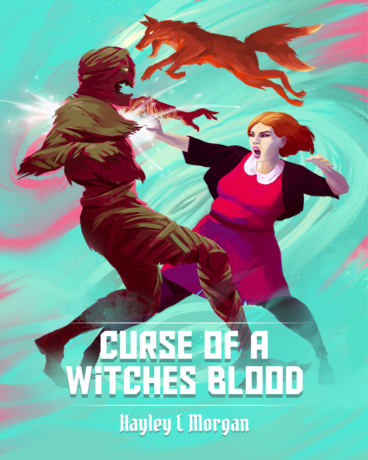
The odd events that have plagued Eve have always made her an outsider. A moving table, shattered windows, a shaking classroom. But when they turn dangerous, Eve is forced to consider something more than just coincidence might be happening. Fighting off horrible creatures with strange powers, her father is kidnapped, and Eve is saved by the one person she never expected to meet: her mother. This is not how her sixteenth birthday was supposed to go. Can she control her power, or will it consume her?
Nathan says:
“Witch’s Blood,” surely? (“No, and don’t call me ‘Shirley!'”)
The artwork is great. A litte cropping, and some tweaking of the type, will bring the rest of the cover up to the artwork’s level. Here’s a five-minute redo:
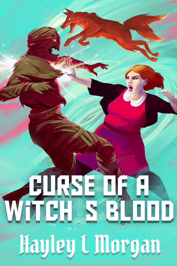
(One of my rules of thumb: “Nobody really needs to see feet.”) I didn’t take the time to find a matching apostrophe because, hey, five minutes.
I’m not sure about the interaction between the title font and the byline font, but that might just be personal taste.
Other comments?
I like it. I like the colors. I’m not going for the fonts, though–I want something with more motion and fluency.
I like it a lot, too! Great job! Tighter cropping and a better choice of type is all that it really needs.
(I am a little unsure about the fox, though, which seems unrelated to the rest of the picture. Rather than floating rather ambiguously, it should definitely be either behind one or both of the figures or in front. It would only take a single paw barely in front or behind part of the girl or creature to do this.)
PS I would not mix and match typefaces, either. The title and author name don’t necessarily have to be in the same face, but they should have some relationship and the type chosen should serve some purpose. I think the face chosen for the author’s name is a little too different.
I likes!
You may want to consider darkening the art around the corners (vignette-ing) to draw the eye more towards the characters–this video shows a digital artist doing it very quickly on his piece (should open right to the moment he talks about vignetting):
https://youtu.be/AKXkTDSvb1k?t=15m49s
You can always darken it on a separate layer to tweak it, see if you like it.
The author byline could be a nice simple sans, I think that might fit better with the cyber-title-type than the high fantasy thing going on right now.
Sounds like a good book! Nice work!
The red-and-cyan contrasts make for a bizarrely effective color scheme, though I can’t help thinking the image looks just a little squashed vertically both in the thumbnail and at full size. 4:5 is a rather odd ratio for a book cover anyway; you couldn’t put it at 2:3? Normally, stretching the image to fit a different aspect ratio would be a big no-no in cover design, but in this case it would seem to be correcting a previous mistake: even for a somewhat stouter woman, the gal’s proportions look just plain wrong on this 5:4 cover, whereas she still looks a bit heavy-set when the image is stretched to fit a 2:3 ratio, but a lot more realistically so.
While I know we’re supposed to focus on the imagery, I also can’t help noticing the grammatical error on this cover is frighteningly consistent with the rather awkward wording of your summary: the second sentence is a fragment, the third is wordy (“a coincidence” would be more concise than “coincidence might be happening”), the fourth sentence contains dangling modifiers (Are the “horrible creatures” or Eve or her father the ones with the strange powers? Was she the one fighting them off, was he, or were they fighting them off together when her father got kidnapped?), and the fourth switches tenses in the middle of the sentence. (“This was not how her sixteenth birthday was supposed to go” or “This is not how her sixteenth birthday is supposed to be going” would be more consistent.) If the contents are as erroneous as the title on the cover, I’d definitely recommend hiring an editor to straighten out your writing before releasing the book for public consumption: once the cover has successfully roped people into taking a look at the preview, nothing kills a potential sale faster than poor grammar and spelling that’s either full of typos or seems to be full of them due to low-quality sentence construction; even people who didn’t get very good grades in English classes in school tend to find awkward and erroneous sentence constructions instinctively off-putting.
I don’t think that your comments about the description are inappropriate. If the author is planning to use those words or similar ones on the back cover, then they become part of the packaging.
Everything relating to the public perception of a book is important. It’s exactly like making sure you are well-groomed when going out on a job interview. If you don’t make a good first impression you are already off to a bad start.
Well, technically it’s the second impression, but that matters too; sort of like if you showed up for the job interview wearing an expensive suit and haircut and carrying an impressive resume only to start speaking ghetto-talk interlaced with obscenities and racial slurs the moment you opened your mouth. As I say, the front cover should look pretty good with just a little adjustment of the aspect ratio, but the preview (and, as you say, the back cover) would really kill any appeal it might otherwise have had.
The suggestion of moving the kitsune so it overlaps slightly with one of the figures is a good one; I think it would give the drawing more of a feeling of space with only a slight tweak of the artwork.
Not sure what’s going on with the fox, as it seems to be leaping somewhere else. I’d reposition it somehow.
Presumably, the MC character on the cover is intentionally a BBW; RK’s observations about that are worth reviewing, in terms of the size/shape and aspect ratio of the cover. I’m not sure if she’s intended to be quite that wide or not, intentional or accidental.
Her teeth look almost sharpish, as though she has sharp, predatory teeth. It’s an optical illusion, I see that by zooming the image, but you may want to try to figure out WHY it’s looking that way. I think it’s the shape of the mouth–it almost looks as though she’s going to take a bit out of her attacker. (Really, if you look at this cover in an unbiased fashion, it’s hard to tell who’s the attacker/bad guy. Sans the description, she looks like an evil witch going after the mummy guy.)
And yes, please, choose different fonts. The byline font has an almost blackletter appearance, which conveys a medieval vibe, which you don’t want. I’m not crazy about the title font, either. I’d recommend a pair of sans fonts, or a sans and serif from the same universal family. Given the artwork, you don’t need foofy fonts.
I’m only asking this out of curiosity… What is going on with the fox’s multiple tails?
It’s a kitsune.
Well, wattaya know. I can’t help but kind of wonder, though, how many potential readers are going to say, “Nice kitsune” rather than “What’s wrong with that fox?” Especially since there is not a clue anywhere, so far as I can tell, that the novel has anything to do with Japanese folklore.
That’s fair. I did find myself rereading the description wondering how Japanese folkore fit into this.