The author says:
LitRPG is a niche within the Fantasy genre. Within even that is something referred to as DungeonRPG or GameRPG. It is Fantasy stories that take place within a game or within a world where the rules are clearly set, like a game. For fun i thought wrote a story that falls on the edge of all three of those.
Adventurers enter dungeons every day. Battling evil monsters, defying dangerous terrain, triumphing over devious traps… … but none of them ever ask why? That arrow trap, who reloads it? The pitfall trap, who cleans out the bodies and sharpens the spikes? What if the grates get clogged, where will the blood and gore drain? When you are trying to study ancient lore or plan on conquering a kingdom, you don’t want to worry about all that. You just want peace.
Mortis Operandi is a different kind of company. One that celebrates diversity. One that celebrates value in individuals. With flexible pay and plenty of advancement opportunities, it is a company that knows its workers are it’s most valuable asset. As they design, build, and install traps, rooms, obstacles, and repair they are a one stop shop. The sudden exit of Mortis Operandi’s CEO, the company was facing ruin. The goblin Eft was choosen as the new CEO and boss. The previous CEO made promises and contracts that Eft now has to fulfill, and it is causing a lot of trouble. Restoring the ancestral home of Ogre’s seems easy enough, what if a thriving town now resides there? Along with facing corporate invasion, Eft must take on the tasks he wouldn’t wish upon his worst foe, Customer Service.
*Note the above statements are forward looking statements. In no way do they promote or suggest that Mortis Operandi will project greater sales or revenue. Understand that investing in a company does involve some risks, and possibly much rewards.
Some covers of books within the Genre for comparison:
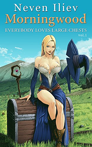
- Morningwood: Everybody Loves Large Chests by Neven Iliev
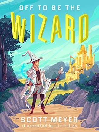
- Off to Be the Wizard by Scott Meyer
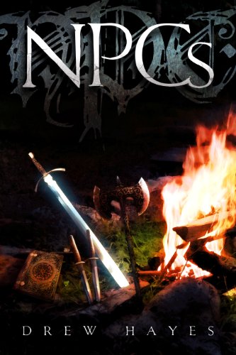
- NPCs by Drew Hayes
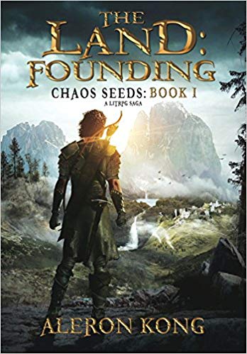
- The Land by Aleron Kong -I think he updated his cover though.
My previous cover you guys rocked at helping my identify things that needed fixing. This time I think the idea for the cover works for the genre but still just looks crappy. So any suggestions or thoughts are appreciated. Even if I have to scrap this one, I’m hoping I’ll have enough to know what is wrong to ensure I don’t pay someone to make the same mistake. Thank you again.
Nathan says:
Just for comparison, here are the four covers you referenced:
Using these four as a sampling, I think the only commonality between fantasy LitRPG covers seems to be “a cover with solid fantasy tropes.”
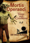
Your novel has a quirky hook: This is the company that works behind the scenes to make all the cool stuff happen. That’s really something that needs to be be put front and center. I can sort of see where you were heading that way with a few of the elements you use, but I’ll be honest: It’s a mishmash. Bad fonts, poor layout, and mismatched graphic elements.
I think you need to start over from concept: How can you get the “hook” of your story on the cover? The first idea I thought of was a Mortis Operandi business card being passed from a goblin hand to a dragon hand (or whatever other fantasy creature’s hand) — enough of a fantasy element in both the hands themselves and in the title font (as in The Land) to convey a high fantasy setting, and the business card as the novel element.
Other ideas?

The cover suffers from the Kitchen Sink Syndrome, which is the urge to include everything on the cover that you think is important.
So there are funny little things happening to the letters in the title—things much too small for anyone to make out, two different B%W graphics that look like something from road warning signs—at two entirely different scales, a goblin and a scroll. And you used two unrelated typefaces one of which is inappropriate for the genre and the other far too overused.
And why you have “CEO” before your name eludes me.
Yet in spite of this plethora of visual elements Nathan is correct in saying that together they really say nothing at all about your book…other than that a goblin might be somehow involved. You need to take a clue from the covers of the books you referenced and focus. You need one dominant element that conveys in a glance something specific about your book—what sets it apart from all the others in its genre. Everything else should go toward supporting that image, not fighting it for attention. For instance, a goblin in a business suit in his executive office…
The be fair, none of those other covers really tell us what the books are about, either. I mean, sure, fantasy. After that, not much else. The first one is humorous in a puerile way (Morningwood? Everybody likes big chests?), but the others don’t say RPGs or anything like that to me. Just…fantasy.
The two with illustrated covers seem to have custom work. The other two are photo-manipulated. Presumably, the books with illustrated covers paid pretty good money for those; the ones with the images are adequate, but not amazing.
I’m not sure what imagery you could use, to convey the idea of a Goblin of all trades; the business card is as good an idea as any. If you can show WELL-drawn hands, a goblin hand, a dragon, a troll…I suppose it’s viable.
Maybe someone else will have a wonderfully creative idea about the imagery for the cover, but at the moment, I got nuttin’.
One last comment–you should be shot for those font choices. Nothing personal, but, please don’t do that again.
Thank you for the suggestions, the business card I think would be simple and able to convey a lot of information. I had no idea what direction to go or even ask someone and it appears I was too close to the project to see.
As for the fonts, I’m sorry.
The CEO thing was me trying to be witty by having that before the author name, however the longer I look at it the more I realize its a horrible idea in the current image.
Seriously though thank you all so far and those who may or may not post later. Like the last time, this is extremely helpful. It helps me see what I want so when I approach a professional I can say that I’m aiming for.
PAPYRUS!! *shakes fist*
Under that long and rather complicated summary, your premise sounds to me more than a little like a summary of the Dungeon Keeper games. While not entirely an original premise, the world probably could use a few more books exploring just who’s running the other half of the show in medieval-ish fantasies: specifically, who’s setting up those dungeons to be crawled in dungeon crawlers. We have seen some meta-fiction books like John Scalzi’s Redshirts and our client Stephan Morse’s The Fiasco dealing with the “other” characters in fantasy and science fiction settings before, but I’d have to say this is the first one I’ve seen that deals with dungeon crawlers specifically; so I guess you’ve got that going for you so far as originality is concerned.
Your current design is rather a mess, however: while a “claymation” style or stenciled-figures-on-warning-signs style or modern-business-guide style are each acceptable approaches to your cover design, they do not mix well under any circumstances whatsoever, and you therefore should definitely not be attempting to do all three at once. Pick one style and stick with it: either a “claymation” kind of picture of the new C.E.O. at his desk in his office (whatever that would look like in a medieval-ish fantasy setting), or a warning sign for a dungeon (again, whatever that would look like in a medieval-ish fantasy setting), or a modern-business-guide style for a not-so-modern fantasy setting. Our esteemed host’s suggestion of showing two fantasy creatures exchanging business cards (again, done in whatever style they would be in a medieval-ish fantasy setting) might also work fairly well for a cover, or you could maybe do a medieval-fantasy parody of a modern recruitment poster (“Goblin Chief Eft wants YOU to help him build and maintain dungeons!”) or a safety poster.
Whatever you do, however, the way to design covers for this kind of story is to do just one thing at a time. Focus on your main character and his part in the central conflict of the story. Assuming the new C.E.O. Eft the goblin is the main character, what’s the main conflict he faces? If it’s keeping the employees on track and the company running smoothly after so suddenly replacing his previous boss, the business guide or recruitment or safety poster design might be the way to go; if it’s the conflict between ogres and the (human?) settlers’ town on their ancestral lands, the “claymation” scene of him in his office (with maybe an ogre and settler sitting in front of his desk) might be your preferred design.
As with the cover image, you also shouldn’t be mixing too many fonts for your title and byline (and as Hitch and Gwen Katz here will tell you, under no circumstances whatsoever should you be using the perpetually problematic Papyrus font for anything). One or (at most) two fonts should be quite enough for this cover. The image comes first, however: figure out whether you want a scene shot straight from the story or a more abstract and symbolic picture featuring something the story’s characters would use (like a business card or guide or poster), and which font(s) to use for your captioning should be easier for both you and us to figure out.
thank you for your comments, the recruitment or Safety poster is brilliant. Funny enough I wasn’t looking at the names of the fonts when working that part out. I was looking to see if it fit the theme I was aiming towards. Thankfully this all has helped me see the cover is beyond my abilities, but I know what to ask for when commissioning something. Thank you again.
Keep the goblin but put him a workshop. Use the detail in the workshop to get the point across. Like you could have gallons of the same exact color paint on a shelf next to boxes of the same parts. Maybe put a heap of broken stuff somewhere under a bench with a shiny new whatever on the bench. Add some sparkle to the new thing and the browser will know subconsciously its an important element.
Fix all the fonts. I’d us a strong fantasy font for the title, maybe even with a grunge metal effect(depends on the art work chosen) and a much simpler font for author name and tag lines. This would be a very fun cover to make! I love your goblin
Thank you, the idea of a busy or a cluttered workshop is a good start. I’ll have to keep the grunge metal effect in the back of my mind for future things, though this cover I think is beyond my current abilities. Thank you again for your thoughts and time.
Maybe try putting goblin in a maid apron and show him about to take a mop, with a bloody or messy scene in the background. Show action that involves cleaning up or fixing.
I would lose the CEO byline- that’s just confusing- and consider a different subtitle besides a stuffy “Terms and Conditions”. No one reads those things when they come up on their computers and they certainly don’t want to read a novel that focuses on that boring, boiler-plate stuff.
Some of the ideas presented, I’m tempted to insert as dividers for parts of the book, like Part 1 – Goblin mopping up blood, Part 2 Goblins reading an instruction manual and ordering a part number. Some excellent suggestions.
As for the CEO thing, I was trying to be witty but forgot the simple rule, that the cover is for people who know nothing about the book, so no one would get it until they read it. I admit it was a poor idea or would be better implemented on swag or something I’m giving out to people in person that have read the book.
Thank you again for the suggestions. All of this is helpful.
I like S Savoy’s idea, but have a different take to consider. Instead of a workshop, have your elf in an office. (He is the CEO, after all.) Show him acting the part, with the office workers creatures from your fantasy realm. Keep the desks and writing utensils era appropriate to maintain the feeling of the time. You can have a window in the background showing a castle on a hill with a dragon flying in the sky, or some similar fantasy elements to set the scene. Maybe even put some motivational posters on the wall made of paper like you used on your cover, but obviously hand drawn with ink. Do your best to reflect a modern office environment, but keeping everything firmly in the fantasy genre. If you can do this properly, I believe it would reflect the humor you imply is within in the book. Hope this helps.
Brilliant!
I dig the idea of the office with a window showing the fantasy aspect. Part of me is tempted to attempt that and to do it in an 8-bit or 16-bit style so it looks like an old NES/SNES game. However I know even that is beyond my current abiltiies, but between that and the business card I think I have an idea of what to commission. Thank you for your time and suggestions.
I like the idea of making it 8-bit style. I think that worked well on the cover of “Off to Be the Wizard.”
I agree–I like that idea.
Alright, the business card idea mulled in the back of my head and I thought I could do that and it not be a dumpster fire.
What do you guys thing of this as a take on the Business card idea. Would simply putting a business card on a black background with nothing else work better?
https://imgur.com/a/fNmVU8p has both an image without a hand and one with. Any thoughts?
thank you all again.
Good concept. Execution problems:
– Turning the card so much makes it hard to read. At most, tilt it 10-15 degrees.
– Find a different title font. I’m begging you.
– WAAAY too many words at too small a size. Imagine if this were an actual business card; there’s no way the recipient would be able to read it! Trim down the words, and make use of the big blank space.
– Most business cards have some contact info.
– The “goblin” hand is unimpressive, and either the goblin is teeny or the business card is huge.
– Rather than a flat black background, make it a very shadowed background of a medieval weapons stockpile or something — dim enough that it can be ignored, but rewarding for the viewer who stops to look.
Unfortunately I think this new design still isn’t working at all. We know it’s supposed to be a business card, but everyone else is just going to see a white rectangle on a black background with a bunch of computer-drawn text. If you want to do a business card, it needs to look like a physical card that exists in physical space, preferably made of old-timey parchment with the text drawn in ink.
The other issue, and I think it’s rather fundamental, is that no matter how nice you make it look, it’s always going to be a cover that’s a ton of text and almost no imagery. Most people won’t even bother zooming in to read the text on your cover, and even fewer are going to take the time to figure out “haha, it’s this goblin’s in-world business card.”
Where this idea would work, I think, is as a giveaway item at events and stuff, where it would be intriguing and people would take the time to read it. Or, alternately, as a digital flyer for you to put up on Instagram and so on. But I don’t think it works as a cover.
If I may–as a total in-joke–I would use some Babelstone font on the card or cover. Now…realistically, only about 1 person in 100 would “get” it, as it’s a take on Tolkien’s Goblin text, but if used a teeny bit, it would be pretty cool/funny for those that do.
Main font-wise, there are some perfectly decent fonts on Dafont that you can use. Chopsic has a strong look. Longshot might work for this. Qallos might be just right–this is not easy to do when the cover is as yet undesigned. Creator Campotype might be perfect for the business card idea. (It can be difficult to read, though, keep that in mind when you do the layout.) Burton’s Nightmare–although it might be too light.
I’m a fan of Beyond Wonderland and again, it might work on the cover depending upon design. Aniron, which isn’t my rave fave, might suit your liking for Papyrus, which I could honestly wish never to see on a cover again as long as i live. One Slice is strong and readable. It may not be foofy enough for you. Highlander might work.
Anyway, there are numerous fonts that can work for a humorous, fantasy book like this. I like the biz card idea, in one way, but I have to agree with Gwen that it’s probably not a winner, all things considered. For the reasons she’s mentioned.
I like Tom Wright’s idea of your Goblin in a busy office, handwritten work posters/whatever on the wall, with flying whatevers out the window.Dragons, unicorns, the usual. You might be able to find a Fiverr or Deviant Artist that could do this for you affordably. Make SURE that they know it’s a cover so that they leave enough room for the text–we see that mistake here all the time. People see a piece of art, fall in love with it, but there’s NO room for the title or byline. Make sure if you commission it, that you too don’t go down that rabbit hole.
Good luck. I really rather like the idea of this book, so I do hope you get a suitable cover for it.
A little late to the party on this one, but I have a suggestion regarding your title.
Rather than “Terms and Conditions”, just call the first one Modus Operandi. Then future volumes can have corporate-speak names with the subtitle “A Modus Operandi Novel” or something similar. This story premise is not entirely unlike the Myth Adventures series, also. Consider looking at the covers of those novels for ideas.
Whoops! MORTIS Operandi. I’m going to blame my phone for that one and definitely not myself for not paying close enough attention.