The author says:
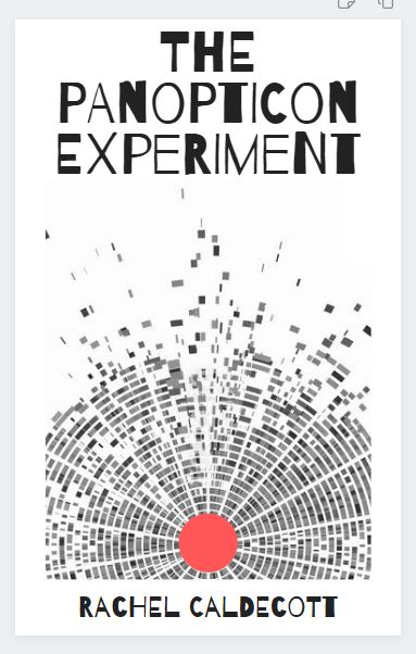
The Panopticon Experiment. YA/Adult crossover. Interspecies telepathy made possible by a mutant gene. Main characters are two 17-year-olds (boy and girl, a snow leopard and an array of baddies). I wanted to avoid simpering girls and cute snow leopards. I don’t have enough money to get a cover designed for me and the ready-to-go covers aren’t suitable. It isn’t a typical YA story so the cover isn’t a typical YA design. This is a complete rough thing I knocked up myself using Canva. The image is DNA sequencing and the circular form reflects the form of a panopticon prison. The red dot is a)visible and b) represents blood.
This is the blurb I was thinking of using: For interspecies telepaths like Flo, the world seems fair and just. Humans and animals live in harmony and the world government represents all sentient beings. When a terrorist attack nearly kills her closest friend, Lonce, the world’s last snow leopard, Flo realizes that life in New Era London is not as safe as she thought. Generations after the apocalypse, a new society based on equality has emerged from the ashes of the old, yet only those with the telepathy gene may serve on the highest council. Marginalized and resentful, those lacking the gene, form a secret society – The Human Supremacy League. Its mission: restore man as the dominant species and eliminate the telepathy gene. Ten years before, the League killed Flo’s parents, and she now aims to find their killers and prevent the league from destroying the genetic bond between man and animal. But she can’t do it alone. While Lonce joins her on her quest, Seb attempts to infiltrate the HSL. He is captured and delivered into the hands of league’s chief scientist at the mysterious Panopticon. With Lonce at her side, Flo races to rescue him before her friend becomes the latest experiment.
Nathan says:
I think the first problem is glaringly obvious: If you have to explain the cover imagery, it isn’t doing its job — a cover has to be understood BEFORE a potential reader knows anything else about the story.
Whether the story is “typical” YA or not, you have to identify: Who is my target reader, and how is she used to have books targeted to her? That means that the cover may not accurately represent the contents, but that’s okay IF the cover attracts the appropriate eyeballs.
The problem here is I can tell absolutely nothing about the book from the cover. Not just “I can’t tell it’s about a snow leopard” or “I don’t recognize the image as being DNA sequencing”; I can’t tell that it’s YA, or that it’s SF, or even that it’s fiction vs. nonfiction. To use the term found over at LBC, this cover is total “mystery meat.”
A readable title font that says “SF,” a partial image of a snow leopard head, and a color scheme that says “YA” (yes, the color scheme can convey that, and more easily than any specific imagery) — that would be a simple cover that hits the bases.
Other comments?
Yup. Any cover that has to be explained needs to be rethought. I think what’s happened is that you have fallen into a trap that snares many DIY cover creators: the lack of objectivity. YOU know the significance of all of the visual elements because you are intimately familiar with the story…but this is an advantage the potential reader will not have.
There is, unfortunately, not a clue on the cover that suggests anything of some of the really interesting aspects of the book as described in your proposed blurb. There is nothing to suggest interspecies telepathy, nothing to suggest humans and animals living together as (evidently) equals. nothing to suggest that your protagonist has a snow leopard as a best friend or that there is any kind of adventure or mystery involved…and so on. Your description is filled with potentially strong visuals—and many that would make your book appear unique: you should take advantage of those.
So, in short: Although your cover is very attractive as a graphic design, it doesn’t convey anything sensible about the nature, ideas or themes of your book. I think you really need to go back to square one and reconsider the cover entirely.
To take a spin off of something Nathan suggested, perhaps an image of a snow leopard and its young friend that transitions into the columns of a DNA sequence might be a starting point. (Though I am not too sure if I would count on anyone, let along a YA reader, recognizing the sequencing for what it is.)
IMO this cover should show the two species being friends as that is the hook of this story but with more of the focus on the animal is ‘human’. The DNA stuff, the telepathy is all secondary stuff they can learn while reading the story, but to entice a reader to read it you need to show the thing that makes this different from a million other books and a friendship between a human an animal as equals would do that.
the Man Kzin Wars covers spring to mind as good examples. They all show the animal using a human artifact of some kind or in some way behaving ‘human’
I think that’s what this book needs. I’d read that book…lol
In fact, this cover reminds me a lot of the covers on various British-published books I inherited from my late mother: all abstract shapes and dots and lines that don’t look like much of anything in particular. A lot of them are famous classics like Aldous Huxley’s Brave New World, so I know the lack of quality wasn’t due to the publishers not being able to afford decent cover designers. As far as I can tell, the reason is simply that British publishers in the 1960s figured they could sell anything and didn’t need the book’s covers to advertise.
Whether they were right about that or not (maybe they were; they somehow sold them to my mother here in the United States, after all), we’re not in the 1960s anymore, nor are we selling to a book-hungry British market. Books need their covers to advertise them, and indie books especially, since the explosion of indie-published books has saturated the market to the breaking point with oceans of sub-par novels few people care to read in a time when public literacy is in decline. Creative and experimental as you may be when writing a book, you need to be a lot more cynical and mercenary when marketing it.
When reading your summary, my very first reaction was to your “I wanted to avoid simpering girls and cute snow leopards” statement: “Aw, but people like to see simpering girls and cute snow leopards!” “It isn’t a typical YA story…” you say? To that, I can only reply “So what!? That’s no reason why you shouldn’t market it like a typical YA story.”
Again, we’re not in the 1960s anymore and while being abstract and experimental and symbolic and all that artsy-fartsy stuff is fine while you’re writing the book, pretentious “art for art’s sake” is exactly what you should be trying to avoid putting on your cover these days. What your prospective readers want to see is some click-bait eye candy and maybe a jingle (i.e. a tagline), not how avant-garde you can be with your art. Bottom line: get a picture of that simpering mutant girl Flo with her cute snow leopard Lonce up on your cover on the double; your marketing depends on it!
(Side note to Nathan: I can’t help noticing something seems to be causing your sidebar feed on Lousy Book Covers to lag badly. Neither this latest cover submission nor your latest comic on Cheap Caffeine are showing up there although the posts have already been up on these sites for at least four hours by my estimate. A glitch in the time-stamp system, perhaps?)
Yes, the old plugin I used hadn’t been updated forever and broke in a recent WordPress update, and the one I replaced it with only mimics the function of the old one gross terms. I’ll keep looking.
After looking for images of snow leopards I went back to the concept above but with a bit more clarity, I hope.
https://i.imgur.com/vlqDGMx.jpg
Sadly, probably not. I don’t think this is really much more indicative of the book’s idea and themes as the original (though it’s very nicely done!). Just like the original, it would take pre-knowledge of the book to appreciate at all what the cover represents. And without that pre-knowledge I am not very sure that the target audience would have a clue as to what they are looking at. What was apparently meant to suggest–or at least represent–blood in the original now resembles a red ball…giving the entire cover image a vague resemblance to a roulette wheel. But I would hesitate being more explicit about the blood: the book might then be taken to be some sort of murder mystery or thriller.
I really do think that the cover needs to be more character-oriented if for no other reason than the apparent uniqueness of the human-animal relationships the author describes.
Unfortunately, we regularly see how characters don’t work on covers unless professionally created through photography or art. I usually assume the presenter based their mock-up on ideas from the book so I usually start there, recreating the idea of the original.
A syringe adjacent to the drop of blood might help, but without reading the book I’m once again pulling ideas out of a truncated description as well as anatomical cavities.
https://i.imgur.com/LNYaphL.jpg
That one, BL–other than the sepia-ish overtone, which doesn’t knock my socks off–is pretty good. I don’t think it conveys a humanized Snow Leopard, but it’s not clear to me that the animal is anthropomorphized anyway. (Is it? Does it walk on two legs, or..?). I do feel it’s screaming for contrast, though. (Savoy will tell you that I’m a total Contrast Ho!)
Depositphotos has some fantastic Snow Leopard illos that you could use as a background, or…there are at least 3 here that are serious contenders: https://depositphotos.com/vector-images/snow-leopard.html
You could also consider a Snowleopard-patterned background, perhaps (or….and this would have to be done JUST right, perhaps a pattern inside block-style sans-serif letters? That could go horribly wrong, but it might be madly successful IF done right…)
This also has possibilities: https://depositphotos.com/170846214/stock-illustration-footprints-of-a-big-cat.html
Anyway, Rachel: I agree with the others. I know, I know, you don’t want to embrace the cover reality–but you have to if you want the book to sell. When I saw your cover, I, exactly like RK, immediately flashed back to Brit covers of Literary Fiction of the 60’s. That’s what it screams–not genre YA fiction.
Remember this mantra: your cover is clickbait. Do not fall prey to that silly idea that some authors have, that if they make their cover “out there” or incoherent or indecipherable or dissonant that it will inspire people to pick it up. It won’t. No YA fantasy reader is going to pick up that cover–it’s that simple. They’ll automatically assume that it’s not what they’re seeking. 1960’s Sci-Fi LitFic? You BETCHA. 2020 YA? No.
And please–please–don’t use that font. I thought your name was Caldecooti.
I’m sure we’d all love to see the next iteration.
PS: Canstockphoto has some splendid watercolors of Snow Leopards for relative pennies ($5-$6).
I was just happy to blend a digital girl with a real leopard.
The image was BW so I shifted the hue to be less boring, and I lazily reused the title and byline from the other mockup to fill the space. A gradiated stream of DNA sequencing under the title might add interets. Like you, I know nothing about the leopard beyond its existence and name. If it’s anthropomorphized I’d go back to abstract rather than attempt to illustrate such a thing.
Pretty nice! I think that if something could be come up with to suggest a psychic link between the leopard and the girl–and it only need be a suggestion–that might nail it
I got it
https://i.imgur.com/p5OmHyt.jpg
LMAO!!!
Heh heh… Yeah, that’s one way to do it!
Of course, if it were up to me, I might just put a dot on each character’s forehead and draw a curved line between them something like the units in Red Alert 2: Yuri’s Revenge when they were either mind-controlling something or being mind-controlled. (As I remember someone joking, that game might as well be called Red Mind Rape Alert 2: Hooray For Mind Rape!) It was a simple enough illustration for most players to grasp how that worked when that game rolled out. The other way of portraying such a thing on the cover is to show lots and lots of concentric circles radiating out from each character’s head… but that might clutter the cover too much.
Actually, I don’t see any necessity for it anyway: if a girl and a big carnivorous cat can hang around with each other without getting into a fight, it’s obvious they’ve got some kind of rapport with each other. As I said, readers like seeing a simpering girl and a cute snow leopard hanging out together on the cover. Anything beyond that is just a bonus.
I could always have them both wear Doc Brown mind readers.
The problem here, as I see it, is that you’ve written a YA book but seem to desperately wish you hadn’t. Your description drips with contempt that anyone might think your book is for young adults, similar to other young adult books, containing elements common to young adult books, etc. So you’ve made a cover that’s deliberately intended to head people off and prevent them from realizing what’s inside.
My advice: Get over it and embrace that you’ve written a book for teenagers containing common YA tropes and that it is not smarter, more sophisticated, or more original than other YA books, because there is a ton of smart, sophisticated, original YA already. (There’s also plenty of trash YA, but that’s no different than any other genre.)
Then look up some YA books with animal sidekicks (The Tiger’s Watch by Julia Ember, Virals by Kathy Reichs) or psychics (Sekret by Lindsay Smith, The Diviners by Libba Bray, Open Minds by Susan Kaye Quinn) or psychics who communicate with animal sidekicks (The Knife of Never Letting Go by Patrick Ness) and make something similar.
P.S. There is no such genre as “crossover.”
The cover for The Tiger’s Watch really has everything you need.
Not too different from my second mock-up. A more appropriate color, contrast, and perhaps one more important element from the book and it could work. And an image appropriate typeface, of course.
Yeah, your mock-up is very nice. And it conveys the sci-fi element, which, of course, this fantasy novel doesn’t.
https://i.imgur.com/soafHFH.jpg
I liked the girl and the leopard better, this image is otherwise impressive but the human is clearly a pseudohuman, a posable digital puppet.
I would say of all of these though, that you have gone for rather dull fonts. The silvery surface in some is very 1980’s as well. This is nicer but still a bit off, perhaps having lettering of different sizes would help? Like fear not the Capital Letter. Also, colour contrast. The title could be in a bright, warm colour to stand out from the blue.
And actually I don’t think there is that much of a stigma against abstract art in YA covers – but it should then be really good and dramatic, to intrigue the potential reader. Like https://www.goodreads.com/book/show/33876440-this-mortal-coil – but even then seems to be rare.
These are mock-ups to present ideas, not finished covers.
There’s no stigma, Tuula, against single strong graphic elements (to wit, Twilight, or Allegiant, for example). But something, somewhere, has to screech “YA” or fantasy or something. (Not to mention, having a trade publisher helps!). We saw it with Game of Thrones’ first book.
But that graphic is just not working for this plotline. If nothing else, it looks like a sci-fi novel–not fantasy or Dystopian fantasy or YA Dystopian Fantasy.
If she cannot afford a drawing of a girl and a leopard (and why are we all saying “simpering,” by the way? At what point did YA heroines, like in Allegiant, Hunger Games, etc., start being described as simpering? YA Dystopian Fiction, YA supernatural fiction and fantasy don’t tend toward simpering females. We ain’t talkin’ your momma’s bodice-rippers here. I’d be the first to say that Twilight’s heroine was definitely a simperer–but that’s a completely different genre. That’s romance, wrapped in a faux-Supernatural wrapper), then she needs to consider a different strong element. Perhaps this Secret Society has a symbol, or a secret symbol (like early Christian fishes), or the Panopticon does. SOMETHING.
And it needs some type of element that says “Fantasy YA Dystopian,” although a lot could be done with the font, too, to convey that feeling.
I do think that some of what Gwen says is accurate–you need to embrace the genre a bit more and give your prospective readers a better chance to find you by ensuring that you provide them with the clickbait–the cover–that they’re expecting, when they go searching for their next read.
I think you are all awesome for spending your time on this. Funnily enough, my dad was Chief editor of Penguin books in the ’60s and probably approved the sort of covers you are referring to… so clearly I was overly influenced. You are all correct. This cover conveys nothing of the story. So it is in the bin. By the way, the Snow Leopard is not anthropomorphised in any way; Sorry for mentioning simpering girls, I’d spent a day at looking at thousands of book covers, and my brain evidently got stuck in the Romance section. B.L. Ally’s mockups are pretty good, although in the story the leopard and the girl do the rescuing. Thank you all again, so much. I hope you had fun. (I have learned not to be a smart arse with my cover art, and will hire someone who knows what they are doing).
I love this cover, the image is fresh, the fonts fun, the tiny splash of red so important. I do not see the cover as a metaphor or reflection of the content exactly, yet that bothers me none. The cover says exciting, ultra-modern, counterintuitive, different, and explosive. The proportions seem magic, big and busting out of the frame. The art makes me think of future thought and of books that bust out of the ordinary. I glanced at about twenty covers looking for one to comment on and this one almost left me speechless. It does seem to scream, ‘Non-Fiction’ and this might be the only problem I’d have with the cover. It does not say ‘Character and Plot,’ it says thought and breaking from the norm. And from the description, that might just fit fine!
I love you! That is what I thought when I did it. I thought it would stand out from the crowd. It also reflected the unusualness of the book. However, in the end I went with something completely different. It is out on Amazon now, if you want to see it. It was a family effort… I hope you like it too. The Panopticon Experiment by Rachel Caldecott.
My comment about Jefferson Rose’s post and Rachels’ reply is that there’s a huge difference between great artwork–and great book covers. It’s the difference between art done by someone who has no need to sell it, or care if it sells, and someone working (for example) in an advertising agency, trying to work up adverts for Campbells Soup, or what-have-you.
I loved the artwork and concept of TPE; but not for a book cover in this decade. It strongly reminded me of covers from the 60’s, as I mentioned, particularly in the UK, but now, today, we are selling something different. When you say “unusualness” of the book, bear in mind that we see that here time after time, with people saying that they thought that the vagueness or weirdness of the cover would “make people click to see what it’s about,” but they don’t. They will just blow past a cover–no matter how unusual–if it doesn’t seem to say “this book is for you.” And you say that by doing the sorta-boring–which is, following the current trends in cover design.
Not necessarily great artwork–but then again, neither are most TV commercials or magazine ads. They have different purposes.
I rather like your new cover, Rachel. Is it high art? No–but it probably suits the book quite well.
I did notice, though, that after a MONTH, your book still has no look inside. That’s rather odd and I would ask Amazon about it. FWIW.
The final cover is really good. I wish I had come up with that.
Oh thank you. I’ll check about the ‘look inside’ feature. I thought it was there. (I’m pretty sure it was on one of the Amazon sites. I’ve had other issues, like Amazon telling people that the book is unavailable, or can only be delivered in January, delivering to completely the wrong town, etc). But will certainly check it out. R
Hitch, I think, although I declared my love for Jefferson, your comments were very true.
Yeah, Rachel, they’ve been a bit behind of late, for whatever reason, in populating the LITB (LookInsideTheBook) and linking paperback and Kindle (yours aren’t linked, either), but a month? That’s a bit too long, something is making their wee brains not work. 😉
Good luck. You’ve obviously worked really hard on the book and the cover and I hope it works out for you. I mean, of course, you loved Jefferson’s post–but given your younger years and your Dad’s gig, it would have been more surprising if your cover didn’t look like the original for this book! I really hope you find another use for it. 😉
Thank you!
As I said it was a collaboration between me, my kids and a very nice (and cheap) design company. Glad you like it. Just hope it sells the book.
Just wrote to Amazon KDP re the issue of not linking the versions and no Look Inside feature on the Kindle, awaiting a reply. So thanks again for the heads up.
In the meantime, I had a funny conversation with a friend of my husband’s who had bought my book in solidarity with me. His comment was “I feel its aimed at a younger audience, a book for an eco-warrior teen rather than an old geezer, which is not a criticism, just my feeling as to its natural market.” I then explained that is exactly who it is aimed at. It is YA fiction. Bless him.
Well, then you should be happy. 🙂
NAAAATHAN!
It’s been a month. I need a break. Come on, dude, you got nuttin’ in the queue?
I submitted a simple one for this lull but it has yet to appear.
B.L.’s was the only one I’ve gotten since this one. I am at the mercy of supply and demand. (I guess everyone’s busy with NaNoWriMo.)
Waaaahhhhhh! I am inundated with crap work and I. WANT. MORE. COVERS. to take my mind off of my own misery…{sniffle}…