The designer says:
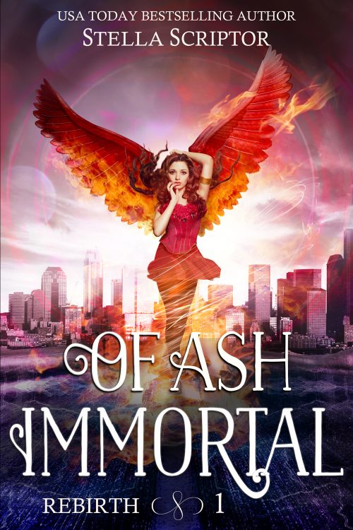
I’m new to selling premades, so I’ve been challenging myself to create one in each major genre to get familiar with current trends. This was my “urban fantasy” attempt. The basic concept is that she’s somehow related to the mythical Phoenix, so her current rebirth is into a modern day city. I browsed bestsellers and high rated urban fantasy books for ideas on color/layout/common tropes when designing it, but it still feels off to me.
Nathan says:
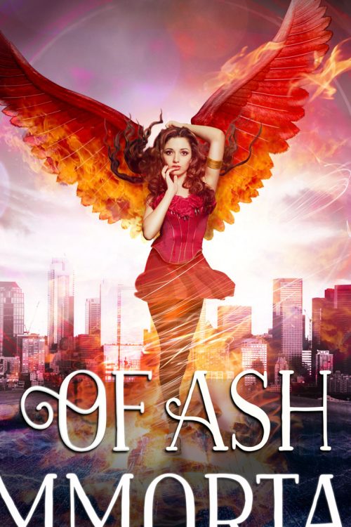
- If it were me, I’d crop the art to about here:
 You don’t lose out on any necessary detail, and there’s more of a focus on the central figure.
2. At first glance, I said, “I’d probably add some swirly-glowing magic.” Then I looked again and say that there is swirly-glowing magic, I just couldn’t see it. Which tells me that you need to do something different with the swirly-glowies — either a different color tint, or more color to show up against the background, or color in the background a bit.
3. Her face seems… vapid. I’d expect this to be a urban-fantasy take on Clueless or Valley Girl.
Other comments?


You did a very nice job and I really can’t add too much to what Nathan has suggested. For instance, not only are the swirls not readily apparent, neither are the flames. The skirt looks a little odd, too: it seems vaguely artificial. And you might want to make her hair appear to be a little looser. Right now you have tendrils rather than a wind-blown look. Oh, and you may want to not make the lower edges of her wings quite so hard. They look a little cut out.
But these all come under the heading of fine-tuning—you really did do a very nice piece!
The stock had a ballgown so the skirt is Frankenstein/painted in – would it work better to just use pants, or change up the outfit entirely? The legs are from a different stock I could more of, or even all of.
Yeah..it does look a little incongruous: it doesn’t really look consistent with the rest of picture. Whatever you do, you need to make it fit in. If changing the entire outfit is what it takes, that maybe what you have to do.
Nice job! Like Nathan and Ron said, you’ve mostly got it. Since the main figure is warm reds and oranges, I’d look at cool blues, greens, or purples for the swirly effects and fire.
The vapid expression doesn’t bother me that much, because I figure you might be offering to replace the head to match the character for the future purchaser anyway.
The subtitle and book number *does* bother me a little, because they don’t come across to me as deliberately off-center, but accidentally off-center. I’d also think abut what you’d do in the case of the author who purchases it having a longer series name. It might be better off to raise the title a little bit to give more space for the subtitle underneath it.
Changing the head would make this a custom cover, not a premade.
This is a really great cover. It has a great humourous vibe to it. I think it will make a nice portfolio piece but it’s really specific for it to sell as a premade cover.
I love the girl’s expression, don’t get me wrong, but the expression, the color of the wings, the fire, the clothing, they’re all great but not at all generic. Which is normally a great thing but not really for premades. If you’re trying to sell premades they need to fit genre in a more generic way, although I suppose you could sell them as customizable premades and offer to customize the details, but that sort of defeats the purpose of having some covers ready to go.
If you’re doing this as an exercise consider the details that could be made generic to fit a multitude of books. So instead of a specific Pheonix try for a girl who can fly – modern setting- as there should be a lot more potential buyers in that category. Or girl who can’t die, or girl who has magic. You need to try to nail a subcategory but not drill down to specifics. Too niche won’t sell.
But I do love this. It’s really great. Maybe you can inspire someone to write that story…lol
That makes a lot of sense, thanks. 🙂 Do you think it would help if I made the wings more just ‘magicky stuff’ flaring out behind her in a wing-like energy shape rather than trying for literal wings, so it could go either way as flight or just magic?
I’d leave this one as is cause it’s so awesome. But as an exercise, I’d aim for a total remake of a more generic magic girl, the details of her magic are up to you but I’d pick a common type of magic to try to portray.
I’d think a badass type girl would sell well. Take a look at Patricia Brigg’s covers. She melds modern and magic really well
By the way, what was your source for the girl? Is what you did with the image sufficiently different that she won’t show up anywhere else?
Upper half Deposit Photos, lower half Neostock Billy – ran through Tineye and didn’t see anything, but that doesn’t mean others couldn’t use her in the future. In the original stock, she’s wearing a ballgown, and there are roses at the bottom of her corset I removed. I didn’t do much to her face besides try to rework the eyes to get some life (which apparently didn’t work, lol) and I added a bracelet and made her hair more red. Other than that, can’t think of anything.
I could headswap her (unfortunately the faces I have to easily swap with all have been used on a lot of book covers, so that might actually make her more common) -or maybe try to headswap her eyes at least, and do some digital painting to modify her face a bit if that’s needed.
Doing some work by hand on a stock image is probably never wasted time. Anything you do to make the image more unique is worth the effort.
So if you’re selling premades… there’s no actual manuscript behind this cover yet? The title and byline are purely speculative filler? I ask because if this is a premade cover without a buyer yet, that makes our job as critics here both easier and more difficult: since we don’t have an author insisting that something on the cover is absolutely vital to the plot and has to stay no matter how visually unappealing it may be, we have a free hand in recommending changes; on the other hand, premades are promoted a bit differently from our usual fare here since what you’re selling is the cover itself rather than the book it’ll be used to advertise.
Our esteemed host and the other critics have already analyzed the cover image’s potential benefits and liabilities, so let’s consider the title(s) and byline. Of Ash Immortal is a suitably dramatic filler title for the genre, but have you considered alternative moods and tones? That somewhat bewildered look on the gal’s face that other critics here have noticed makes me think a book using this cover might actually have a flair for comedy, something like the premise of the original Buffy the Vampire Slayer movie and the television series it subsequently spawned: into a grim and gritty modern setting full of demons and vampires and other hellish creatures of the night strolls a new Chosen One to save humanity… and she’s an air-headed cheerleader? Likewise, your cover has me thinking of titles like Bunny Wunderly the Were-Phoenix or Hell Can Wait: Fallen Angel Barbie Does Las Vegas.
The names in filler bylines can likewise be clever in either a dramatic or a humorous fashion: e.g. “Ginny Blaze” or “Laurel Auburn” for the dramatic angle, and “Lotta Rouge” or “Moira Heevins” for the humorous approach. While names like that might earn you an om-nom-nom de plume tag over at Lousy Book Covers if they were on a finished cover, they’re not going to be on the finished versions of these covers, and in the meantime they help get your prospective customers’ attention. They also serve the secondary purpose of signaling to authors in search of a cover as to whether the tone of the cover properly matches that of their story; if they want their readers to brood grimly over a dramatic story, they’ll pick a cover that likewise makes them brood grimly over it, or if they want to tickle their readers’ funny bones, they’ll pick a cover that tickles their own funny bones.
When doing premades, you can’t be incredibly specific with the imagery since you don’t know all the details of the story it’ll be advertising, but you can at least maintain consistency between the tone of the artwork and the lettering. How much market there is for covers with red angel (or were-phoenix) gals on them specifically, I don’t know, but somebody out there writing an urban fantasy might well be writing a story about some kind of flying gal who wears a lot of red. Just don’t be too surprised if a prospective buyer asks you something like “Well, my story’s heroine is a faerie; could you maybe shrink your cover’s gal down a bit, put some butterfly wings on her, and add a little glittery streak behind her to indicate a flight path?”
Man, if they asked for all of that I’d charge them for a custom cover! 😀
Absolutely…lol
That’s a complete remake.
Lol, yes! Ideally if a person wanted that many changes they’d order a custom from me 😉 Only changes I would do on a premade is changing text and *possibly* some minor tweaks that can be done by deleting layers or changing a color slightly.
But the “too specific” definitely makes sense. I’ll need to resist the urge to add in overly restricting details in the future :S
The skirt especially and the legs do not look right – more swirls perhaps? Fog it out of sight? Or give her a long narrow skirt, as angels usually are depicted in gowns (the bell skirt of a ballroom gown might look wrong, I agree with removing that from the stock image.) And I am not sure the wings fit… but that is very slight, maybe no one else will ever notice. Since humans do not have wings, it is hard to say what angle they should leave from the back. If she was not ever so slightly turned away, it would be easier.
The title is oddly not centered and not properly off centre either.
This doesn’t mean I think it is bad – it’s pretty good.
I would like a bit more flame, I think, it is good now esthetically but a bit inconspicuous. But if there was more contrast in colours, as already suggested, that would make it stand out better too.
The concept is fine, but there are a lot of issues:
-Like the others, the vapid expression is what jumps out at me. A girl who looks more active and engaged spurs more people to buy the book–and the cover.
-The wings are clearly a drawing, so it looks less like she has wings and more like she’s standing in front of a cardboard cutout of wings.
-Her hair is two different sets of hair, one affected by the wind and the other not.
-I also noticed the skirt.
-The skyline photo is fine, but the city just stops and turns into an empty expanse of purplish concrete, which the girl is standing on. She should either be a) in some meaningful spatial relationship to the city, or b) clearly in an abstract space that’s not connected to the city.
(And not that it’s going to matter on a premade, but go ahead and say “Rebirth Book 1” instead of just “Rebirth 1.”
I photoshopped out the road lines in the background stock city/road image since I wanted to put the title there. But if I crop in as suggested and raise the title, it wouldn’t be so much a problem – should I put them back in so it’s clearly a road again?
If it’s cropped closer and it’s all covered with fire and stuff, I think I wouldn’t notice.
Sorry, much belatedly: I just figured out the issue with the background photo. It’s taken with an extremely wide-angle lens, which means that the girl in the foreground must be extremely tiny.
I knew there was some reason that was bothering me. But I think you’re right that it probably won’t matter if you zoom in and add more fire and stuff.
I agree with the notes of the others re. the girl’s expression. I’d also say her arms feel off, the raised one (her left) feeling bigger than the othere even taking foreshortening into account. However, I’ve certainly seen worse-Photoshopped girls than this on professional covers! She passes muster at a glance, which is the main thing.
You’ve also done strong work with colour, atmopshere and texture. You haven’t let it get muddy or dark.
What’s letting the cover done is the fetails. It just needs a bit of attention to the balance and layout of things.
I have gone into detail, and done some quick editing to show you how things can be improved, here: https://www.kathrynrosamiller.com/post/premade-cover
I actually prefer the original spacing as it doesn’t feel so crowded. I also really liked the sky treatment that making her bigger hides. Maybe a compromise of raising the city just a bit would work but I think that’s probably the artists prerogative as it’s their art and that’s a totally artistic choice. I did like most of the title changes although if I were nitpicking I’d recommend shrinking it just a bit to give more room on the edge.